# React Native Search Engine
## Alert the library is subject to change at least the next 2 months.
###  >> [Examples](https://github.com/jsnavarroc/serchEngineExample)
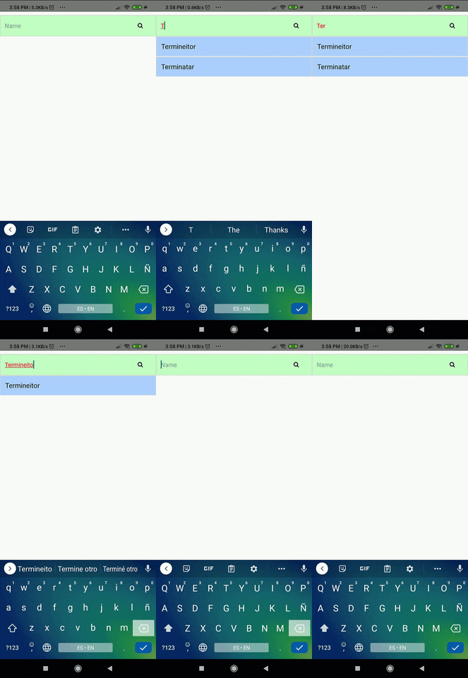
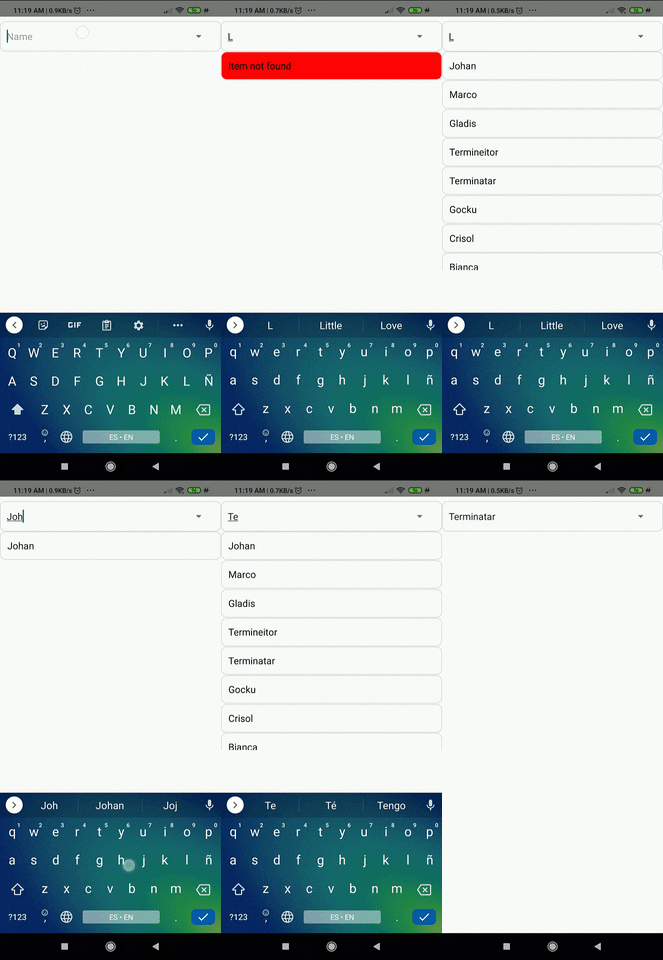
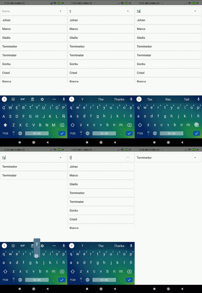
### It is a type of search engine like the "html5's browsers input", it can be used to auto-complete words or to search for elements within an array or object.

<p align="center">
    <img src="https://media.tenor.com/images/8f6b762fc94290066e11bf813830150e/tenor.gif" width="200" alt="option 1">
    <img src="https://media2.giphy.com/media/Zuf1gNyIwROWND4FW2/giphy.gif" width="200" alt="option 2">
    <img src="https://media2.giphy.com/media/ZVRWhVuLcRgwonQ3Rf/giphy.gif" width="200" alt="option 3">
    <img src="https://media2.giphy.com/media/wptdqGxqLWmKKepOSQ/giphy.gif" width="200" alt="option 3">
</p>
 
------------ 

## Documentation

### React Native Search Engine  Component

| Name                      | Description                              | Default     | Type    | Criterion |
|---------------------------|------------------------------------------|-------------|---------|-----------|
| searchKey                 | If you are working with an array of objects and you want to search by a specific property that all objects have in common, can put something like 'user.name'  | ""         | String  |  Optional |
| value                     | If you want me to submit an initial search  | ""       | String  |  Optional |
| data                      | The data to searching                    | [ ]         | Array   | Optional  |
| textInfoStyle             | Text information styles                  | { }         | Object  | Optional  |
| buttonEnabled             | If you want show or not the button       | true        | Boolean | Optional  |
| showAllMode               | If you want  to show all options when it can't find anything | false       | Boolean | Optional  |
| showNoResults               | Doesn't show the options, but the onChange Element gives me the filtered data | false       | Boolean | Optional  |
| textInputStyle            | Input text styles                        | { }         | Object  | Optional  |
| placeholder               | Help text                                | 'Search'    | String  | Optional  |
| containerInputStyle       | Styles of input text containing          | { }         | Object  | Optional  |
| containerTextInfoStyle    | Styles of information text containing    | { }         | Object  | Optional  |
| containerTextError        | Styles of input text containing          | { }         | Object  | Optional  |
| textInfoStyleError        | Styles of information text containing    | { }         | Object  | Optional  |
| containerScrollStyle      | Text tag container stylesl               | { }         | Object  | Optional  |
| containerButtonStyle      | Options display styles                   | { }         | Object  | Optional  |
| containerIconStyle        | Icon Styles                              | { }         | Object  | Optional  |
| onChangeSearch           | Get the text or object                    | onChangeSearch={object => setOption(object)} | Function  | Optional  |
| customizeComponentInput   | Used to return an input component        | customizeComponentInput | Object  | Optional  |
| customizComponenteResult  | It is used to return an output component | ({ valueResult, element }) => < CustomizComponenteResult/> | Function | Optional  |
| leftIcon                | This is used to customize the icon         | () => < leftIcon/> | Function | Optional  |
| error        | you can set if have or no error                       |  false    | Boolean  | Optional  |

------------ 


When you want to customize the component you need set this customizeComponentInput object:

| Name                      | Description                              | Default     | Type    | Criterion |
|---------------------------|------------------------------------------|-------------|---------|-----------|
|       InputCutom          |It is the input component that you want to set |undefine|  Array  |  Optional |
|       addPropsInput          |The properties that you want to pass to the custom component |undefine|  Object  |  Optional |

## Warning 
### Strings beginning with the following characters will not be found:


|      |               |    Characters
|------|---------------|-------------------|
| 1    |               | +                 |
| 2    |               | :                 |
| 3    |               | (                 |
| 4    |               | *                 |
| 5    |               | ?                 |
| 6    |               | \                 |
| 7    |               | [                 |
| 8    |               | .                 |
| 9    |               | ^                 |
| 10   |               | \|                |
| 11   |               | )                 |


------------ 
## How Implement

<img src="https://i.ibb.co/17sgZVJ/image.png" width="200" alt="accessibility text">


### Simpler way

<p align="center">
    <img src="https://i.ibb.co/tq5RRBc/Simpler-way0.jpg" width="200" alt="accessibility text">
    <img src="https://i.ibb.co/b1dVm8V/Simpler-way1.jpg" width="200" alt="accessibility text">
    <img src="https://i.ibb.co/DGYx0QY/Simpler-way-0-1.jpg" width="200" alt="accessibility text">
    <img src="https://i.ibb.co/SVLR0jH/Simpler-way2.jpg" width="200" alt="accessibility text">
</p>
 

```JS  
     <SearchEngine
      data={data}
      searchKey={'properties.emails.0'}
      onChangeSearch={object => setOption(object)}
      buttonEnabled={true}
      placeholder={'email'}
    />
```
### Complexer way

<p align="center">
    <img src="https://i.ibb.co/c6G1VNJ/Complexer-way1.jpg" width="200" alt="accessibility text">
</p>

``` JS
    import { Icon } from 'native-base';
```

```JS
    <SearchEngine
      data={data}
      searchKey={'properties.emails.0'}
      onChangeSearch={object => setOption(object)}
      buttonEnabled={true}
      placeholder={'email'}
      containerIconStyle={styles.containerIconStyle}
      containerInputStyle={styles.containerInputStyle}
      containerScrollStyle={styles.containerScrollStyle}
      containerTextInfoStyle={styles.containerTextInfoStyle}
      containerButtonStyle={styles.containerButtonStyle}
      leftIcon={() => <Icon name="arrow-down" />}
    />
```

## Example
[EXAMPLE CODE](./Example.md)

------------ 


<div align="center">
 <a href="https://paypal.me/jsnavarroc">
 <H2>Donation</H2>
    <img src="https://fitsmallbusiness.com/wp-content/uploads/2018/01/Paypal-Working-Capital-Reviews-150x150.png" width="70" alt="accessibility text">
 </a>
</div>

 >> [Make a donation](https://paypal.me/jsnavarroc)
------------ 

## Author
Johan Navarro  | [https://johansolution.com](http://johansolution.com/)

------------ 

## License
[GNU &copy;](./LICENSE)