


[](https://travis-ci.org/joemccann/dillinger)
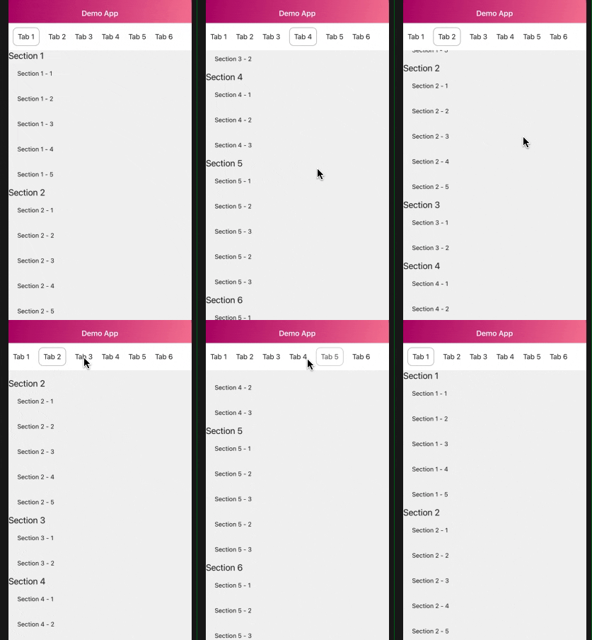 A ScrollView-like component with animated horizontal tab when scrolling
# Get started
## Installation
Install the dependency.
```sh
$ npm install react-native-scrollable-tabstring
```
```sh
$ yarn add react-native-scrollable-tabstring
```
## Usage
Start using the components or try it on Snack
[here](https://snack.expo.io/@thongbui/rn-scrollable-tabstring).
```js
import ScrollableTabString from 'react-native-scrollable-tabstring';
//Standard scrollable tab
yourCustomOnPressIfNeeded}
dataTabs={yourTabNamesList}
dataSections={yourDataSectionList}
renderSection={(item) => yourCustomSectionItemRender}
renderTabName={(item) => yourCustomSectionTabName}
selectedTabStyle={{
...your custom styles when a Tab is scrolled to or tapped
}}
unselectedTabStyle={{
...your custom styles when a Tab is normal
}}
/>
```
## Component Detail
This component currently support tab list for **horizontal** side and vertical section list. Both of which are __**[Flatlist](https://facebook.github.io/react-native/docs/flatlist)**__
| Property | Type | Required | Default | Description |
| -------- | ---- | -------- | ------- | ----------- |
| dataTabs | Array | Yes | [] | A tab list to represent |
| dataSections | Array | Yes | [] | A Section list to represent |
| isParent | Boolean | No | false | Switch to `true` if you want to support more sections following by a parent tab, see detail [here](https://github.com/hoangthongbui/react-native-scrollable-tabstring#scrollable-tab-with-parent-tab) |
| headerTransitionWhenScroll | Boolean | No | true | Animation at tab header when section scrolling |
| tabPosition | String | No | top | Tab list position arrangement, `top` and `bottom` |
| renderSectionItem | Func | Yes | | Function to render Section Item |
| renderTabNameItem | Func | Yes | | Function to render Tab Item, equal to [renderItem](https://reactnative.dev/docs/flatlist#renderitem) in `Flatlist` |
| customTabNamesProps | Object | No | | [Flatlist](https://reactnative.dev/docs/flatlist) Props, avoid props like `renderItem`, `data`, `ref`, `onScroll` as may result some issues |
| customSectionProps | Object | No | | [ScrollView](https://reactnative.dev/docs/scrollview) Props |
| onPressTab | Func | No | | Custom function when pressing on a tab |
| onScrollSection | Func | No | | Custom function when section scrolling |
| selectedTabStyle | Object | No | `{ borderBottomColor: 'black', borderBottomWidth: 1, }` | Custom style when a tab is selected |
| unselectedTabStyle | Object | No | `{ backgroundColor: 'white', alignItems: 'center', justifyContent: 'center', }` | Custom style when a tab is unselected |
## Example
### Scrollable tab
Display a basic scrollable tab
```text
Note: Length of `dataTabs` and `dataSections` must equal, otherwise may result in incorrect scrolling order
```
```js
const tabNames = [{
title: 'Tab 1',
},
...................
{
title: 'Tab 6',
}];
const dataSections = [
{
name: 'Section 1',
data: [..........]
},
...............
{
name: 'Section 6',
data: [..........]
},
];
render () {
return (
(
{item.name}
{
item.data.map((i) => (
{i.name}
))
}
)}
renderTabName={(item) => (
{item.title}
)}
selectedTabStyle={{
borderColor: Colors.brown_grey,
borderRadius: 10,
borderWidth: 1,
margin: 10
}}
unselectedTabStyle={{
backgroundColor: Colors.white,
alignItems: 'center',
justifyContent: 'center',
}}
/>
)
};
```
### Scrollable tab with parent tab
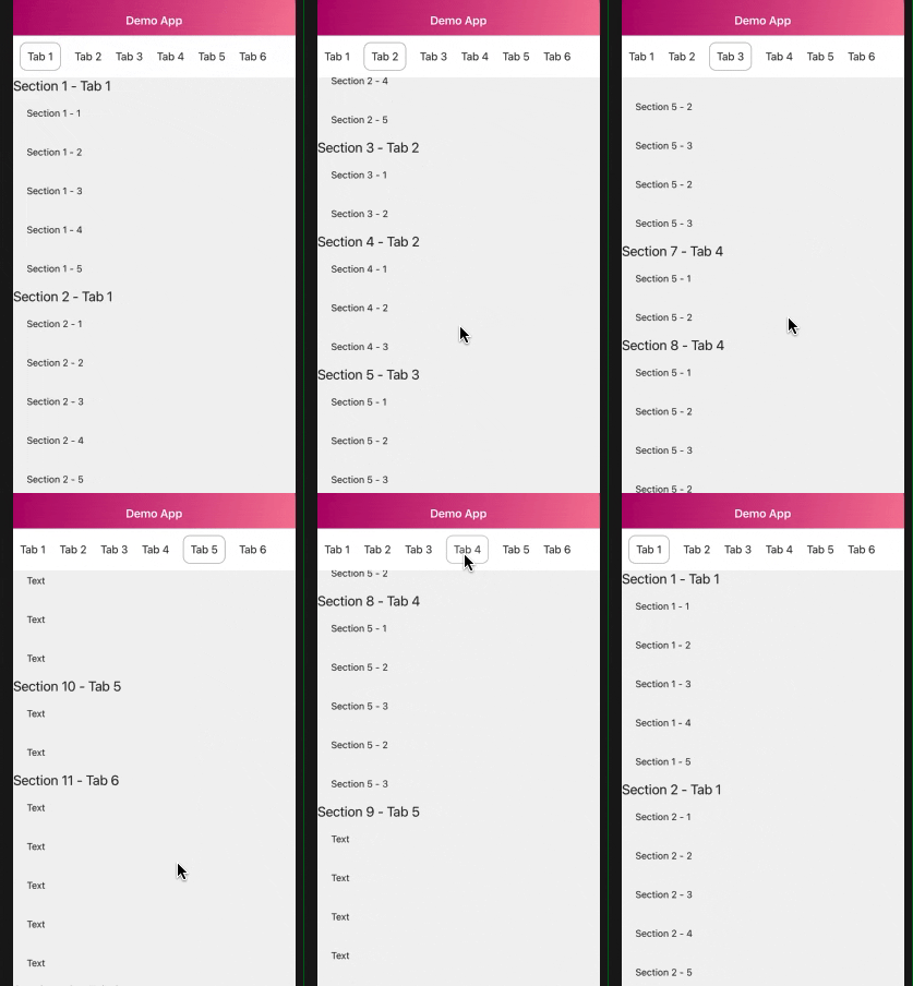
Scrollable tab with parent tab and children section follow
Use this if you want to support more sections following on a tab.
Add `index` key to parent tab and sections (start from 0). For example Tab 1 has 2 children section follow. They are Section 1 and Section 2 -> index of Tab 1, Section 1 and 2 are 0
```text
Note: Index of both parent and children section must equivalent and those sections must be adjacent.
```
A ScrollView-like component with animated horizontal tab when scrolling
# Get started
## Installation
Install the dependency.
```sh
$ npm install react-native-scrollable-tabstring
```
```sh
$ yarn add react-native-scrollable-tabstring
```
## Usage
Start using the components or try it on Snack
[here](https://snack.expo.io/@thongbui/rn-scrollable-tabstring).
```js
import ScrollableTabString from 'react-native-scrollable-tabstring';
//Standard scrollable tab
yourCustomOnPressIfNeeded}
dataTabs={yourTabNamesList}
dataSections={yourDataSectionList}
renderSection={(item) => yourCustomSectionItemRender}
renderTabName={(item) => yourCustomSectionTabName}
selectedTabStyle={{
...your custom styles when a Tab is scrolled to or tapped
}}
unselectedTabStyle={{
...your custom styles when a Tab is normal
}}
/>
```
## Component Detail
This component currently support tab list for **horizontal** side and vertical section list. Both of which are __**[Flatlist](https://facebook.github.io/react-native/docs/flatlist)**__
| Property | Type | Required | Default | Description |
| -------- | ---- | -------- | ------- | ----------- |
| dataTabs | Array | Yes | [] | A tab list to represent |
| dataSections | Array | Yes | [] | A Section list to represent |
| isParent | Boolean | No | false | Switch to `true` if you want to support more sections following by a parent tab, see detail [here](https://github.com/hoangthongbui/react-native-scrollable-tabstring#scrollable-tab-with-parent-tab) |
| headerTransitionWhenScroll | Boolean | No | true | Animation at tab header when section scrolling |
| tabPosition | String | No | top | Tab list position arrangement, `top` and `bottom` |
| renderSectionItem | Func | Yes | | Function to render Section Item |
| renderTabNameItem | Func | Yes | | Function to render Tab Item, equal to [renderItem](https://reactnative.dev/docs/flatlist#renderitem) in `Flatlist` |
| customTabNamesProps | Object | No | | [Flatlist](https://reactnative.dev/docs/flatlist) Props, avoid props like `renderItem`, `data`, `ref`, `onScroll` as may result some issues |
| customSectionProps | Object | No | | [ScrollView](https://reactnative.dev/docs/scrollview) Props |
| onPressTab | Func | No | | Custom function when pressing on a tab |
| onScrollSection | Func | No | | Custom function when section scrolling |
| selectedTabStyle | Object | No | `{ borderBottomColor: 'black', borderBottomWidth: 1, }` | Custom style when a tab is selected |
| unselectedTabStyle | Object | No | `{ backgroundColor: 'white', alignItems: 'center', justifyContent: 'center', }` | Custom style when a tab is unselected |
## Example
### Scrollable tab
Display a basic scrollable tab
```text
Note: Length of `dataTabs` and `dataSections` must equal, otherwise may result in incorrect scrolling order
```
```js
const tabNames = [{
title: 'Tab 1',
},
...................
{
title: 'Tab 6',
}];
const dataSections = [
{
name: 'Section 1',
data: [..........]
},
...............
{
name: 'Section 6',
data: [..........]
},
];
render () {
return (
(
{item.name}
{
item.data.map((i) => (
{i.name}
))
}
)}
renderTabName={(item) => (
{item.title}
)}
selectedTabStyle={{
borderColor: Colors.brown_grey,
borderRadius: 10,
borderWidth: 1,
margin: 10
}}
unselectedTabStyle={{
backgroundColor: Colors.white,
alignItems: 'center',
justifyContent: 'center',
}}
/>
)
};
```
### Scrollable tab with parent tab
Scrollable tab with parent tab and children section follow
Use this if you want to support more sections following on a tab.
Add `index` key to parent tab and sections (start from 0). For example Tab 1 has 2 children section follow. They are Section 1 and Section 2 -> index of Tab 1, Section 1 and 2 are 0
```text
Note: Index of both parent and children section must equivalent and those sections must be adjacent.
```
 ```js
const tabNames = [{
title: 'Tab 1',
index: 0
}
.....
, {
title: 'Tab 6',
index: 5
}];
const dataSections = [
{
name: 'Section 1',
index: 0,
data: [..........]
},
{
name: 'Section 2',
index: 0,
data: [..........]
},
{
name: 'Section 3',
index: 1,
data: [..........]
},
{
name: 'Section 4',
index: 1,
data: [..........]
},
{
name: 'Section 5',
index: 2,
data: [..........]
},
{
name: 'Section 6',
index: 2,
data: [..........]
},
{
name: 'Section 7',
index: 3,
data: [..........]
},
{
name: 'Section 8',
index: 4,
data: [..........]
},
];
const ScrollableTabStringDemo = () => (
(
{item.name}
{
item.data.map((i) => (
{i.name}
))
}
)}
renderTabName={(item) => (
{item.title}
)}
selectedTabStyle={{
borderColor: Colors.brown_grey,
borderRadius: 10,
borderWidth: 1,
margin: 10
}}
unselectedTabStyle={{
backgroundColor: Colors.white,
alignItems: 'center',
justifyContent: 'center',
}}
/>
);
```
## Limitation
This component allows you to customize some Flatlist props on Tab Name and ScrollView props as well. However, you should avoid some of properties like `onScroll`, `renderItem`, `CellRendererComponent`, `horizontal` as may result some issues.
Furthermore, this component doesn't support on load more yet due to heavily calculated, still working on this :p
## Contributing
All contributions are welcome! Please open an issue if you get stuck and bugs, or a PR if you have any feature idea, improvements and bug fixing. I'm very appreciate !
## License
MIT
```js
const tabNames = [{
title: 'Tab 1',
index: 0
}
.....
, {
title: 'Tab 6',
index: 5
}];
const dataSections = [
{
name: 'Section 1',
index: 0,
data: [..........]
},
{
name: 'Section 2',
index: 0,
data: [..........]
},
{
name: 'Section 3',
index: 1,
data: [..........]
},
{
name: 'Section 4',
index: 1,
data: [..........]
},
{
name: 'Section 5',
index: 2,
data: [..........]
},
{
name: 'Section 6',
index: 2,
data: [..........]
},
{
name: 'Section 7',
index: 3,
data: [..........]
},
{
name: 'Section 8',
index: 4,
data: [..........]
},
];
const ScrollableTabStringDemo = () => (
(
{item.name}
{
item.data.map((i) => (
{i.name}
))
}
)}
renderTabName={(item) => (
{item.title}
)}
selectedTabStyle={{
borderColor: Colors.brown_grey,
borderRadius: 10,
borderWidth: 1,
margin: 10
}}
unselectedTabStyle={{
backgroundColor: Colors.white,
alignItems: 'center',
justifyContent: 'center',
}}
/>
);
```
## Limitation
This component allows you to customize some Flatlist props on Tab Name and ScrollView props as well. However, you should avoid some of properties like `onScroll`, `renderItem`, `CellRendererComponent`, `horizontal` as may result some issues.
Furthermore, this component doesn't support on load more yet due to heavily calculated, still working on this :p
## Contributing
All contributions are welcome! Please open an issue if you get stuck and bugs, or a PR if you have any feature idea, improvements and bug fixing. I'm very appreciate !
## License
MIT