# react-native-quick-preview
[](https://www.npmjs.com/package/react-native-quick-preview)
[](https://github.com/Hashtagsmile/react-native-quick-preview/actions/workflows/ci.yml)
[](https://github.com/Hashtagsmile/react-native-quick-preview/blob/main/LICENSE)
Long-press an item to peek at its content, swipe down to dismiss. The kind of preview you know from Instagram or iOS Peek & Pop, as a small headless library for React Native.
I wanted this pattern in my own apps and couldn't find a maintained library for it, so I built one. The API follows the approach popularized by [Gorhom's bottom sheet](https://github.com/gorhom/react-native-bottom-sheet): mount a provider once, then present from anywhere.
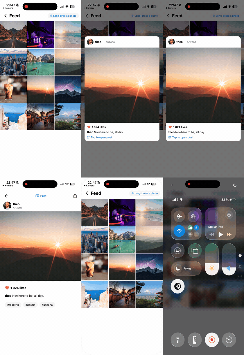
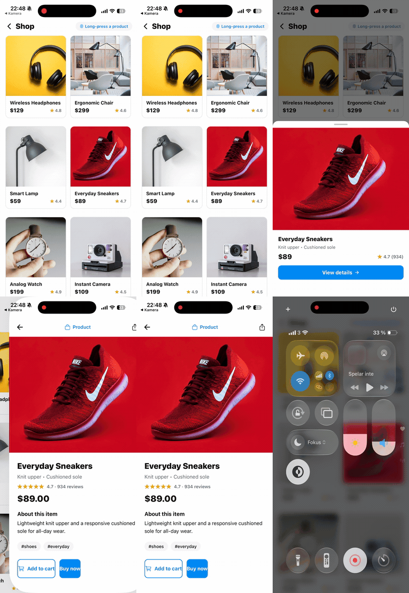
What you get:
- Headless: you render the preview content, the library handles presentation, gestures and dismissal
- Two variants: centered `popover` and bottom `sheet`
- Present from a hook, or from a static handle that also works outside React components
- Swipe-to-dismiss, backdrop press, Android back button handling
- Screen reader announcements and accessibility labels
- TypeScript types, CJS + ESM builds, zero dependencies of its own
## Why use this
The long-press peek is a common interaction, but the existing options each stop short in a specific way:
- **Expo Router's `Link.Preview`** is the native peek-and-pop — but it's **iOS-only**, it previews the **route a link points to** (it navigates on tap), and it requires Expo Router with a native stack.
- **Native context-menu libraries** (`react-native-ios-context-menu`, `zeego`) render a real custom peek — but only on **iOS**, because the "preview floating above a menu" is an iOS-only OS affordance (`UITargetedPreview`) with no Android equivalent. They also ship native modules, so they don't run in Expo Go.
- **`@gorhom/bottom-sheet`** is the go-to sheet, but it's sheet-only (no peek), and its imperative API still needs a mounted component plus a ref — there's no static handle you can call from outside React.
This library fills the intersection none of them cover:
> **A long-press peek that renders any React node identically on iOS *and* Android, with no native module — presentable from anywhere, no router required.**
Concretely, reach for it when you want:
- **The same peek on both platforms.** Pure JS + Reanimated renders your content the same way on iOS and Android.
- **To preview arbitrary content, not a route or a menu.** A product card, an image, a profile — anything, without navigating.
- **No native build.** Works in Expo Go and bare React Native; no config plugin, no prebuild.
- **To present from anywhere.** `QuickPreview.present(node)` is importable and callable from a service, a store action, or any non-React code (after `PreviewProvider` is mounted once at the root).
**When *not* to use it:** if you're iOS-only and want pixel-perfect native peek fidelity and system haptics, use `react-native-ios-context-menu` or Expo Router's `Link.Preview` — a Reanimated re-creation approximates the native feel, it doesn't reproduce it. And if you just need a bottom sheet, use `@gorhom/bottom-sheet`. This library is for the cross-platform, arbitrary-content peek specifically.
## Add it to your app
**How it works.** Wrap each list or grid item in `QuickPreviewPressable`. A **tap** runs `onPress` (go straight to your full screen); a **long-press** opens the peek returned by `renderPreview`. Make that peek tappable and tapping it opens the full screen too — otherwise it just displays until dismissed (swipe down, tap outside, or Android back).
```text
┌─ tap ─────────────────────────────► your detail screen
item ──┤
└─ long-press ─► peek ─┬─ tap peek ─► your detail screen
└─ swipe / tap outside ─► back to the list
```
You build **one new thing per item: the preview content** — usually a compact version of a card you already have. The "full screen" is just the route you already navigate to, so it isn't extra work.
### 1 · Install
```bash
npm install react-native-quick-preview
```
It has four peer dependencies. **Most apps already have the first three** — React Navigation and Expo Router both pull them in — so install whatever's missing:
```bash
npx expo install react-native-reanimated react-native-gesture-handler react-native-safe-area-context
npm install react-native-portalize
```
| Peer dependency | What it's for | Native? |
| --- | --- | --- |
| `react-native-reanimated` | The peek animation (worklets) | yes |
| `react-native-gesture-handler` | Long-press & swipe gestures | yes |
| `react-native-safe-area-context` | Sheet insets | yes |
| `react-native-portalize` | Renders the peek above your app | no — pure JS |
If Reanimated and Gesture Handler are already installed, adding this library is **JS-only — no native rebuild**. (Reanimated needs its Babel plugin; Expo sets this up via `babel-preset-expo`. Versions and bare-RN notes are under [Requirements](#requirements).)
### 2 · Wrap your app once
```tsx
import { GestureHandlerRootView } from 'react-native-gesture-handler'
import { SafeAreaProvider } from 'react-native-safe-area-context'
import { PreviewProvider } from 'react-native-quick-preview'
export default function App() {
return (
// SafeAreaProvider is recommended so the peek clears the notch / home
// indicator. It's optional — without it the peek falls back to zero insets
// rather than crashing. Most apps already have one (React Navigation /
// Expo Router mount it for you).
)
}
```
### 3 · Drop it onto a list item
```tsx
// note: touchables used *inside* a preview must come from gesture-handler, not react-native
import { Pressable } from 'react-native-gesture-handler'
import { QuickPreview, QuickPreviewPressable } from 'react-native-quick-preview'
navigation.navigate('Product', { id: product.id })} // tap → full screen
renderPreview={() => ( // long-press → peek
{
QuickPreview.close()
navigation.navigate('Product', { id: product.id }) // tap the peek → full screen
}}
>
{/* reuse a card you already have */}
)}
>
```
That's the whole integration — three files touched, reusing your existing detail route as the destination.
> Prefer to trigger it yourself? Grab the hook — `const { present } = useQuickPreview()` — and call `present(node, options)` from any handler, or use the static `QuickPreview.present(node, options)` from outside React (below).
## Requirements
- **React Native** ≥ 0.64 (peer). Tested on RN 0.81.
- **React** ≥ 18.2.
- **Peer dependencies** (must be installed in your app): `react-native-reanimated` (≥ 3; both Reanimated 3 and 4 are supported), `react-native-gesture-handler` (≥ 2), `react-native-safe-area-context` (≥ 4), `react-native-portalize`.
- **Reanimated's Babel plugin** must be configured — this is required, not optional. React Native consumes this library's TypeScript source (the standard distribution model for Reanimated libraries), so the plugin transforms its worklets as part of your app's build. Expo configures it for you via `babel-preset-expo`; bare RN apps add it manually (`react-native-worklets/plugin` on Reanimated 4, `react-native-reanimated/plugin` on Reanimated 3). On Expo SDK 54, do **not** also add the plugin by hand — `babel-preset-expo` already includes it, and a duplicate breaks worklets.
- Your app must render `` once, inside a `` (step 2 above).
- `` (from `react-native-safe-area-context`) is **recommended** so the peek clears the notch and home indicator, but **not required** — without one the peek falls back to zero insets instead of crashing. React Navigation and Expo Router already mount it, so most apps have it.
- `expo-haptics` is **optional** — only needed if you want haptics; pass it to `QuickPreviewPressable` via `onLongPressStart`.
## Presenting from outside components
`QuickPreview` is a static handle to the same controller. Use it in event handlers, services, or anywhere React context isn't available. Before the provider mounts it's a safe no-op (with a warning in dev builds).
```tsx
import { QuickPreview } from 'react-native-quick-preview'
QuickPreview.present(, { variant: 'sheet' })
QuickPreview.update({ size: { maxHeight: 480 } })
QuickPreview.isOpen() // boolean
QuickPreview.close()
```
## QuickPreviewPressable
Most of the time you want the same thing: long-press opens a preview, a normal tap navigates. `QuickPreviewPressable` wires that up, including a press-down scale animation:
```tsx
import * as Haptics from 'expo-haptics' // optional
import { QuickPreviewPressable } from 'react-native-quick-preview'
router.push(`/product/${product.id}`)}
renderPreview={() => }
previewOptions={{ variant: 'popover' }}
delay={350} // long-press delay in ms
onLongPressStart={() => Haptics.impactAsync(Haptics.ImpactFeedbackStyle.Medium)}
>
```
`onLongPressStart` fires on the JS thread right before the preview opens. Use it for haptics or analytics. The library doesn't import `expo-haptics` itself, so you stay in control of the dependency (and Metro never has to resolve a package you don't use).
## Tappable preview content
The preview renders inside a gesture-handler overlay. Buttons and tappable areas **inside your preview content** should use touchables from `react-native-gesture-handler` (not `react-native`) — React Native's own `Pressable` / `TouchableOpacity` don't reliably receive taps inside that overlay.
```tsx
// ✗ tap may not fire inside the preview
import { Pressable } from 'react-native'
// ✓ works inside the preview
import { Pressable } from 'react-native-gesture-handler'
present(
{ QuickPreview.close(); router.push('/detail') }}>
,
{ variant: 'popover' }
)
```
## Scrollable previews
If the preview content scrolls, use `QuickPreviewScrollView` instead of a plain `ScrollView`. Otherwise the scroll gesture and the swipe-to-dismiss gesture fight each other.
```tsx
import { QuickPreviewScrollView } from 'react-native-quick-preview'
present(
,
{ variant: 'sheet' }
)
```
## API reference
### `present(node, options?)`
Available from `useQuickPreview()` and the static `QuickPreview`. Presents `node` as the preview content. Calling it while a preview is open replaces the content.
| Option | Type | Default | Description |
| --- | --- | --- | --- |
| `variant` | `'popover' \| 'sheet'` | `'popover'` | Centered card or bottom sheet |
| `size` | `'auto' \| number \| { maxHeight?, maxWidth? }` | `'auto'` | Constrains the preview container |
| `dismissOnBackdropPress` | `boolean` | `true` | Close when the backdrop is tapped |
| `dismissOnPanDown` | `boolean` | `true` | Close on swipe-down gesture |
| `accessibilityLabel` | `string` | | Label announced for the preview container |
| `onOpenStart` / `onOpenEnd` | `() => void` | | Open animation lifecycle |
| `onCloseStart` / `onCloseEnd` | `() => void` | | Close animation lifecycle |
### Controller
Both `useQuickPreview()` and the static `QuickPreview` expose:
| Method | Description |
| --- | --- |
| `present(node, options?)` | Open a preview with the given content |
| `close()` | Dismiss the current preview |
| `update(options)` | Merge new options into the open preview |
| `isOpen()` | Whether a preview is currently open |
### Exports
| Export | Purpose |
| --- | --- |
| `PreviewProvider` | Hosts the preview layer; mount once at the root |
| `useQuickPreview` | Controller from React context (throws outside the provider) |
| `QuickPreview` | Static controller handle (safe no-op before mount) |
| `QuickPreviewPressable` | Long-press-to-preview wrapper with tap-through |
| `QuickPreviewScrollView` | Gesture-aware ScrollView for preview content |
| `QuickPreviewComponent` | Low-level headless component, for fully custom hosts |
| `QuickPreviewOptions`, `QuickPreviewVariant`, `QuickPreviewSize`, `QuickPreviewController` | Public TypeScript types |
## Accessibility
Open and close are announced to screen readers via `AccessibilityInfo.announceForAccessibility`, the Android hardware back button closes an open preview, the backdrop is an accessible close target, and `accessibilityLabel` on the container is forwarded to assistive tech.
## Example app
The [repo](https://github.com/Hashtagsmile/react-native-quick-preview) contains an Expo example app with e-commerce, article and travel preview patterns:
```bash
git clone https://github.com/Hashtagsmile/react-native-quick-preview.git
cd react-native-quick-preview
npm install
npm run build
npm run example
```
The example app is on **Expo SDK 54** (React Native 0.81, Reanimated 4) and runs in Expo Go on iOS and Android. See its [recording guide](https://github.com/Hashtagsmile/react-native-quick-preview/blob/main/apps/expo-quick-preview-example/RECORDING.md) if you want to reproduce the demo GIFs.
## Compatibility
| | Status |
| --- | --- |
| **Platforms** | iOS and Android (identical rendering — it's pure JS/Reanimated) |
| **Expo** | Works in Expo Go and dev clients. No config plugin, no prebuild, no native module. |
| **Bare React Native** | Supported (configure the Reanimated Babel plugin yourself). |
| **New Architecture** | Supported. Verified on RN 0.81 + Reanimated 4 (New-Arch-only). |
| **Old Architecture** | Supported via Reanimated 3. |
| **Web (react-native-web)** | Not a target. It may partially work, but gestures/portals aren't tested there. |
## Limitations
Be clear-eyed about what this is and isn't:
- **It's a re-creation, not the native OS peek.** On iOS, `react-native-ios-context-menu` and Expo Router's `Link.Preview` use the system `UIContextMenuInteraction` (system blur, morph, tuned haptics). This library approximates that feel with Reanimated — it does not reproduce it pixel-for-pixel. If you're iOS-only and want native fidelity, use one of those instead (see [Why use this](#why-use-this)).
- **No built-in action menu.** This presents a *preview*, not a context menu with actions. Render your own buttons inside the preview if you need them.
- **Haptics aren't automatic.** Native context menus fire system haptics for free; here you wire them via `onLongPressStart` (one line — see `QuickPreviewPressable`).
- **One preview at a time.** Calling `present()` while a preview is open replaces the content; previews don't stack.
- **Light theme by default.** The popover/sheet containers use a white background. Style your own content freely; a dark container background isn't a built-in option yet.
- **Screen-reader announcements are English** ("Quick preview opened/closed"). Labels you pass are used verbatim, but the built-in announcement strings aren't localized yet.
- **Requires the peer setup.** No `GestureHandlerRootView` + `PreviewProvider`, or a missing Reanimated Babel plugin, and it won't work — this is not a drop-in with zero configuration.
## Versioning
This package follows semver. Release notes live in the [CHANGELOG](https://github.com/Hashtagsmile/react-native-quick-preview/blob/main/CHANGELOG.md).
Heads up if you're coming from 1.x: version 2.0.0 replaced the old `` component with the provider + controller architecture described above. v1 code will not compile against v2. The changelog has migration notes.
## License
MIT © Oliver Lindblad