

[](http://makeapullrequest.com)
# react-native-progress-steps
A simple and fully customizable React Native component that implements a progress stepper UI.
* Each steps content is displayed inside of a customizable ScrollView.
* Fully customizable buttons are displayed at the bottom of the component to move between steps.
Example One | Example Two
:-------------------------:|:-------------------------:
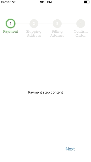 [examples/ExampleOne.js](examples/ExampleOne.js)| 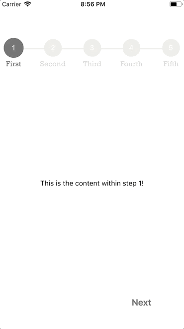 [examples/ExampleTwo.js](examples/ExampleTwo.js)
## Installation
If using yarn:
```
yarn add react-native-progress-steps
```
If using npm:
```
npm i react-native-progress-steps
```
## Usage
```
import { ProgressSteps, ProgressStep } from 'react-native-progress-steps';
```
Simply place a `` tag for each desired step within the `` wrapper.
```
This is the content within step 1!
This is the content within step 2!
This is the content within step 3!
```
### Button Styling Usage
Button container and text are fully customizable using the `nextBtnStyle, nextBtnTextStyle, previousBtnStyle, and previousBtnTextStyle` props.
Example usage to change a buttons text color:
```
const buttonTextStyle = {
color: '#393939'
};
return (
This is the content within step 1!
This is the content within step 2!
)
```
### Current Step Error and Validation Handling
The `errors` prop should be used if there's a need for validation and error handling when clicking the next button. If you would like to prevent the next step from being rendered, set the `errors` prop to `true`. By default, it will be `false`.
Example usage of validation check:
```
state = {
isValid: false,
errors: false
};
onNextStep = () => {
if (!this.state.isValid) {
this.setState({ errors: true });
} else {
this.setState({ errors: false });
}
};
render() {
return (
This is the content within step 1!
This is the content within step 2!
);
}
```
## Documentation
### Progress Steps Component
| Name | Description | Default | Type |
|---------------------------|------------------------------------------|-------------|---------|
| borderWidth | Width of the progress bar between steps | 6 | Number |
| borderStyle | Type of border for the progress bar | solid | String |
| activeStepIconBorderColor | Outside border color for the active step | #4bb543 | String |
| progressBarColor | Color of the default progress bar | #ebebe4 | String |
| completedProgressBarColor | Color of the completed progress bar | #4bb543 | String |
| activeStepIconColor | Color of the active step icon | transparent | String |
| completedStepIconColor | Color of the completed step icon | #4bb543 | String |
| disabledStepIconColor | Color of the disabled step icon | #ebebe4 | String |
| labelFontFamily | Font family for the step icon label | iOS/Android default font | String |
| labelColor | Color of the default label | lightgray | String |
| labelFontSize | Font size for the step icon label | 14 | Number |
| activeLabelColor | Color of the active label | #4bb543 | String |
| activeLabelFontSize | Optional font size for the active step icon label | null | Number |
| completedLabelColor | Color of the completed label | lightgray | String |
| activeStepNumColor | Color of the active step number | black | String |
| completedStepNumColor | Color of the completed step number | black | String |
| disabledStepNumColor | Color of the disabled step number | white | String |
| completedCheckColor | Color of the completed step checkmark | white | String |
| activeStep | Manually specify the active step | 0 | Number |
| isComplete | Set all Steps to active state | false | Boolean |
| topOffset | Set progress bar top offset | 30 | Number |
| marginBottom | Set progress bar bottom margin | 50 | Number |
### Progress Step Component
| Name | Description | Default | Type |
|------------------|--------------------------------------------------------------------------|----------|---------|
| label | Title of the current step to be displayed | null | String |
| onNext | Function called when the next step button is pressed | null | Func |
| onPrevious | Function called when the previous step button is pressed | null | Func |
| onSubmit | Function called when the submit step button is pressed | null | Func |
| nextBtnText | Text to display inside the next button | Next | String |
| previousBtnText | Text to display inside the previous button | Previous | String |
| finishBtnText | Text to display inside the button on the last step | Submit | String |
| nextBtnStyle | Style object to provide to the next/finish buttons | { textAlign: 'center', padding: 8 } | Object |
| nextBtnTextStyle | Style object to provide to the next/finish button text | { color: '#007aff', fontSize: 18 } | Object |
| nextBtnDisabled | Value to disable/enable next button | false | Boolean |
| previousBtnStyle | Style object to provide to the previous button | { textAlign: 'center', padding: 8 } | Object |
| previousBtnTextStyle | Style object to provide to the previous button text | { color: '#007aff', fontSize: 18 } | Object |
| previousBtnDisabled | Value to disable/enable previous button | false | Boolean |
| scrollViewProps | Object to provide props to ScrollView component | {} | Object |
| scrollable | The content of the Progress Step should be scrollable | true | Boolean |
| viewProps | Object to provide props to view component if scrollable is false | {} | Object |
| errors | Used to assist with current step validation. If true, the next step won't be rendered | false | Boolean |
| removeBtnRow | Used to render the progress step without the button row | false | Boolean |
## Contributing
Pull requests are always welcome! Feel free to open a new GitHub issue for any changes that can be made.
**Working on your first Pull Request?** You can learn how from this *free* series [How to Contribute to an Open Source Project on GitHub](https://egghead.io/series/how-to-contribute-to-an-open-source-project-on-github)
## Author
Colby Miller | [https://colbymillerdev.com](https://colbymillerdev.com)
## License
[MIT](./LICENSE)