
[](https://www.npmjs.com/package/@sekizlipenguen/react-native-popup-confirm-toast)
[](https://www.npmjs.com/package/@sekizlipenguen/react-native-popup-confirm-toast)
[](https://github.com/sekizlipenguen/react-native-popup-confirm-toast/issues)
[](https://github.com/sekizlipenguen/react-native-popup-confirm-toast/issues?q=is%3Aissue+is%3Aclosed)
# @sekizlipenguen/react-native-popup-confirm-toast
A flexible and user-friendly popup, toast, and bottom sheet solution for React Native. This package provides customizable components for displaying interactive messages, confirmation dialogs, and toast notifications in your mobile applications.
**Note:** This package has been moved to the `@sekizlipenguen` scope for improved organization and better support for future updates.
## Example Bottom Sheet
| Custom Example 1 | Custom Example 2 | Custom Example 3 | Custom Example 4 |
|:----------------------:|:----------------------:|:----------------------:|:----------------------:|
| 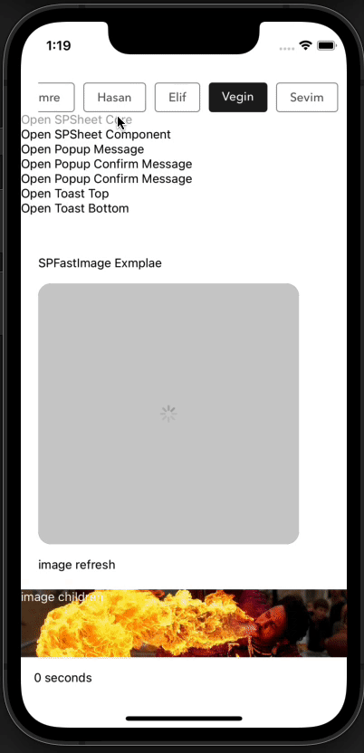 |  |  |  |
## Example Drawer
| Drawer Left | Drawer Right | Drawer Top | Drawer Bottom |
|:-----------------------:|:-----------------------:|:-----------------------:|:-----------------------:|
|  |  |  |  |
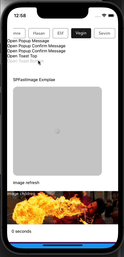
## Example Popup Message
| Example Message | Example Confirm Message | Example Message AutoClose | Example Custom Body Component |
|:----------------------:|:-----------------------:|:-------------------------:|:-----------------------------:|
| 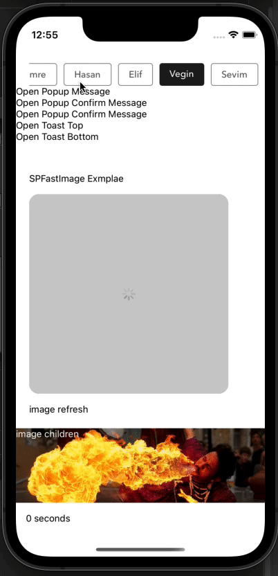 |  | 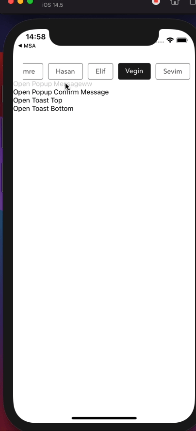 |  |
## Example Toast Message
| Example Toast Top | Example Toast Bottom |
|:-----------------:|:--------------------:|
| 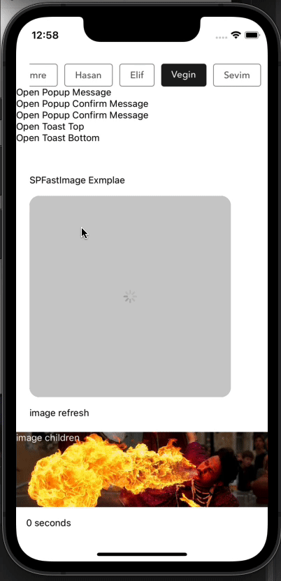 |  |
## Usage
## Installation
Using npm:
```bash
npm install @sekizlipenguen/react-native-popup-confirm-toast
```
Using yarn:
```bash
yarn add @sekizlipenguen/react-native-popup-confirm-toast
```
## Usage
Wrap your root component in Provider from @sekizlipenguen/react-native-popup-confirm-toast. If you have a vanilla React Native project,
it's a good idea to add it in the component which is passed to AppRegistry.registerComponent. This will usually be in
the index.js file. If you have an Expo project, you can do this inside the exported component in the App.js file.
### Example Provider
```javascript
import * as React from 'react';
import { AppRegistry } from 'react-native';
import {Root as PopupRootProvider} from '@sekizlipenguen/react-native-popup-confirm-toast';
import { name as appName } from './app.json';
import App from './src/App';
export default function Main() {
return (
);
}
AppRegistry.registerComponent(appName, () => Main);
```
### Example Bottom Sheet
```javascript
import { Root, SPSheet } from '@sekizlipenguen/react-native-popup-confirm-toast'
const component = (props) => {
//hook or class
return (Hi, SekizliPenguen);
//props.spSheet.hide();
//props.spSheet.setHeight(150,()=>alert('nice'));
};
{
const spSheet = SPSheet;
spSheet.show({
component: () => component({...this.props, spSheet}),
dragFromTopOnly: true,
onCloseComplete: () => {
alert('onCloseComplete');
},
onOpenComplete: () => {
alert('onOpenComplete');
},
height:260
});
}
>
Open SPSheet Message
```
### Example Message
```javascript
import {Popup} from '@sekizlipenguen/react-native-popup-confirm-toast'
Popup.show({
type: 'success',
title: 'Success!',
textBody: 'Mutlak özgürlük, kendi başına hiçbir anlam ifade etmez. ',
buttonText: 'OK',
callback: () => Popup.hide()
})
}
>
Open Popup Message
```
### Example Confirm Message
```javascript
import {Popup} from '@sekizlipenguen/react-native-popup-confirm-toast'
Popup.show({
type: 'confirm',
title: 'Dikkat!',
textBody: 'Mutlak özgürlük, kendi başına hiçbir anlam ifade etmez. ',
buttonText: 'Tamam',
confirmText: 'Vazgeç',
callback: () => {
alert('Okey Callback && hidden');
Popup.hide();
},
cancelCallback: () => {
alert('Cancel Callback && hidden');
Popup.hide();
},
})
}
>
Open Popup Confirm Message
```
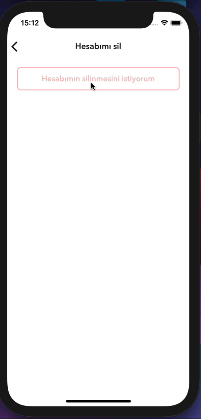
### Example Custom Body Component
```javascript
import { Root, Popup } from '@sekizlipenguen/react-native-popup-confirm-toast'
//hooks or class component
const bodyComponent = ({props,bodyProps}) => {
return (
bodyProps.onLayout(e)}>
Mustafa Kemal ATATÜRK
);
}
{
const popup = Popup;
popup.show({
type: 'confirm',
textBody: 'Hesabınızın silinme işlemini onaylamak için şifrenizi giriniz.',
bodyComponent: (bodyProps) => bodyComponent({...props,bodyProps,popup}),
confirmText: 'Cancel',
iconEnabled: false,
buttonEnabled: false,
});
}}
>
Open Popup Confirm Message
```
### Toast
```javascript
import { Root, Toast } from '@sekizlipenguen/react-native-popup-confirm-toast'
Toast.show({
title: 'I\'m Eight!',
text: 'The best gift I received in this life are the codes. They are worlds inside the worlds.',
backgroundColor: '#702c91',
timeColor: '#440f5f',
timing: 3000,
icon: ,
position: 'bottom',
statusBarType:'dark-content',
onCloseComplete: () => {
alert('onCloseComplete');
},
onOpenComplete: () => {
alert('onOpenComplete');
},
})
}
>
Open Bottom Toast
Toast.show({
title: 'I\'m Eight!',
text: 'The best gift I received in this life are the codes. They are worlds inside the worlds.',
backgroundColor: '#702c91',
timeColor: '#440f5f',
timing: 3000,
icon: ,
position: 'top',
statusBarTranslucent: false,
statusBarType:'light-content',
onCloseComplete: () => {
alert('onCloseComplete');
},
onOpenComplete: () => {
alert('onOpenComplete');
},
})
}
>
Open Top Toast
```
### Drawer
```javascript
import {Root, Drawer} from '@sekizlipenguen/react-native-popup-confirm-toast'
const DrawerContent = ({onClose}) => {
return (
Custom Drawer Content
Close Drawer
);
};
{
Drawer.show({
component: DrawerContent,
position: 'left',
drawerWidth: 300,
backgroundColor: 'rgba(0, 0, 0, 0.5)',
drawerColor: '#ffffff',
duration: 300,
backdropPressToClose: true,
onOpenComplete: () => {
console.log('Drawer opened');
},
onCloseComplete: () => {
console.log('Drawer closed');
},
});
}}
>
Open Left Drawer
{
Drawer.show({
component: DrawerContent,
position: 'right',
drawerWidth: 280,
});
}}
>
Open Right Drawer
{
Drawer.show({
component: DrawerContent,
position: 'top',
drawerWidth: 200,
});
}}
>
Open Top Drawer
{
Drawer.show({
component: DrawerContent,
position: 'bottom',
drawerWidth: 250,
});
}}
>
Open Bottom Drawer
```
## Features & Documentation
### SPSheet
| Key | Type | Description | Default |
|----------------------------|--------------------------|---------------------------------------------------------------------------|--------------------|
| `background` | string | | rgba(0, 0, 0, 0.5) |
| `height` | number | auto height (min: 250) | 250 |
| `duration` | number | animation time used when opening | 250(ms) |
| `closeDuration` | number | animation time used when closing | 300(ms) |
| `closeOnDragDown` | boolean | Use drag with motion to close the window | true |
| `closeOnPressMask` | boolean | press the outside space to close the window | true |
| `closeOnPressBack` | boolean | Press the back key to close the window (Android only) | true |
| `dragTopOnly` | boolean | use only the top area of the draggable icon to close the window | false |
| `component` | component(hook or class) | custom modal component container | null |
| `onOpen` | function | works after the window is opened | null |
| `onOpenComplete` | function | works after the window is opened | null |
| `onClose` | function | works after window is closed | null |
| `onCloseComplete` | function | works after window is closed | null |
| `customStyles` | object | customStyles: { draggableIcon: {}, container: {}, draggableContainer:{} } | {} |
| `timing` | number | Use this parameter for automatic shutdown. | 0(ms) |
| `keyboardHeightAdjustment` | boolean | re-adjusts the height when the keyboard is opened | false |
### Popup
| Key | Type | Description | Default |
|--------------------------|------------------------------------|----------------------------------------------------------------------------------------------------|---------------------------------------------------------------------------------------------------------------------------|
| `title` | string | | false |
| `textBody` | string | | false |
| `bodyComponent` | component(hook or class) | custom modal component container | null |
| `bodyComponentForce` | boolean | The component you specify covers the entire space | false |
| `onLayout` | (event: LayoutChangeEvent) => void | Triggers automatically to calculate and adjust the height of the popup component during rendering. | - |
| `type` | enum | enum(success, info, danger, warning, confirm) | warning |
| `buttonText` | string | | Ok |
| `confirmText` | string | | Cancel |
| `callback` | function | ok button press | popupHidden |
| `cancelCallback` | function | cancel button press | popupHidden |
| `background` | string | | rgba(0, 0, 0, 0.5) |
| `timing` | number | 0 > autoClose | 0 |
| `iconEnabled` | boolean | | true
|
| `iconHeaderStyle` | object | | {height: 75, width: 100, backgroundColor: '#fff'} |
| `icon` | requireUrl | | require('../assets/{type}.png') |
| `containerStyle` | object | | { position: 'absolute', zIndex: 10, backgroundColor: 'rgba(0, 0, 0, 0.5)', alignItems: 'center', top: 0, left: 0,} |
| `modalContainerStyle` | object | | { width: '90%',backgroundColor: '#fff', borderRadius: 8, alignItems: 'center', overflow: 'hidden', position: 'absolute'}} |
| `buttonContentStyle` | object | | {} |
| `okButtonStyle` | object | | {backgroundColor: '#702c91'} |
| `confirmButtonStyle` | object | | default |
| `okButtonTextStyle` | object | | default |
| `confirmButtonTextStyle` | object | | default |
| `titleTextStyle` | object | | default |
| `descTextStyle` | object | | default |
| `bounciness` | number | | 15 |
| `onClose` | function | when the popup is first closed | false |
| `onCloseComplete` | function | | false |
| `onOpen` | function | when the popup is first opened | false |
| `onOpenComplete` | function | | false |
| `duration` | boolean | | 100 |
| `closeDuration` | boolean | | 100 |
### Toast
| Key | Type | Description | Default |
|--------------------------|-----------|---------------------------------------------------|---------------------------------------------------------------|
| `title` | string | | false |
| `text` | string | Description | false |
| `titleTextStyle` | object | | {color: '#fff',fontWeight: 'bold',fontSize: 16} |
| `descTextStyle` | object | | {marginTop: 5,fontSize: 13,color: '#fff', fontWeight: '400',} |
| `backgroundColor` | string | | #1da1f2 |
| `timeColor` | string | time backgroundColor | #1c6896 |
| `position` | enum | parameters => top, bottom | bottom |
| `icon` | component | (react-native-vector-icons or component) | null |
| `timing` | number | | 5000 ms |
| `statusBarType` | string | | default |
| `statusBarTranslucent` | boolean | | false |
| `statusBarHidden` | boolean | | false |
| `statusBarAndroidHidden` | boolean | | true |
| `statusBarAppleHidden` | boolean | | false |
| `hiddenDuration` | number | | 200 ms |
| `startDuration` | number | | 200 ms |
| `onOpen` | function | works after the window is opened | null |
| `onOpenComplete` | function | works after the window is opened | null |
| `onClose` | function | works after window is closed | null |
| `onCloseComplete` | function | works after window is closed | null |
### Drawer
| Key | Type | Description | Default |
|------------------------|--------------------------|----------------------------------------------------|--------------------|
| `component` | component(hook or class) | custom drawer component (receives onClose as prop) | null |
| `position` | enum | enum(left, right, top, bottom) | left |
| `drawerWidth` | number | width or height of drawer depending on position | 80% of screen |
| `backgroundColor` | string | backdrop background color | rgba(0, 0, 0, 0.5) |
| `drawerColor` | string | drawer background color | #ffffff |
| `duration` | number | animation duration in milliseconds | 300(ms) |
| `backdropPressToClose` | boolean | close drawer when pressing backdrop | true |
| `onOpen` | function | works when the drawer starts opening | null |
| `onOpenComplete` | function | works after the drawer is fully opened | null |
| `onClose` | function | works when the drawer starts closing | null |
| `onCloseComplete` | function | works after the drawer is fully closed | null |
### Methods
| Component Name | Method Name | Example | Description |
|----------------|-------------|------------------------------------------------------------------------|-------------------------------------|
| SPSheet | show | const spSheet = SPSheet; spSheet.show(config); | |
| SPSheet | hide | const spSheet = SPSheet; spSheet.hide(); | |
| SPSheet | setHeight | const spSheet = SPSheet; spSheet.setHeight(500,completeEventFunction); | allows you to change the box height |
| Popup | show | const popup = Popup; popup.show(config); | |
| Popup | hide | const popup = Popup; popup.hide(); | |
| Toast | show | const toast = Toast; toast.show(config); | |
| Toast | hide | const toast = Toast; toast.hide(); | |
| Drawer | show | const drawer = Drawer; drawer.show(config); | |
| Drawer | hide | const drawer = Drawer; drawer.hide(); | |
### Helper Function
```javascript
import {getStatusBarHeight} from '@sekizlipenguen/react-native-popup-confirm-toast';
```
## Author
SekizliPenguen
## License
[MIT](./LICENSE)