# react-native-tooltip-menu
Currently works only with `iOS` and `Android`.
This component is modified from another project [react-native-tooltip-menu](https://github.com/alimek/react-native-tooltip-menu)
# How to install
```bash
npm install react-native-popover-tooltip --save
```
To use the component, import the component as shown below
```js
import PopoverTooltip from 'react-native-popover-tooltip';
```
# Example
```javascript
class App extends React.Component {
constructor(props) {
super(props);
this.state = {
order: 1
};
}
render() {
return (
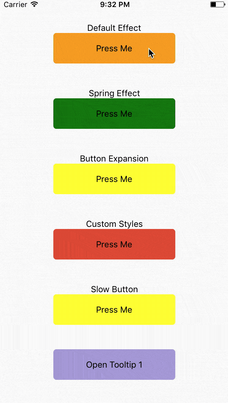
Default Effect
Press Me
}
items={[
{
label: 'Item 1',
onPress: () => {}
},
{
label: 'Item 2',
onPress: () => {}
}
]}
// animationType='timing'
// using the default timing animation
/>
Spring Effect
Press Me
}
items={[
{
label: 'Item 1',
onPress: () => {}
},
{
label: 'Item 2',
onPress: () => {}
}
]}
animationType='spring' // spring-damper animation
springConfig={{tension: 100, friction: 3}} // tension controls the potential of the spring effect,
// friction controls the damper effect
/>
Button Expansion
Press Me
}
items={[
{
label: 'Item 1',
onPress: () => {}
},
{
label: 'Item 2',
onPress: () => {}
}
]}
animationType='spring'
buttonComponentExpandRatio={1.2} // ratio of button component expansion after tooltip poped up
/>
Custom Styles
Press Me
}
items={[
{
label: 'Item 1',
onPress: () => {}
},
{
label: 'Item 2',
onPress: () => {}
}
]}
animationType='spring'
overlayStyle={{backgroundColor: 'transparent'}} // set the overlay invisible
tooltipContainerStyle={{borderRadius:0}}
labelContainerStyle={{backgroundColor: '#ED5736', width: 120, alignItems: 'center'}}
labelSeparatorColor='#1BD1A5' />
Slow Button
Press Me
}
items={[
{
label: 'Item 1',
onPress: () => {}
},
{
label: 'Item 2',
onPress: () => {}
}
]}
// animationType='timing'
// using the default timing animation
timingConfig={{duration: 1000}}
opacityChangeDuration={1000} />
{
this.refs['tooltip'+this.state.order].toggle(); // open popover tooltips one by one
this.setState({order: (this.state.order)%5+1 });
}}>
Open Tooltip {this.state.order}
);
}
}
```
# Configuration
## Props:
| Property | Type | Default | Description |
|----------------|---------------|-----------|--------------------------------------|
| buttonComponent | node ||| Component that can be long pressed
| items | `Array` | | Items to be rendered in menu. Each of item requires `label` as `string` or `function` if you want to render your own component and `onClick` as `function` to be called when you click item. |
| componentWrapperStyle | Object | Optional | Style `Object` if you want to overwrite wrapper for your `buttonComponent`
| componentContainerStyle | Object | Optional | Style `Object` if you want to overwrite container that is between wrapper and your `buttonComponent`
| overlayStyle | Object | Optional | Style `Object` if you want to overwrite overlay style's.
| onRequestClose | `function` | Optional, default `() => {}` | Modal onRequestClose required function on Android
| labelContainerStyle | `Object` | Optional | Style `Object` if you want to change default `TooltipMenuItem` View's style.
| tooltipContainerStyle | `Object` | Optional | Style of the container of the entire tooltip menu.
| labelStyle | `Object` | Optional | Style `Object` if you want to change default `TooltipMenuItem` Text's style.
| labelSeparatorColor | `String` | Color of the separator between two tooltip menu items.
| animationType | `String` | timing | Tooptip popping animation. timing = popup within a specific duration, spring = popup with a spring bumper model.
| timingConfig | `Object` | {duration: 200} | Configuration of timing animation. Attribute duration is the duration of the animation.
| springConfig | `Object` | {tension: 100, friction: 7} | Configuration of spring animation. Attributes tension and friction control the behavior of the spring bumper effect.
| opacityChangeDuration | `number` | 200 | Duration of opacity change of the overlay, during both appearance and dispearance.
| buttonComponentExpandRatio | `number` | 1.0 | Ratio of button component expansion after tooltip poped up.
| setBelow | `Boolean` | false | Sets the default position of the tooltip to appear below the intended target.
| triangleOffset | `Number` | 0 | Number of pixels to offset triangle from center. Positive numbers will push right. Negative Numbers will push left.
## Methods:
| Property | Description |
|----------------|---------------|
| toggle | Open or hide popover tooltip |