# react-native-pie-chart
[](https://www.npmjs.com/package/react-native-pie-chart)
[](https://www.npmjs.com/package/react-native-pie-chart)
[](https://github.com/aidin36/react-native-pie-chart/blob/master/LICENSE)
Simple pie chart module for your React Native app, for both iOS and Android.
 ## Installation
You need to have `react`, `react-native` and `react-native-svg` as your app's dependencies.
`react-native-svg` can be installed both in `expo` and in an ejected app. If you had trouble installing `react-native-svg`, refer to the project's documentation: https://www.npmjs.com/package/react-native-svg
Then install this package with:
`~$ npm install react-native-pie-chart --save`
If you're upgradeing from an old version, see the upgrade guide below.
## Usage
Here's a quick start code. Refer to the `example` directory for a fully working app.
```javascript
import React, { Component } from 'react'
import { StyleSheet, ScrollView, Text, View } from 'react-native'
import PieChart from 'react-native-pie-chart'
export default class TestChart extends Component {
render() {
const widthAndHeight = 250
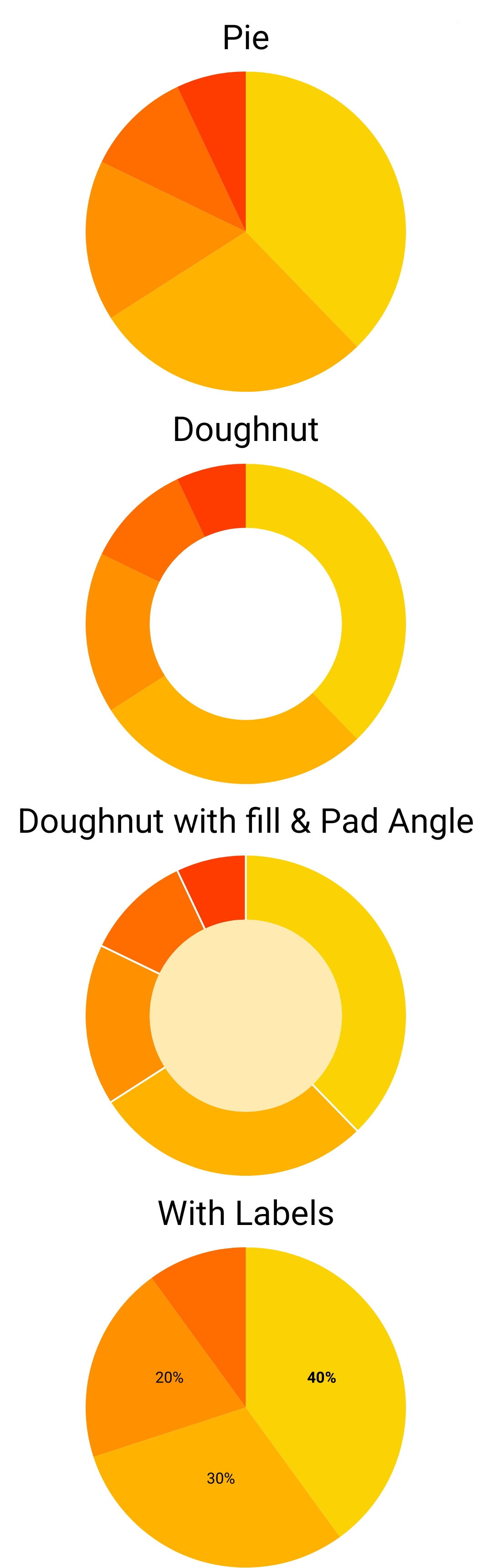
const series = [
{ value: 430, color: '#fbd203' },
{ value: 321, color: '#ffb300' },
{ value: 185, color: '#ff9100' },
{ value: 123, color: '#ff6c00' },
]
return (
Basic
Doughnut
)
}
}
const styles = StyleSheet.create({
container: {
flex: 1,
alignItems: 'center',
},
title: {
fontSize: 24,
margin: 10,
},
})
```
### Adding labels to the chart
For each element in the `series` list, you can also pass a `label` object. It allows you to adjust the font and position of each label. By default, the labels will appear at the center of each slice of the pie. You can use `offsetX` and `offsetY` to move the label.
For example, in the above example code, you can add the labels like this:
```javascript
const series = [
{ value: 430, color: '#fbd203', label: { text: 'A', fontWeight: 'bold' } },
{ value: 321, color: '#ffb300', label: { text: 'mobile', offsetY: 10, offsetX: 10 } },
{ value: 185, color: '#ff9100', label: { text: '%22', fontSize: 8, fontStyle: 'italic', outline: 'white' } },
{ value: 123, color: '#ff6c00' },
]
```
## Example App
Have a look at the app in the `example` directory for a complete Typescript app that shows a few charts.
To setup and run the example app follow these instructions:
```bash
# Clone package
~$ git clone https://github.com/genexu/react-native-pie-chart.git
# Install dependencies
~$ cd react-native-pie-chart/example
~$ npm install
# Run simulator
# Notice: please make sure your simulator state is normal
~$ npm run start
# Then like usual, press 'a' for Android, 'i' for iOS, etc.
```
## TypeScript
The npm package includes TypeScript types.
## Upgrade guide
### Upgrade from 3.x.x to 4.x.x
If you don't want to change your code, we still provide the old API. You only need to change your imports from `react-native-pie-chart` to `react-native-pie-chart/v3api`. Nothing else needs to be changed!
But if you want to use the new features, you need to use the new API. Here's how to upgrade your code.
`series` prop is now a list of an object, that includes the `value` and `color` of each pie's slice. You need to change this:
```javascript
const series = [100, 120, 80]
const sliceColors = ['red', 'blue', 'pink']
```
to this:
```javascript
const series = [
{ value: 100, color: 'red' },
{ value: 120, color: 'blue' },
{ value: 80, color: 'pink' },
]
```
`coverRadius` and `coverFill` props are also combined into a `cover` object. `cover` can be a `number` or an object containing `radius` and `color`. So, this:
```
```
will change to this:
```
```
And this:
```
```
will change to this:
```
```
### Upgrade version 2.x.x to 3.x.x
The package migrated from deprecated `@react-native-community/art` to `react-native-svg`. You need to install `react-native-svg` as per installation guide above. You can now remove `@react-native-community/art` if you didn't use it in your own code.
`doughnut` property is removed. If you set the `coverFill` prop, the chart will become a doughnut.
### Upgrade version 1.x.x to 2.x.x
The only breaking change between version one and two is `chart_wh` prop. It is renamed to `widthAndHeight`. Beside that, there shouldn't be any issue upgrading.
## Props
```Typescript
export type SliceLabel = {
/**
* Text of the label
*/
text: string
/**
* Color to fill the font with
*/
fill?: string
/**
* Color of the font's outline
*/
stroke?: string
/**
* string or number
*/
fontSize?: NumberProp
/**
* Can be:
*'normal', 'bold', 'bolder', 'lighter', '100', '200',... until '900'
*/
fontWeight?: FontWeight
/**
* Name of the font
*/
fontFamily?: string
/**
* Can be:
* 'normal', 'italic', 'oblique'
*/
fontStyle?: FontStyle
/**
* By default, the label will be placed at the center of the slice.
* You can change it by setting these offsets. These are offset from
* the center. These can be negative.
*/
offsetX?: number
offsetY?: number
}
/**
* Represents one slice of the pie
*/
export type Slice = {
/**
* Value the slice represents.
* Should be a positive number.
*/
value: number
/**
* Color of the slice. Can be any string that HTML & CSS accepts.
*/
color: string
/**
* Optional label that appears on top of the slice.
*/
label?: SliceLabel
}
/**
* Represents the hole inside the doughnut chart
*/
export type Cover = {
/**
* Radius of the doughnut hole, in precentage.
* For example 0.3 to cover 30% of the center of the chart.
*/
radius: number
/**
* Optional. Color of the doughnut hole.
* If you want the hole to be transparent, don't provide this
* field.
*/
color?: string
}
export type Props = {
/**
* Diameter of the chart. In otherwords, size of the square that wraps the chart's circle.
*/
widthAndHeight: number
/**
* Chart's data.
* The sum of the series values cannot be zero.
*/
series: Slice[]
/**
* Optional.
* If a `number`, it's the radius of the doughnut's hole, in percentage.
* (The hole will be transparent).
* Should be between zero and one.
* It can be an object that also defined the color of the hole.
*/
cover?: number | Cover
/**
* Optional.
* React-native's style object. This will apply to the chart's SVG.
*/
style?: StyleProp
/**
* If provided, it creates a gap between the slices. Use very small numbers, like `0.01`.
*/
padAngle?: number
}
```
### v3 API
For backward compatibility, we still provide the older API from v3. If you import the component like this:
```javascript
import PieChart from 'react-native-pie-chart/v3api'
```
It will have the following props.
```Typescript
export type Props = {
/**
* Diameter of the chart. In otherwords, size of the square that wraps the chart's circle.
*/
widthAndHeight: number
/**
* Chart's data. Should be a list of all positive (or zero) numbers.
* The sum of the series cannot be zero.
*/
series: number[]
/**
* Color of each slice. The first element is the color of the first slice,
* the second one is the color of the second slice, and so on.
* The size of the `sliceColor` array should be equal to the size of the `series` array.
*/
sliceColor: string[]
/**
* Color of the doughnut's hole.
* Don't provide it or set it to null to make it transparent.
*/
coverFill?: string | null
/**
* Size of the doughnut's hole, in percentage.
* Should be between zero and one.
*/
coverRadius?: number
/**
* React-native's style object. This will apply to the chart's SVG.
*/
style?: StyleProp
}
```
## Installation
You need to have `react`, `react-native` and `react-native-svg` as your app's dependencies.
`react-native-svg` can be installed both in `expo` and in an ejected app. If you had trouble installing `react-native-svg`, refer to the project's documentation: https://www.npmjs.com/package/react-native-svg
Then install this package with:
`~$ npm install react-native-pie-chart --save`
If you're upgradeing from an old version, see the upgrade guide below.
## Usage
Here's a quick start code. Refer to the `example` directory for a fully working app.
```javascript
import React, { Component } from 'react'
import { StyleSheet, ScrollView, Text, View } from 'react-native'
import PieChart from 'react-native-pie-chart'
export default class TestChart extends Component {
render() {
const widthAndHeight = 250
const series = [
{ value: 430, color: '#fbd203' },
{ value: 321, color: '#ffb300' },
{ value: 185, color: '#ff9100' },
{ value: 123, color: '#ff6c00' },
]
return (
Basic
Doughnut
)
}
}
const styles = StyleSheet.create({
container: {
flex: 1,
alignItems: 'center',
},
title: {
fontSize: 24,
margin: 10,
},
})
```
### Adding labels to the chart
For each element in the `series` list, you can also pass a `label` object. It allows you to adjust the font and position of each label. By default, the labels will appear at the center of each slice of the pie. You can use `offsetX` and `offsetY` to move the label.
For example, in the above example code, you can add the labels like this:
```javascript
const series = [
{ value: 430, color: '#fbd203', label: { text: 'A', fontWeight: 'bold' } },
{ value: 321, color: '#ffb300', label: { text: 'mobile', offsetY: 10, offsetX: 10 } },
{ value: 185, color: '#ff9100', label: { text: '%22', fontSize: 8, fontStyle: 'italic', outline: 'white' } },
{ value: 123, color: '#ff6c00' },
]
```
## Example App
Have a look at the app in the `example` directory for a complete Typescript app that shows a few charts.
To setup and run the example app follow these instructions:
```bash
# Clone package
~$ git clone https://github.com/genexu/react-native-pie-chart.git
# Install dependencies
~$ cd react-native-pie-chart/example
~$ npm install
# Run simulator
# Notice: please make sure your simulator state is normal
~$ npm run start
# Then like usual, press 'a' for Android, 'i' for iOS, etc.
```
## TypeScript
The npm package includes TypeScript types.
## Upgrade guide
### Upgrade from 3.x.x to 4.x.x
If you don't want to change your code, we still provide the old API. You only need to change your imports from `react-native-pie-chart` to `react-native-pie-chart/v3api`. Nothing else needs to be changed!
But if you want to use the new features, you need to use the new API. Here's how to upgrade your code.
`series` prop is now a list of an object, that includes the `value` and `color` of each pie's slice. You need to change this:
```javascript
const series = [100, 120, 80]
const sliceColors = ['red', 'blue', 'pink']
```
to this:
```javascript
const series = [
{ value: 100, color: 'red' },
{ value: 120, color: 'blue' },
{ value: 80, color: 'pink' },
]
```
`coverRadius` and `coverFill` props are also combined into a `cover` object. `cover` can be a `number` or an object containing `radius` and `color`. So, this:
```
```
will change to this:
```
```
And this:
```
```
will change to this:
```
```
### Upgrade version 2.x.x to 3.x.x
The package migrated from deprecated `@react-native-community/art` to `react-native-svg`. You need to install `react-native-svg` as per installation guide above. You can now remove `@react-native-community/art` if you didn't use it in your own code.
`doughnut` property is removed. If you set the `coverFill` prop, the chart will become a doughnut.
### Upgrade version 1.x.x to 2.x.x
The only breaking change between version one and two is `chart_wh` prop. It is renamed to `widthAndHeight`. Beside that, there shouldn't be any issue upgrading.
## Props
```Typescript
export type SliceLabel = {
/**
* Text of the label
*/
text: string
/**
* Color to fill the font with
*/
fill?: string
/**
* Color of the font's outline
*/
stroke?: string
/**
* string or number
*/
fontSize?: NumberProp
/**
* Can be:
*'normal', 'bold', 'bolder', 'lighter', '100', '200',... until '900'
*/
fontWeight?: FontWeight
/**
* Name of the font
*/
fontFamily?: string
/**
* Can be:
* 'normal', 'italic', 'oblique'
*/
fontStyle?: FontStyle
/**
* By default, the label will be placed at the center of the slice.
* You can change it by setting these offsets. These are offset from
* the center. These can be negative.
*/
offsetX?: number
offsetY?: number
}
/**
* Represents one slice of the pie
*/
export type Slice = {
/**
* Value the slice represents.
* Should be a positive number.
*/
value: number
/**
* Color of the slice. Can be any string that HTML & CSS accepts.
*/
color: string
/**
* Optional label that appears on top of the slice.
*/
label?: SliceLabel
}
/**
* Represents the hole inside the doughnut chart
*/
export type Cover = {
/**
* Radius of the doughnut hole, in precentage.
* For example 0.3 to cover 30% of the center of the chart.
*/
radius: number
/**
* Optional. Color of the doughnut hole.
* If you want the hole to be transparent, don't provide this
* field.
*/
color?: string
}
export type Props = {
/**
* Diameter of the chart. In otherwords, size of the square that wraps the chart's circle.
*/
widthAndHeight: number
/**
* Chart's data.
* The sum of the series values cannot be zero.
*/
series: Slice[]
/**
* Optional.
* If a `number`, it's the radius of the doughnut's hole, in percentage.
* (The hole will be transparent).
* Should be between zero and one.
* It can be an object that also defined the color of the hole.
*/
cover?: number | Cover
/**
* Optional.
* React-native's style object. This will apply to the chart's SVG.
*/
style?: StyleProp
/**
* If provided, it creates a gap between the slices. Use very small numbers, like `0.01`.
*/
padAngle?: number
}
```
### v3 API
For backward compatibility, we still provide the older API from v3. If you import the component like this:
```javascript
import PieChart from 'react-native-pie-chart/v3api'
```
It will have the following props.
```Typescript
export type Props = {
/**
* Diameter of the chart. In otherwords, size of the square that wraps the chart's circle.
*/
widthAndHeight: number
/**
* Chart's data. Should be a list of all positive (or zero) numbers.
* The sum of the series cannot be zero.
*/
series: number[]
/**
* Color of each slice. The first element is the color of the first slice,
* the second one is the color of the second slice, and so on.
* The size of the `sliceColor` array should be equal to the size of the `series` array.
*/
sliceColor: string[]
/**
* Color of the doughnut's hole.
* Don't provide it or set it to null to make it transparent.
*/
coverFill?: string | null
/**
* Size of the doughnut's hole, in percentage.
* Should be between zero and one.
*/
coverRadius?: number
/**
* React-native's style object. This will apply to the chart's SVG.
*/
style?: StyleProp
}
```