# react-native-phone-country-picker
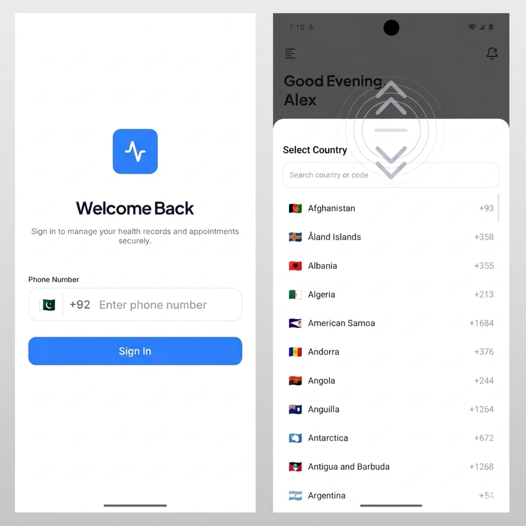
A lightweight, TypeScript-first React Native phone input with a built-in **animated** country picker bottom sheet (smooth open/close, swipe-to-dismiss), search, and safe-area aware layout.
## Preview
## Why this library
`react-native-phone-country-picker` provides a production-friendly phone input where users can:
- Select a country from a bottom sheet
- Search by country name, ISO code, or dial code
- Enter local number digits while the component handles dial-code composition
- Receive a full phone value in `onChangePhone`
Designed for npm distribution and collaboration-focused codebases:
- Typed public API
- Internal utils/hooks split for maintainability
- Minimal and customizable UI surface
## Features
- **Animated country bottom sheet** — spring open, fade backdrop, swipe down on the handle to dismiss (no extra setup in your app code)
- Drag handle + tap-outside backdrop to close
- Safe-area aware sheet height (75% of screen) with bottom inset on notched devices
- Fast search (`name`, `ISO code`, `dial code`)
- Smart country resolution from phone value:
- Respects user-selected country first
- Tries `libphonenumber-js` parsing
- Falls back to dial-prefix matching
- Longest dial-prefix match support (e.g. `+1242` before `+1`)
- TypeScript-first API and exports
- Fully customizable input container/label/error styles
- Lightweight architecture with focused internal utilities
## Installation
```bash
npm install react-native-phone-country-picker
```
or
```bash
yarn add react-native-phone-country-picker
```
### Peer dependencies
- `react`
- `react-native`
- `react-native-safe-area-context` (used for bottom inset on the country picker sheet)
Wrap your app root with `SafeAreaProvider` from `react-native-safe-area-context` so insets resolve correctly (Expo and most RN apps already do this). The animated sheet uses this for correct bottom padding — install it once at the app level; you do not wire the sheet yourself.
## Basic usage
```tsx
import React, { useState } from "react";
import { View } from "react-native";
import { PhoneCountryPicker } from "react-native-phone-country-picker";
export default function Example() {
const [phone, setPhone] = useState("+14155552671");
return (
);
}
```
## Country picker UX (built-in)
The country selector opens as a bottom sheet with:
- **Smooth animations** — sheet slides up with a spring; backdrop fades in/out
- **Swipe down to dismiss** — drag the handle area downward to close (velocity/distance thresholds built in)
- **Backdrop tap** — tap outside the sheet to close
- **Hardware back** — Android back closes the sheet
No changes are required to your `PhoneCountryPicker` usage — open the picker by tapping the flag as before. Gestures and animation are handled inside the library.
## API
### `PhoneCountryPicker`
#### Props
| Prop | Type | Default | Description |
|------|------|---------|-------------|
| `value` | `string` | — | Full phone value (typically E.164-like), e.g. `+14155552671`. |
| `onChangePhone` | `(value: string) => void` | — | Called on input/country changes with updated full value (`dialCode + localDigits`). |
| `label` | `string?` | `"Phone"` | Optional label above the input. |
| `placeholder` | `string?` | `"Enter phone number"` | Placeholder for local number field. |
| `errorText` | `string?` | — | Optional error message shown below input. |
| `disabled` | `boolean?` | `false` | Disables interactions and editing. |
| `wrapperStyle` | `StyleProp?` | — | Style for outer wrapper. |
| `labelStyle` | `StyleProp?` | — | Style override for label text. |
| `inputContainerStyle` | `StyleProp?` | — | Style override for phone input container. |
| `inputStyle` | `StyleProp?` | — | Style override for dial code + text input text. |
| `errorTextStyle` | `StyleProp?` | — | Style override for error text. |
## Value behavior
- Displays a country flag + dial code and a local digit input.
- Sanitizes non-digit input internally.
- Preserves local digits when changing country and recomposes with new dial code.
- Internal country resolution order:
1. Explicit user selection
2. `libphonenumber-js` parsed country
3. Dial prefix lookup
4. Default fallback country (US, then first item)
## Public exports
```ts
import { PhoneCountryPicker } from "react-native-phone-country-picker";
import type {
PhoneInputProps,
CountryItem
} from "react-native-phone-country-picker";
```
## Customization example
```tsx
;
```
## Development
```bash
yarn install
yarn lint
yarn typecheck
yarn test
yarn build
```
## License
MIT