# react-native-nepali-picker
[](https://www.npmjs.com/package/react-native-nepali-picker) [](https://www.npmjs.com/package/react-native-nepali-picker) [](https://www.npmjs.com/package/react-native-nepali-picker) [](https://www.npmjs.com/package/react-native-nepali-picker)
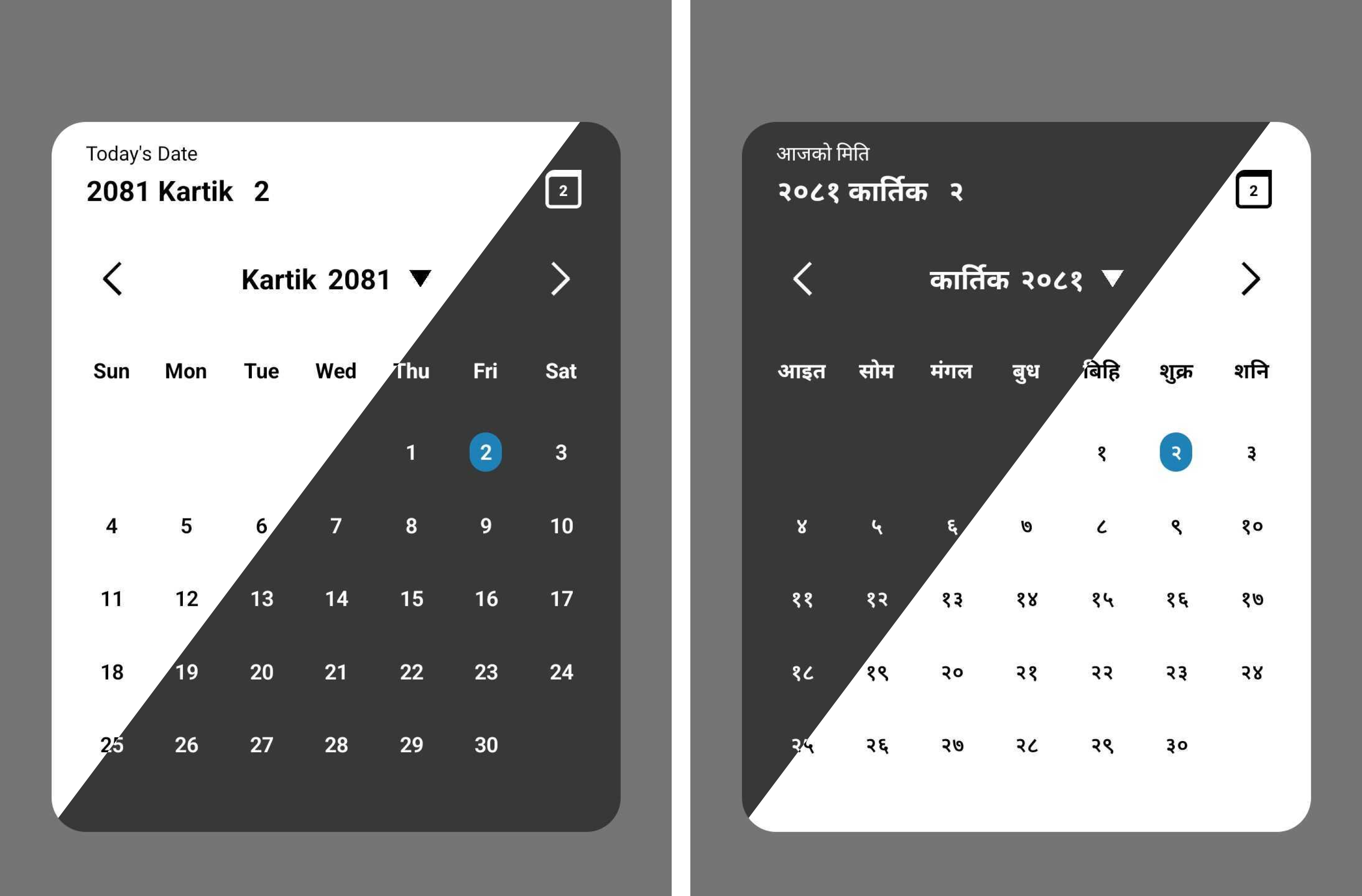
As a Nepali-date picker it will help you on your `react native` project to integrate the Nepali date picker.Addition to that it also have functions for date conversion.
## Feature
- Support all platforms (IOS, android, web and expo).
- Minimalist design.
- Support Nepali and English language.
- Support dark theme.
- Support Date conversion form BS to Ad and vice-versa.
# Installation
```sh
# Install with npm
npm install react-native-nepali-picker
# For installation with yarn
yarn add react-native-nepali-picker
```
# Usage
Example uses of `` component, which is the actual picker component. For more info
```jsx
import { useState } from 'react';
import {View, Text, TouchableOpacity } from 'react-native';
//import calendar picker component
import {
CalendarPicker,
} from 'react-native-nepali-picker';
export default function App() {
const [visible, setVisible] = useState(false);
const [date, setDate] = useState();
const onDateSelect = (PickedDate: string) => {
setDate(PickedDate);
};
return (
{/* actual picker component */}
setVisible(false)}
onDateSelect={onDateSelect}
//these are optional
// date={date}
// minDate='2081-01-13'
// maxDate='2084-11-30'
// dayTextStyle={{ fontSize: 14, }}
// weekTextStyle={{ fontSize: 15, }}
// titleTextStyle={{ fontSize: 20, }}
// language="np"
// theme="light"
// brandColor="#420420"
/>
{/* Button to open calendar picker*/}
setVisible(true)}>
Open Calendar
);
}
```
# Props
### visible
Boolean value to control whether to show the picker modal or not.
| type | default | required |
|-------|-------|-------|
| boolean | none | yes |
### onClose
Function that execute on picker modal closed.
You have to set the visible props to false , in addition to that you can execute others customs function too.
| type | default | required |
|-------|-------|-------|
| ()=>void | none | yes |
### onDateSelect
Function that execute on select the date
The string parameter is the selected date in Nepali format.
| type | default | required |
|-------|-------|-------|
| (string)=>void | none | yes |
### date
Currently Selected date value, default to today's Nepali date.
>[!Note]
> Value should be within range i.e `(2000-01-01 to 2099-12-30)` or If minDate
> and maxDate is provided then date should be the date between that range,
| type | default | required |
|-------|-------|-------|
| string | Today's Nepali date| no|
### minDate
Minimum Selectable date.
>[!Note]
> Value should be within range i.e `(2000-01-01 to 2099-12-30)`,
| type | default | required |
|-------|-------|-------|
| string | 2000-01-01| no|
### maxDate
Maximum Selectable date.
>[!Note]
> Value should be within range i.e `(2000-01-01 to 2099-12-30)`,
| type | default | required |
|-------|-------|-------|
| string | 2099-12-30| no|
>[!> [!WARNING] ]
> Remember the `minDate` must be less than or equals to `maxDate` value
### theme
Preferred theme for picker modal.
| type | default | required |
|-------|-------|-------|
| "dark" \| "light" | light| no|
### language
Preferred language for picker modal.
| type | default | required |
|-------|-------|-------|
| "en" \| "np"| "en"| no |
### brandColor
Color that represent your brand or organization. This color only applied to highlight today date on calendar.
> [!Note]
> Provide the string of color in hex code.
| type | default | required |
|-------|-------|-------|
| "string"| "#2081b9"| no |
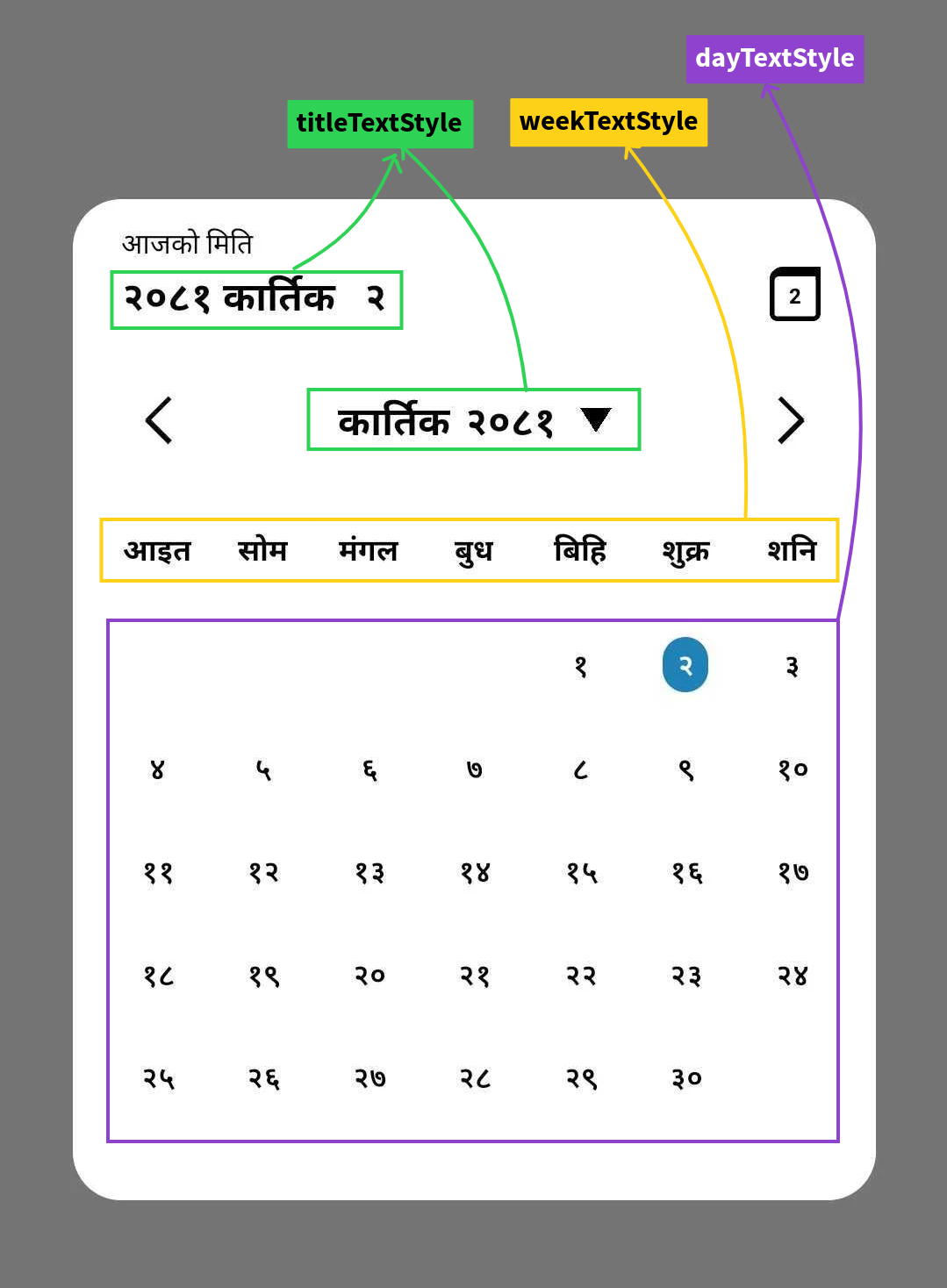
### titleTextStyle
Props that help you to apply custom style on date title of picker modal.
>[!> [!WARNING]
> Color of text can't be changed,it's explicitly defined according to the theme you choose default to `black`.]
| type | default | required |
|-------|-------|-------|
| TextStyle |{fontSize:20,fontWeight:'bold' } | no |
### weekTextStyle
Props that help you to apply custom style on week text of picker modal.
>[!> [!WARNING]
> Color of text can't be changed,it's explicitly defined according to the theme you choose default to `black`.]
| type | default | required |
|-------|-------|-------|
| TextStyle |{fontSize:15,fontWeight:'bold' } | no |
### dayTextStyle
Props that help you to apply custom style on day text of picker modal.
>[!> [!WARNING]
> Color of text can't be changed,it's explicitly defined according to the theme you choose default to `black`.]
| type | default | required |
|-------|-------|-------|
| TextStyle |{fontSize:15,fontWeight:'600' } | no |
**uses**
```jsx
setVisible(false)}
onDateSelect={onDateSelect}
language="np"
theme="dark"
//dayTextStyle={{ fontSize: 14, }}
//weekTextStyle={{ fontSize: 15, }}
//titleTextStyle={{ fontSize: 20, }}
/>
```
# Functions
This package provides three main functions:
### 1) AdtoBs(date:string):string
Convert a date from Anno Domini (AD) to Bikram Sambat (BS):
Function return the BS date in string type with format `yyyy-mm-dd`
>[!Note]
> Supported date range is `1943-04-14` AD to `2042-04-14` AD.
#### **uses**
```js
import {AdToBs} form 'react-native-nepali-picker'
const adDate = '2000-09-21';
const bsDate = AdToBs(adDate);
console.log(bsDate); // Output: 2057-06-05
```
### 2) BstoAd(date:string):string
Convert date from Bikram Sambat (BS) to Anno Domini (AD).
Function return the AD date in string type with format `yyyy-mm-dd`.
>[!Note]
> Supported date range is `2000-01-01` BS to `2099-12-30` BS.
#### **uses**
```js
import {BsToAd} form 'react-native-nepali-picker'
const bsDate = '2057-06-05';
const adDate = BsToAd(bsDate);
console.log(adDate); // Output: 2000-09-21
```
### 3) NepaliToday():string
Get the current date in Nepali calendar (BS)
Function return the BS date in string type with format `yyyy-mm-dd`.
#### **uses**
```js
import {NepaliToday} form 'react-native-nepali-picker'
const today = NepaliToday();
console.log(today); // Output: Current date in BS format (e.g., 2080-07-15)
```
## Full Example uses
```jsx
import { useState } from 'react';
import { StyleSheet, View, Text, TouchableOpacity } from 'react-native';
import {
AdToBs,
BsToAd,
CalendarPicker,
NepaliToday,
} from 'react-native-nepali-picker';
export default function App() {
const [visible, setVisible] = useState(false);
const [date, setDate] = useState();
const onDateSelect = (PickedDate: string) => {
setDate(PickedDate);
};
return (
{/* actual picker component */}
setVisible(false)}
onDateSelect={onDateSelect}
language="np"
theme="light"
/>
setVisible(true)}>
Open Calendar
{date}
{/* convert date on AD to BS equivalent date: required format is (YYYY-MM-DD) */}
{AdToBs('2000-09-21')}
{/* convert date on BS to AD equivalent date: required format is (YYYY-MM-DD) */}
{BsToAd('2056-01-01')}
{/* This function will return the current nepali date: return value is string and format is (YYYY-MM-DD) */}
{NepaliToday()}
);
}
const styles = StyleSheet.create({
container: {
flex: 1,
alignItems: 'center',
justifyContent: 'center',
},
button: {
paddingHorizontal: 10,
paddingVertical: 20,
borderRadius: 5,
backgroundColor: '#fe6684',
marginBottom: 10,
},
text: {
color: '#000',
fontSize: 20,
},
box: {
width: 60,
height: 60,
marginVertical: 20,
},
});
```
## Contact
If you noticed something that need improvement or have additional feature request or just want to chat, feel free to reach out or you can create pull request for feature request, I will try my best to help you.
#### Social
( *You will get instant response on Linkedin than Email.* )
[Linkedin](https://www.linkedin.com/in/kushal-chapagain-1aa66419a/)
[Email](mailto:chapagainkushal74@gmail.com)
[X](https://x.com/chapagainkushal)
## Contributing
See the [contributing guide](CONTRIBUTING.md) to learn how to contribute to the repository and the development workflow.
## License
MIT
---
Made with [create-react-native-library](https://github.com/callstack/react-native-builder-bob)