# react-native-keypad-component
A customizable and animated keypad component for React Native applications, perfect for PIN entry, passcode screens, and secure input scenarios.
Watch demo video here: [Demo Video](https://res.cloudinary.com/dwdsjbetu/image/upload/v1753799731/ScreenRecording2025-07-29at15.15.12-ezgif.com-video-to-gif-converter_1_pzx9iw.gif)
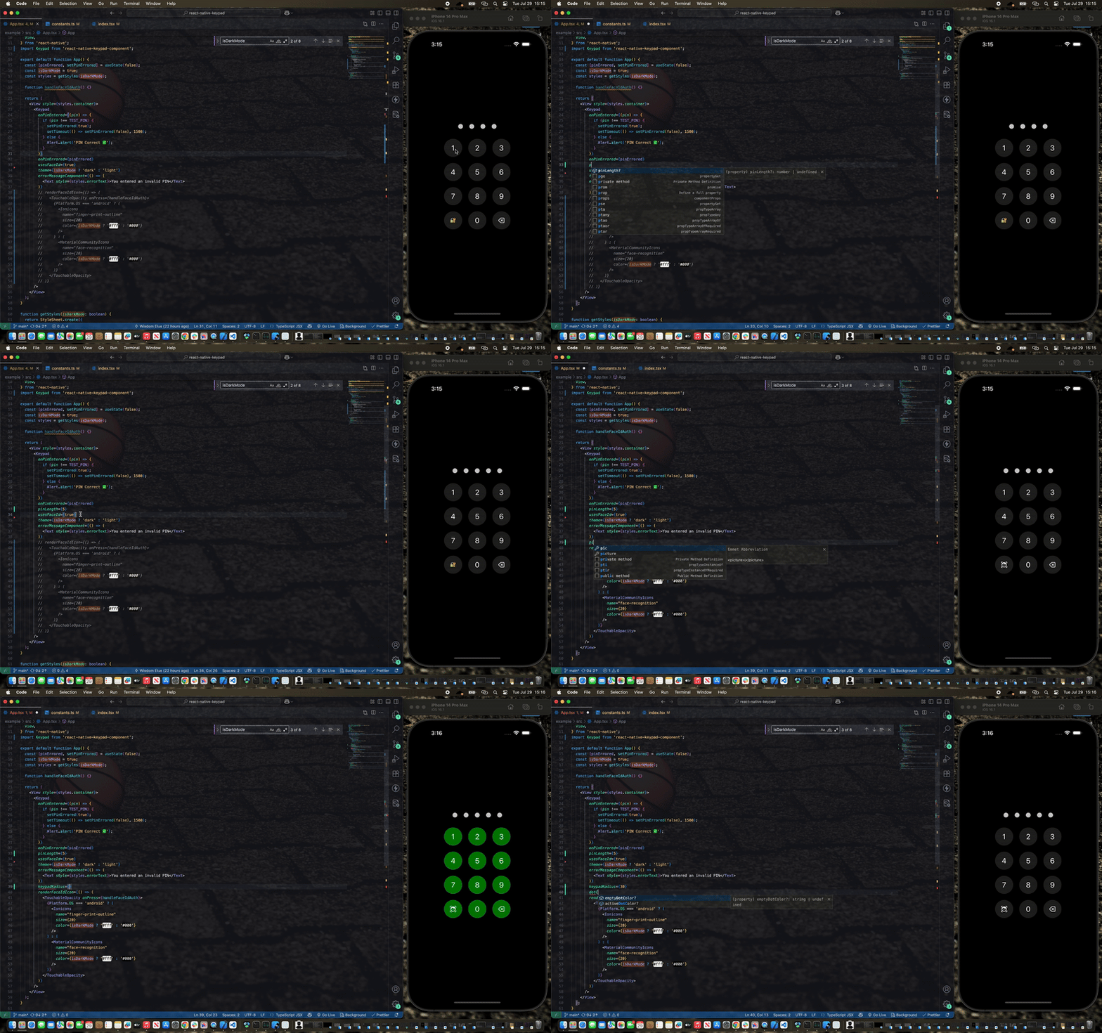
## Features
- ✨ Smooth animations with React Native Reanimated
- 🎨 Customizable themes (light/dark)
- 🔧 Highly configurable styling
- 🎯 TypeScript support
- 📏 Adjustable PIN length
- 🚫 Built-in error handling with shake animation
## Installation
### npm
```sh
npm install react-native-keypad-component
```
### yarn
```sh
yarn add react-native-keypad-component
```
### bun
```sh
bun add react-native-keypad-component
```
### Expo
```sh
npx expo install react-native-keypad-component
```
### Peer Dependencies
This package requires the following peer dependencies:
```sh
yarn add react-native-reanimated
yarn add react-native-gesture-handler
```
Make sure to follow the [React Native Reanimated installation guide](https://docs.swmansion.com/react-native-reanimated/docs/fundamentals/getting-started/) for proper setup.
### CLI Tool
For quick scaffolding, you can also use the [React Native Keypad Component CLI](https://github.com/Elue-dev/rn-keypad-cli) to add the source code directly to your project. This makes it even easier than it already is to customize the component to fit your exact needs.
```sh
npx rn-keypad-cli@latest
```
## Basic Usage
```js
import React from 'react';
import Keypad from 'react-native-keypad-component';
export default function App() {
function handlePinEntered(pin) {
console.log('PIN entered:', pin);
// Handle PIN validation here
}
return ;
}
```
## Advanced Usage
```js
import React, { useState } from 'react';
import { View, Text } from 'react-native';
import Keypad from 'react-native-keypad-component';
export default function SecureScreen() {
const [hasError, setHasError] = useState(false);
function handlePinEntered(pin) {
// your PIN validation logic here
if (pin === '1234') {
setHasError(false);
// Navigate to secure area
} else {
setHasError(true);
setTimeout(() => setHasError(false), 3000);
}
}
function onDigitPressed(digit: string) {
// Called when a digit is pressed (e.g., to trigger haptic feedback or update state)
console.log('Digit pressed:', digit);
Haptics.selectionAsync();
}
function onBackspacePressed() {
// Called when the backspace button is pressed (e.g., to trigger haptic feedback or clear input)
Haptics.selectionAsync();
}
const renderFaceIdIcon = () => 👆;
const renderErrorMessage = () => (
Incorrect PIN. Please try again.
);
return (
);
}
```
## Props
| Prop | Type | Required | Default | Description |
| ------------------------------- | ------------------------- | -------- | ----------- | --------------------------------------------------- |
| `onPinEntered` | `(pin: string) => void` | ✅ | - | Callback function called when PIN entry is complete |
| `onPinErrored` | `boolean` | ❌ | `false` | Triggers error state and shake animation |
| `onDigitPressed` | `(digit: string) => void` | ❌ | - | Triggered when a digit is pressed |
| `onBackspacePressed` | `() => void` | ❌ | - | Triggered when the backspace button is pressed |
| `errorMessageComponent` | `() => ReactNode` | ❌ | `undefined` | Custom component to display error messages |
| `pinLength` | `number` | ❌ | `4` | Number of digits in the PIN |
| `style` | `ViewStyle` | ❌ | `undefined` | Custom styles for the main container |
| `buttonStyle` | `ViewStyle` | ❌ | `undefined` | Custom styles for keypad buttons |
| `buttonTextStyle` | `TextStyle` | ❌ | `undefined` | Custom styles for button text |
| `keypadTextSize` | `number` | ❌ | `24` | Font size for keypad button text |
| `disableKeypadBackground` | `boolean` | ❌ | `false` | Removes background color from buttons |
| `usesFaceId` | `boolean` | ❌ | `false` | Enables Face ID/Touch ID button |
| `keypadRadius` | `number` | ❌ | `30` | Border radius for kaypad buttons and dots |
| `theme` | `'light' \| 'dark'` | ❌ | `'light'` | Overall theme of the keypad |
| `keypadColor` | `string` | ❌ | `'#f2f2f7'` | Button background color |
| `textColor` | `string` | ❌ | `'#000000'` | Text color of keypad |
| `dotColor` | `string` | ❌ | `'#000000'` | Filled dot color |
| `emptyDotColor` | `string` | ❌ | `'#d1d1d6'` | Empty dot color |
| `dotWidth` | `number` | ❌ | `16` | Width of PIN dot |
| `dotHeight` | `number` | ❌ | `16` | Height of PIN dot |
| `gridGap` | `number` | ❌ | `10` | Gap between keypad buttons |
| `renderFaceIdIcon` | `() => ReactNode` | ❌ | `undefined` | Custom Face ID/Touch ID icon component |
| `applyBackgroundToFaceIdButton` | `boolean` | ❌ | `true` | Applies button background to Face ID button |
## Theming
The keypad supports both light and dark themes out of the box. You can customize colors for each theme:
## Animations
The keypad includes several built-in animations:
- **Dot Animation**: Dots scale when PIN digits are entered/removed
- **Shake Animation**: Triggered when `onPinErrored` is true
- **Error Message**: Smooth zoom in/out transitions
- **Layout Transitions**: Smooth transitions when error messages appear/disappear
## Error Handling
To display errors and trigger the shake animation:
```js
const [hasError, setHasError] = useState(false);
function handlePinEntered(pin) {
if (isValidPin(pin)) {
setHasError(false);
// Handle success
} else {
setHasError(true);
// Clear error after some time
setTimeout(() => setHasError(false), 3000);
}
}
(
Invalid PIN
)}
/>;
```
## Biometric Authentication
Enable Face ID or Touch ID button:
```js
function renderFaceIdIcon () (
return (
)
);
;
```
## Customization Examples
### Minimal Keypad
```js
```
### Colorful Keypad
```js
// Example usage with dark mode support
import { useTheme } from 'your-theme-provider'; // Replace with your theme hook
const isDarkMode = useTheme();
;
```
## Contributing
See the [contributing guide](CONTRIBUTING.md) to learn how to contribute to the repository and the development workflow.
## License
MIT