# react-native-js-shimmer-placeholder
Shimmering effect using [react-native-reanimated](https://github.com/software-mansion/react-native-reanimated), [react-native-linear-gradient](https://github.com/react-native-community/react-native-linear-gradient) and [react-native-masked-view](https://github.com/react-native-community/react-native-masked-view)
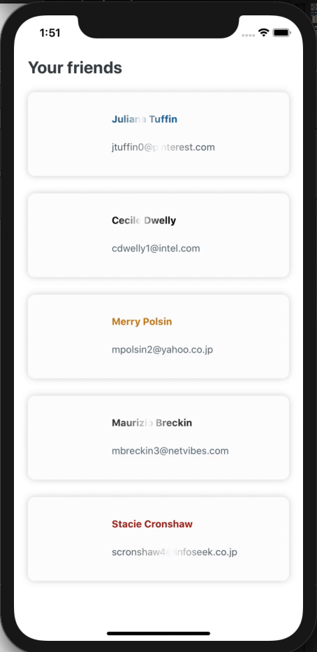
## Demo
## Installation
Make sure you have already installed [react-native-reanimated](https://github.com/software-mansion/react-native-reanimated), [react-native-linear-gradient](https://github.com/react-native-community/react-native-linear-gradient) and [react-native-masked-view](https://github.com/react-native-community/react-native-masked-view) or install it from their links
```
npm install react-native-js-shimmer-placeholder --save
```
or using yarn
```
yarn add react-native-js-shimmer-placeholder
```
## Usage
To use shimmering effect for View
```javascript
import {
ViewPlaceholder,
Direction,
} from "react-native-js-shimmer-placeholder";
🚀
;
```
To use shimmering effect for Text
```javascript
import { TextPlaceholder } from "react-native-js-shimmer-placeholder";
Hey React Native devs!
;
```
## Properties
#### Common props for both ViewPlaceholder and TextPlaceholder
| Prop | Description | Default |
| :---------------------------------- | ------------------------------------------------------------------------------------------------- | ----------------------: |
| **`baseColor`** | The base color of the linear gradient | `white` |
| **`boomerangMode`** | After reaching the end of animation, either restart from the beginning or reverse back towards it | `false` |
| **`canTriggerAnimationCompletion`** | Conditional trigger of Animation completion `(useful for lists)` | `true` |
| **`canUseProc`** | Should use `proc` function from reanimated | `true` |
| **`direction`** | Sets the direction of the Shimmer to move | `Direction.RIGHT` |
| **`gradientStyle`** | Style for the Linear Gradient itself | `{}` |
| **`highlightColor`** | The highlight color for the shimmer | `rgba(211,211,211,0.5)` |
| **`locations`** | Same as the prop used in Linear Gradient | `[0, 0.5, 1]` |
| **`onAnimationComplete`** | Triggers on animation completion | `emptyFn` |
| **`repeatCount`** | Number of times to repeat the animation | `Depends on show prop` |
| **`repeatDelay`**\* | Delay after which the current animation will repeat | `0` |
| **`show`** | Whether to show the shimmer effect | `true` |
| **`totalDuration`** | Duration of the single shimmer cycle | `1500` |
> \*Set `canUseProc` prop to true for the maximum number of items with same `repeatDelay` and false to others if you use different `repeatDelay`'s.
#### Props only for ViewPlaceholder
| Prop | Description | Default |
| :--------------------------- | ------------------------------------------------------------------------------------- | ---------: |
| **`children`** | Child to render inside placeholder | `null` |
| **`childrenWrapperStyle`** | Wrapper style for the children | `{}` |
| **`style`** | Container style for shimmer which wraps the Linear Gradient and the children you pass | `{}` |
| **`gradientContainerStyle`** | Container style for gradient | `{}` |
| **`height`** | Height of the shimmer | `100%` |
| **`width`** | Width of the Shimmer | `Required` |
To pass [View props](https://reactnative.dev/docs/view#props) just pass the props as you do for a View Component
#### Props only for TextPlaceholder
| Prop | Description | Default |
| :------------------------ | ---------------------------------------------------------------- | -------------------------: |
| **`children`** | Text to be shimmered | `undefined` |
| **`style`** | Style for the MaskedView | `{ flex:1 }` |
| **`viewBehindMaskStyle`** | Children of MaskedView which gives the actual color for the Text | `{ flex:1, width:"100%" }` |
| **`textStyle`** | Style for Text to be rendered | `{}` |
| **`textColor`** | Text color of the children | `#5F717B` |
To pass [Text Props](https://reactnative.dev/docs/text#props) just pass the props as you do for a Text Component
#### Limitation
1. Do not use for more than 5 number of list item because of this react-native-reanimated limitation https://github.com/software-mansion/react-native-reanimated/issues/782
#### TODO List
- [ ] Adding support for Reanimated 2 which will solve the above mentioned limitation
#### Contribution
Any help to improve the module is appreciated
#### LICENSE
react-native-js-shimmer-placeholder is licensed under [The MIT License](https://github.com/Ashwin-Mothilal/react-native-js-shimmer-placeholder/blob/master/LICENSE)