### If this project has helped you out, please support us with a star 🌟
[](http://npmjs.org/package/react-native-input-spinner)
[](https://packagequality.com/#?package=react-native-input-spinner)
[](https://prettier.io/)
[](http://npmjs.org/package/react-native-input-spinner)
## 📘 Description
**Author:** Marco Cesarato
**Github:** https://github.com/marcocesarato/react-native-input-spinner
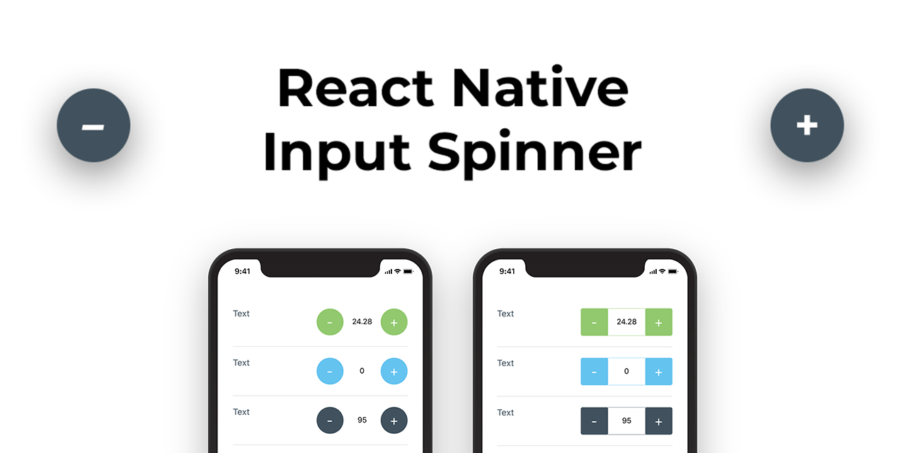
An extendible input number spinner component for react-native highly customizable.
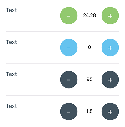
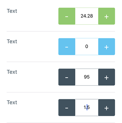
This component enhance a text input for entering numeric values, with increase and decrease buttons.
Try it on the published demo web app: [https://marcocesarato.github.io/react-native-input-spinner/](https://marcocesarato.github.io/react-native-input-spinner/)
_Compatible with: Android, iOS, Windows, Web and Expo._
## 📖 Install
Install the library from npm or yarn just running one of the following command lines:
| npm | yarn |
| ----------------------------------------------- | ------------------------------------- |
| `npm install react-native-input-spinner --save` | `yarn add react-native-input-spinner` |
[](https://nodei.co/npm/react-native-input-spinner/)
## 💻 Usage
```javascript
import InputSpinner from "react-native-input-spinner";
// Example
 |
|  |
### High customization
| Skins | Customization |
| ----------------------------------------- | -------------------------------------- |
|
|
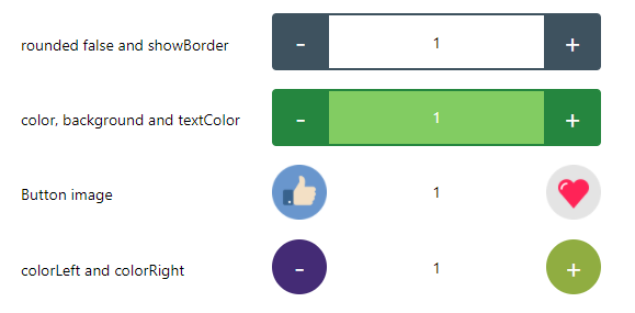
### High customization
| Skins | Customization |
| ----------------------------------------- | -------------------------------------- |
|  |
|  |
## ⚡️ Example
### Web
[https://marcocesarato.github.io/react-native-input-spinner/](https://marcocesarato.github.io/react-native-input-spinner/)
### Expo
Clone or download repo and after:
```shell
cd Example
yarn install # or npm install
expo start
```
Open Expo Client on your device. Use it to scan the QR code printed by `expo start`. You may have to wait a minute while your project bundles and loads for the first time.
[Example App Screenshot](images/example_app.png)
## 💡 Props
Check the "[Props List](PROPS.md)" file to have the complete list of component props ordered by name.
### Structure
|
## ⚡️ Example
### Web
[https://marcocesarato.github.io/react-native-input-spinner/](https://marcocesarato.github.io/react-native-input-spinner/)
### Expo
Clone or download repo and after:
```shell
cd Example
yarn install # or npm install
expo start
```
Open Expo Client on your device. Use it to scan the QR code printed by `expo start`. You may have to wait a minute while your project bundles and loads for the first time.
[Example App Screenshot](images/example_app.png)
## 💡 Props
Check the "[Props List](PROPS.md)" file to have the complete list of component props ordered by name.
### Structure
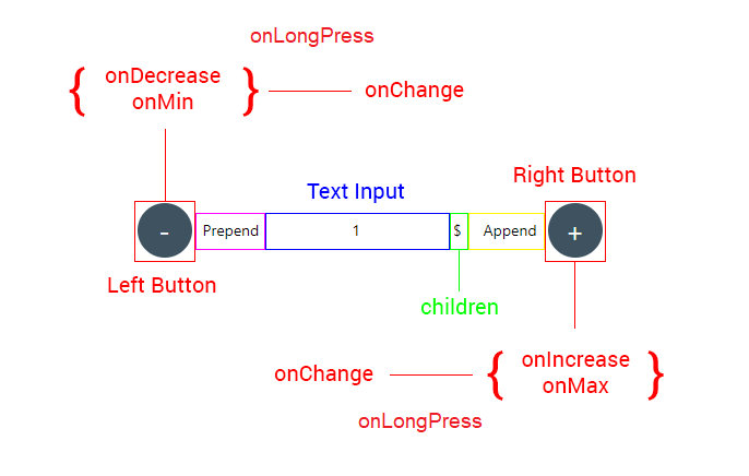 ### Handlers
| Handler | Description | Func |
| ----------------- | ----------------------------------------------------------------------------- | ---------------------- |
| `onBlur` | Callback that is called when the text input is blurred. | (e) => { ... } |
| `onChange` | Callback that is called when the number of the Spinner change. | (num) => { ... } |
| `onDecrease` | Callback that is called when decrease button is clicked get value decreased. | (decreased) => { ... } |
| `onFocus` | Callback that is called when the text input is focused. | (e) => { ... } |
| `onIncrease` | Callback that is called when increase button is clicked get value increased . | (increased) => { ... } |
| `onKeyPress` | Callback that is called when a key is pressed. | (e) => { ... } |
| `onLongPress` | Callback that is called when holding the right or the left button | Function |
| `onMax` | Callback that is called when max is reached get max number permitted. | (max) => { ... } |
| `onMin` | Callback that is called when min is reached get min number permitted. | (min) => { ... } |
| `onSubmitEditing` | Callback that is called when the text input's submit button is pressed | (e) => { ... } |
### Props
| Property | Description | Type | Default | Note |
| ---------------------- | ------------------------------------------------------------------------------------------------------------------------------ | ---------------- | ------- | --------------------------------- |
| `accelerationDelay` | Delay time before start the `onLongPress` event and increase or decrease and continually | Number | `1000` | |
| `append` | Custom element before right button | Component | | |
| `autoFocus` | If `true`, focuses the input on `componentDidMount`. | | `false` | |
| `continuity` | On min value is reached next decrease value will be the max value, if max is reached next increase value will be the min value | Boolean | `false` | |
| `disabled` | Disable the Spinner or not | Boolean | `false` | |
| `editable` | Set if input number field is editable or not | Boolean | `true` | |
| `emptied` | Set if input can be empty | Boolean | `false` | |
| `initialValue` | Initial value of the Spinner | String
### Handlers
| Handler | Description | Func |
| ----------------- | ----------------------------------------------------------------------------- | ---------------------- |
| `onBlur` | Callback that is called when the text input is blurred. | (e) => { ... } |
| `onChange` | Callback that is called when the number of the Spinner change. | (num) => { ... } |
| `onDecrease` | Callback that is called when decrease button is clicked get value decreased. | (decreased) => { ... } |
| `onFocus` | Callback that is called when the text input is focused. | (e) => { ... } |
| `onIncrease` | Callback that is called when increase button is clicked get value increased . | (increased) => { ... } |
| `onKeyPress` | Callback that is called when a key is pressed. | (e) => { ... } |
| `onLongPress` | Callback that is called when holding the right or the left button | Function |
| `onMax` | Callback that is called when max is reached get max number permitted. | (max) => { ... } |
| `onMin` | Callback that is called when min is reached get min number permitted. | (min) => { ... } |
| `onSubmitEditing` | Callback that is called when the text input's submit button is pressed | (e) => { ... } |
### Props
| Property | Description | Type | Default | Note |
| ---------------------- | ------------------------------------------------------------------------------------------------------------------------------ | ---------------- | ------- | --------------------------------- |
| `accelerationDelay` | Delay time before start the `onLongPress` event and increase or decrease and continually | Number | `1000` | |
| `append` | Custom element before right button | Component | | |
| `autoFocus` | If `true`, focuses the input on `componentDidMount`. | | `false` | |
| `continuity` | On min value is reached next decrease value will be the max value, if max is reached next increase value will be the min value | Boolean | `false` | |
| `disabled` | Disable the Spinner or not | Boolean | `false` | |
| `editable` | Set if input number field is editable or not | Boolean | `true` | |
| `emptied` | Set if input can be empty | Boolean | `false` | |
| `initialValue` | Initial value of the Spinner | String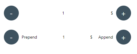 ##### Description
- Top spinner with a child
- Bottom spinner with `prepend` and `append`
### Props Styles
| Property | Description | Type | Default | Note |
| ------------------ | ----------------------------- | ------ | ------- | --------------------------------------------- |
| `buttonPressStyle` | Button style on Pressed state | Object | | Could overwrite other props |
| `buttonStyle` | Button style | Object | | Could overwrite other props |
| `inputStyle` | Text Input style | Object | | Could overwrite other props |
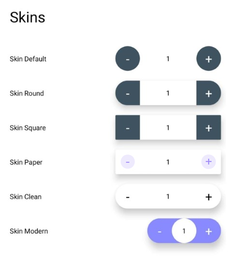
| `skin` | Skin layout | String | | `clean`, `modern`, `paper`, `round`, `square` |
| `style` | Container style | Object | | Could overwrite other props |
### Props Colors
| Property | Description | Type | Default | Note |
| ---------------------- | ---------------------------------------------------------- | ------ | ------------- | ---- |
| `background` | Custom input text background color | String | `transparent` |
| `buttonPressTextColor` | Custom color of the button of the Spinner on Pressed state | String | Auto |
| `buttonTextColor` | Custom color of the label's button of the Spinner | String | Auto |
| `colorAsBackground` | Use color as background | Bool | `false` |
| `colorLeft` | Custom color of the Spinner left button | String | `#3E525F` |
| `colorMax` | Custom color of the Spinner when reach max value | String | |
| `colorMin` | Custom color of the Spinner when reach min value | String | |
| `colorPress` | Custom color of the Spinner button on touch press | String | `#3E525F` |
| `colorRight` | Custom color of the Spinner right button | String | `#3E525F` |
| `color` | Custom color of the Spinner | String | `#3E525F` |
| `textColor` | Custom input text number color | String | Auto |
#### Screenshots
##### Description
- Top spinner with a child
- Bottom spinner with `prepend` and `append`
### Props Styles
| Property | Description | Type | Default | Note |
| ------------------ | ----------------------------- | ------ | ------- | --------------------------------------------- |
| `buttonPressStyle` | Button style on Pressed state | Object | | Could overwrite other props |
| `buttonStyle` | Button style | Object | | Could overwrite other props |
| `inputStyle` | Text Input style | Object | | Could overwrite other props |
| `skin` | Skin layout | String | | `clean`, `modern`, `paper`, `round`, `square` |
| `style` | Container style | Object | | Could overwrite other props |
### Props Colors
| Property | Description | Type | Default | Note |
| ---------------------- | ---------------------------------------------------------- | ------ | ------------- | ---- |
| `background` | Custom input text background color | String | `transparent` |
| `buttonPressTextColor` | Custom color of the button of the Spinner on Pressed state | String | Auto |
| `buttonTextColor` | Custom color of the label's button of the Spinner | String | Auto |
| `colorAsBackground` | Use color as background | Bool | `false` |
| `colorLeft` | Custom color of the Spinner left button | String | `#3E525F` |
| `colorMax` | Custom color of the Spinner when reach max value | String | |
| `colorMin` | Custom color of the Spinner when reach min value | String | |
| `colorPress` | Custom color of the Spinner button on touch press | String | `#3E525F` |
| `colorRight` | Custom color of the Spinner right button | String | `#3E525F` |
| `color` | Custom color of the Spinner | String | `#3E525F` |
| `textColor` | Custom input text number color | String | Auto |
#### Screenshots
 ##### Description
- Spinner with `color`, `buttonTextColor`, `colorPress` and `buttonPressTextColor` custom colors
### Props Container Style
| Property | Description | Type | Default | Note |
| ------------ | ------------------------------------- | ------- | ------- | ------------------------------------------------ |
| `height` | Custom height of the Spinner | Number | `50` |
| `shadow` | Show container shadow | Boolean | `false` | Use with `background` like `background={"#FFF"}` |
| `showBorder` | Show the border of the Spinner or not | Boolean | `false` | Use with `rounded={false}` |
| `style` | Container style | Object | | Could overwrite other props |
| `width` | Custom width of the Spinner | Number | `150` |
### Props Buttons Style
| Property | Description | Type | Default | Note |
| ----------------------- | ------------------------------------------------------------------ | --------- | -------------- | --------------------------- |
| `activeOpacity` | Opacity of underlay on pressed button | Number | `0.85` |
| `arrows` | Labels on button will be (< and >) instead of (+ and -) | Boolean | `false` |
| `buttonFontFamily` | Custom fontFamily of buttons of the Spinner | String | System Default |
| `buttonFontSize` | Custom fontSize of buttons of the Spinner | Number | `14` |
| `buttonLeftDisabled` | Disable left button | Boolean | `false` | |
| `buttonLeftImage` | Custom element on the button left of the spinner | Component | | Could overwrite other props |
| `buttonLeftText` | Custom text on the button left of the spinner | String | |
| `buttonPressLeftImage` | Custom element on the button left of the spinner on pressed state | Component | | Could overwrite other props |
| `buttonPressRightImage` | Custom element on the button right of the spinner on pressed state | Component | | Could overwrite other props |
| `buttonPressStyle` | Button Style on Pressed state (Plus and Minus buttons) | Object | |
| `buttonPressTextColor` | Custom color of the button of the Spinner on Pressed state | String | `#FFFFFF` |
| `buttonRightDisabled` | Disable right button | Boolean | `false` | |
| `buttonRightImage` | Custom element on the button right of the spinner | Component | | Could overwrite other props |
| `buttonRightText` | Custom text on the button right of the spinner | String | |
| `buttonStyle` | Button Style (Plus and Minus buttons) | Object | |
| `buttonTextColor` | Custom color of the labels's button of the Spinner | String | `#FFFFFF` |
| `buttonPressTextStyle` | Button Style on Pressed state (Plus and Minus buttons) | Object | | Could overwrite other props |
| `buttonTextStyle` | Button text Style state (Plus and Minus buttons) | Object | | Could overwrite other props |
| `rounded` | Use circular button | Boolean | `true` |
### Props Text Input Style
| Property | Description | Type | Default | Note |
| ------------ | -------------------------------------------------- | ------ | -------------- | ------------------------- |
| `background` | Custom input text background color | String | `transparent` |
| `fontFamily` | Custom fontFamily of the text input of the Spinner | String | System Default |
| `fontSize` | Custom fontSize of the text input of the Spinner | Number | `14` |
| `inputStyle` | Text Input style | Object | | Can overwrite other props |
| `textColor` | Custom input text number color | String | `#000000` |
## 🤔 How to contribute
Have an idea? Found a bug? Please raise to [ISSUES](https://github.com/marcocesarato/react-native-input-spinner/issues).
Contributions are welcome and are greatly appreciated! Every little bit helps, and credit will always be given.
##### Description
- Spinner with `color`, `buttonTextColor`, `colorPress` and `buttonPressTextColor` custom colors
### Props Container Style
| Property | Description | Type | Default | Note |
| ------------ | ------------------------------------- | ------- | ------- | ------------------------------------------------ |
| `height` | Custom height of the Spinner | Number | `50` |
| `shadow` | Show container shadow | Boolean | `false` | Use with `background` like `background={"#FFF"}` |
| `showBorder` | Show the border of the Spinner or not | Boolean | `false` | Use with `rounded={false}` |
| `style` | Container style | Object | | Could overwrite other props |
| `width` | Custom width of the Spinner | Number | `150` |
### Props Buttons Style
| Property | Description | Type | Default | Note |
| ----------------------- | ------------------------------------------------------------------ | --------- | -------------- | --------------------------- |
| `activeOpacity` | Opacity of underlay on pressed button | Number | `0.85` |
| `arrows` | Labels on button will be (< and >) instead of (+ and -) | Boolean | `false` |
| `buttonFontFamily` | Custom fontFamily of buttons of the Spinner | String | System Default |
| `buttonFontSize` | Custom fontSize of buttons of the Spinner | Number | `14` |
| `buttonLeftDisabled` | Disable left button | Boolean | `false` | |
| `buttonLeftImage` | Custom element on the button left of the spinner | Component | | Could overwrite other props |
| `buttonLeftText` | Custom text on the button left of the spinner | String | |
| `buttonPressLeftImage` | Custom element on the button left of the spinner on pressed state | Component | | Could overwrite other props |
| `buttonPressRightImage` | Custom element on the button right of the spinner on pressed state | Component | | Could overwrite other props |
| `buttonPressStyle` | Button Style on Pressed state (Plus and Minus buttons) | Object | |
| `buttonPressTextColor` | Custom color of the button of the Spinner on Pressed state | String | `#FFFFFF` |
| `buttonRightDisabled` | Disable right button | Boolean | `false` | |
| `buttonRightImage` | Custom element on the button right of the spinner | Component | | Could overwrite other props |
| `buttonRightText` | Custom text on the button right of the spinner | String | |
| `buttonStyle` | Button Style (Plus and Minus buttons) | Object | |
| `buttonTextColor` | Custom color of the labels's button of the Spinner | String | `#FFFFFF` |
| `buttonPressTextStyle` | Button Style on Pressed state (Plus and Minus buttons) | Object | | Could overwrite other props |
| `buttonTextStyle` | Button text Style state (Plus and Minus buttons) | Object | | Could overwrite other props |
| `rounded` | Use circular button | Boolean | `true` |
### Props Text Input Style
| Property | Description | Type | Default | Note |
| ------------ | -------------------------------------------------- | ------ | -------------- | ------------------------- |
| `background` | Custom input text background color | String | `transparent` |
| `fontFamily` | Custom fontFamily of the text input of the Spinner | String | System Default |
| `fontSize` | Custom fontSize of the text input of the Spinner | Number | `14` |
| `inputStyle` | Text Input style | Object | | Can overwrite other props |
| `textColor` | Custom input text number color | String | `#000000` |
## 🤔 How to contribute
Have an idea? Found a bug? Please raise to [ISSUES](https://github.com/marcocesarato/react-native-input-spinner/issues).
Contributions are welcome and are greatly appreciated! Every little bit helps, and credit will always be given.
