# :foggy: Grid list component

[](https://www.npmjs.com/package/react-native-grid-list)
[](https://www.npmjs.com/package/react-native-grid-list)
[](https://travis-ci.org/gusgard/react-native-grid-list)

## Installation
```
yarn add react-native-grid-list
```
or
```
npm install react-native-grid-list --save
```
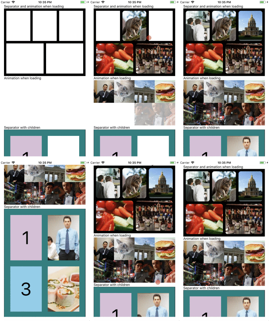
## Example
### Expo
[Example](https://snack.expo.io/@gusgard/react-native-grid-list)
### Code
```js
import React, { PureComponent } from 'react';
import { View, StyleSheet, Image } from 'react-native';
import GridList from 'react-native-grid-list';
const items = [
{ thumbnail: { uri: 'https://lorempixel.com/200/200/animals' } },
{ thumbnail: { uri: 'https://lorempixel.com/200/200/city' } },
{ thumbnail: { uri: 'https://lorempixel.com/200/200/nature' } },
{ thumbnail: { uri: 'https://lorempixel.com/200/200/cats' } },
];
export default class App extends PureComponent {
renderItem = ({ item, index }) => (
);
render() {
return (
);
}
}
const styles = StyleSheet.create({
container: {
flex: 1,
backgroundColor: 'white',
},
image: {
width: '100%',
height: '100%',
borderRadius: 10,
},
});
```
Check the code [here](./example/README.md)
You can use all the props from FlatList:
http://facebook.github.io/react-native/docs/flatlist.html
## Props
| Prop | Default | Type | Description |
| :------------------------------ | :--------------------------------: | :-------------: | :----------------------------------------- |
| children | - | `node` | Children elements |
| data | _not required if children is used_ | `array` | Data to use in renderItem |
| renderItem | _not required if children is used_ | `func` | Function that render each item of the grid |
| numColumns | 3 | `number` | Number of elements in a row |
| itemStyle | {} | `ViewPropTypes` | Style for the wrapper of item |
| **Separator** |
| showSeparator | false | `bool` | Show a separator between items |
| separatorBorderWidth | 0 | `number` | Set separator width |
| separatorBorderColor | 'white' | `string` | Set separator color |
| **Animation** |
| showAnimation | false | `bool` | Show an animation when load item |
| animationInitialBackgroundColor | 'white' | `string` | Set initial backgroundColor for animation |
| animationDuration | 500 | `number` | Duration of the animation |
## Author
Gustavo Gard