# React Native Gradient Buttons [](https://twitter.com/intent/tweet?text=Gradient%20buttons%20in%20%40reactnative%20by%20%40thomaswang%20with%201%20line%20of%20code%21%20Instructions%20here%3A%20https%3A%2F%2Fgithub.com%2Fzivlakmilos%2Freact-native-gradient-buttons-improved)
[](https://www.npmjs.com/package/react-native-gradient-buttons-improved)
[](https://facebook.github.io/react-native/)
[](https://github.com/thomaswang/react-native-gradient-buttons/blob/master/LICENSE)
Lightweight, customizable and haptic Gradient Buttons for React Native.
 Supports press and long press actions.
## Requirements
Requires React and React Native.
For pure React Native projects you must install [react-native-unimodules](https://github.com/unimodules/react-native-unimodules) as part of [Expo's bare workflow](https://docs.expo.io/versions/latest/introduction/managed-vs-bare/#bare-workflow).
## Installation
```
yarn add react-native-gradient-buttons
# or
npm install --save react-native-gradient-buttons-improved
```
## Usage
```
# ES6 import
import GradientButton from 'react-native-gradient-buttons-improved';
```
## Props
- `style`: `ViewStyle`
- No default
- options: any styles you want to apply to the button
- `text`: `String`
- No default
- options: any string
- `textStyle`: `TextSyle`
- default: `{}`
- options: any styles you want to apply to the text
- `gradientBegin`: `String`
- default: `'#00d2ff'`
- options: Any hex, rgb, or color
- `gradientEnd`: `String`
- default: `'#3a47d5'`
- options: Any hex, rgb, or color
- `gradientDirection`: `String`
- default: `'horizontal'`
- options: `'horizontal'`, `'vertical'`, `'diagonal'`
- `height`: `Number` or `String` (for %)
- default: `75`
- options: any number
- `width`: `Number` or `String` (for %)
- No default
- options: any number
- `radius`: `Number`
- default: `50`
- options: any number
- `impact`: `Boolean`
- default: `false`
- options: `true` or `false`
- `impactStyle`: `String`
- default: `'Heavy'`
- options: `'Heavy'`, `'Medium'`, `'Light'`
- `onPressAction`: `Function`
- No default
- options: any function you want to pass to the Gradient Button
- `onLongPressAction`: `Function`
- No default
- options: any function you want to pass to the Gradient Button
- `disabled`: `Boolean`
- default: false
- `disabledGradientBegin`: `String`
- default: `'#D3D3D3'`
- options: Any hex, rgb, or color
- `disabledGradientEnd`: `String`
- default: `'#696969'`
- options: Any hex, rgb, or color
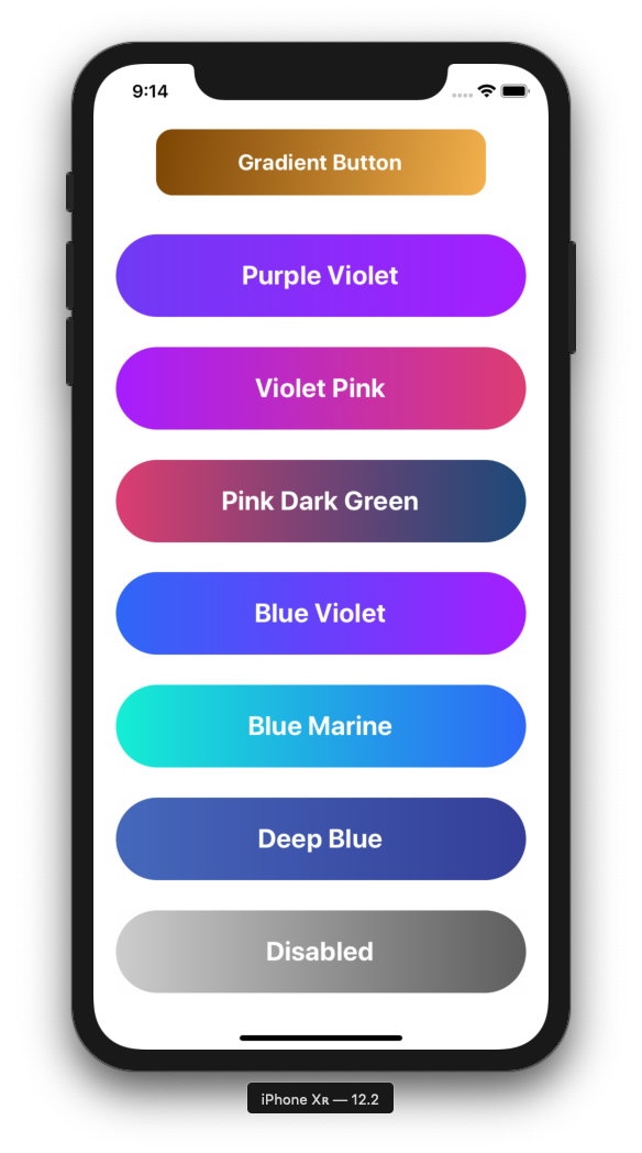
**Design+Code Specific Gradient Props**
- purpleViolet
- violetPink
- pinkDarkGreen
- blueViolet
- blueMarine
- deepBlue
## Examples
```
alert('You pressed me!')}
/>
alert('You pressed me!')}
onLongPressAction={() => alert('You long pressed me!')}
>
Gradient Button #2
```
Supports press and long press actions.
## Requirements
Requires React and React Native.
For pure React Native projects you must install [react-native-unimodules](https://github.com/unimodules/react-native-unimodules) as part of [Expo's bare workflow](https://docs.expo.io/versions/latest/introduction/managed-vs-bare/#bare-workflow).
## Installation
```
yarn add react-native-gradient-buttons
# or
npm install --save react-native-gradient-buttons-improved
```
## Usage
```
# ES6 import
import GradientButton from 'react-native-gradient-buttons-improved';
```
## Props
- `style`: `ViewStyle`
- No default
- options: any styles you want to apply to the button
- `text`: `String`
- No default
- options: any string
- `textStyle`: `TextSyle`
- default: `{}`
- options: any styles you want to apply to the text
- `gradientBegin`: `String`
- default: `'#00d2ff'`
- options: Any hex, rgb, or color
- `gradientEnd`: `String`
- default: `'#3a47d5'`
- options: Any hex, rgb, or color
- `gradientDirection`: `String`
- default: `'horizontal'`
- options: `'horizontal'`, `'vertical'`, `'diagonal'`
- `height`: `Number` or `String` (for %)
- default: `75`
- options: any number
- `width`: `Number` or `String` (for %)
- No default
- options: any number
- `radius`: `Number`
- default: `50`
- options: any number
- `impact`: `Boolean`
- default: `false`
- options: `true` or `false`
- `impactStyle`: `String`
- default: `'Heavy'`
- options: `'Heavy'`, `'Medium'`, `'Light'`
- `onPressAction`: `Function`
- No default
- options: any function you want to pass to the Gradient Button
- `onLongPressAction`: `Function`
- No default
- options: any function you want to pass to the Gradient Button
- `disabled`: `Boolean`
- default: false
- `disabledGradientBegin`: `String`
- default: `'#D3D3D3'`
- options: Any hex, rgb, or color
- `disabledGradientEnd`: `String`
- default: `'#696969'`
- options: Any hex, rgb, or color
**Design+Code Specific Gradient Props**
- purpleViolet
- violetPink
- pinkDarkGreen
- blueViolet
- blueMarine
- deepBlue
## Examples
```
alert('You pressed me!')}
/>
alert('You pressed me!')}
onLongPressAction={() => alert('You long pressed me!')}
>
Gradient Button #2
```