# 📅 React Native Google Calendar View
A **fully customizable**, **performant**, and **interactive** Google Calendar-style scheduler for React Native.
Designed to look and feel premium, with smooth Reanimated transitions, smart auto-scrolling, and complete control over event rendering.
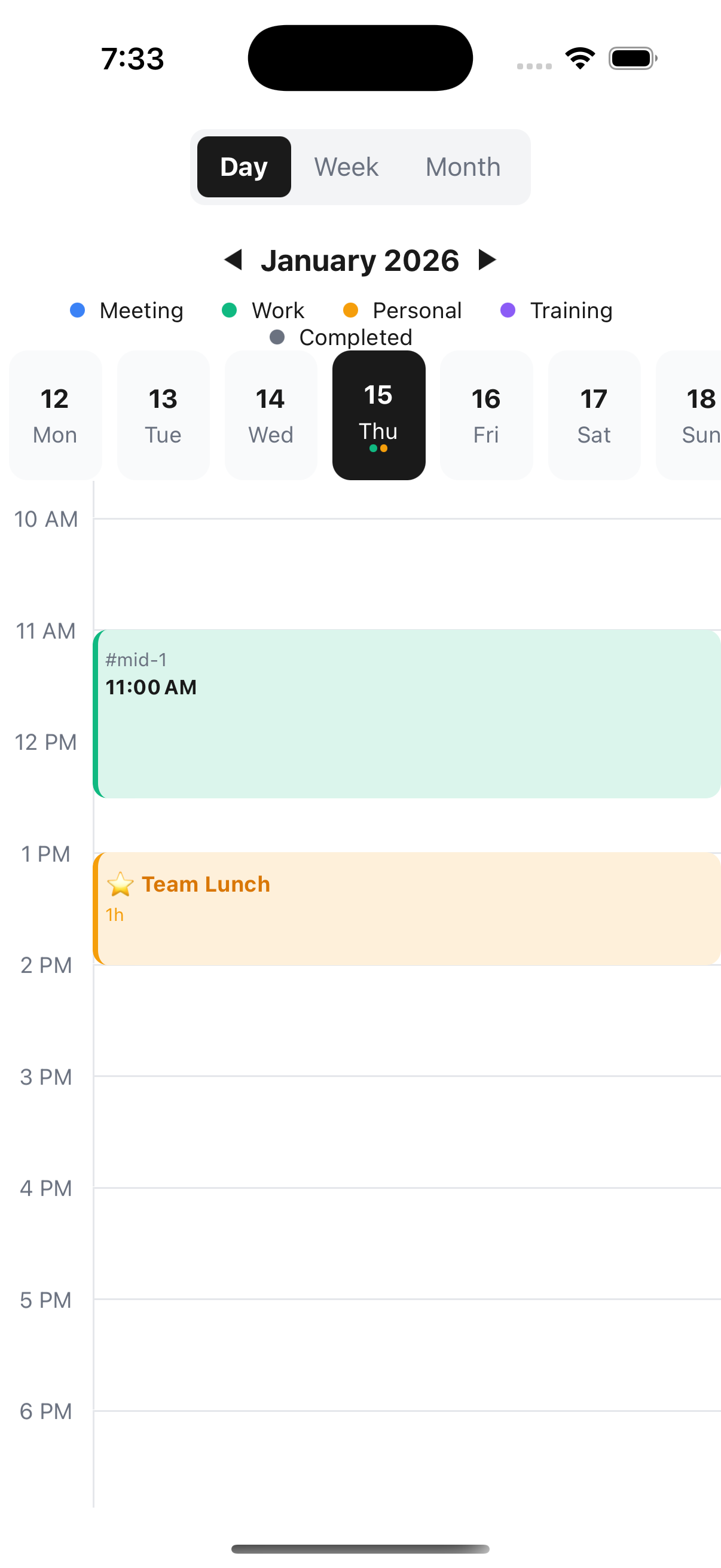
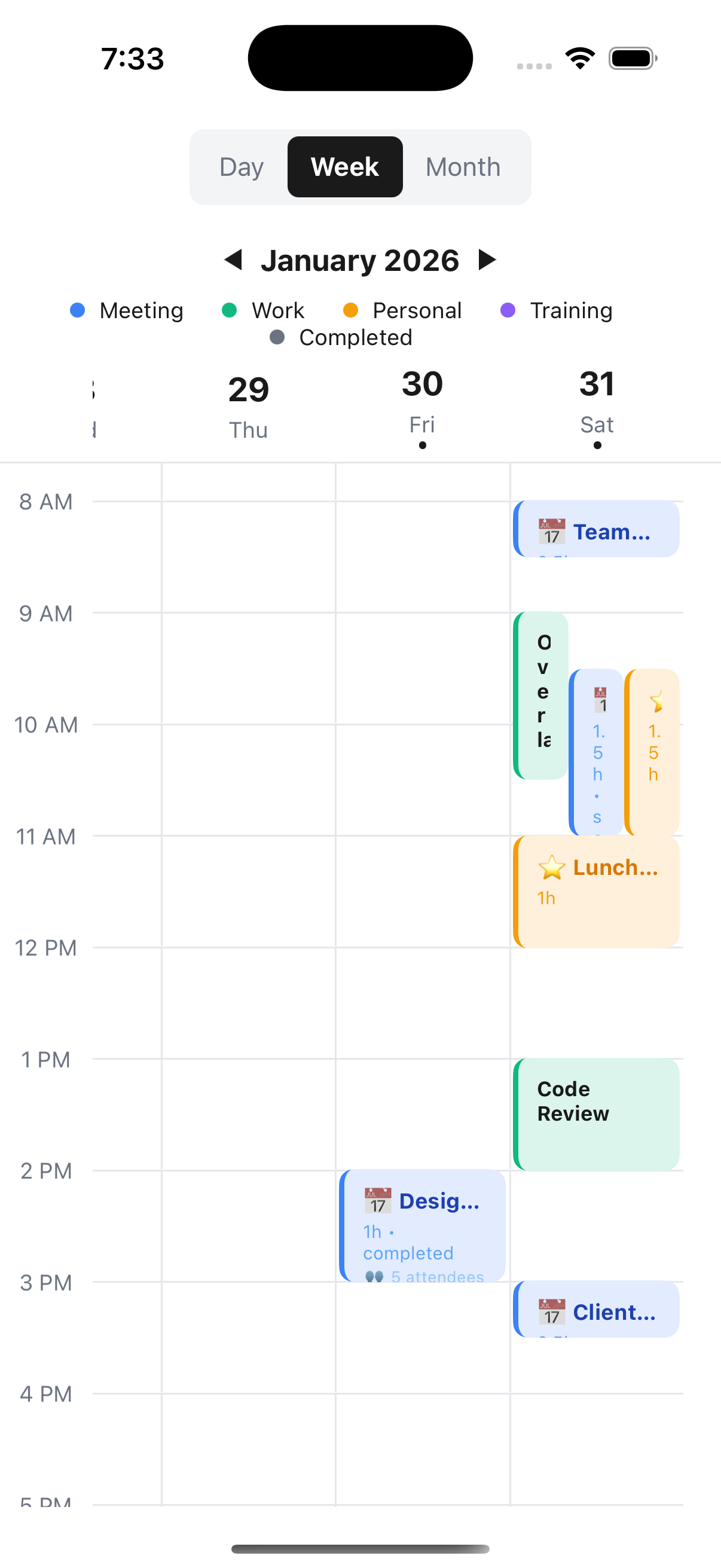
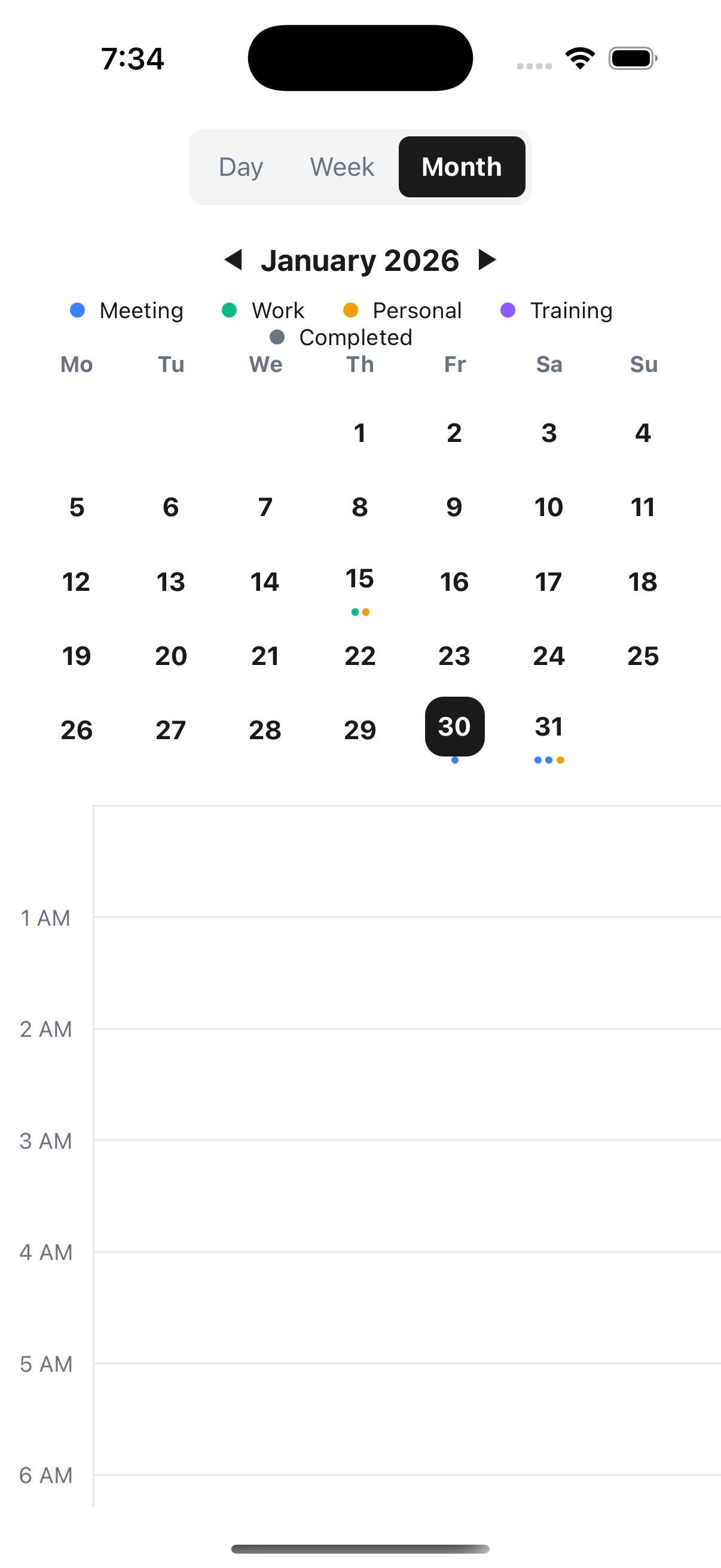
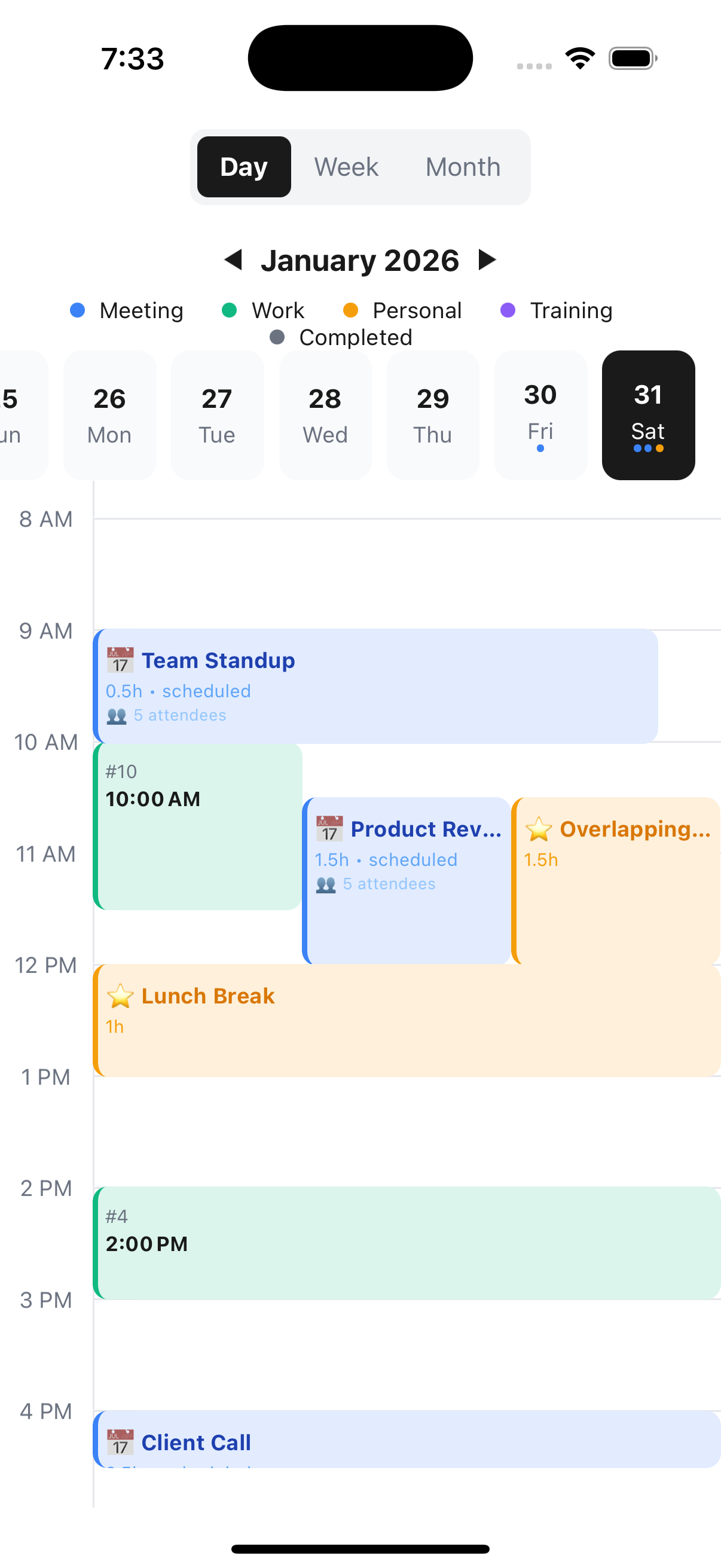
## 📸 Screenshots
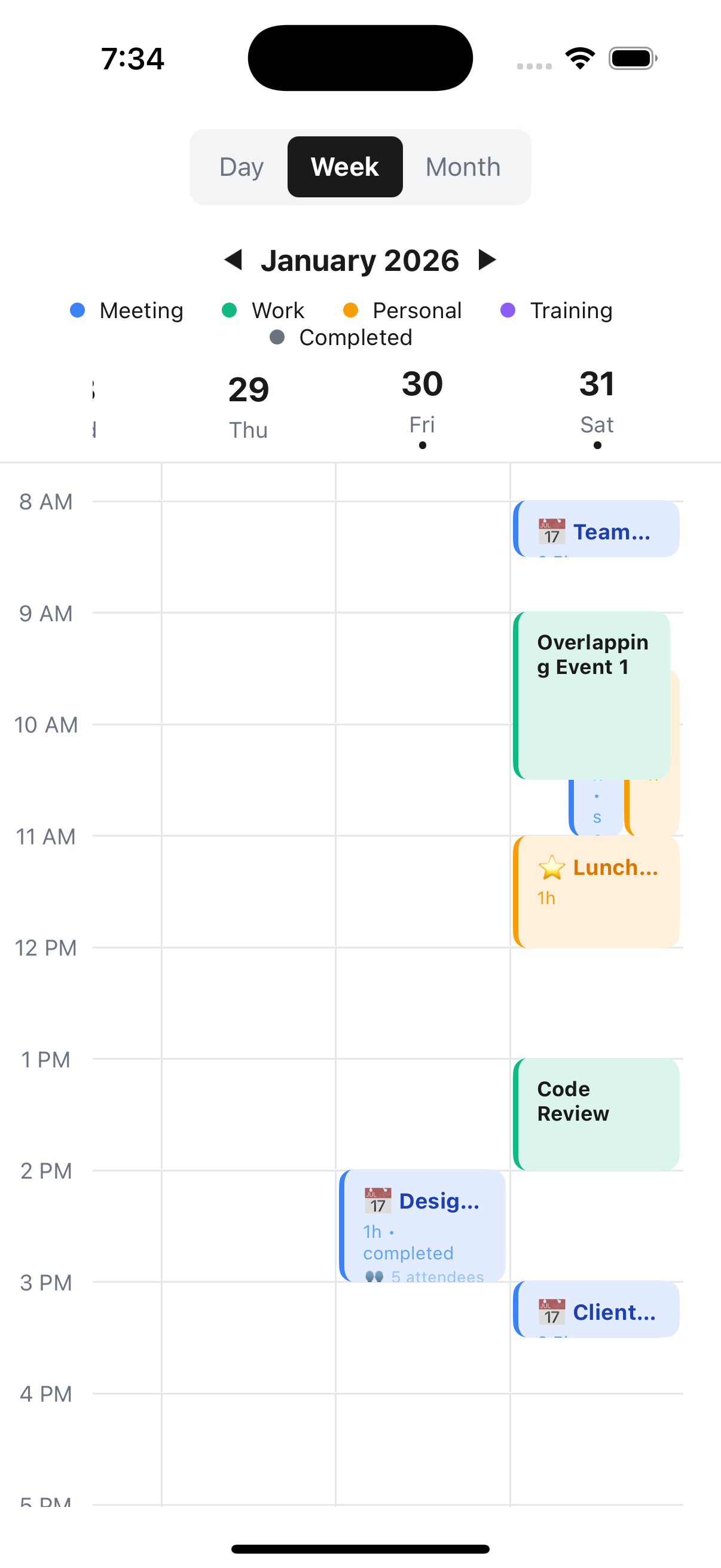
[](https://badge.fury.io/js/react-native-google-calendar-view)
[](https://opensource.org/licenses/MIT)
## ✨ Features
- **🎨 Fully Customizable Event Cards**: The visual star of this library. Render **anything** inside an event card while we handle the complex positioning and overlapping logic.
- **📱 Three View Modes**: Day, Week, and Month views with native-like transitions.
- **👆 Interactive**: Whole-card touch handling, swipe gestures for months, and smooth panning.
- **⚡ Performance First**: Built with `react-native-reanimated` for 60fps animations.
- **🔄 Smart Navigation**:
- Auto-scrolls to the first event when switching days.
- Interactive month paging (swipe just like native apps).
- Intelligent date selection logic.
- **📊 Smart Layout**: Handles overlapping events automatically and beautifully.
- **🌈 Theming**: Full control over colors, fonts, and grid spacing.
- **📝 TypeScript**: 100% typed API.
## 🚀 Installation
```bash
npm install react-native-google-calendar-view
```
or
```bash
yarn add react-native-google-calendar-view
```
### Peer Dependencies
This library interacts with `react-native-reanimated` for animations. Ensure you have the following installed:
```bash
npm install react-native-reanimated
```
> Don't forget to add the Reanimated babel plugin to your `babel.config.js`.
## 📖 Usage
### Basic Example
```tsx
import React from 'react';
import { View } from 'react-native';
import {
CustomCalendar,
CalendarEvent,
} from 'react-native-google-calendar-view';
const events: CalendarEvent[] = [
{
id: '1',
title: 'Code Review',
start: new Date(new Date().setHours(10, 0)),
duration: 1.5,
status: 'scheduled',
},
];
export default function App() {
return (
);
}
```
## 🎨 Styling & Customization
This library shines when you customize it.
### 1. Customizing Event Cards (Inner Style)
You are not stuck with a default look. Use `renderEventCard` to provide your own component. The library wraps your component in a `Pressable` that handles positioning and clicks, allowing you to focus purely on the inner design.
```tsx
import { Text, View, StyleSheet } from 'react-native';
// ... inside your component
(
{event.title}
{event.start.getHours()}:00 - {event.duration}h
{/* You can add icons, user avatars, status indicators, etc. */}
)}
/>;
const styles = StyleSheet.create({
cardContainer: {
flex: 1, // Ensure it fills the card area
padding: 8,
borderRadius: 6,
overflow: 'hidden',
},
cardTitle: {
fontSize: 14,
fontWeight: 'bold',
color: '#333',
},
cardTime: {
fontSize: 12,
color: '#666',
},
});
```
### 2. Custom Styling via Props
Customize different sections of the calendar container.
```tsx
```
### 3. Custom Event Markers (Month View)
```tsx
(
{/* Render dots, icons, or counts */}
)}
/>
```
## 📚 API Reference
### Props
| Prop | Type | Default | Description |
| ------------------------ | ---------------------------- | ------------ | -------------------------------------------------- |
| `events` | `CalendarEvent[]` | `[]` | Array of event objects. |
| `initialDate` | `Date` | `new Date()` | The starting date. |
| `viewMode` | `'day' \| 'week' \| 'month'` | `'day'` | Current view. Can be controlled state. |
| `onViewChange` | `(mode) => void` | - | Callback when view changes. |
| `onDateChange` | `(date) => void` | - | Callback when selected date changes. |
| `onEventPress` | `(event) => void` | - | Callback when an event card is pressed. |
| `renderEventCard` | `Function` | - | **Core Feature**: Custom renderer for event cards. |
| `theme` | `CalendarTheme` | - | Color and font customization. |
| `startHour` | `number` | `1` | Start hour for the grid (0-23). |
| `timeSlots` | `string[]` | 24h | Custom Y-axis labels. |
| `headerLayout` | `'row' \| 'column'` | `'row'` | Layout direction for the header. |
| `legendPosition` | `'left' \| 'right'` | `'left'` | Position of the legend relative to date navigator. |
| `legendItems` | `LegendItem[]` | - | Array of `{ label, color }` for the legend. |
| `styles` | `CalendarStyles` | - | Overrides for specific component styles. |
| `labels` | `CalendarLabels` | - | Custom labels for UI text. |
| `renderHeaderRight` | `() => ReactNode` | - | Render custom content in the header. |
| `renderEventMarkers` | `(date, events) => Node` | - | Custom renderer for month view dots/markers. |
| `renderTimeLabel` | `(time) => Node` | - | Custom renderer for time slots. |
| `getEventContainerStyle` | `(event) => ViewStyle` | - | Function to return dynamic styles for event cards. |
## 🤝 Contributing
See the [contributing guide](CONTRIBUTING.md) to learn how to contribute to the repository and the development workflow.
## 📄 License
MIT
---
Made with ❤️ by [Om Shankar Shah](https://github.com/OmShankar123)