# react-native-form-component

A customizable form component for react-native.
<br />
It handles basic validation of inputs, and also alerts you of failed validations.
<br />

![WhatsApp Image 2021-09-28 at 6 30 53 PM](https://user-images.githubusercontent.com/34392299/135331616-78e74fb6-2e89-4529-9bb3-e50b99213adc.jpeg)
![ezgif com-gif-maker](https://user-images.githubusercontent.com/34392299/135331258-525de545-1937-40dc-8225-122d9a102572.gif)

<br />

## Installation

```sh
yarn add react-native-form-component
```

## Functions

| Name       | Description                                                                                                                 |
| ---------- | --------------------------------------------------------------------------------------------------------------------------- |
| submitForm | Does the same thing as `onButtonPress()` in `Form` component. It does validation first, then carries out the defined action |

<br />

## Components

- [Form](#form)
- [FormItem](#formitem)
- [Label](#label)
- [Modal](#Modal)
- [Picker](#Picker)
- [PinInput](#PinInput)
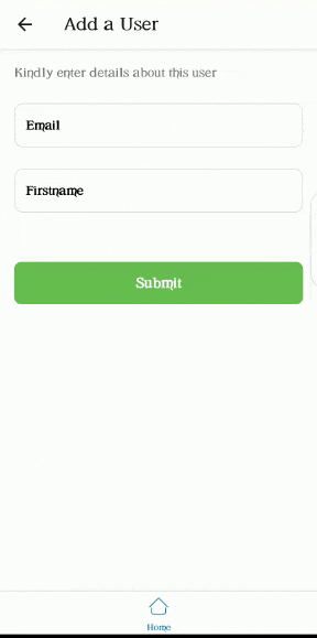
### Form

Wrapper component for form items. It is advised to use this component to wrap every other component contained in this library. The `Form` component comes with a button that does validation of `FormItem`s when clicked. The default validation for each `FormItem` is based on the value of its keyboardType prop.

```jsx
import { Form, FormItem } from 'react-native-form-component';
//...

return (
  <Form onButtonPress={() => console.warn('do something')}>
    <FormItem />
  </Form>
);
```

### Props

| Prop                   | Function                                                                                               | Type               | Default | Platform |
| ---------------------- | ------------------------------------------------------------------------------------------------------ | ------------------ | ------- | -------- |
| keyboardVerticalOffset | Distance between the top of the user screen and the Form component, may be non-zero in some use cases. | number             | 50      | iOS      |
| buttonText             | Text to be displayed by submit button                                                                  | string             | Submit  | All      |
| buttonStyle            | Style of submit button                                                                                 | object \| object[] | -       | All      |
| buttonTextStyle        | Style of submit button text                                                                            | object \| object[] | -       | All      |
| onButtonPress          | Action to be performed when submit button is pressed                                                   | () => void         | -       | All      |
| style                  | Style Form wrapper                                                                                     | ViewStyle          | {}      | All      |
| hideSubmitButton       | To not render the submit button                                                                        | boolean            | false   | All      |

<br />

### FormItem

```jsx
import React, { useRef } from 'react';
import { FormItem } from 'react-native-form-component';
//...

const emailInput = useRef();

return (
  //...
  <FormItem
    label="Email"
    isRequired
    value={email}
    onChangeText={(email) => setEmail(email)}
    asterik
    ref={emailInput}
  />
);
```

### Props

Inherits [TextInput Props](https://reactnative.dev/docs/textinput#props)

| Prop                | Function                                                                                                                                                                                                                                                                             | Type                                     | Required |
| ------------------- | ------------------------------------------------------------------------------------------------------------------------------------------------------------------------------------------------------------------------------------------------------------------------------------ | ---------------------------------------- | -------- |
| ref                 | ref for item                                                                                                                                                                                                                                                                         | React.Ref<TextInput>                     | yes      |
| value               | Value to show for the `FormItem`                                                                                                                                                                                                                                                     | string                                   | yes      |
| label               | Label for FormItem                                                                                                                                                                                                                                                                   | string                                   | no       |
| labelStyle          | Style of label                                                                                                                                                                                                                                                                       | object \| object[]                       | no       |
| textInputStyle      | Style of TextInput portion of `FormItem`                                                                                                                                                                                                                                             | object \| object[]                       | no       |
| isRequired          | Indicates whethter this item is required or not                                                                                                                                                                                                                                      | boolean                                  | no       |
| underneathText      | Text just below the `FormItem`                                                                                                                                                                                                                                                       | string                                   | no       |
| underneathTextStyle | Style of underneathText                                                                                                                                                                                                                                                              | object \| object[]                       | no       |
| customValidation    | A function used to add custom validation to a `FormItem`. The function returns an object of the shape `{status: boolean, message: string}`. `status` is true when the validation passes and false when it fails. `message` is the underneath text to be shown when validation fails. | () => {status: boolean, message: string} | no       |
| asterik             | Whether or not to add an asterik to label                                                                                                                                                                                                                                            | boolean                                  | no       |
| children            | A ReactElement to render on the left part of the TextInput. Usually an icon                                                                                                                                                                                                          | ReactElement                             | no       |
| floatingLabel       | Whether or not the label should float                                                                                                                                                                                                                                                | boolean                                  | no       |
| textArea            | Whether or not the input should be a textArea                                                                                                                                                                                                                                        | boolean                                  | no       |
| showErrorIcon       | Whether or not to show an icon when an error occurs                                                                                                                                                                                                                                  | boolean                                  | no       |
| errorBorderColor    | Set the color of the border when an error occurs                                                                                                                                                                                                                                     | string                                   | no       |
| showIcon            | Icon to be rendered when secureTextEntry is true and you want password to be visible                                                                                                                                                                                                 | JSX.Element                              | no       |
| hideIcon            | Icon to be rendered when secureTextEntry is true and you want password to be hidden                                                                                                                                                                                                  | JSX.Element                              | no       |

<br />

### Label

```jsx
import { Label } from 'react-native-form-component';
//...

return (
  //...
  <Label text="repository name" isRequired />
);
```

### Props

| Prop         | Type                                                       | Required |
| ------------ | ---------------------------------------------------------- | -------- |
| text         | string                                                     | yes      |
| asterik      | boolean                                                    | no       |
| textStyle    | [TextStyle](https://reactnative.dev/docs/text#style)       | no       |
| style        | [ViewStyle](https://reactnative.dev/docs/view-style-props) | no       |
| asterikStyle | object \| object[]                                         | no       |

<br />

### Modal

```jsx
import { Modal } from 'react-native-form-component';

return (
  <Modal show isRequired>
    <View style={{ flex: 1, alignItems: 'center', justifyContent: 'center' }}>
      <Text>I am inside a modal!</Text>
    </View>
  </Modal>
);
```

### Props

Inherits [Modal Props](https://reactnative.dev/docs/modal)

| Prop            | Type      | Required |
| --------------- | --------- | -------- |
| show            | boolean   | yes      |
| backgroundColor | string    | no       |
| children        | ReactNode | no       |

<br />

### Picker

![ezgif com-gif-maker](https://user-images.githubusercontent.com/34392299/135761859-c3efad0a-9171-449b-a808-279b347aab89.gif)

```jsx
import React, { useState } from 'react';
import { Picker } from 'react-native-form-component';

const [number, setNumber] = useState(1);

return (
  <Picker
    items={[
      { label: 'One', value: 1 },
      { label: 'Two', value: 2 },
      { label: 'Three', value: 3 },
    ]}
    label="Pick a number"
    selectedValue={number}
    onSelection={(item) => setNumber(item.value)}
  />
);
```

### Props

| Prop               | Type                                                       | Required |
| ------------------ | ---------------------------------------------------------- | -------- |
| items              | Array<{label: string; value: string \| number}>            | yes      |
| onSelection        | (item) => void                                             | yes      |
| selectedValue      | string \| number                                           | yes      |
| pickerIcon         | ReactNode                                                  | no       |
| iconWrapperStyle   | [ViewStyle](https://reactnative.dev/docs/view-style-props) | no       |
| asterik            | boolean                                                    | no       |
| asterikStyle       | [TextStyle](https://reactnative.dev/docs/text#style)       | no       |
| label              | string                                                     | no       |
| labelStyle         | [TextStyle](https://reactnative.dev/docs/text#style)       | no       |
| labelWrapperStyle  | [ViewStyle](https://reactnative.dev/docs/view-style-props) | no       |
| placeholder        | string                                                     | no       |
| selectedValueStyle | [TextStyle](https://reactnative.dev/docs/text#style)       | no       |
| buttonStyle        | [ViewStyle](https://reactnative.dev/docs/view-style-props) | no       |
| itemLabelStyle     | [TextStyle](https://reactnative.dev/docs/view-style-props) | no       |
| type               | "modal" \| "dropdown"                                      | no       |

<br />

### PinInput

```jsx
import React, { useState } from 'react';
import { PinInput } from 'react-native-form-component';

const [pin, setPin] = useState('');

return <PinInput numOfInput={4} onChangeText={(text) => setPin(text)} />;
```

### Props

| Prop           | Type                   | Required |
| -------------- | ---------------------- | -------- |
| numOfInput     | number                 | yes      |
| onChangeText   | (text: string) => void | yes      |
| textInputStyle | TextStyle              | no       |
| style          | StyleProp<ViewStyle>   | no       |

<br />

## Contributing

See the [contributing guide](CONTRIBUTING.md) to learn how to contribute to the repository and the development workflow.

## License

MIT
