# React Native Floating Label Input
## About The Package
This is a fully customizable React Native package, and its props extend from [React-native textinput props](https://reactnative.dev/docs/textinput#props). If your label floats in the text input while focusing or blurring, this is the perfect package for you, with multiple examples to meet your needs. 💅🎉
## Getting Started
`npm i react-native-floating-label-inputs`
or using yarn
`yarn add react-native-floating-label-inputs`
# Props
* All react native [text input props](https://reactnative.dev/docs/textinput) are supported in the input field. other than that the package have the following props
| Prop | Type | Default | Description |
| :---------------------------: | :------------------------------------------: | :-------------------------------------------------------------------------------------------------------------------------------------------------------------------------------------------------------------------------------------------------: | :----------------------------------------------------------------------------------------------------------------------------------------------------------------------------------------------------------------------------------------------------------------------------------------------------------: |
| `label` | string | "" |label of the input field
| `Icon` | JSX.Element | Undefined | Left icon should be supported by the app.
| `floatUpRange` | number | 25 | Set the float up Range. if you provide negative number floats down
| `rightIcon` | JSX.Element | Undefined | Add right side component, it can be an icon. and should be supported by the up.
| `inputStyle` | ViewStyle | {} | Set the input style which means the style of the input texts.
| `labelStyle` | TextStyle | {} | Set the label style for the floating label component.
| `labelColor` | String | '#111' | Set the lable color.
| `containerStyle` | ViewStyle | {} | Set styles to the input container component.
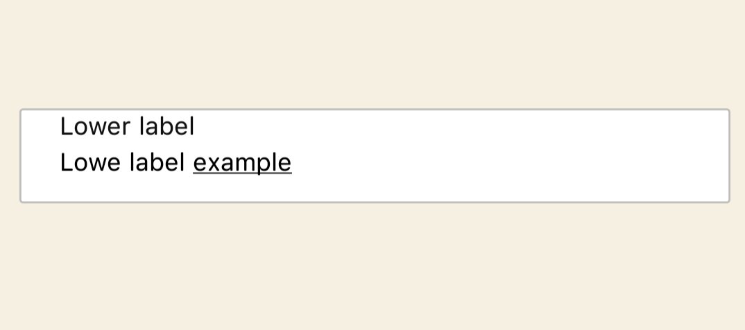
| `error` | string or boolean | '' | Set your error message.if error message is passed the border and the label turns red.
(back to top)
# Usage
### Basic usage example
```ts
import {View, Text} from 'react-native';
import React, {useState} from 'react';
import FloatingLabelTextInput from 'react-native-floating-label-inputs';
// @ts-ignore
import Icon from 'react-native-vector-icons/EvilIcons';
export default function CommonExample() {
return (
console.log(text)}
/>
);
}
```
### Lower Float Up Range
* `floatUpRange` is a prop that gives floating range starting from zero. You should assign the appropriate number depending on your container height. the default value given is 25 but depending on your input container height it may vary.
 ``` js
import {View, Text} from 'react-native';
import React from 'react';
import FloatingLabelTextInput from 'react-native-floating-label-inputs';
export default function LoweFloatUpRange() {
return (
);
}
```
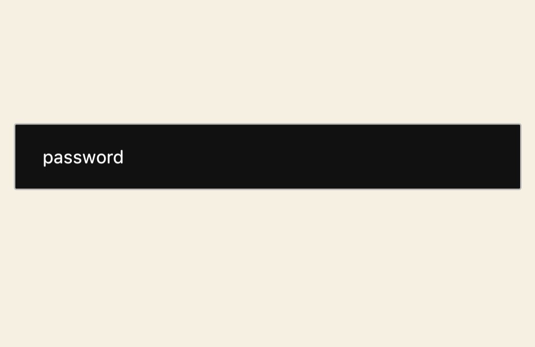
### Different color depending on your style
* As this package is dynamic you can use own style, Their are 4 styling props to do this. `containerStyle` is responsible for the container that holds the text field. `inputStyle` is a style given to the texts that are typed by the user. `labelStyle` responsible for styling the lable and `lableColor` is color of the label.
```ts
import {View, Text} from 'react-native';
import React from 'react';
import FloatingLabelTextInput from 'react-native-floating-label-inputs';
export default function ColoredExample() {
return (
);
}
```
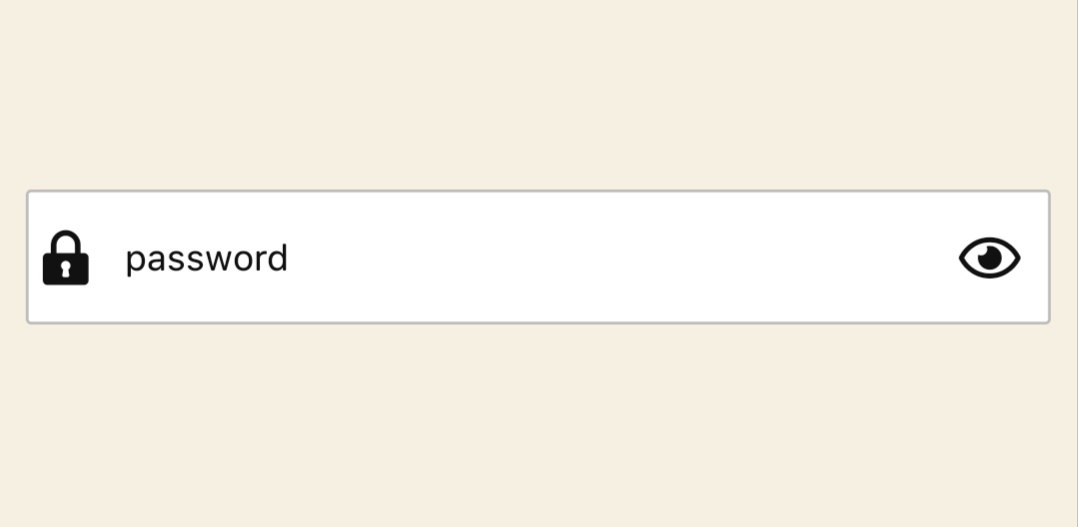
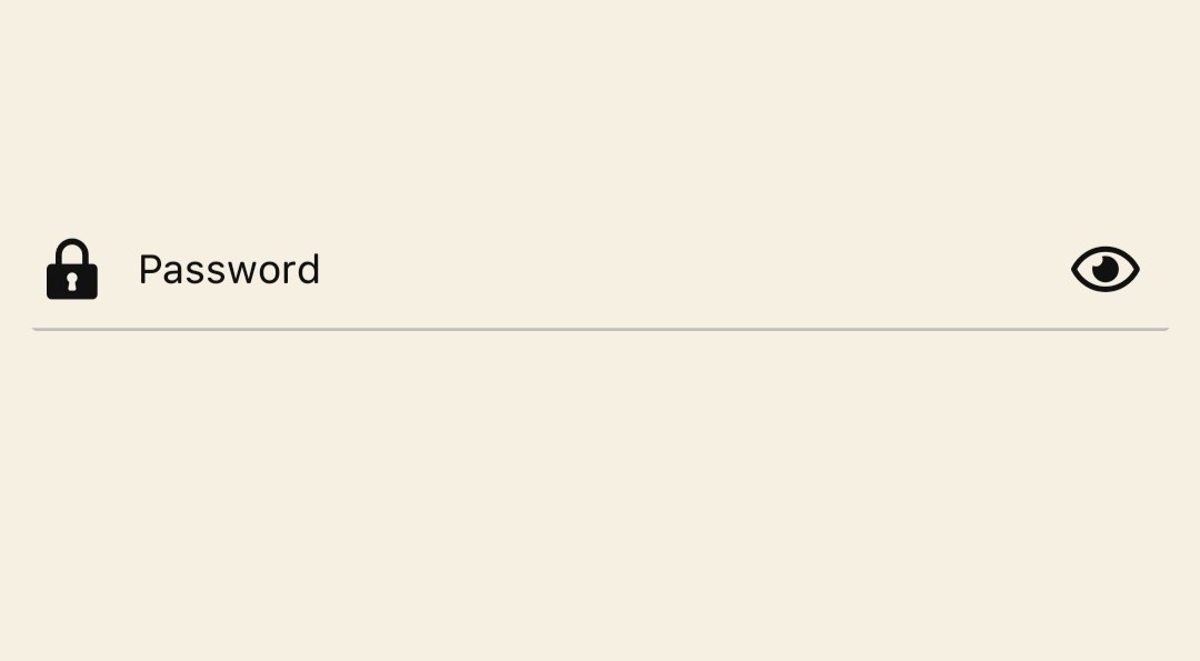
- Using icon
Set an icon both to the right side (The first icon, which is displayed on the right side of the input field) and left side (The second icon, which is displayed on the left side of the input field)
``` js
import {View, Text} from 'react-native';
import React from 'react';
import FloatingLabelTextInput from 'react-native-floating-label-inputs';
export default function LoweFloatUpRange() {
return (
);
}
```
### Different color depending on your style
* As this package is dynamic you can use own style, Their are 4 styling props to do this. `containerStyle` is responsible for the container that holds the text field. `inputStyle` is a style given to the texts that are typed by the user. `labelStyle` responsible for styling the lable and `lableColor` is color of the label.

```ts
import {View, Text} from 'react-native';
import React from 'react';
import FloatingLabelTextInput from 'react-native-floating-label-inputs';
export default function ColoredExample() {
return (
);
}
```
- Using icon
Set an icon both to the right side (The first icon, which is displayed on the right side of the input field) and left side (The second icon, which is displayed on the left side of the input field)
 ```js
import React, {useState} from 'react';
import FloatingLabelTextInput from 'react-native-floating-label-inputs';
//@ts-ignore
import FontisoIcon from 'react-native-vector-icons/Fontisto';
import FontAwesome5Icon from 'react-native-vector-icons/FontAwesome5';
function WithIcon() {
const [showPassword, setShowPassword] = useState(true);
return (
console.log('Icon pressed')}
/>
}
rightIcon={
!showPassword ? (
setShowPassword((s: boolean) => !s)}
/>
) : (
setShowPassword((s: boolean) => !s)}
/>
)
}
secureTextEntry={showPassword}
/>
);
}
export default WithIcon;
```
- TextArea
A floating label for your `TextArea` field that can accept multiple lines of text. The label will float up a certain range (specified by the "floatUpRange" prop) as the user types. The "containerStyle" prop that sets the height of the container element, and an "inputStyle" prop that sets the height of the input field itself.
```js
import React, {useState} from 'react';
import FloatingLabelTextInput from 'react-native-floating-label-inputs';
//@ts-ignore
import FontisoIcon from 'react-native-vector-icons/Fontisto';
import FontAwesome5Icon from 'react-native-vector-icons/FontAwesome5';
function WithIcon() {
const [showPassword, setShowPassword] = useState(true);
return (
console.log('Icon pressed')}
/>
}
rightIcon={
!showPassword ? (
setShowPassword((s: boolean) => !s)}
/>
) : (
setShowPassword((s: boolean) => !s)}
/>
)
}
secureTextEntry={showPassword}
/>
);
}
export default WithIcon;
```
- TextArea
A floating label for your `TextArea` field that can accept multiple lines of text. The label will float up a certain range (specified by the "floatUpRange" prop) as the user types. The "containerStyle" prop that sets the height of the container element, and an "inputStyle" prop that sets the height of the input field itself.
 ```js
import React from 'react';
import FloatingLabelTextInput from 'react-native-floating-label-inputs';
export default function TextAreaExample() {
return (
);
}
```
- Border Bottom With an icon
```js
import React from 'react';
import FloatingLabelTextInput from 'react-native-floating-label-inputs';
export default function TextAreaExample() {
return (
);
}
```
- Border Bottom With an icon
 ``` js
import React, {useState} from 'react';
import FloatingLabelTextInput from 'react-native-floating-label-inputs';
import FontAwesome5Icon from 'react-native-vector-icons/FontAwesome5';
import FontisoIcon from 'react-native-vector-icons/Fontisto';
export default function BorderBottomWithIcon() {
const [showPassword, setShowPassword] = useState(true);
return (
console.log('Icon pressed')}
/>
}
rightIcon={
!showPassword ? (
setShowPassword((s: boolean) => !s)}
/>
) : (
setShowPassword((s: boolean) => !s)}
/>
)
}
secureTextEntry={showPassword}
/>
);
}
```
``` js
import React, {useState} from 'react';
import FloatingLabelTextInput from 'react-native-floating-label-inputs';
import FontAwesome5Icon from 'react-native-vector-icons/FontAwesome5';
import FontisoIcon from 'react-native-vector-icons/Fontisto';
export default function BorderBottomWithIcon() {
const [showPassword, setShowPassword] = useState(true);
return (
console.log('Icon pressed')}
/>
}
rightIcon={
!showPassword ? (
setShowPassword((s: boolean) => !s)}
/>
) : (
setShowPassword((s: boolean) => !s)}
/>
)
}
secureTextEntry={showPassword}
/>
);
}
```
(back to top)
### [click here](https://github.com/Dagic-zewdu/react-native-floating-label-inputs/tree/dev/examples) for more examples.
## support us
[☕ Buy me a coffee](https://www.buymeacoffee.com/dagizewdudc)
- You can also give as star to our repo.
## Authors
### Author 1
👤 **Dagmawi Zewdu**
- GitHub: [@Dagic-zewdu](https://github.com/Dagic-zewdu)
- LinkedIn: [Dagi-Zewdu](https://www.linkedin.com/in/dagic-zewdu/)
### Author 2
👤 **Sentayhu Berhanu**
- GitHub: [@sentayhu19](https://github.com/sentayhu19)
- LinkedIn: [sentayhu-berhanu](https://www.linkedin.com/in/sentayhu-berhanu-6376579a/)
## Contribution
If you have a suggestion that would make this better, please fork the repo and create a pull request. You can also simply open an issue with the tag "enhancement".
Don't forget to give the project a star! Thanks again!
1. Fork the Project
2. Create your Feature Branch (`git checkout -b feature/AmazingFeature`)
3. Commit your Changes (`git commit -m 'Add some AmazingFeature'`)
4. Push to the Branch (`git push origin feature/AmazingFeature`)
5. Open a Pull Request
(back to top)
### Built With
* [React Native](https://reactnative.dev/)
* [TypeScript](https://www.typescriptlang.org/)
* [JavaScript](https://www.javascript.com/)