# react-native-drag-drop-and-swap
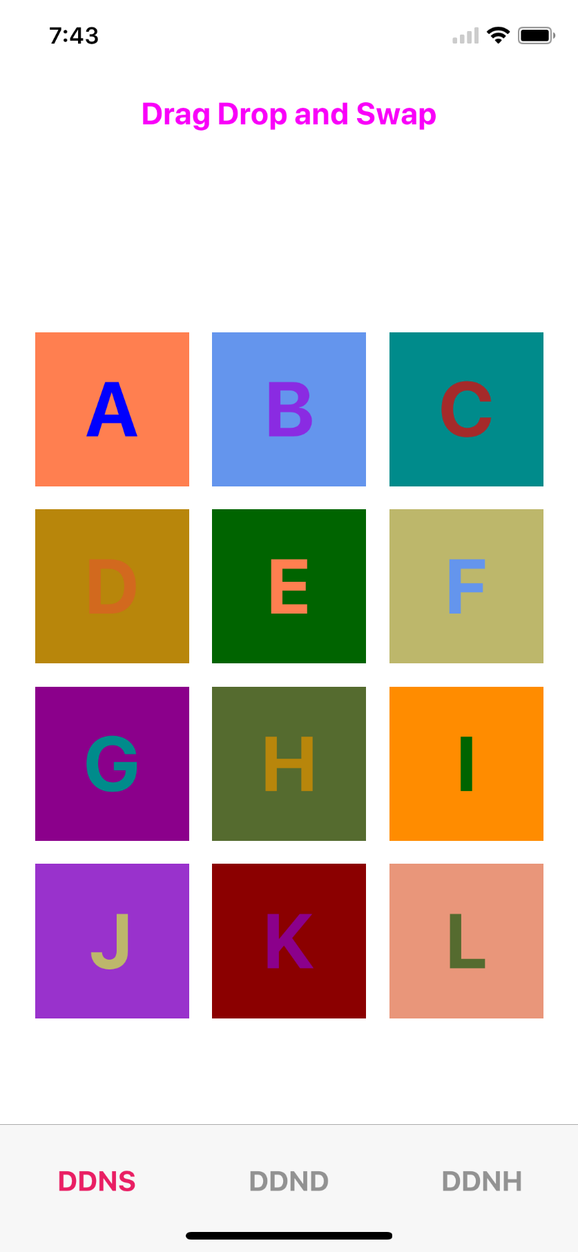
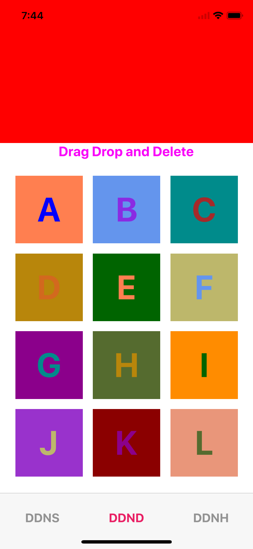
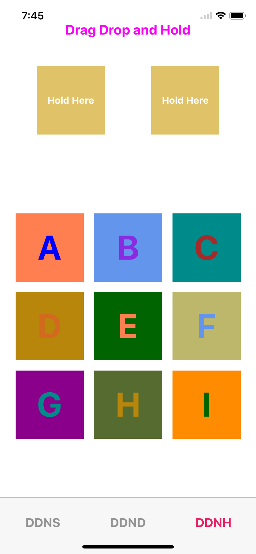
## Screenshots
## Getting started
`$ npm install --save react-native-drag-drop-and-swap`
## Usage
```javascript
import {
DragContainer,
Draggable,
DropZone
} from "react-native-drag-drop-and-swap";
// Main component to render
class DraggyInner extends React.Component {
constructor(props) {
super(props);
this.state = {
color: ["blue","blueviolet","brown","chocolate","coral","cornflowerblue","darkcyan","darkgoldenrod","darkgreen","darkkhaki","darkmagenta","darkolivegreen","darkorange","darkorchid","darkred","darksalmon","darkseagreen","darkslateblue","darkslategrey"]
};
}
render() {
if (this.props.dragOver && !this.props.ghost && !this.props.dragging) {
LayoutAnimation.easeInEaseOut();
return (
{" "}
{this.props.alphabet.data}{" "}
);
}
let shadows = {
shadowColor: "black",
shadowOffset: { width: 0, height: 20 },
shadowOpacity: 0.5,
shadowRadius: 20,
opacity: 0.5
};
return (
{this.props.alphabet.data}
);
}
}
//Drag helper
class Draggy extends React.Component {
render() {
return (
this.props.onDrop(e, this.props.index)}
onEnter={e =>
this.props.onHover(this.props.alphabet, this.props.index)
}
>
);
}
}
// Genertaing data to display
let alphaData = [];
let first = "A",
last = "L";
for (var i = first.charCodeAt(0); i <= last.charCodeAt(0); i++) {
alphaData.push({ data: eval("String.fromCharCode(" + i + ")"), id: i });
}
//Main screen
class DDNS extends Component {
constructor(props) {
super(props);
this.displayName = "DragDropTest";
this.onDrop = this.onDrop.bind(this);
this.onHover = this.onHover.bind(this);
this.onDelete = this.onDelete.bind(this);
this.state = {
alphabets: alphaData,
hoverData: {},
dropData: {},
hoverDataIndex: null
};
}
onDrop(data, index) {
let alphabets = this.state.alphabets.map((item, i) => {
if (item.id == data.id) {
return this.state.hoverData;
}
if (item.id == this.state.hoverData.id) {
return data;
}
return item;
});
this.setState({ alphabets });
}
onDelete(e) {
let data = this.state.alphabets || [];
let alphabets = data.map((item, i) => {
if (e.id === item.id) {
return { id: e.id, data: "" };
} else {
return item;
}
});
this.setState({ alphabets });
}
onHover(hoverData, hoverDataIndex) {
this.setState({ hoverData, hoverDataIndex });
}
render() {
return (
Drag Drop and Swap
{this.state.alphabets.map((item, i) => (
))}
);
}
}
```
#Example implementation of Drag and Drop in React Native
The implementation provides three components, DragContainer, Draggable, and DropZone. [Example](https://github.com/ranvirgorai/react-native-drag-drop-and-swap/tree/master/example/DDNS "Example")
##DragContainer
This component must be higher up the react tree than the other two components. It's size is not important, it just provides the context by which everything communicates.
## API
### Props
| Prop | Type | Optional | Default | Description |
| ------------- | -------- | -------- | ------- | ----------------------------------------------------------------------------------------------------------------------------------- |
| `onDragStart` | Function | Yes | | Is called when dragging begins. It is passed a summary of the dragged element. |
| `onDragEnd` | Function | Yes | | Is called when dragging ends. It is passed two arguments, the same summary as onDragStart, and array of zones that were dropped on. |
##DropZone
This is a wrapper component for an area where a Draggable element can be dropped.
### Props
| Prop | Type | Optional | Default | Description |
| ---------- | -------- | -------- | ------- | ------------------------------------------------------------------------------------------------------- |
| `onEnter` | Function | Yes | | Is called when an item is dragged over the zone. |
| `onLeave` | Function | Yes | | Is called when an item is dragged off of the zone. |
| `onDrop` | Function | Yes | | Is called when an item is dropped. The data property of the draggable is passed through as an argument. |
| `disabled` | Boolean | Yes | | Prevents being a dropzone when when set to true. |
####The children of the DropZone are passed the following props also;
Prop | Type | Optional | Default | Description
------------------- | -------- | -------- | ------------ | -----------
`dragOver` | Boolean |Yes| |Is true when there is an item being dragged over the zone.
##Draggable
This is a wrapper component that makes it's children draggable.
| Prop | Type | Optional | Default | Description |
| ---------- | ------- | -------- | ------- | ----------------------------------------------------------------------------------- |
| `data` | Any | Yes | | Whatever is passed in the data prop will be given to the DropZone on drop. |
| `dragOn` | String | Yes | | Expects either onLongPress (default) or onPressIn. Determines when dragging begins. |
| `disabled` | Boolean | Yes | | Prevents dragging when set to true. |
| `onPress` | function | Yes | | Is called when an item is Pressed. |
####The children of the Draggable componnent are passed the following props also;
Prop | Type | Optional | Default | Description
------------------- | -------- | -------- | ------------ | -----------
`dragging`| Boolean| Yes| |The component is being dragged.
`ghost` |string|Yes| |The component is the ghost left in place of the item being dragged.