[](https://www.crossplatform.se/)
# Crossplatform React-Native Components
Beautiful React-Native components using [react-native-paper](https://github.com/callstack/react-native-paper) and other libraries. If using a paper provider your theme should be applied to all the components.
## [Show me Components!](#components)
**Package renamed**
Previous package name: `@crossplatform/react-native-components`
New package name: `react-native-cross-components`
## Install
When using [Expo](https://www.expo.io/) icons and Paper are bundled.
Note that version of [**React-Native-Vector-Icons**](https://github.com/oblador/react-native-vector-icons) is bound by [Expo](https://www.expo.io) for compatibility.
The iconset used is currently [FontAwesome v4 icons](https://fontawesome.com/v4.7.0/icons/). Ability to customize which iconset is used might be added.
### Native
Install with [react-native-paper](https://github.com/callstack/react-native-paper) and [react-native-vector-icons](https://github.com/oblador/react-native-vector-icons) if you don't already have them.
```bash
npm i react-native-cross-components
npm i react-native-paper
npm i react-native-vector-icons
react-native link
```
```bash
yarn add react-native-cross-components
yarn add react-native-paper
yarn add react-native-vector-icons
react-native link
```
### Expo prev CRNA
```bash
npm i react-native-cross-components
```
```bash
yarn add react-native-cross-components
```
## Documentation
See our GitHub Pages generated from code comments. This documentation is also available as intellisense / auto complete.
* **[API Documentation](https://crossplatformsweden.github.io/react-native-components/)**
The **[styles](https://crossplatformsweden.github.io/react-native-components/modules/_styles_.html)** used by this library are exported for your convenience.
See **[Components](#components)** below for examples
---
[](https://www.npmjs.com/package/react-native-cross-components)
[](https://www.npmjs.com/package/react-native-cross-components)
[](https://crossplatformsweden.visualstudio.com/ParkeraApp/_build/latest?definitionId=15)
[](https://codecov.io/gh/crossplatformsweden/react-native-components)
[](https://david-dm.org/crossplatformsweden/react-native-components)
[](https://github.com/crossplatformsweden/react-native-components)
[](https://github.com/prettier/prettier)

[](https://facebook.github.io/react-native/)
[](https://github.com/callstack/react-native-paper)
[](https://github.com/oblador/react-native-vector-icons)
[](https://github.com/n4kz/react-native-indicators)
[](https://github.com/react-native-community/react-native-modal)
[](https://github.com/crossplatformsweden/react-native-components)
[](https://github.com/crossplatformsweden/react-native-components)
[](https://github.com/crossplatformsweden/react-native-components)
[](https://twitter.com/crossplatformse)
## Table of Contents
* [[Show me Components!](#components)](#-show-me-components----components-)
* [Install](#install)
+ [Native](#native)
+ [Expo prev CRNA](#expo-prev-crna)
* [Documentation](#documentation)
* [Components](#components)
+ [CrossButton](#crossbutton)
+ [CrossBusyIndicator](#crossbusyindicator)
+ [CrossSpinner](#crossspinner)
+ [CrossLabel](#crosslabel)
+ [CrossEditor](#crosseditor)
Table of contents generated with markdown-toc
## Components
### CrossButton
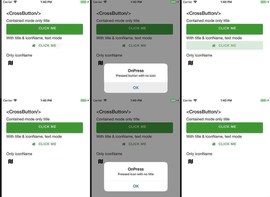
Renders an [FontAwesome Button](https://github.com/oblador/react-native-vector-icons#iconbutton-component) if only `iconName` is supplied, else an [Paper Button](https://callstack.github.io/react-native-paper/button.html).
For properties and documentation, see **[API reference - Class CrossButton](https://crossplatformsweden.github.io/react-native-components/classes/_components_buttons_crossbutton_.crossbutton.html)**.
Styles can be customized using [ButtonStyle, IconStyle and style properties](https://crossplatformsweden.github.io/react-native-components/interfaces/_components_buttons_crossbutton_.icrossbuttonprops.html).
However, react-native-paper is currently missing the option to customize **[fontSize](https://github.com/callstack/react-native-paper/issues/546)**.
**Examples**
Button with **[title](https://crossplatformsweden.github.io/react-native-components/interfaces/_components_modals_crossbusyindicator_.ibusyindicatorprops.html#type)**, but no icon and **[mode](https://crossplatformsweden.github.io/react-native-components/interfaces/_components_buttons_crossbutton_.icrossbuttonprops.html#mode)** *contained* (background color):
```typescript
import { CrossButton } from 'react-native-cross-components';
export const ButtonComp => () => (
OnButtonPress('Pressed button with no icon')}
/>
);
```
Button with **[title](https://crossplatformsweden.github.io/react-native-components/interfaces/_components_modals_crossbusyindicator_.ibusyindicatorprops.html#type)** and **[iconName](https://crossplatformsweden.github.io/react-native-components/interfaces/_components_buttons_crossbutton_.icrossbuttonprops.html#iconname)**, default *text* **[mode](https://crossplatformsweden.github.io/react-native-components/interfaces/_components_buttons_crossbutton_.icrossbuttonprops.html#mode)** (no background):
```typescript
import { CrossButton } from 'react-native-cross-components';
export const ButtonComp => () => (
OnButtonPress('Pressed button with icon')}
/>
);
```
Clickable icon:
```typescript
import { CrossButton } from 'react-native-cross-components';
export const ButtonComp => () => (
OnButtonPress('Pressed icon with no title')}
backgroundColor="transparent"
/>
);
```
### CrossBusyIndicator
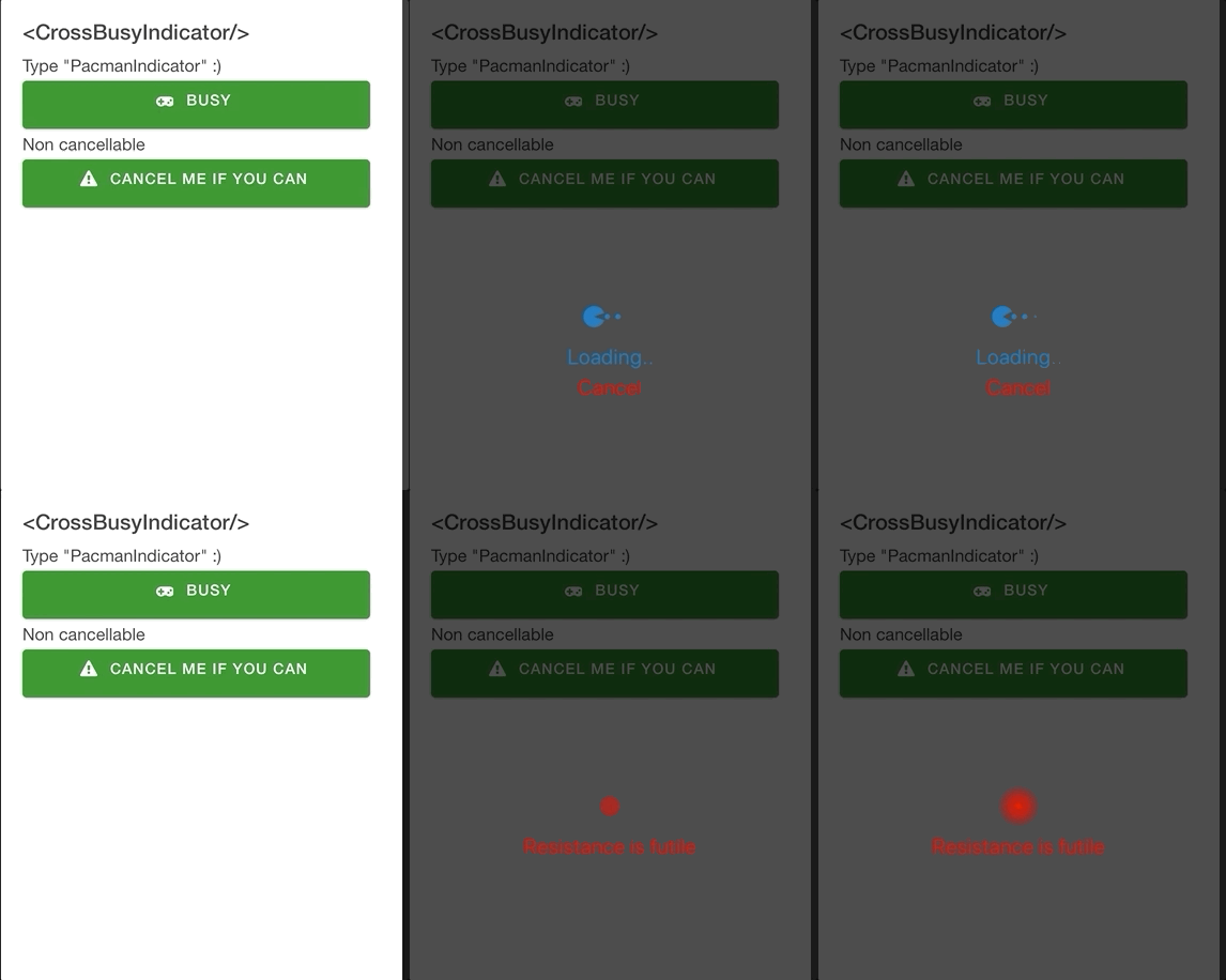
Renders a [react-native-modal](https://github.com/react-native-community/react-native-modal) containing cool animations from [react-native-indicators](https://github.com/n4kz/react-native-indicators).
For properties and documentation, see **[API reference - Class CrossBusyIndicator](https://crossplatformsweden.github.io/react-native-components/classes/_components_modals_crossbusyindicator_.crossbusyindicator.html)**.
**Examples**
Feedback **[message](https://crossplatformsweden.github.io/react-native-components/interfaces/_components_modals_crossbusyindicator_.ibusyindicatorprops.html#message)** and *PacmanIndicator* **[type](https://crossplatformsweden.github.io/react-native-components/interfaces/_components_modals_crossbusyindicator_.ibusyindicatorprops.html#type)** (because, why not).
```typescript
this.setState({ isBusy: false })}
/>
```
Non-cancellable and custom styles for `spinnerProps` and `messageStyle`:
```typescript
```
Custom **[modal](https://crossplatformsweden.github.io/react-native-components/interfaces/_components_modals_crossbusyindicator_.ibusyindicatorprops.html#modalprops)** props:
```typescript
```
### CrossSpinner
[](https://github.com/n4kz/react-native-indicators)
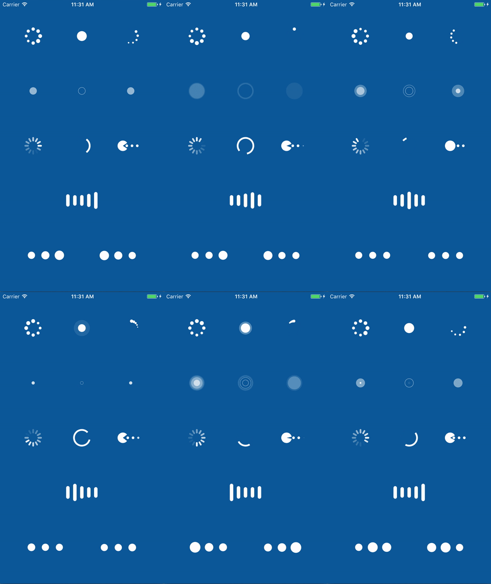
Basically just wraps [react-native-indicators](https://github.com/n4kz/react-native-indicators) so you can provide the type you want via property.
For properties and documentation, see **[API reference - Class CrossSpinner](https://crossplatformsweden.github.io/react-native-components/modules/_components_animations_crossspinner_.html)**.
**Examples**
```typescript
```
### CrossLabel
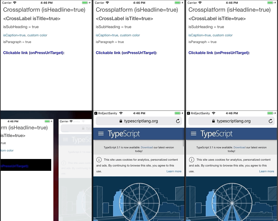
Wraps [react-native-paper](https://callstack.github.io/react-native-paper/index.html) typhography components and can also act as a clickable text link.
For properties and documentation, see **[API reference - Class CrossLabel](https://crossplatformsweden.github.io/react-native-components/modules/_components_labels_crosslabel_.html)**.
**Examples**
**Headline** component:
```typescript
Crossplatform (isHeadline=true)
```
**Title** component:
```typescript
<CrossLabel isTitle=true>
```
**Subheading** (with custom style):
```typescript
isSubHeading = true
```
**Caption** component (with custom style):
```typescript
isCaption=true, custom color
```
**Paragraph** component (with custom style):
```typescript
isParagraph = true
```
URL link using **[onPressUrlTarget](https://crossplatformsweden.github.io/react-native-components/interfaces/_components_labels_crosslabel_.icrosslabelprops.html#onpressurltarget)** property. You can also set color using **[linkColor](https://crossplatformsweden.github.io/react-native-components/interfaces/_components_labels_crosslabel_.icrosslabelprops.html#linkcolor)**.
```typescript
Clickable link (onPressUrlTarget):
```
Regular **onPress** event:
```typescript
Message('CrossLabel onPress')}
style={{ marginTop: 20, marginBottom: 10 }}
>
onPress message
```
### CrossEditor
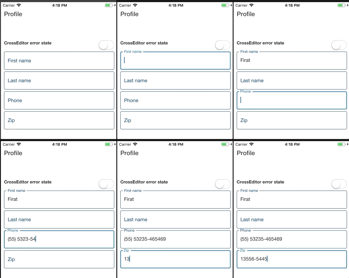
A [Paper TextInput](https://callstack.github.io/react-native-paper/text-input.html) that also supports masking using [react-native-masked-input](https://github.com/benhurott/react-native-masked-text).
For properties and documentation, see **[API reference - Class CrossEditor](https://crossplatformsweden.github.io/react-native-components/modules/_components_input_crosseditor_.html)**.
**Examples**
Basic usage
```typescript
console.log('Got value', val)}
value={'Textvalue'}
/>
```
Masked input usage. For `maskProps` documentation see [react-native-masked-input](https://github.com/benhurott/react-native-masked-text).
```typescript
```