# React Native Credit Cards
🎨 A beautiful and customizable credit card form component for React Native with card flip animation and validation support.
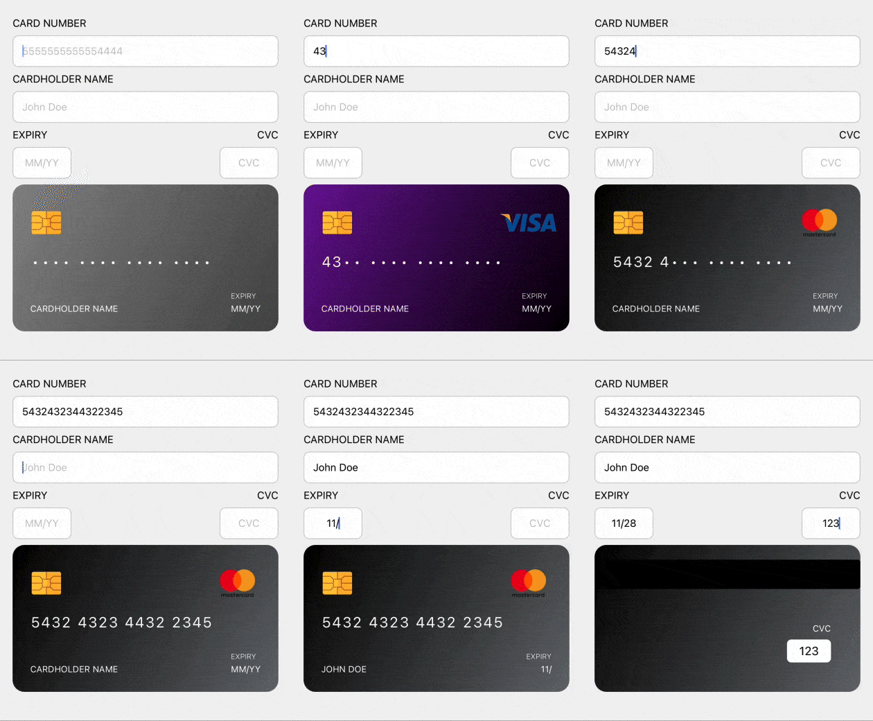
## Features
- 🎨 Beautiful credit card UI with flip animation
- 💳 Support for 11 major card types with logos (Visa, Mastercard, Amex, Discover, JCB, Diners Club, UnionPay, Maestro, RuPay, Troy, Electron)
- ✅ Built-in validation utilities
- 🔄 Real-time card type detection
- 🎬 Configurable flip animations (horizontal/vertical)
- 📱 Optimized for React Native & Expo
- 🎯 Full TypeScript support
- 🎭 Customizable themes and styling
- 🎪 Standalone card component (no form required)
- 🎛️ External flip control with hooks
## Installation
```bash
npm install react-native-credit-cards
```
### Dependencies
#### Required
```bash
npm install react-native-reanimated
```
#### Optional (for enhanced features)
**For React Native CLI projects:**
```bash
npm install react-native-linear-gradient react-native-flip-card
cd ios && pod install # iOS only
```
**For Expo projects:**
```bash
npx expo install expo-linear-gradient
npm install react-native-flip-card
```
**Note:** The library works without optional dependencies but with reduced visual effects (fallback to simple animations).
## Usage
### Standalone Credit Card
```tsx
import React from 'react';
import { CreditCard } from 'react-native-credit-cards';
const App = () => {
return (
);
};
```
### Custom Theme
```tsx
import React from 'react';
import { CreditCard } from 'react-native-credit-cards';
const App = () => {
return (
);
};
```
### Custom Themes by Card Type
You can override themes for specific card types:
```tsx
import React from 'react';
import { CreditCard } from 'react-native-credit-cards';
const App = () => {
const customCardThemes = {
visa: {
gradient: { start: '#FF6B6B', end: '#FF8E8E' },
textColor: '#FFFFFF'
},
mastercard: {
gradient: { start: '#4ECDC4', end: '#44A08D' },
textColor: '#FFFFFF'
},
amex: {
gradient: { start: '#A8E6CF', end: '#88D8A3' },
textColor: '#333333'
}
};
return (
);
};
```
### Custom Placeholders
You can customize placeholder text for empty fields:
```tsx
import React from 'react';
import { CreditCard } from 'react-native-credit-cards';
const App = () => {
return (
);
};
```
### Multi-language Support
```tsx
// Turkish example
// French example
```
### Credit Card Form
```tsx
import React, { useState } from 'react';
import { CreditCardForm } from 'react-native-credit-cards';
const App = () => {
const [values, setValues] = useState({
cardNumber: '',
cardHolderName: '',
expiry: '',
cvc: '',
});
const handleChange = (field: string) => (value: string) => {
setValues(prev => ({ ...prev, [field]: value }));
};
return (
);
};
```
### Custom Form with Card Flip Control
```tsx
import React, { useState } from 'react';
import { View, TextInput } from 'react-native';
import { CreditCard, useCreditCardFlip } from 'react-native-credit-cards';
const CustomForm = () => {
const [values, setValues] = useState({
cardNumber: '',
cardHolderName: '',
expiry: '',
cvc: '',
});
const { isBackVisible, showBack, showFront } = useCreditCardFlip();
return (
{/* Your custom form inputs */}
setValues(prev => ({...prev, cvc: text}))}
/>
);
};
```
### Custom Flip Animations
You can customize flip animations with the `flipAnimation` prop:
```tsx
import React, { useState } from 'react';
import { CreditCard } from 'react-native-credit-cards';
const AnimatedCard = () => {
const [isBackVisible, setIsBackVisible] = useState(false);
return (
);
};
```
### Vertical Flip Animation
```tsx
```
### With Formik
```tsx
import React from 'react';
import { Formik } from 'formik';
import { CreditCardForm } from 'react-native-credit-cards';
const PaymentForm = () => {
return (
{
console.log(values);
}}
>
{({ values, errors, touched, handleChange, handleBlur }) => (
)}
);
};
```
## API Reference
### CreditCardForm Props
| Prop | Type | Default | Description |
|------|------|---------|-------------|
| `values` | `object` | `undefined` | Form values object |
| `errors` | `object` | `undefined` | Form errors object |
| `touched` | `object` | `undefined` | Form touched fields object |
| `handleChange` | `function` | `undefined` | Field change handler |
| `handleBlur` | `function` | `undefined` | Field blur handler |
| `disabled` | `boolean` | `false` | Disable all inputs |
| `isBackVisible` | `boolean` | `undefined` | Control card flip externally |
| `onFlipCard` | `function` | `undefined` | Callback when card should flip |
### CreditCard Props
| Prop | Type | Default | Description |
|------|------|---------|-------------|
| `cardNumber` | `string` | `''` | Card number to display |
| `cardHolderName` | `string` | `''` | Cardholder name to display |
| `expiry` | `string` | `''` | Expiry date (MM/YY) |
| `cvc` | `string` | `''` | CVC code |
| `isBackVisible` | `boolean` | `false` | Show back of card |
| `cardType` | `CardType` | `undefined` | Force specific card type |
| `autoDetectCardType` | `boolean` | `true` | Auto-detect card type from number |
| `customTheme` | `CustomCardTheme` | `undefined` | Custom colors for the card |
| `customCardThemes` | `Partial>` | `undefined` | Custom themes for specific card types |
| `labels` | `CardLabels` | `undefined` | Custom labels for card fields |
| `placeholders` | `CardPlaceholders` | `undefined` | Custom placeholder text for empty fields |
| `useCustomFlipCard` | `boolean` | `false` | Use custom reanimated flip instead of react-native-flip-card |
| `flipAnimation` | `FlipAnimationConfig` | `undefined` | Flip animation configuration |
### FlipAnimationConfig
| Prop | Type | Default | Description |
|------|------|---------|-------------|
| `duration` | `number` | `300` | Animation duration in milliseconds |
| `friction` | `number` | `8` | Spring friction (higher = less bouncy) |
| `perspective` | `number` | `1000` | 3D perspective value |
| `flipHorizontal` | `boolean` | `true` | Enable horizontal flip |
| `flipVertical` | `boolean` | `false` | Enable vertical flip |
### CardLabels
| Prop | Type | Default | Description |
|------|------|---------|-------------|
| `cardholderName` | `string` | `'CARDHOLDER NAME'` | Label for cardholder name field |
| `expiry` | `string` | `'EXPIRY'` | Label for expiry date field |
| `cvc` | `string` | `'CVC'` | Label for CVC field |
### CardPlaceholders
| Prop | Type | Default | Description |
|------|------|---------|-------------|
| `cardNumber` | `string` | `'•••• •••• •••• ••••'` | Placeholder for empty card number |
| `cardHolderName` | `string` | `'CARDHOLDER NAME'` | Placeholder for empty cardholder name |
| `expiry` | `string` | `'MM/YY'` | Placeholder for empty expiry date |
| `cvc` | `string` | `'•••'` | Placeholder for empty CVC |
### Supported Card Types
- `visa` - Visa cards (starts with 4) ✅ *Logo included*
- `mastercard` - Mastercard (starts with 5[1-5] or 2221-2720) ✅ *Logo included*
- `amex` - American Express (starts with 34 or 37) ✅ *Logo included*
- `discover` - Discover (starts with 6011, 622126-622925, 644-649, 65) ✅ *Logo included*
- `jcb` - JCB (starts with 35, 2131, 1800) ✅ *Logo included*
- `dinersclub` - Diners Club (starts with 300-305, 36, 38) ✅ *Logo included*
- `unionpay` - UnionPay (starts with 62, 88) ✅ *Logo included*
- `maestro` - Maestro (starts with 50, 56-58, 6304, 6759, 6761-6763) ✅ *Logo included*
- `rupay` - RuPay (starts with 60, 6521, 6522) ✅ *Logo included*
- `troy` - Troy (starts with 9792) - Turkey specific ✅ *Logo included*
- `electron` - Visa Electron (starts with 4026, 417500, 4405, 4508, 4844, 4913, 4917) ✅ *Uses Visa logo*
- `unknown` - Default card type
**Note:** Cards without logos will display only the chip and card information.
## Hooks
### useCreditCardFlip
Hook for managing credit card flip state in custom forms.
```tsx
const { isBackVisible, showBack, showFront, toggleCard } = useCreditCardFlip();
```
**Returns:**
- `isBackVisible` - Current flip state
- `showBack()` - Show back of card
- `showFront()` - Show front of card
- `toggleCard()` - Toggle between front/back
- `setIsBackVisible(boolean)` - Set flip state directly
## Utility Functions
The package also exports utility functions for validation and formatting:
```tsx
import {
getCardType,
formatCardNumber,
formatExpiryDate,
validateCardNumber,
validateExpiryDate,
validateCVC
} from 'react-native-credit-cards';
// Usage
const cardType = getCardType('4111111111111111'); // 'visa'
const formatted = formatCardNumber('4111111111111111'); // '4111 1111 1111 1111'
const isValid = validateCardNumber('4111111111111111'); // true
```
## Styling
The components use default styles but can be customized by modifying the style files or creating your own theme.
## Contributing
Contributions are welcome! Please read the contributing guidelines before submitting PRs.
## License
MIT © Sami Çavaş
## Support
If you like this project, please consider giving it a ⭐️ on GitHub!



