# react-native-circular-progress-indicator

[![license](https://img.shields.io/github/license/mashape/apistatus.svg)]()
![platforms](https://img.shields.io/badge/platforms-Android%20%7C%20iOS-brightgreen.svg?style=flat&colorB=191A17)
[![Version](https://img.shields.io/npm/v/react-native-circular-progress-indicator.svg)](https://www.npmjs.com/package/react-native-circular-progress-indicator)
[![npm](https://img.shields.io/npm/dt/react-native-circular-progress-indicator.svg)](https://www.npmjs.com/package/react-native-circular-progress-indicator)

A simple and customizable React Native circular progress indicator component.

This project is inspired from this [Youtube tutorial](https://www.youtube.com/watch?v=x2LtzCxbWI0). Do check it out. Special mention at [@mironcatalin](https://www.youtube.com/channel/UCTcH04SRuyedaSuuQVeAcdg)

## Demo

❤️ [Expo Snack](https://snack.expo.dev/@nithinpp69/react-native-circular-progress-indicator)
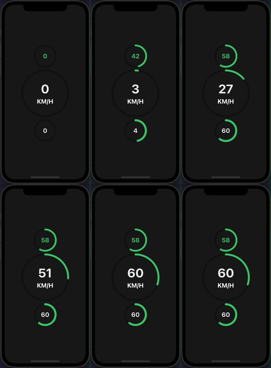
![](demo.gif)
![](demo2.gif)
![](demo3.gif)
![](demo4.gif)
![](demo5.gif)
![](demo6.gif)
![](demo7.gif)

## Prerequisites

⚠️ Peer Dependencies

- [react-native-svg](https://www.npmjs.com/package/react-native-svg#installation)
- [react-native-reanimated-v2](https://docs.swmansion.com/react-native-reanimated/docs/fundamentals/installation/)

This component has a peer dependency on react-native-reanimated-v2. react-native-reanimated-v2 has to be installed and linked into your project.
Follow [react-native-reanimated-v2](https://docs.swmansion.com/react-native-reanimated/docs/fundamentals/installation/) to install the dependency.

This component has a peer dependency on react-native-svg to draw the countdown circle. react-native-svg has to be installed and linked into your project.
Follow [react-native-svg](https://www.npmjs.com/package/react-native-svg#installation) to install the dependency.

## Installation

Supported version: react-native >= 0.59.0

```
npm install react-native-circular-progress-view
```

or

```
yarn add react-native-circular-progress-view
```

## Example

```
import CircularProgress from 'react-native-circular-progress-indicator';

....

<CircularProgress value={58} />
<CircularProgress
  value={60}
  radius={120}
  duration={2000}
  textColor={'#ecf0f1'}
  maxValue={200}
  title={'KM/H'}
  titleColor={'white'}
  titleStyle={{fontWeight: 'bold'}}
/>
<CircularProgress
  value={60}
  activeStrokeWidth={12}
  textColor={'#ecf0f1'}
/>

```

![](demo.gif)

#### with value prefix/suffix

```
import CircularProgress from 'react-native-circular-progress-indicator';

....

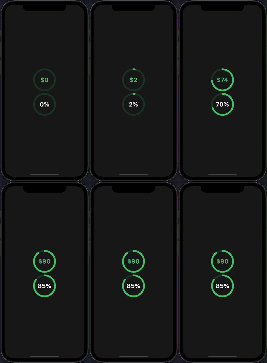
<CircularProgress
  value={90}
  valuePrefix={'$'}
  inActiveStrokeColor={'#2ecc71'}
  inActiveStrokeOpacity={0.2}
/>

<CircularProgress
  value={85}
  inActiveStrokeColor={'#2ecc71'}
  inActiveStrokeOpacity={0.2}
  textColor={'#fff'}
  valueSuffix={'%'}
/>

```

![](demo2.gif)

#### with callback function

```
import CircularProgress from 'react-native-circular-progress-indicator';

....

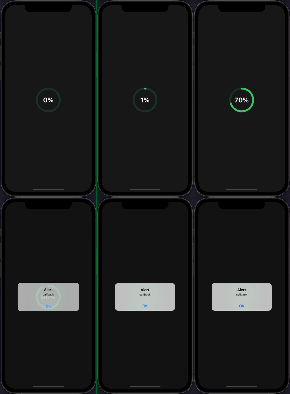
<CircularProgress
  value={90}
  inActiveStrokeColor={'#2ecc71'}
  inActiveStrokeOpacity={0.2}
  textColor={'#fff'}
  valueSuffix={'%'}
  onAnimationComplete={() => { alert('callback') }}
/>

```

![](demo3.gif)

#### custom

```
import CircularProgress from 'react-native-circular-progress-indicator';

....

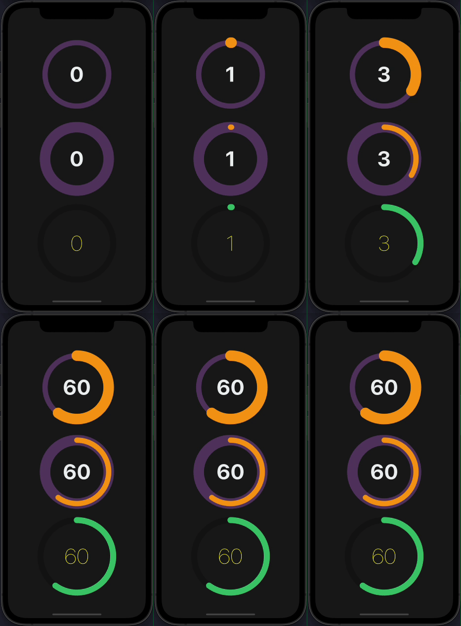
 <CircularProgress
  value={60}
  radius={120}
  textColor={'#ecf0f1'}
  activeStrokeColor={'#f39c12'}
  inActiveStrokeColor={'#9b59b6'}
  inActiveStrokeOpacity={0.5}
  inActiveStrokeWidth={20}
  activeStrokeWidth={40}
/>

<CircularProgress
  value={60}
  radius={120}
  textColor={'#ecf0f1'}
  activeStrokeColor={'#f39c12'}
  inActiveStrokeColor={'#9b59b6'}
  inActiveStrokeOpacity={0.5}
  inActiveStrokeWidth={40}
  activeStrokeWidth={20}
/>

<CircularProgress
  value={60}
  radius={120}
  inActiveStrokeOpacity={0.5}
  activeStrokeWidth={20}
  inActiveStrokeWidth={20}
  textStyle={{ fontWeight: '100', color: 'yellow' }}
/>

```

![](demo4.gif)

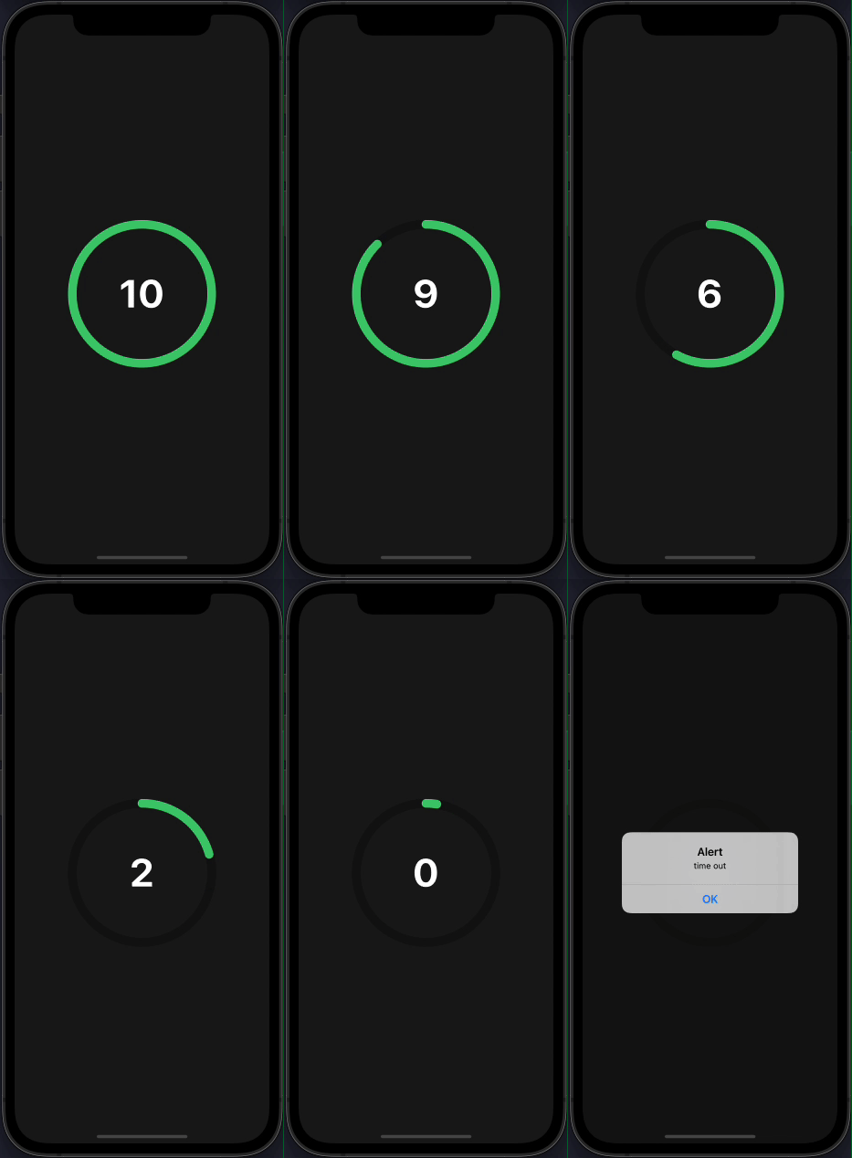
#### use as a countdown timer

```
import CircularProgress from 'react-native-circular-progress-indicator';

....

<CircularProgress
  value={0}
  radius={120}
  maxValue={10}
  initialValue={10}
  textColor={'#fff'}
  activeStrokeWidth={15}
  inActiveStrokeWidth={15}
  duration={10000}
  onAnimationComplete={() => alert('time out')}
/>

```

![](demo5.gif)

#### with gradient effect

```
import CircularProgress from 'react-native-circular-progress-indicator';

....

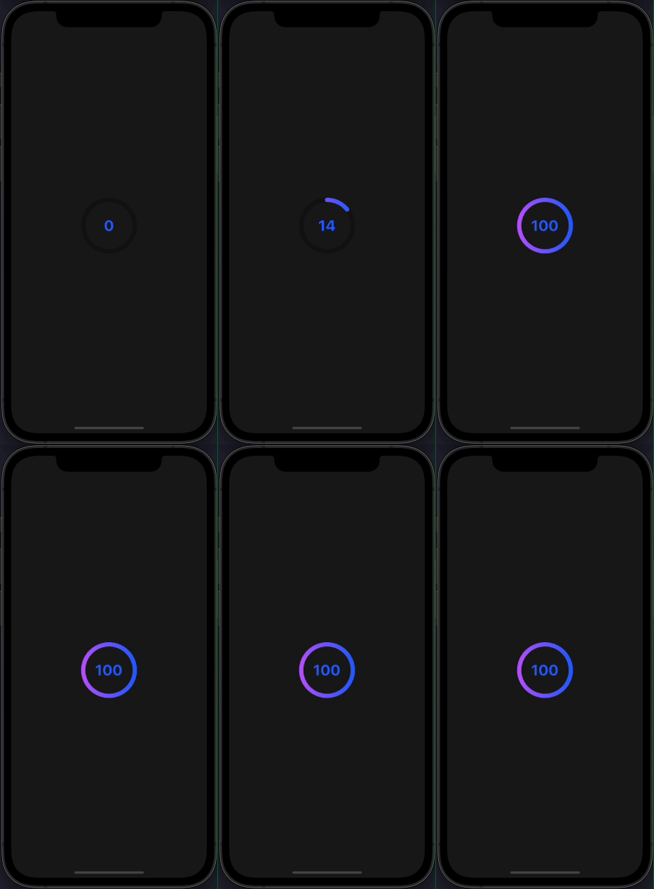
<CircularProgress
  value={100}
  activeStrokeColor={'#2465FD'}
  activeStrokeSecondaryColor={'#C25AFF'}
/>

```

![](demo6.gif)

#### with multiple child

```
import { CircularProgressWithChild } from 'react-native-circular-progress-indicator';

// accepts any react element as child
....

const props = {
  activeStrokeWidth: 25,
  inActiveStrokeWidth: 25,
  inActiveStrokeOpacity: 0.2
};

...

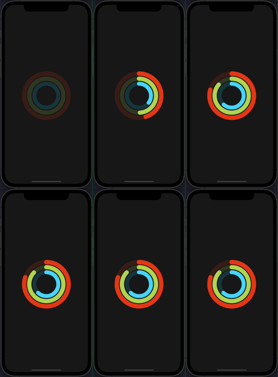
<CircularProgressWithChild
  {...props}
  value={80}
  radius={125}
  activeStrokeColor={'#e84118'}
  inActiveStrokeColor={'#e84118'}
>
  <CircularProgressWithChild
    {...props}
    value={87}
    radius={100}
    activeStrokeColor={'#badc58'}
    inActiveStrokeColor={'#badc58'}
  >
    <CircularProgressWithChild
      {...props}
      value={62}
      radius={75}
      activeStrokeColor={'#18dcff'}
      inActiveStrokeColor={'#18dcff'}
    />
  </CircularProgressWithChild>
</CircularProgressWithChild>

```

![](demo7.gif)

## Props

|            Prop            | Description                                                                           |             Type              |   Default Value   | Required |
| :------------------------: | :------------------------------------------------------------------------------------ | :---------------------------: | :---------------: | :------: |
|           value            | progress value                                                                        |            Number             |         0         |   true   |
|        initialValue        | initial progress value. Helpful when used as a countdown timer                        |            Number             |         0         |  false   |
|           title            | title to display below the progress value                                             |            String             |        ''         |  false   |
|         titleStyle         | title text style                                                                      |            Object             |        {}         |  false   |
|         titleColor         | title text color                                                                      |            String             |                   |  false   |
|       titleFontSize        | title text font size                                                                  |            Number             |                   |  false   |
|          subtitle          | subtitle to display below the progress value                                          |            String             |        ''         |  false   |
|       subtitleStyle        | subtitle text style                                                                   |            Object             |        {}         |  false   |
|       subtitleColor        | subtitle text color                                                                   |            String             |                   |  false   |
|      subtitleFontSize      | subtitle text font size                                                               |            Number             |                   |  false   |
|   circleBackgroundColor    | progress circle background color                                                      |            String             |   'transparent'   |  false   |
|           radius           | progress circle radius                                                                |            Number             |        60         |  false   |
|     activeStrokeWidth      | active progress circle stroke width                                                   |            Number             |        10         |  false   |
|    inActiveStrokeWidth     | inactive progress circle stroke width                                                 |            Number             |        10         |  false   |
|          duration          | progress animation duration                                                           |            Number             |        500        |  false   |
|           delay            | progress animation delay                                                              |            Number             |         0         |  false   |
|         textColor          | progress value text color                                                             |            String             |                   |  false   |
|         textStyle          | progress value text style                                                             |            Object             |        {}         |  false   |
|          maxValue          | progress maximum value. Percentage calculation is based on the maximum value provided |            String             |        100        |  false   |
|          fontSize          | progress value text font size                                                         |            Number             |                   |  false   |
|   inActiveStrokeOpacity    | inactive progress circle opacity value                                                |            Number             |         1         |  false   |
|       strokeLinecap        | progress stroke line cap                                                              | 'round' or 'butt' or 'square' |      'round'      |  false   |
|    onAnimationComplete     | callback when animation is completed.                                                 |           Function            |      ()=>{}       |  false   |
|        valuePrefix         | prefix value                                                                          |            String             |        ''         |  false   |
|        valueSuffix         | suffix value                                                                          |            String             |        ''         |  false   |
|     activeStrokeColor      | active progress circle color                                                          |            String             |     '#2ecc71'     |  false   |
| activeStrokeSecondaryColor | active progress secondary color. Use this to provide a gradient effect                |            String             |        ''         |  false   |
|    inActiveStrokeColor     | inactive progress circle color                                                        |            String             | 'rgba(0,0,0,0.3)' |  false   |
|     showProgressValue      | show or hide the progress text value                                                  |             Bool              |       true        |  false   |
|         clockwise          | show ring progress clockwise or anti-clockwise. pass false to enable anti clock-wise  |             Bool              |       true        |  false   |

## License

This project is licenced under the MIT License.