# React Native Chooser
Simple DropDown menu for React Native App! Your Select Tag for React Native. Fully Customizable too.
## Introduction
React Native Chooser is simple, customizable and easy to use dropdown in React Native. It has been tested on both Android and IOS and works like a charm.
## Installation
```
npm i react-native-chooser --save
```
## Usage
```js
import React, { Component } from 'react';
import {Select, Option} from "react-native-chooser";
import {
AppRegistry,
StyleSheet,
Text,
View
} from 'react-native';
export default class AwesomeProject extends Component {
constructor(props) {
super(props);
this.state = {value : "Select Me Please"}
}
onSelect(value, label) {
this.setState({value : value});
}
render() {
return (
);
}
}
```
### Props
#### Props for Select
| Prop Name | Data Type | Default Values | Description |
|-----------------|-----------|-----------------|--------------------------------------------------|
| onSelect | function | null | function that executes on selection of an option |
| defaultText | string | Click To Select | Text to show as default text |
| style | object | null | To style the select box. |
| backdropStyle | object | null | To style the overlay |
| textStyle | object | null | To style the text shown in the box |
| optionListStyle | object | null | To style the selection box |
| transparent | boolean | false | To set the transparent prop on Modal |
| animationType | string | "none" | To set the animationType prop on Modal |
| indicator | string | "none", "up" or "down" | "none" | To enable an indicator arrow |
| indicatorColor | string | "black" | The color of the indicator arrow |
| indicatorSize | number | 10 | The size of the indicator arrow |
| indicatorStyle | object | null | To style the indicator arrow |
| indicatorIcon | react element | null | Show the indicator icon |
| selected | string | null | Give it same value as you give to Option |
| selectedStyle | object | null | Apply styles to the selected Option |
#### Functions for Select
| Function Name | Description |
|-----------|-----------|
| setSelectedText(text) | Set default text in the select option, often used to reset text.|
#### Props for Option
| Prop Name | Data Type | Default Values | Description |
|-----------|-----------|----------------|---------------------------------------|
| style | object | null | To style each option |
| styleText | object | null | To style the text shown in the option |
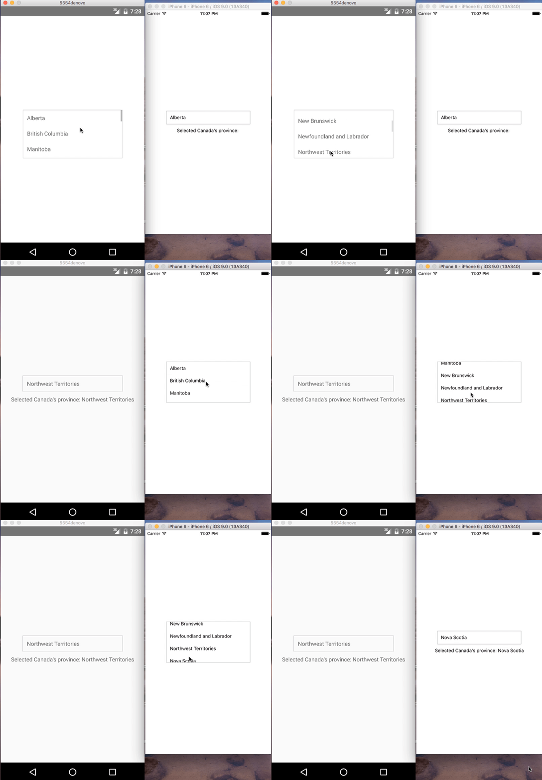
## Demo
### IOS and Android:
## Contributions
Your contributions and suggestions are heartily♡ welcome. (✿◠‿◠)