react-native-calendar-strip
Easy to use and visually stunning calendar component for React Native.
Table of Contents
Install
Usage
Props
Animations
Localization
Device Specific Notes
Local Development
Contributing
License
## Install
```sh
$ npm install react-native-calendar-strip
# OR
$ yarn add react-native-calendar-strip
```
## Usage
### Scrollable CalendarStrip — New in 2.x
The `scrollable` prop was introduced in 2.0.0 and features a bi-directional infinite scroller. It recycles days using RecyclerListView, shifting the dates as the ends are reached. The Chrome debugger can cause issues with this updating due to a [RN setTimeout bug](https://github.com/facebook/react-native/issues/4470). To prevent date shifts at the ends of the scroller, set the `minDate` and `maxDate` range to a year or less.
The refactor to support `scrollable` introduced internal changes to the `CalendarDay` component. Users of the `dayComponent` prop may need to adjust their custom day component to accommodate the props passed to it.
```jsx
import { View, StyleSheet } from 'react-native';
import CalendarStrip from 'react-native-calendar-strip';
const Example = () => (
);
const styles = StyleSheet.create({
container: { flex: 1 }
});
```
### Simple "out of the box" Example
You can use this component without any styling or customization. Just import it in your project and render it:
```jsx
import { View, StyleSheet } from 'react-native';
import CalendarStrip from 'react-native-calendar-strip';
const Example = () => (
);
const styles = StyleSheet.create({
container: { flex: 1 }
});
```
### Styling and animations Example
Even though this component works withouth any customization, it is possible to customize almost everything, so you can make it as beautiful as you want:
```jsx
import React, {Component} from 'react';
import {
AppRegistry,
View
} from 'react-native';
import moment from 'moment';
import CalendarStrip from 'react-native-calendar-strip';
class Example extends Component {
let datesWhitelist = [{
start: moment(),
end: moment().add(3, 'days') // total 4 days enabled
}];
let datesBlacklist = [ moment().add(1, 'days') ]; // 1 day disabled
render() {
return (
);
}
}
AppRegistry.registerComponent('Example', () => Example);
```
## Props
### Initial data and onDateSelected handler
| Prop | Description | Type | Default |
| -------------------- | ------------------------------------------------------------------------------------------------------------------------------------------------------------------ | -------- | ---------- |
| **`numDaysInWeek`** | Number of days shown in week. Applicable only when scrollable is false. | Number | **`7`** |
| **`scrollable`** | Dates are scrollable if true. | Bool | **`False`**|
| **`scrollerPaging`** | Dates are scrollable as a page (7 days) if true (Only works with `scrollable` set to true). | Bool | **`False`**|
| **`startingDate`** | Date to be used for centering the calendar/showing the week based on that date. It is internally wrapped by `moment` so it accepts both `Date` and `moment Date`. | Any |
| **`selectedDate`** | Date to be used as pre selected Date. It is internally wrapped by `moment` so it accepts both `Date` and `moment Date`. | Any |
| **`onDateSelected`** | Function to be used as a callback when a date is selected. Receives param `date` Moment date. | Function |
| **`onWeekChanged`** | Function to be used as a callback when a week is changed. Receives params `(start, end)` Moment dates. | Function |
| **`onWeekScrollStart`**| Function to be used as a callback in `scrollable` mode when dates page starts gliding. Receives params `(start, end)` Moment dates. | Function |
| **`onWeekScrollEnd`**| Function to be used as a callback in `scrollable` mode when dates page stops gliding. Receives params `(start, end)` Moment dates. | Function |
| **`onHeaderSelected`**| Function to be used as a callback when the header is selected. Receives param object `{weekStartDate, weekEndDate}` Moment dates. | Function |
| **`headerText`** | Text to use in the header. Use with `onWeekChanged` to receive the visible start & end dates. | String |
| **`updateWeek`** | Update the week view if other props change. If `false`, the week view won't change when other props change, but will still respond to left/right selectors. | Bool | **`True`** |
| **`useIsoWeekday`** | start week on ISO day of week (default true). If false, starts week on _startingDate_ parameter. | Bool | **`True`** |
| **`minDate`** | minimum date that the calendar may navigate to. A week is allowed if minDate falls within the current week. | Any |
| **`maxDate`** | maximum date that the calendar may navigate to. A week is allowed if maxDate falls within the current week. | Any |
| **`datesWhitelist`** | Array of dates that are enabled, or a function callback which receives a date param and returns true if enabled. Array supports ranges specified with an object entry in the array. Check example Below | Array or Func |
| **`datesBlacklist`** | Array of dates that are disabled, or a function callback. Same format as _datesWhitelist_. This overrides dates in _datesWhitelist_. | Array or Func |
| **`markedDates`** | Dates that are marked with dots or lines. Format as markedDatesFormat. | Array or Func | **[]**
| **`scrollToOnSetSelectedDate`** | Controls whether to reposition the scroller to the date passed to `setSelectedDate`. | Bool | **`True`** |
##### datesWhitelist Array Example
```jsx
datesWhitelist = [
// single date (today)
moment(),
// date range
{
start: (Date or moment Date),
end: (Date or moment Date)
}
];
return (
);
```
##### datesBlacklist Callback Example
```jsx
const datesBlacklistFunc = date => {
return date.isoWeekday() === 6; // disable Saturdays
}
return (
);
```
##### markedDates Example
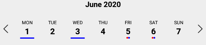
`markedDates` may be an array of dates with dots/lines, or a callback that returns the same shaped object for a date passed to it.
```jsx
// Marked dates array format
markedDatesArray = [
{
date: '(string, Date or Moment object)',
dots: [
{
color: ,
selectedColor: (optional),
},
],
},
{
date: '(string, Date or Moment object)',
lines: [
{
color: ,
selectedColor: (optional),
},
],
},
];
```
```jsx
// Marked dates callback
markedDatesFunc = date => {
// Dot
if (date.isoWeekday() === 4) { // Thursdays
return {
dots:[{
color: ,
selectedColor: (optional),
}]
};
}
// Line
if (date.isoWeekday() === 6) { // Saturdays
return {
lines:[{
color: ,
selectedColor: (optional),
}]
};
}
return {};
}
```
### Hiding Components
| Prop | Description | Type | Default |
| ------------------- | --------------------------------- | ---- | ---------- |
| **`showMonth`** | Show or hide the month label. | Bool | **`True`** |
| **`showDate`** | Show or hide all the dates. | Bool | **`True`** |
| **`showDayName`** | Show or hide the day name label | Bool | **`True`** |
| **`showDayNumber`** | Show or hide the day number label | Bool | **`True`** |
### Styling
| Prop | Description | Type | Default |
| ------------------------------ | ------------------------------------------------------------------------------------------------------------------------------------------ | -------------- | ---------- |
| **`style`** | Style for the top level CalendarStrip component. | Any |
| **`innerStyle`** | Style for the responsively sized inner view. This is necessary to account for padding/margin from the top level view. The inner view has style `flex:1` by default. If this component is nested within another dynamically sized container, remove the flex style by passing in `[]`. | Any |
| **`calendarHeaderStyle`** | Style for the header text of the calendar | Any |
| **`calendarHeaderContainerStyle`** | Style for the header text wrapper of the calendar | Any |
| **`calendarHeaderPosition`** | Position of the header text (above or below) | `above, below` | **`above`** |
| **`calendarHeaderFormat`** | Format for the header text of the calendar. For options, refer to [Moment documentation](http://momentjs.com/docs/#/displaying/format/) | String |
| **`dateNameStyle`** | Style for the name of the day on work days in dates strip | Any |
| **`dateNumberStyle`** | Style for the number of the day on work days in dates strip. | Any |
| **`dayContainerStyle`** | Style for all day containers. RNCS scales the width & height responsively, so take that into account if overriding them. | Any |
| **`weekendDateNameStyle`** | Style for the name of the day on weekend days in dates strip. | Any |
| **`weekendDateNumberStyle`** | Style for the number of the day on weekend days in dates strip. | Any |
| **`styleWeekend`** | Whether to style weekend dates separately. | Bool | **`True`** |
| **`highlightDateNameStyle`** | Style for the selected name of the day in dates strip. | Any |
| **`highlightDateNumberStyle`** | Style for the selected number of the day in dates strip. | Any |
| **`highlightDateNumberContainerStyle`** | Style for the selected date number container. Similar to `highlightDateNumberStyle`, but this fixes the issue that some styles may have on iOS when using `highlightDateNumberStyle`. | Any |
| **`highlightDateContainerStyle`** | Style for the selected date container. | Object |
| **`disabledDateNameStyle`** | Style for disabled name of the day in dates strip (controlled by datesWhitelist & datesBlacklist). | Any |
| **`disabledDateNumberStyle`** | Style for disabled number of the day in dates strip (controlled by datesWhitelist & datesBlacklist). | Any |
| **`markedDatesStyle`** | Style for the marked dates marker. | Object |
| **`disabledDateOpacity`** | Opacity of disabled dates strip. | Number | **`0.3`** |
| **`customDatesStyles`** | Custom per-date styling, overriding the styles above. Check Table Below . | Array or Func | [] |
| **`shouldAllowFontScaling`** | Override the underlying Text element scaling to respect font settings | Bool | **`True`**|
| **`upperCaseDays`** | Format text of the days to upper case or title case | Bool | **`True`**|
#### customDatesStyles
This prop may be passed an array of style objects or a callback which receives a date param and returns a style object for it. The format for the style object follows:
| Key | Description | Type | optional |
| ------------------------ | ---------------------------------------------------------------------------------- | ---- | ----------- |
| **`startDate`** | anything parseable by Moment. | Any | **`False`** (unused w/ callback)|
| **`endDate`** | specify a range. If no endDate is supplied, startDate is treated as a single date. | Any | **`True`** (unused w/ callback) |
| **`dateNameStyle`** | Text style for the name of the day. | Any | **`True`** |
| **`dateNumberStyle`** | Text style for the number of the day. | Any | **`True`** |
| **`highlightDateNameStyle`** | Text style for the selected name of the day. This overrides the global prop. | Any | **`True`** |
| **`highlightDateNumberStyle`** | Text style for the selected number of the day. This overrides the global prop. | Any | **`True`** |
| **`dateContainerStyle`** | Style for the date Container. | Any | **`True`** |
##### Array Usage Example:
```jsx
let customDatesStyles = [];
let startDate = moment();
for (let i=0; i<6; i++) {
customDatesStyles.push({
startDate: startDate.clone().add(i, 'days'), // Single date since no endDate provided
dateNameStyle: styles.dateNameStyle,
dateNumberStyle: styles.dateNumberStyle,
// Random color...
dateContainerStyle: { backgroundColor: `#${(`#00000${(Math.random() * (1 << 24) | 0).toString(16)}`).slice(-6)}` },
});
}
render() {
return (
);
}
```
##### Callback Usage Example:
```jsx
const customDatesStylesFunc = date => {
if (date.isoWeekday() === 5) { // Fridays
return {
dateNameStyle: {color: 'blue'},
dateNumberStyle: {color: 'purple'},
dateContainerStyle: {color: 'yellow'},
}
}
}
render() {
return (
);
}
```
#### Responsive Sizing
| Prop | Description | Type | Default |
| ---------------------------- | ---------------------------------------------------------------------------------------------------------------------------------------------------- | ------ | -------- |
| **`maxDayComponentSize`** | Maximum size that CalendarDay will responsively size up to. | Number | **`80`** |
| **`minDayComponentSize`** | Minimum size that CalendarDay will responsively size down to. | Number | **`10`** |
| **`responsiveSizingOffset`** | Adjust the responsive sizing. May be positive (increase size) or negative (decrease size). This value is added to the calculated day component width | Number | **`0`** |
| **`dayComponentHeight`** | Fixed height for the CalendarDay component or custom `dayComponent`. | Number | |
#### Icon Sizing
| Prop | Description | Type | Default |
| -------------------- | --------------------------------------------------------------------------------------------------------------------------------------------------------------------------------------- | ---- | ------- |
| **`iconLeft`** | Icon to be used for the left icon. It accepts require statement with url to the image (`require('./img/icon.png')`), or object with remote uri `{uri: 'http://example.com/image.png'}` | Any |
| **`iconRight`** | Icon to be used for the right icon. It accepts require statement with url to the image (`require('./img/icon.png')`), or object with remote uri `{uri: 'http://example.com/image.png'}` | Any |
| **`iconStyle`** | Style that is applied to both left and right icons. It is applied before _iconLeftStyle_ or _iconRightStyle_. | Any |
| **`iconLeftStyle`** | Style for left icon. It will override all of the other styles applied to icons. | Any |
| **`iconRightStyle`** | Style for right icon. It will override all of the other styles applied to icons. | Any |
| **`iconContainer`** | Style for the container of icons. (Example usage is to add `flex` property to it so in the portrait mode, it will shrink the dates strip) | Any |
| **`leftSelector`** | Component for the left selector control. May be an instance of any React component. This overrides the icon\* props above. Passing in an empty array `[]` hides this control. | Any |
| **`rightSelector`** | Component for the right selector control. May be an instance of any React component. This overrides the icon\* props above. Passing in an empty array `[]` hides this control. | Any |
#### Custom Day component
| Prop | Description | Type | Default |
| -------------------- | --------------------------------------------------------------------------------------------------------------------------------------------------------------------------------------- | ---- | ------- |
| **`dayComponent`** | User-defined component for the Days. All day-related props are passed to the custom component: https://github.com/BugiDev/react-native-calendar-strip/blob/master/src/CalendarStrip.js#L542 | Any |
### Methods
Methods may be accessed through the instantiated component's [ref](https://reactjs.org/docs/react-component.html).
| Prop | Description |
| ------------------------------------- | --------------------------------------------------------------------------------- |
| **`getSelectedDate()`** | Returns the currently selected date. If no date is selected, returns undefined. |
| **`setSelectedDate(date)`** | Sets the selected date. `date` may be a Moment object, ISO8601 date string, or any format that Moment is able to parse. It is the responsibility of the caller to select a date that makes sense (e.g. within the current week view). Passing in a value of `0` effectively clears the selected date. `scrollToOnSetSelectedDate` controls whether the scroller repositions to the selected date. |
| **`getNextWeek()`** | Advance to the next week. |
| **`getPreviousWeek()`** | Rewind to the previous week. |
| **`updateWeekView(date)`** | Show the week starting on `date`. |
## Animations
### Week Strip Animation
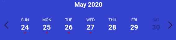
| Sequence example (dates shown one by one) | Parallel example (dates shown all at once) |
| -------------------------------------------------------------------------------------------------------------------------------------------------------------------------- | ------------------------------------------------------------------------------------------------------------------------------------------------------------------------- |
|  |  |
#### Week Strip Animation Options
The `calendarAnimation` prop accepts an object in the following format:
| Props | Description | Types |
| -------------- | --------------------------------------------------- | ------------------------ |
| **`Type`** | Pick which type of animation you would like to show | `sequence` or `parallel` |
| **`duration`** | duration of animation in milliseconds | Number (ms) |
| **`useNativeDriver`** | Use Animated's native driver (default true) | Bool |
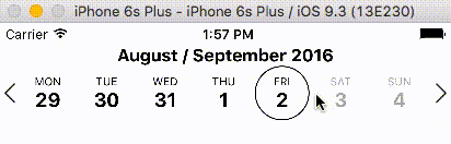
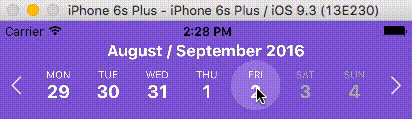
### Day Selection Animation
| Border example | Background example |
| --------------------------------------------------------------------------------------------------------------------------------------------------------------------------- | --------------------------------------------------------------------------------------------------------------------------------------------------------------------- |
|  |  |
#### Day Selection Animation Options
The `daySelectionAnimation` prop accepts an object in the following format:
| Props | Description | Type |
| -------------------------- | ---------------------------------------------------------------------------------------------------------------------- | ------------------------ |
| **`Type`** | Pick which type of animation you would like to show | `border` or `background` |
| **`duration`** | duration of animation in milliseconds | Number (ms) |
| **`borderWidth`** | Selected day's border width. _Required if the type is set to border_. | Number |
| **`borderHighlightColor`** | Selected day's border color. _Required if the type is set to border_. | String |
| **`highlightColor`** | Highlighted color of selected date. _Required if the type is set to background_. | String |
| **`animType`** | optional config options passed to [LayoutAnimation](https://facebook.github.io/react-native/docs/layoutanimation.html) | any |
| **`animUpdateType`** | optional config options passed to [LayoutAnimation](https://facebook.github.io/react-native/docs/layoutanimation.html) | any |
| **`animProperty`** | optional config options passed to [LayoutAnimation](https://facebook.github.io/react-native/docs/layoutanimation.html) | any |
| **`animSpringDamping`** | optional config options passed to [LayoutAnimation](https://facebook.github.io/react-native/docs/layoutanimation.html) | any |
## Localization
| Props | Description | Type |
| ------------ | ---------------- | ------ |
| **`locale`** | Locale for dates | Object |
This prop is used for adding localization to react-native-calendar-strip component. The localization rules are the same as moments and can be found in [moments documentation](http://momentjs.com/docs/#/i18n/)
| `locale` Props | Description | Type |
| -------------- | ----------------------------------------------------------- | ------ |
| **`name`** | The name of the locale (ex. 'fr') | String |
| **`config`** | The config object holding all of the localization strings.. | Object |
#### Build Release info
To properly make a release build, import the appropriate "Locale" module using the following steps. Not importing the locale module will crash the release build (though the dev build will work).
1- import momentJs module:
> $ yarn add moment
or
> $ npm install moment
2- Go to your index.js and import the specific "Locale" after the main moment import. Ex:
```
import 'moment';
import 'moment/locale/fr'; // language must match config
import moment from 'moment-timezone'; // only if timezone is needed
```
The locale import must match the language specified in the locale config (example below).
#### Example of one locale object is:
```jsx
const locale = {
name: 'fr',
config: {
months: 'Janvier_Février_Mars_Avril_Mai_Juin_Juillet_Août_Septembre_Octobre_Novembre_Décembre'.split(
'_'
),
monthsShort: 'Janv_Févr_Mars_Avr_Mai_Juin_Juil_Août_Sept_Oct_Nov_Déc'.split(
'_'
),
weekdays: 'Dimanche_Lundi_Mardi_Mercredi_Jeudi_Vendredi_Samedi'.split('_'),
weekdaysShort: 'Dim_Lun_Mar_Mer_Jeu_Ven_Sam'.split('_'),
weekdaysMin: 'Di_Lu_Ma_Me_Je_Ve_Sa'.split('_'),
longDateFormat: {
LT: 'HH:mm',
LTS: 'HH:mm:ss',
L: 'DD/MM/YYYY',
LL: 'D MMMM YYYY',
LLL: 'D MMMM YYYY LT',
LLLL: 'dddd D MMMM YYYY LT'
},
calendar: {
sameDay: "[Aujourd'hui à] LT",
nextDay: '[Demain à] LT',
nextWeek: 'dddd [à] LT',
lastDay: '[Hier à] LT',
lastWeek: 'dddd [dernier à] LT',
sameElse: 'L'
},
relativeTime: {
future: 'dans %s',
past: 'il y a %s',
s: 'quelques secondes',
m: 'une minute',
mm: '%d minutes',
h: 'une heure',
hh: '%d heures',
d: 'un jour',
dd: '%d jours',
M: 'un mois',
MM: '%d mois',
y: 'une année',
yy: '%d années'
},
ordinalParse: /\d{1,2}(er|ème)/,
ordinal: function(number) {
return number + (number === 1 ? 'er' : 'ème');
},
meridiemParse: /PD|MD/,
isPM: function(input) {
return input.charAt(0) === 'M';
},
// in case the meridiem units are not separated around 12, then implement
// this function (look at locale/id.js for an example)
// meridiemHour : function (hour, meridiem) {
// return /* 0-23 hour, given meridiem token and hour 1-12 */
// },
meridiem: function(hours, minutes, isLower) {
return hours < 12 ? 'PD' : 'MD';
},
week: {
dow: 1, // Monday is the first day of the week.
doy: 4 // The week that contains Jan 4th is the first week of the year.
}
}
};
```
## Device Specific Notes
- OnePlus devices use OnePlus Slate font by default which causes text being cut off in the date number in react-native-calendar-strip. To overcome this change the default font of the device or use a specific font throughout your app.
## Development with Sample Application
To facilitate development, the `example` directory has a sample app.
```sh
cd example
npm run cp
npm install
npm start
```
The CalendarStrip source files are copied from the project root directory into `example/CalendarStrip` using `npm run cp`. If a source file is modified, it must be copied over again with `npm run cp`.
## Contributing
Contributions are welcome!
1. Fork it.
2. Create your feature branch: `git checkout -b my-new-feature`
3. Commit your changes: `git commit -am 'Add some feature'`
4. Push to the branch: `git push origin my-new-feature`
5. Submit a pull request :D
Or open up [an issue](https://github.com/BugiDev/react-native-calendar-strip/issues).
## Contributors
| [
Bogdan Begovic](https://github.com/BugiDev)
[💬](#question-BugiDev "Answering Questions") [💻](https://github.com/bugidev/react-native-calendar-strip/commits?author=BugiDev "Code") [🎨](#design-BugiDev "Design") [📖](https://github.com/bugidev/react-native-calendar-strip/commits?author=BugiDev "Documentation") [💡](#example-BugiDev "Examples") [🔧](#tool-BugiDev "Tools") | [
Peace](https://github.com/peacechen)
[💬](#question-peacechen "Answering Questions") [🐛](https://github.com/bugidev/react-native-calendar-strip/issues?q=author%3Apeacechen "Bug reports") [💻](https://github.com/bugidev/react-native-calendar-strip/commits?author=peacechen "Code") [📖](https://github.com/bugidev/react-native-calendar-strip/commits?author=peacechen "Documentation") [👀](#review-peacechen "Reviewed Pull Requests") | [
Chris Burns](http://www.usebillo.com)
[💬](#question-Burnsy "Answering Questions") [🐛](https://github.com/bugidev/react-native-calendar-strip/issues?q=author%3ABurnsy "Bug reports") [💻](https://github.com/bugidev/react-native-calendar-strip/commits?author=Burnsy "Code") [📖](https://github.com/bugidev/react-native-calendar-strip/commits?author=Burnsy "Documentation") [🔧](#tool-Burnsy "Tools") [💡](#example-Burnsy "Examples") [👀](#review-Burnsy "Reviewed Pull Requests") | [
samcolby](https://github.com/samcolby)
[💻](https://github.com/bugidev/react-native-calendar-strip/commits?author=samcolby "Code") [⚠️](https://github.com/bugidev/react-native-calendar-strip/commits?author=samcolby "Tests") | [
Florian Biebel](https://chromosom23.de)
[💻](https://github.com/bugidev/react-native-calendar-strip/commits?author=1ne8ight7even "Code") | [
Vitaliy Zhukov](http://intspirit.com/)
[💻](https://github.com/bugidev/react-native-calendar-strip/commits?author=Vitall "Code") | [
lbrdar](https://github.com/lbrdar)
[💻](https://github.com/bugidev/react-native-calendar-strip/commits?author=lbrdar "Code") |
| :---: | :---: | :---: | :---: | :---: | :---: | :---: |
| [
Dimka Vasilyev](https://github.com/gHashTag)
[💻](https://github.com/bugidev/react-native-calendar-strip/commits?author=gHashTag "Code") | [
Eugene](https://github.com/hellpirat)
[💻](https://github.com/bugidev/react-native-calendar-strip/commits?author=hellpirat "Code") |
Thanks goes to these wonderful people ([emoji key](https://github.com/kentcdodds/all-contributors#emoji-key)):
## Discussion and Collaboration
In addition to the [Github Issues](https://github.com/BugiDev/react-native-calendar-strip/issues) page, there is a [Discord group](https://discord.gg/RvFM97v) for React Native with a channel specifically for [react-native-calendar-strip](https://discordapp.com/channels/413352084981678082/413360340579909633). Thanks @MichelDiz for setting that up.
## License
Licensed under the MIT License.


