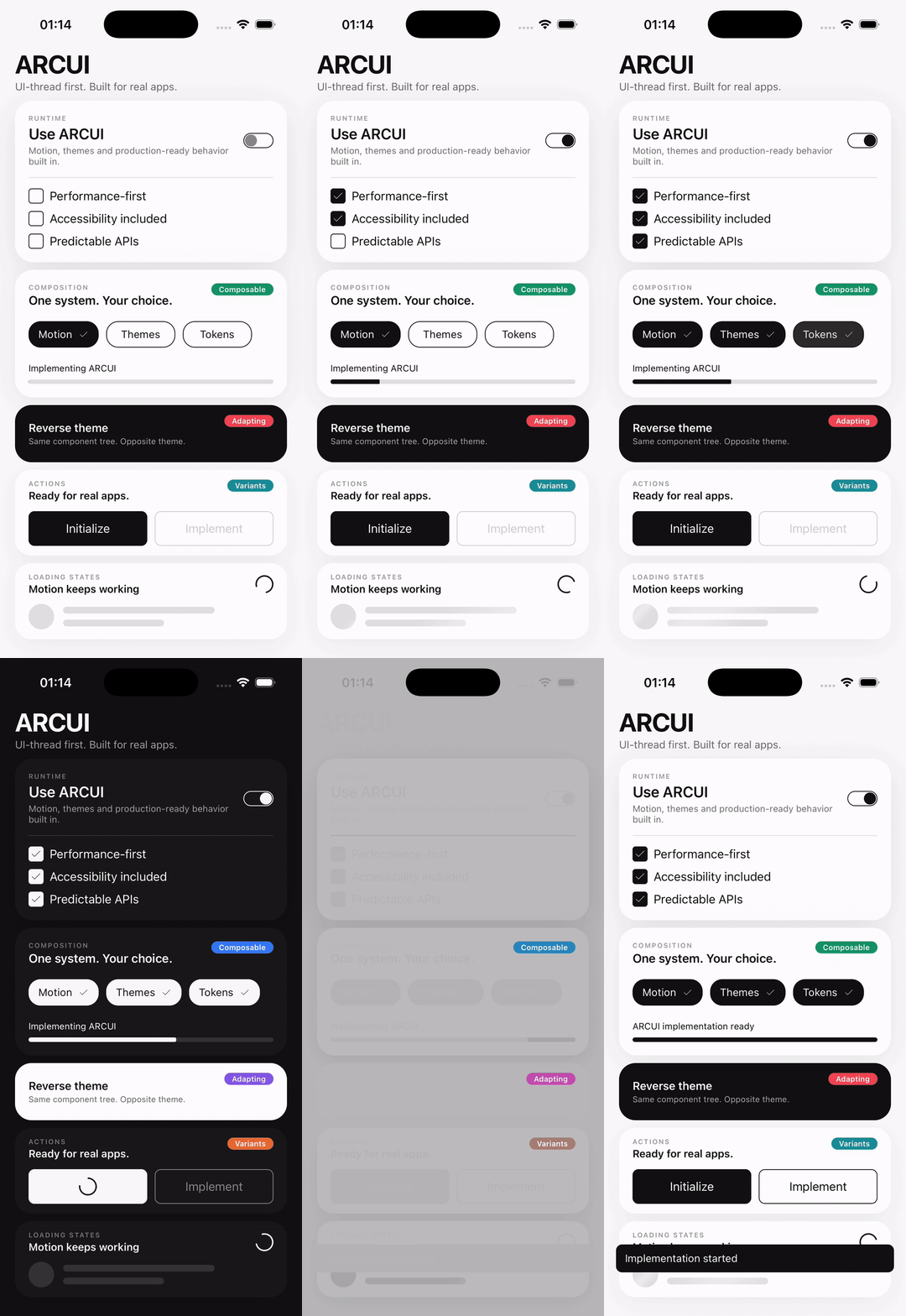
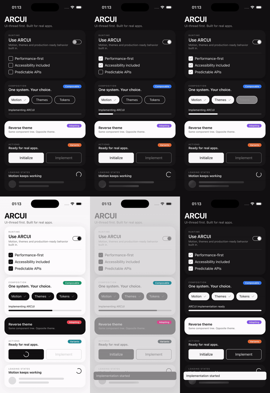
# ARCUI
**High-performance React Native UI with UI-thread-first motion, accessibility, theming, and predictable APIs.**
Built for React 19, modern React Native, Reanimated, Expo, and bare React Native applications.
[](https://www.npmjs.com/package/react-native-arc-ui)


[Documentation](https://arcui.arcstylen.com) · [npm](https://www.npmjs.com/package/react-native-arc-ui) · [GitHub](https://github.com/arcvlad/react-native-arc-ui) · [Issues](https://github.com/arcvlad/react-native-arc-ui/issues)
## Why ARCUI
| | |
| -------------------------------- | ------------------------------------------------------------------------------------------------------------------- |
| **UI-thread-first motion** | Frame-level visual work uses Reanimated and stays off the JavaScript thread where practical. |
| **Accessibility from the start** | Native semantics, controlled font scaling, Reduced Motion, accessible state, and localizable library-owned strings. |
| **Tokens and themes** | Light, dark, system, theme interpolation, `ReverseTheme`, and design-system-first configuration. |
| **Predictable state ownership** | React owns semantic state. SharedValues own frame-level visual state. Public APIs make that boundary explicit. |
| **AI-ready guidance** | Version-matched references and patterns ship with the package for AI-assisted ARCUI development. |
ARCUI is designed for modern React Native applications that need reusable UI without giving up motion quality, accessibility, or control over the design system.
## Installation
```bash
npm install react-native-arc-ui react-native-reanimated react-native-gesture-handler react-native-svg
```
For Expo projects:
```bash
npm install react-native-arc-ui
npx expo install react-native-reanimated react-native-gesture-handler react-native-svg
```
Follow the official setup instructions for the Reanimated and React Native Gesture Handler versions used by your application.
ARCUI does not declare `react-native-worklets` as a direct peer dependency. Consumers using a Reanimated version that requires additional setup should follow that Reanimated version's installation requirements.
## Quick start
Wrap your application once with `ARCUI`:
```tsx
import { useState } from "react";
import { ARCUI, Button, Screen, Text, Toggle } from "react-native-arc-ui";
export default function App() {
const [notificationsEnabled, setNotificationsEnabled] = useState(true);
return (
Account settings
Notifications
);
}
```
The provider owns ARCUI-wide theme state, animated theme progress, font scale, safe-area information, localization strings, and shared overlay infrastructure.
## AI-assisted development
ARCUI ships version-matched guidance for AI coding tools. When an assistant is inspecting this repository, start with [`AGENTS.md`](./AGENTS.md); it routes ARCUI usage work to the focused guidance under `ai/`.
```text
ai/
├── SKILL.md
├── INDEX.md
├── references/
└── patterns/
```
For an installed package, start with `ai/SKILL.md`. `ai/INDEX.md` routes the agent to focused references only when needed, while `references/` documents ARCUI contracts and `patterns/` covers common composition workflows.
The guidance ships alongside the package so AI-generated ARCUI code can target the same API version installed in the application. These files are documentation-only and are not ARCUI runtime entry points.
## Motion that follows the UI
ARCUI uses React state for semantic and structural state, and Reanimated SharedValues for continuous visual state.
That means theme interpolation, transforms, gesture movement, progress, visibility transitions, and other frame-level feedback can stay on the UI thread where practical.
```text
semantic state → React
visual progress → SharedValues
frame updates → UI thread
```
ARCUI does not use React state as an animation frame driver. Motion respects Reduced Motion preferences, and the library does not intentionally cap animation to 60 FPS on higher-refresh-rate devices.
## Themes and composition
ARCUI supports `system`, `light`, and `dark` themes with animated transitions.
```tsx
{children}
```
`ReverseTheme` inverts the animated theme context for a subtree, so composed components continue to interpolate naturally without maintaining a second static theme implementation.
```tsx
import { ReverseTheme, Text, ThemedView } from "react-native-arc-ui";
Opposite theme, same ARCUI behavior.;
```
For application-specific theme-aware UI, ARCUI exposes:
```ts
import {
useARCUITheme,
useARCUIAnimatedTheme,
useARCUISystem,
} from "react-native-arc-ui";
```
## Tokens first
Colors, typography, spacing, sizing, radii, borders, animation configuration, safe-area behavior, and component defaults are driven by ARCUI tokens.
```tsx
import {
ARCUI,
Screen,
Text,
defaultTokens,
type TTokensOverride,
} from "react-native-arc-ui";
const tokens = {
spacing: {
...defaultTokens.spacing,
l: 24,
},
} satisfies TTokensOverride;
export default function App() {
return (
Custom ARCUI tokens.
);
}
```
Top-level token overrides are intentionally shallow. Compose nested token groups explicitly when customizing them.
## Color overrides and semantic tones
Color-owning components use a consistent `colors` contract. Every color override accepts either a fixed color or a theme-aware pair:
```tsx
```
A fixed string is used in both themes. A complete `{ light, dark }` pair participates in ARCUI's animated theme transition. Partial `colors` objects fall back to the matching semantic tone/component token state.
Semantic components expose `tone` only where it represents a real preset, including Button, Badge, Toast, Infobox, and Dropdown item danger semantics. Consumer-owned `ReactNode` content remains consumer-owned and is not recolored automatically.
## Components
### Layout and presentation
`Screen` · `ThemedView` · `Text` · `Divider` · `FluidView` · `ReverseTheme` · `Infobox` · `Badge` · `Icon`
### Actions and selection
`Button` · `Checkbox` · `Radio` · `Toggle` · `Chip` · `SelectionGroup` · `Accordion` · `AccordionGroup`
### Inputs
`Input` · `InputPassword` · `InputArea` · `InputNumber` · `InputOTP` · `Select` · `Slider`
### Navigation
`Header` · `Tab` · `TabBar` · `TabNavigation` · `TabScreen`
### Feedback and loading
`ProgressBar` · `SpinnerLoader` · `SkeletonLoader`
### Overlays
`Dropdown` · `Modal`
Toast and Dialog use provider-owned imperative APIs rather than public visual components.
## Controlled where semantics matter
ARCUI keeps semantic application state explicit.
```tsx
const [checked, setChecked] = useState(false);
Remember this device
;
```
The consumer remains the source of truth. ARCUI requests changes through callbacks and renders from the value supplied by the owner.
Native text-input ownership is preserved where it is useful: `Input` and `InputArea` support React Native's normal controlled and uncontrolled `TextInput` patterns.
## Accessibility
Accessibility is part of the component architecture, not a final pass.
ARCUI includes native roles and semantic state, accessible labels and actions, central font-scale handling, accessible validation states, Reduced Motion support, localizable ARCUI-owned strings, and consumer accessibility escape hatches where they are safe.
## Toast and Dialog
Transient global feedback is managed through ARCUI's shared provider infrastructure.
```tsx
import { showDialog, showToast } from "react-native-arc-ui";
showToast({
message: "Changes saved",
placement: "bottom",
});
showDialog({
title: "Continue?",
message: "Your current changes will be preserved.",
actions: [{ label: "Continue" }],
});
```
## Testing
ARCUI's test utilities live outside the production entry point:
```tsx
import { ARCUIMock } from "react-native-arc-ui/testing";
render(
,
);
```
Avoid deep imports from `src` or `dist`; only documented package entry points are part of the public API contract.
## Compatibility
ARCUI targets modern React Native while keeping the public runtime compatible across the supported Reanimated 3.19+ and 4.x range.
| Dependency | Supported range |
| ---------------------------- | ----------------- |
| React | `>=19.0.0` |
| React Native | `>=0.78.0` |
| React Native Reanimated | `>=3.19.0 <5.0.0` |
| React Native Gesture Handler | `>=2.28.0` |
| React Native SVG | `>=15.0.0` |
New Architecture is the primary modern target. Consumers should choose a Reanimated version compatible with their React Native version and architecture.
## Documentation
Full documentation, component examples, API guidance, theming, tokens, motion, accessibility, AI guidance, and integration details live at:
**https://arcui.arcstylen.com**
The README is intentionally a fast product and onboarding overview rather than a complete API reference.
## Project
- [Documentation](https://arcui.arcstylen.com)
- [npm package](https://www.npmjs.com/package/react-native-arc-ui)
- [Source code](https://github.com/arcvlad/react-native-arc-ui)
- [Changelog](./CHANGELOG.md)
- [Issues](https://github.com/arcvlad/react-native-arc-ui/issues)
ARCUI follows semantic versioning.
## License
ARCUI is distributed under the MIT License. See [`LICENSE`](./LICENSE) for details.