[](https://www.npmjs.com/package/react-native-animated-header)
[](https://www.npmjs.com/package/react-native-animated-header)
# react-native-animated-form
Collapsing toolbar for Android and iOS
## Installation
```bash
npm install --save react-native-animated-header
or
yarn add react-native-animated-header
```
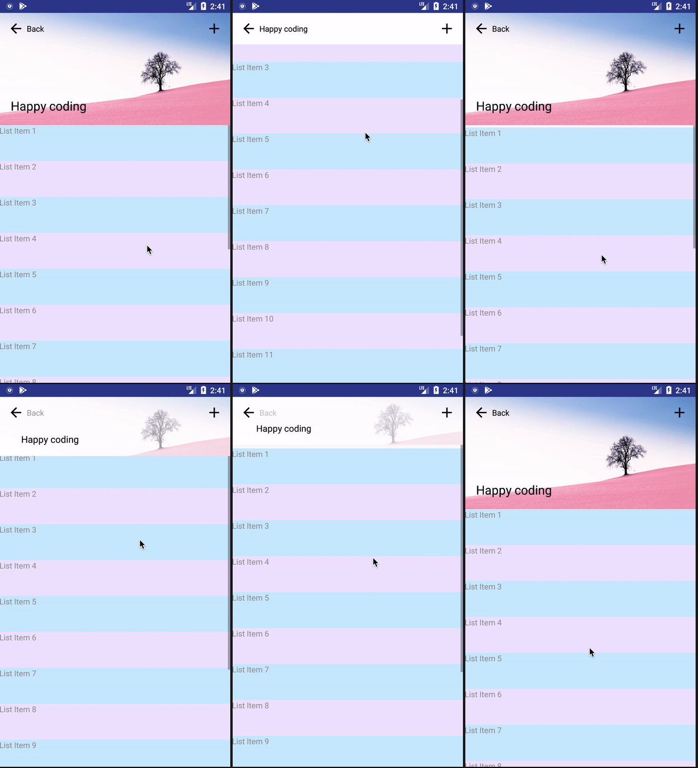
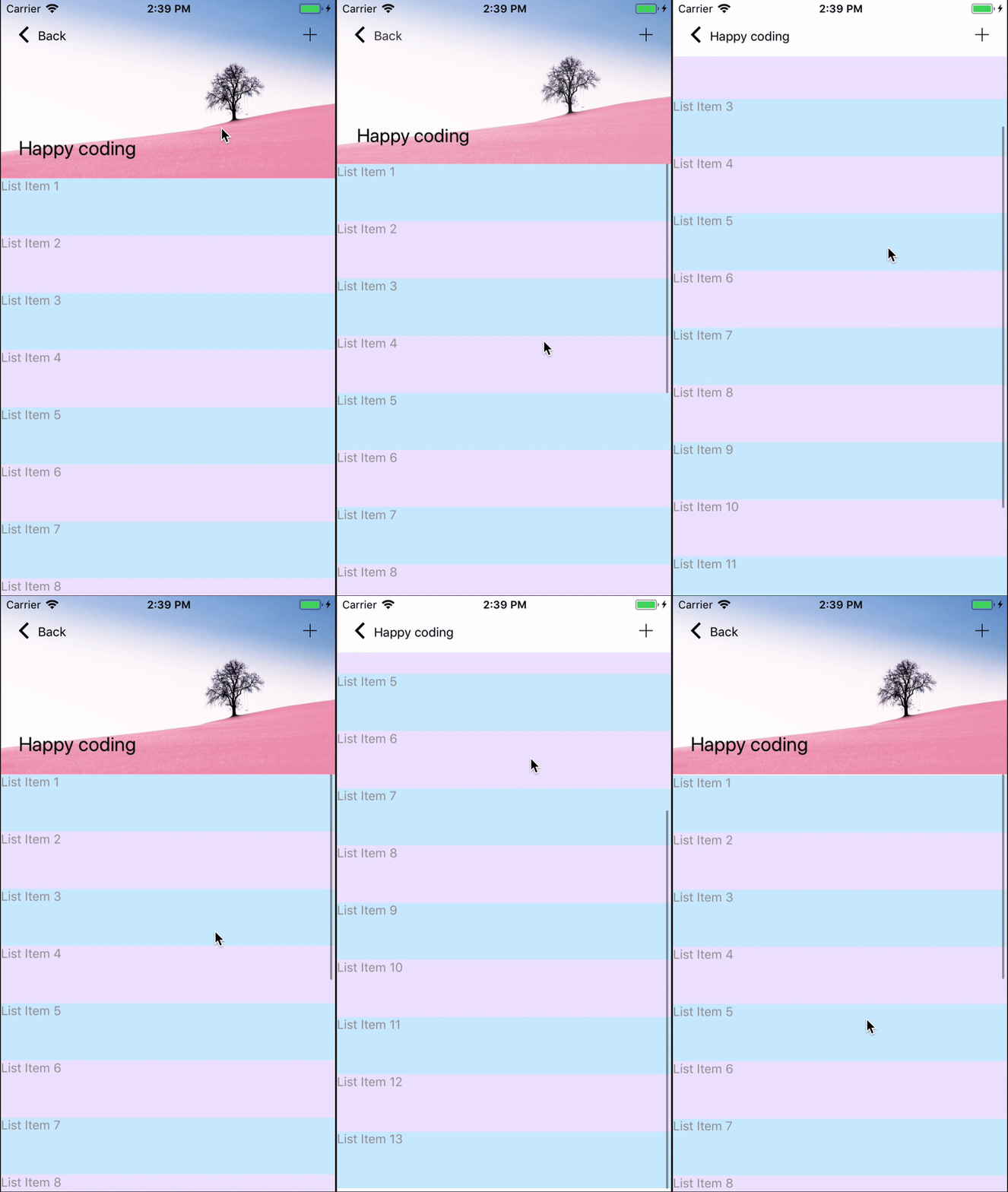
## Demo
Android
iOS
iPhone X
![iPhoneX]
(https://raw.githubusercontent.com/maphongba008/react-native-animated-header/master/demo/ipx.gif)
## Usage
```javascript
import React, { Component } from 'react';
import { Text, View, ScrollView } from 'react-native';
import { Icon } from 'native-base';
import AnimatedHeader from 'react-native-animated-header';
import Bg from './assets/bg.jpg';
getListItems = count => {
const items = [];
let i = 0;
while (i < count) {
i++;
items.push(
{`List Item ${i}`}
);
}
return items;
};
export default class App extends Component {
render() {
return (
()}
renderRight={() => ()}
backStyle={{ marginLeft: 10 }}
backTextStyle={{fontSize: 14, color: '#000'}}
titleStyle={{ fontSize: 22, left: 20, bottom: 20, color: '#000' }}
headerMaxHeight={200}
imageSource={Bg}
toolbarColor='#FFF'
disabled={false}
>
{getListItems(20)}
);
}
}
```
## Properties
name | description | type | isOptional | default
:---- |:----------- | :----| ---- | :-------
backText | Back text, leave it empty to hide | String | Yes | `undefined`
title | Header title | String | Yes | `undefined`
renderLeft | To render icon on the left | Function | Yes | `undefined`
renderRight | To render icon on the right | Function | Yes | `undefined`
backStyle | Style of back container | Object | Yes | { marginLeft: 10 }
backTextStyle | Style of back text | Object | Yes | { fontSize: 16 }
titleStyle | Style of title, use `left` and `bottom` for positioning the text | Object | Yes | { fontSize: 20, left: 40, bottom: 30 }
toolbarColor | Toolbar background color | String | Yes | `#FFF`
headerMaxHeight | Height of header when expanded | Number | Yes | `200`
disabled | Do not allow header to collapse | Boolean | Yes | `false`
noBorder | Hide header separator | Boolean | Yes | `false`
imageSource | Image background for header | Image | Yes | `undefined`
parallax | Use parallax effect | Boolean | Yes | `false`
## Warning
`AnimatedHeader` only accept 1 child, `ScrollView` or `FlatList`
## Copyright and License
MIT License
Copyright (c) 2018 maphongba008