React Mark Image
=========================
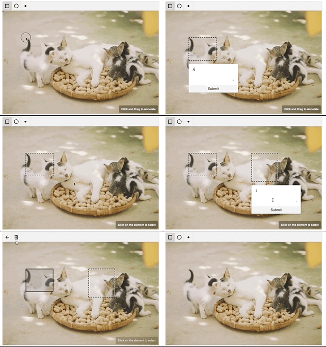 ## Installation
```
npm install --save react-mark-image
# or
yarn add react-mark-image
```
## Usage
```tsx
import React, { useState } from 'react';
import { Annotation, IAnnotation } from 'react-mark-image';
export default function Simple() {
const [annotations, setAnnotations] = useState([]);
return (
);
}
```
### Props
Prop | Description | Default
---- | ----------- | -------
`src` | Image src attribute |
`alt` | Image alt attribute |
`annotations` | Array of annotations |
`children` | Any react elements that needs to be added next to marked image|
`className` | class name that needs to be applied to the parent div|
`editorMode` | Can be one of AnnotateWithText, AnnotateOnly, ReadOnlyWithSelection or ReadOnly. When AnnotateWithText is used, annotation will need text which is rendered when the annotation is hovered. In ReadOnly new annotations cannot be added|
`idFunction` | Function to be used for creating ids of annotation objects|
`renderContent` | Function that renders `Content` | See [custom components](#using-custom-components)
`renderEditor` | Function that renders `Editor` Component | See [custom components](#using-custom-components)
`renderShape` | Function that renders `Shape` Component | See [custom components](#using-custom-components)
`renderOverlay` | Function that renders `Overlay` | See [custom components](#using-custom-components)
`selectors`| Array of selectors that should be available |
`allowedShapes`| Array of allowedShapes. |
`onAnnotationsUpdate` | callback handler whenever annotations are updated |
`onAnnotationClick` | `onClick` handler for annotation |
`onSelectedAnnotationUpdate` | `onSelectedAnnotationUpdate` handler for annotation when it's selected. This callback takes two arguments i.e. annotation and the selected indicator |
`overlayOptions` | Options for overlay.| See [Overlay options](#overlay-options) |
`style` | styles that need to the applied to the parent container|
`toolBarOptions` | Options for toolbar.| See [Toolbar options](#tool-bar-options) |
#### Annotation object
An Annotation object is an object that conforms to the object shape
```ts
interface AnnotationData extends Record {
text?: string;
id: string;
}
export interface IGeometry {
type: string;
x: number;
y: number;
height: number;
width: number;
}
export interface IAnnotation {
selection?: {
mode: string;
anchorX?: number | null;
anchorY?: number | null;
};
geometry: IGeometry;
data: AnnotationData;
}
```
## Using custom components
`Annotation` supports `renderProp`s for almost every internal component.
This allows you to customize everything about the the look of the annotation interface, and you can even use canvas elements for performance or more complex interaction models.
- `renderShape` - used for selecting annotation area (during annotation creation)
- `renderEditor` - appears after annotation area has been selected (during annotation creation)
- `renderComponent` - auxiliary component that appears when mouse is hovering over the highlight. It is passed an object that contains the annotation being hovered over. `{ annotation }`
- `renderOverlay` - Component overlay for Annotation (i.e. 'Click and Drag to Annotate')
You can view the default renderProps [here](src/components/defaultProps.js)
**Note**: You cannot use `:hover` selectors in css for components returned by `renderSelector` and `renderHighlight`. This is due to the fact that `Annotation` places DOM layers on top of these components, preventing triggering of `:hover`
## Overlay Options
Overlay options are of the format
```typescript
export interface OverlayOptions {
displayOverlay?: boolean;
overlayText?: string;
}
```
## Toolbar Options
Toolbar options are of the format
```typescript
export interface RenderSelectedAnnotationIconsProps {
annotation: IAnnotation;
unSelectAnnotation: () => void;
}
export interface ToolBarOptions {
showToolBar?: boolean;
showDeleteOption?: boolean;
renderToolbarIcons?: () => ReactElement | null;
renderSelectedAnnotationIcons?: (
props: RenderSelectedAnnotationIconsProps
) => ReactElement | null;
}
```
#### This is an Advanced Topic
The Annotation API allows support for custom shapes that use custom logic such as polygon or freehand selection. This is done by defining your own selection logic and passing it as a selector in the `selectors` property.
Selectors are objects that must have the following properties:
- `TYPE` - string that uniquely identifies this selector (i.e. `RECTANGLE`)
- `intersects` - method that returns true if the mouse point intersects with the annotation geometry
- `area` - method that calculates and returns the area of the annotation geometry
- `methods` - object that can contain various listener handlers (`onMouseUp`, `onMouseDown`, `onMouseMove`, `onClick`). These listener handlers are called when triggered in the annotation area. These handlers must be reducer-like methods - returning a new annotation object depending on the change of the method
You can view a defined `RectangleSelector` [here](src/hocs/RectangleSelector.js)
## License
MIT
# Contributing
We use TSDX to build this project.
## Commands
Build the project
```bash
npm start # or yarn start
```
This builds to `/dist` and runs the project in watch mode so any edits you save inside `src` causes a rebuild to `/dist`.
Then run either Storybook or the example playground:
### Storybook
Run inside another terminal:
```bash
yarn storybook
```
This loads the stories from `./stories`.
> NOTE: Stories should reference the components as if using the library, similar to the example playground. This means importing from the root project directory. This has been aliased in the tsconfig and the storybook webpack config as a helper.
### Example
Then run the example inside another:
```bash
cd example
npm i # or yarn to install dependencies
npm start # or yarn start
```
To do a one-off build, use `npm run build` or `yarn build`.
To run tests, use `npm test` or `yarn test`.
## Configuration
Code quality is set up for you with `prettier`, `husky`, and `lint-staged`. Adjust the respective fields in `package.json` accordingly.
### Jest
Jest tests are set up to run with `npm test` or `yarn test`.
### Bundle analysis
Calculates the real cost of your library using [size-limit](https://github.com/ai/size-limit) with `npm run size` and visulize it with `npm run analyze`.
## Deploying the Example Playground
The Playground is just a simple [Parcel](https://parceljs.org) app, you can deploy it anywhere you would normally deploy that. Here are some guidelines for **manually** deploying with the Netlify CLI (`npm i -g netlify-cli`):
```bash
cd example # if not already in the example folder
npm run build # builds to dist
netlify deploy # deploy the dist folder
```
Alternatively, if you already have a git repo connected, you can set up continuous deployment with Netlify:
```bash
netlify init
# build command: yarn build && cd example && yarn && yarn build
# directory to deploy: example/dist
# pick yes for netlify.toml
## Publishing to NPM
We recommend using [np](https://github.com/sindresorhus/np).
## Installation
```
npm install --save react-mark-image
# or
yarn add react-mark-image
```
## Usage
```tsx
import React, { useState } from 'react';
import { Annotation, IAnnotation } from 'react-mark-image';
export default function Simple() {
const [annotations, setAnnotations] = useState([]);
return (
);
}
```
### Props
Prop | Description | Default
---- | ----------- | -------
`src` | Image src attribute |
`alt` | Image alt attribute |
`annotations` | Array of annotations |
`children` | Any react elements that needs to be added next to marked image|
`className` | class name that needs to be applied to the parent div|
`editorMode` | Can be one of AnnotateWithText, AnnotateOnly, ReadOnlyWithSelection or ReadOnly. When AnnotateWithText is used, annotation will need text which is rendered when the annotation is hovered. In ReadOnly new annotations cannot be added|
`idFunction` | Function to be used for creating ids of annotation objects|
`renderContent` | Function that renders `Content` | See [custom components](#using-custom-components)
`renderEditor` | Function that renders `Editor` Component | See [custom components](#using-custom-components)
`renderShape` | Function that renders `Shape` Component | See [custom components](#using-custom-components)
`renderOverlay` | Function that renders `Overlay` | See [custom components](#using-custom-components)
`selectors`| Array of selectors that should be available |
`allowedShapes`| Array of allowedShapes. |
`onAnnotationsUpdate` | callback handler whenever annotations are updated |
`onAnnotationClick` | `onClick` handler for annotation |
`onSelectedAnnotationUpdate` | `onSelectedAnnotationUpdate` handler for annotation when it's selected. This callback takes two arguments i.e. annotation and the selected indicator |
`overlayOptions` | Options for overlay.| See [Overlay options](#overlay-options) |
`style` | styles that need to the applied to the parent container|
`toolBarOptions` | Options for toolbar.| See [Toolbar options](#tool-bar-options) |
#### Annotation object
An Annotation object is an object that conforms to the object shape
```ts
interface AnnotationData extends Record {
text?: string;
id: string;
}
export interface IGeometry {
type: string;
x: number;
y: number;
height: number;
width: number;
}
export interface IAnnotation {
selection?: {
mode: string;
anchorX?: number | null;
anchorY?: number | null;
};
geometry: IGeometry;
data: AnnotationData;
}
```
## Using custom components
`Annotation` supports `renderProp`s for almost every internal component.
This allows you to customize everything about the the look of the annotation interface, and you can even use canvas elements for performance or more complex interaction models.
- `renderShape` - used for selecting annotation area (during annotation creation)
- `renderEditor` - appears after annotation area has been selected (during annotation creation)
- `renderComponent` - auxiliary component that appears when mouse is hovering over the highlight. It is passed an object that contains the annotation being hovered over. `{ annotation }`
- `renderOverlay` - Component overlay for Annotation (i.e. 'Click and Drag to Annotate')
You can view the default renderProps [here](src/components/defaultProps.js)
**Note**: You cannot use `:hover` selectors in css for components returned by `renderSelector` and `renderHighlight`. This is due to the fact that `Annotation` places DOM layers on top of these components, preventing triggering of `:hover`
## Overlay Options
Overlay options are of the format
```typescript
export interface OverlayOptions {
displayOverlay?: boolean;
overlayText?: string;
}
```
## Toolbar Options
Toolbar options are of the format
```typescript
export interface RenderSelectedAnnotationIconsProps {
annotation: IAnnotation;
unSelectAnnotation: () => void;
}
export interface ToolBarOptions {
showToolBar?: boolean;
showDeleteOption?: boolean;
renderToolbarIcons?: () => ReactElement | null;
renderSelectedAnnotationIcons?: (
props: RenderSelectedAnnotationIconsProps
) => ReactElement | null;
}
```
#### This is an Advanced Topic
The Annotation API allows support for custom shapes that use custom logic such as polygon or freehand selection. This is done by defining your own selection logic and passing it as a selector in the `selectors` property.
Selectors are objects that must have the following properties:
- `TYPE` - string that uniquely identifies this selector (i.e. `RECTANGLE`)
- `intersects` - method that returns true if the mouse point intersects with the annotation geometry
- `area` - method that calculates and returns the area of the annotation geometry
- `methods` - object that can contain various listener handlers (`onMouseUp`, `onMouseDown`, `onMouseMove`, `onClick`). These listener handlers are called when triggered in the annotation area. These handlers must be reducer-like methods - returning a new annotation object depending on the change of the method
You can view a defined `RectangleSelector` [here](src/hocs/RectangleSelector.js)
## License
MIT
# Contributing
We use TSDX to build this project.
## Commands
Build the project
```bash
npm start # or yarn start
```
This builds to `/dist` and runs the project in watch mode so any edits you save inside `src` causes a rebuild to `/dist`.
Then run either Storybook or the example playground:
### Storybook
Run inside another terminal:
```bash
yarn storybook
```
This loads the stories from `./stories`.
> NOTE: Stories should reference the components as if using the library, similar to the example playground. This means importing from the root project directory. This has been aliased in the tsconfig and the storybook webpack config as a helper.
### Example
Then run the example inside another:
```bash
cd example
npm i # or yarn to install dependencies
npm start # or yarn start
```
To do a one-off build, use `npm run build` or `yarn build`.
To run tests, use `npm test` or `yarn test`.
## Configuration
Code quality is set up for you with `prettier`, `husky`, and `lint-staged`. Adjust the respective fields in `package.json` accordingly.
### Jest
Jest tests are set up to run with `npm test` or `yarn test`.
### Bundle analysis
Calculates the real cost of your library using [size-limit](https://github.com/ai/size-limit) with `npm run size` and visulize it with `npm run analyze`.
## Deploying the Example Playground
The Playground is just a simple [Parcel](https://parceljs.org) app, you can deploy it anywhere you would normally deploy that. Here are some guidelines for **manually** deploying with the Netlify CLI (`npm i -g netlify-cli`):
```bash
cd example # if not already in the example folder
npm run build # builds to dist
netlify deploy # deploy the dist folder
```
Alternatively, if you already have a git repo connected, you can set up continuous deployment with Netlify:
```bash
netlify init
# build command: yarn build && cd example && yarn && yarn build
# directory to deploy: example/dist
# pick yes for netlify.toml
## Publishing to NPM
We recommend using [np](https://github.com/sindresorhus/np).