# react-hover-slideshow
[![Downloads][downloads-image]][npm-url]
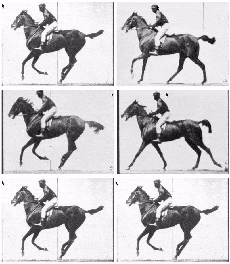
Iterates through an image slideshow based on cursor/touch position.
# Requirements
* Node 10 and higher
* React 16.8 and higher
# Live demo
See the [Storybook examples](https://davidcalhoun.github.io/react-hover-slideshow/index.html)
# Installation
`react-hover-slideshow` is distributed via [npm](https://www.npmjs.com/) which comes with [Node](https://nodejs.org/). To install it as a dependency of your project, simply navigate to your project directory and run:
* `npm i --save react-hover-slideshow`
# Peer dependencies
This module also depends on your project already having `react` and `prop-types` as peer dependencies. If you don't yet have those, you can add them as dependencies of your project with this:
* `npm i --save react prop-types`
* ⚠️Warning!⚠️ - this code uses [Hooks](https://reactjs.org/docs/hooks-intro.html) under the hood, which was introduced in React 16.8. This code will not work with older versions of React.
# Usage
The simplest way to use `react-hover-slideshow` is to use the `HoverSlideshow` component:
```js
import React from "react";
import { HoverSlideshow } from "react-hover-slideshow";
// As a function component
function MyFunctionComponent(props) {
const imageURLs = [
"https://example.com/1.jpg",
"https://example.com/2.jpg",
"https://example.com/3.jpg"
];
return (
My photo album
);
}
// Or as a class component
class MyClassComponent extends React.Component {
render() {
const imageURLs = [
"https://example.com/1.jpg",
"https://example.com/2.jpg",
"https://example.com/3.jpg"
];
return (
My photo album
);
}
}
```
Alternatively you can use `HoverSlideshowAnimated` with the same interface, which will give you a nice crossfade effect. Note that this animated variation depends on the peer dependency `react-transition-group`, which you can add you your project with the following:
* `npm i --save react-transition-group`
# Advanced usage with hooks
Behind the scenes, the helper components above use the hook `useHoverSlideshow`. If you wish for more control over the image component markup and CSS, I recommend making a copy of `/src/HoverSlideshow.js` and making this small change:
```diff
import React from "react";
import PropTypes from "prop-types";
-import useHoverSlideshow from "./useHoverSlideshow";
+import { useHoverSlideshow } from "react-hover-slideshow";
```
Then simply use that code as a baseline, and tweak what you like! Here's a quick guide of what's happening in the hook:
* `currentImage` - determined by figuring out the user's "cursor progress" over an element, then finding the closest match in the `images` array passed in. For instance, if `images` contains two image hrefs, the first image will display until the user's cursor passes over 50% of the element (where 50% is defined horizontally by default).
* `updateHoverSlideshow` - updates `currentImage` based on `mousemove` and `touchmove` events
* `resetHoverSlideshow` - should be called when the user is no longer interacting with the element (`mouseout` or `touchend`). Resets by displaying the first image in the array.
# Local development
1. Clone this repo: `git clone git@github.com:davidcalhoun/react-hover-slideshow.git`
1. Navigate to directory: `cd react-hover-slideshow`
1. Install dev dependencies: `npm i`
1. Check the `scripts` section in `package.json` for a list of available dev commands.
[downloads-image]: https://img.shields.io/npm/dm/react-hover-slideshow.svg?style=flat-square
[npm-url]: https://www.npmjs.com/package/react-hover-slideshow