
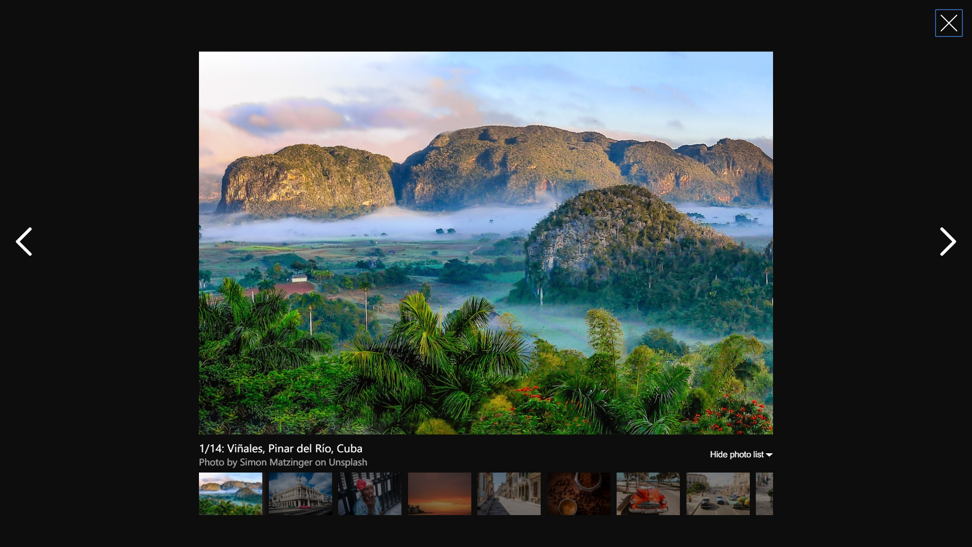
Friendly, customizable and accessible-ready simple photo gallery based on React, inspired by Airbnb.




---
## Install
```bash
npm install react-bnb-gallery
```
```bash
yarn add react-bnb-gallery
```
```bash
pnpm add react-bnb-gallery
```
Import styles once in your app entrypoint:
```ts
import 'react-bnb-gallery/dist/style.css';
```
## Usage
```tsx
import { useState } from 'react';
import { ReactBnbGallery } from 'react-bnb-gallery';
import 'react-bnb-gallery/dist/style.css';
const PHOTOS = [
{
photo: 'https://example.com/photo1.jpg',
thumbnail: 'https://example.com/photo1-thumb.jpg',
alt: 'Sunset over mountain ridge',
thumbnailAlt: 'Small preview of mountain sunset',
caption: 'Photo 1',
subcaption: 'Author name or location',
},
{
photo: 'https://example.com/photo2.jpg',
thumbnail: 'https://example.com/photo2-thumb.jpg',
caption: (
Photo 2 by Author
),
subcaption: Taken at sunset,
},
];
export default function App() {
const [open, setOpen] = useState(false);
return (
<>
setOpen(false)}
/>
);
}
```
## Styling Tokens
The distributed stylesheet uses semantic CSS custom properties (shadcn-style token contract). The gallery reads these tokens directly, so you can fully theme it from CSS:
- `--rbg-radius`
- `--rbg-foreground`
- `--rbg-foreground-subtle`
- `--rbg-foreground-muted`
- `--rbg-overlay`
- `--rbg-icon`
- `--rbg-spinner-track`
- `--rbg-spinner-head`
- `--rbg-photo-shadow`
- `--rbg-z-modal`
You can override tokens anywhere above the gallery in your cascade:
```css
:root {
--rbg-radius: 0.5rem;
--rbg-foreground: #f8fafc;
--rbg-foreground-subtle: rgba(248, 250, 252, 0.82);
--rbg-foreground-muted: rgba(248, 250, 252, 0.72);
--rbg-overlay: rgb(8, 10, 14);
--rbg-icon: var(--rbg-foreground);
--rbg-spinner-track: rgba(248, 250, 252, 0.2);
--rbg-spinner-head: var(--rbg-foreground);
--rbg-photo-shadow: 0 0.6rem 1rem rgba(0, 0, 0, 0.45);
}
```
Default light-mode token overrides are applied via `.mode-light` (or `.rbg-light`).
## CSS Architecture
- Namespace: all public classes are prefixed with `gallery-` to avoid collisions.
- States: component state classes use `is-*` (`is-open`, `is-collapsed`, `is-active`).
- Legacy state aliases (`hide`, `open`, `active`) are still emitted for backward compatibility in `2.x`.
- Deprecated state aliases (removed next major):
- `loading` → `is-loading`
- `hide` → `is-thumbnails-collapsed` (figcaption state) or `is-open` (toggle state)
- `open` → `is-collapsed`
- `active` → `is-active`
- Selector strategy: prefer direct element hooks (`gallery-photo-button`, `gallery-thumbnail-image`) instead of deep descendant selectors.
- Theming contract: use `--rbg-*` tokens as the stable customization surface.
### Stable CSS Hooks
Prefer these class hooks in custom CSS and tests:
- `gallery-modal`
- `gallery-overlay`
- `gallery-main`
- `gallery-photo-image`
- `gallery-photo-button`
- `gallery-thumbnails-list`
- `gallery-thumbnail-item`
- `gallery-thumbnail-button`
- `gallery-thumbnail-image`
- `gallery-control-icon`
- `gallery-close-icon`
## Exports
- `ReactBnbGallery` (recommended)
- `Gallery`
- Types: `ReactBnbGalleryProps`, `GalleryPhoto`, `GalleryPhrases`, `GalleryController`
> `default` export is deprecated in `2.x` and will be removed in the next major version.
## Props
### ``
| Prop | Type | Default | Description |
|---|---|---|---|
| `activePhotoIndex` | `number` | `0` | Index of the photo shown on open. |
| `activePhotoPressed` | `() => void` | `undefined` | Callback fired when the active photo is clicked. |
| `backgroundColor` | `string` | `undefined` | Deprecated in `2.x` (still works as compatibility alias) and planned for removal in next major. Prefer CSS token `--rbg-overlay`. |
| `direction` | `string` | `'forwards'` | Deprecated in `2.x`; planned for removal in next major. |
| `keyboard` | `boolean` | `true` | Enable keyboard navigation (arrow keys, Escape). |
| `leftKeyPressed` | `() => void` | `undefined` | Callback fired when the left arrow key is pressed. |
| `light` | `boolean` | `false` | Enables light mode styles for controls. |
| `nextButtonPressed` | `() => void` | `undefined` | Callback fired when the next button is pressed. |
| `onClose` | `() => void` | `undefined` | Callback fired when the gallery is closed. |
| `opacity` | `number` | `1` | Background overlay opacity (0-1). |
| `photos` | `string \| GalleryPhoto \| Array` | `[]` | Photos to render. Non-array input is deprecated in `2.x`. |
| `phrases` | `GalleryPhrases` | `defaultPhrases` | Custom labels for UI strings. |
| `preloadSize` | `number` | `5` | Number of adjacent photos to preload. |
| `prevButtonPressed` | `() => void` | `undefined` | Callback fired when the previous button is pressed. |
| `rightKeyPressed` | `() => void` | `undefined` | Callback fired when the right arrow key is pressed. |
| `show` | `boolean` | `false` | Controls whether the gallery modal is visible. |
| `showThumbnails` | `boolean` | `true` | Show the thumbnail strip. |
| `wrap` | `boolean` | `false` | Wrap continuously through photos. |
| `zIndex` | `number` | `2000` | CSS `z-index` for the modal overlay. |
### `GalleryPhoto`
| Field | Type | Description |
|---|---|---|
| `photo` | `string` | URL of the full-size image. |
| `thumbnail` | `string` | URL of the thumbnail image. |
| `alt` | `string` | Alt text for the full-size image. Falls back to `caption` when omitted. |
| `thumbnailAlt` | `string` | Alt text for the thumbnail image. Falls back to `alt`, then `caption`. |
| `caption` | `ReactNode` | Primary caption shown below the photo. |
| `subcaption` | `ReactNode` | Secondary caption (author/location, etc.). |
| `number` | `number` | Override the displayed photo number. |
## Compatibility
- `react` + `react-dom`: `^18 || ^19`
- Runtime validation via `propTypes` was removed in `2.1.x`; TypeScript declarations are the source of truth.
## Live Demo
Docs and demo: [https://peterpalau.github.io/react-bnb-gallery/](https://peterpalau.github.io/react-bnb-gallery/)
Run locally:
```bash
pnpm docs:dev
```
## Development
```bash
pnpm install
pnpm lint
pnpm test
pnpm build
```
## Migration Notes
### `2.0.0`
- Upgrade to `react` + `react-dom` `^18 || ^19`.
- React 17 and older are no longer supported.
### `2.1.x`
- Runtime `propTypes` and `airbnb-prop-types` validation were removed.
- Added `GalleryPhoto.alt` and `GalleryPhoto.thumbnailAlt` with backward-compatible fallback to `caption`.
- Added `GalleryPhoto.caption` and `GalleryPhoto.subcaption` support for `ReactNode` content.
- Deprecated (planned removal next major):
- non-array `photos` input
- `direction` prop
### `2.2.x` (planned)
- Tailwind/token-driven stylesheet architecture is now the default.
- Introduced `--rbg-*` CSS tokens as the primary customization API.
- Added explicit `gallery-*` element hooks and `is-*` state classes for safer styling overrides.
- Continued 2.x deprecation path with runtime warnings/docs for APIs planned to be removed in `3.0.0`.
## Deprecation Tracker (`2.x` -> `3.0.0`)
| Deprecated in `2.x` | Status in `2.x` | Planned `3.0.0` action | Replacement |
|---|---|---|---|
| `default` export | Works with deprecation notice in docs | Remove | Named export: `ReactBnbGallery` |
| `backgroundColor` prop | Backward-compatible alias for overlay color; warns in dev when used | Remove | CSS token: `--rbg-overlay` |
| `direction` prop | Deprecated (backward compatible) | Remove | Use default navigation direction |
| Non-array `photos` input | Deprecated (backward compatible) | Remove | Always pass `Array` |
| Legacy state classes (`loading`, `hide`, `open`, `active`) | Still emitted for compatibility | Remove aliases | `is-loading`, `is-thumbnails-collapsed`/`is-open`, `is-collapsed`, `is-active` |
### `3.0.0` Prep Checklist
- Replace default import with named import:
- `import { ReactBnbGallery } from 'react-bnb-gallery'`
- Migrate `backgroundColor` prop usage to CSS token `--rbg-overlay`.
- Replace deprecated class selectors with `gallery-*` hooks and `is-*` states.
- Ensure `photos` is always passed as an array.
- Remove any usage of the `direction` prop.
## Roadmap
- v3 roadmap: [docs/release/V3_ROADMAP.md](docs/release/V3_ROADMAP.md)
- release workflow checklist: [docs/release/RELEASE_WORKFLOW_CHECKLIST.md](docs/release/RELEASE_WORKFLOW_CHECKLIST.md)
## License
MIT: [LICENSE](https://raw.githubusercontent.com/peterpalau/react-bnb-gallery/master/LICENSE)
## Changelog
See [CHANGELOG.md](https://github.com/peterpalau/react-bnb-gallery/blob/master/CHANGELOG.md).
## Contributing
Read [CONTRIBUTING.md](https://github.com/peterpalau/react-bnb-gallery/blob/master/CONTRIBUTING.md) before opening a pull request.
