# react-animate-components-ts

Fill your simply looking webistes with awesome animations with react-animate-components-ts 🚀
Easy to use animation component library where you can find tons of animation components in the upcoming versions of this package for now we introduced some incredible animation components or wrappers that animate components of your page smoothly with an eye caching transitions!

<div align="center">
 <h1> React Animations Components</h1>
</div>

<div align="center">
   <a href="https://axios-http.com"><img width=200 src="https://miro.medium.com/v2/resize:fit:971/1*iI2L2ZNAL51tBpM-gzzGRw.png" /></a><br>
</div>
<p align="center">Turn your websites into beutifully looking ones</p>

<h1>Installation</h1>

_npm_

```js
npm install react-animate-components-ts
```

_yarn_

```js
yarn add react-animate-components-ts
```

<br>

<hr/>
<br>

<h1>Documentation</h1>

The library comes with two unique category based animation components:

- Auto/Inview based animation components
- Scroll based animation components

<h3>Lets get jump into first 👇</h3>

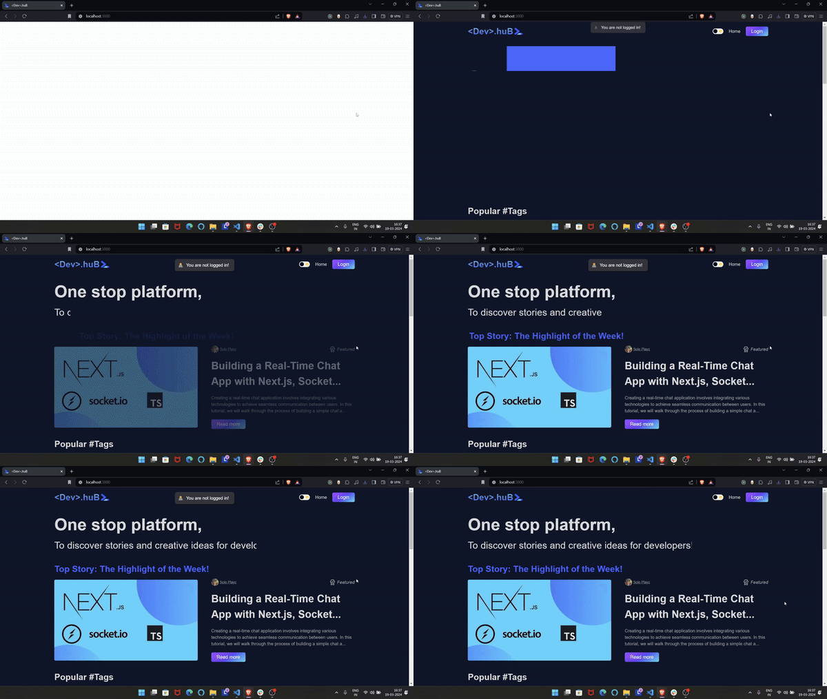
<h1>Auto/Inview based animation components Usage</h1>

`App.jsx`

```tsx
import { Fill, Reveal, SlideIn, FadeIn } from "react-animate-components-ts";

const App = () => {
 // not the entrire code this exmaple only shows the animation added to the text or comoponent which are wrapped with the components that comes from react-animate-components-ts package imported above!
 return (
      <Reveal overlayBg={"var(--main-color)"} delay={0.5}>
        <b>One stop&nbsp;platform,</b>
      </Reveal>
      <Fill delay={1} overlayBg={"var(--bg)"}>
        <p>To discover stories and creative ideas for developers!</p>
      </Fill>
      <SlideIn from="right" right={100} type="tween" duration={1} delay={1.2}>
        <h1 className={styles.featuredHeading}>
          Top Story: The Highlight of the Week!
        </h1>
      </SlideIn>
      <FadeIn delay={1}>
        <HeroPostCard/>
      <FadeIn/>
   )
};

```

<h1>Result</h1>

<div align="center">
 <img src="https://dev-hub-nextjs-app.vercel.app/_next/image?url=http%3A%2F%2Fres.cloudinary.com%2Fdvzjzf36i%2Fimage%2Fupload%2Fv1710846751%2Fudvqurjyldoatbbza3nm.gif&w=1920&q=75"/>
</div>
<br>
<br>
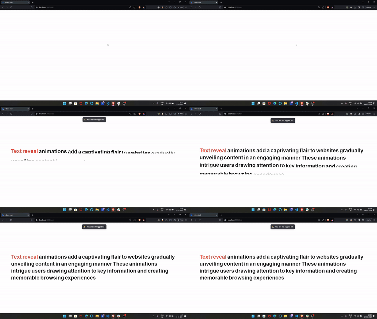
<h1>Special TextReveal component</h1>

```jsx
import React from "react";
import styles from "./page.module.css";
import { TextReveal } from "react-animate-components-ts";
const words = [
  "<span style='color:#ff3f3f'>Text</span>",
  "<span style='color:#ff3f3f'>reveal</span>",
  "animations",
  "add",
  "a",
  "captivating",
  "flair",
  "to",
  "websites",
  "gradually",
  "unveiling",
  "content",
  "in",
  "an",
  "engaging",
  "manner",
  "These",
  "animations",
  "intrigue",
  "users",
  "drawing",
  "attention",
  "to",
  "key",
  "information",
  "and",
  "creating",
  "memorable",
  "browsing",
  "experiences",
];

const page = () => {
  return (
    <div className={styles.page}>
      <h1 style={{ fontSize: "3rem" }}>
        <TextReveal delay={0} words={words} />
      </h1>
    </div>
  );
};

export default page;
```

<div align="center">
 <img src="https://dev-hub-nextjs-app.vercel.app/_next/image?url=http%3A%2F%2Fres.cloudinary.com%2Fdvzjzf36i%2Fimage%2Fupload%2Fv1710846789%2Fyfuwjn4jfmb3xyvgc6f1.gif&w=1920&q=75"/>
</div>

## Listed are the Auto/Inview based animation components

`<FadeIn/>`
`<Pop/>`
`<TextReveal/>`
`<Fill/>`
`<Reveal/>`
`<SlideIn/>`

<hr/>

<h1>All Props</h1>

```ts
  children: React.ReactNode;
  overlayBg: string;
  revealInView?: true | false;
  animateOnce?: true | false;
  delay?: number;
  duration?: number;
  animateFrom?: true | false;
  from: string;
  left: number;
  right: number;
  type: string;
  origin: string;
  iPop:number;
```

<h1>Props defination</h1>

<code style="color : fuchsia">?</code> **indicates not required or optional property**

1. **`children`**: Your component to animate should wrapped around react-animate-components-ts

2. **`overlayBg`**: background color for <code style="color : cyan">Fill</code> & <code style="color : cyan">Reveal</code> components

   - <code style="color : cyan">Fill</code>: overlayBg or background-color should match the background of the parent component to get the fill animation effect

   - <code style="color : cyan">Reveal</code>: overlayBg or background-color should not match the background of the parent component to see the reveal animation effect

3. **`revealInView`** <code style="color : fuchsia">?</code>: By providing true to this prop indicates animation should starts when only the component visible in the view and for false animation will takes places regardless of the component visibility in the viewport - default value is set to `true`

4. **`animateOnce`** <code style="color : fuchsia">?</code>: This property controls when the animation should occasionally trigger when set to true the component will animate everytime when it comes into viewport and if false the component will animate once when it is being first time visible in viewport **Note** this prop is only acceptable when `revealInView` prop is set to **true**

5. **`duration`** <code style="color : fuchsia">?</code>: Duration of animation in number will be count in seconds

6. **`delay`** <code style="color : fuchsia">?</code>: Delay for the animation in number starts will be count in seconds

7. **`animateFrom`** <code style="color : fuchsia">?</code> : Special prop for <code style="color : cyan">Fill</code> component which controls the direction from where the the component should start fill animation accepts only 2 values: **"left"** or **"right"** and default is set to **"left"** fill animation will begin from **"left"** direction

8. **`from`**: Special prop for <code style="color : cyan">SlideIn</code> component initiate slide animation either from **"left"** or **"right"** from the below two props one of the prop is <code style="color : red">required\*</code> when from value is given!

   - `left` <code style="color : lightskyblue">when from = "left"</code> : Initial position of component from left value should a **positive number**

   - `right` <code style="color : lightskyblue">when from = "right"</code> : Initial position of component from right value should a **positive number**

9. **`type`**: Special prop for <code style="color : cyan">SlideIn</code> component accepts any one value from the below ones!

   - `tween`: Gaves fade effect while sliding in

   - `spring`: Gaves stretchy/springy animation effect while sliding in

10. **`origin`** <code style="color : fuchsia">?</code>: Special prop for <code style="color : cyan">Pop</code> component to set the origin of Pop animation!

    - ```ts
      Predifined values: "center" | "bottom" | "top" | "left" | "right" | "bottom left" | "bottom right" | "top left" | "top right" | `${number} ${number}`;
      ```
    - where `${number} ${number}`: sepcifies customs values you can pass to set the origin of the element that will animate or pop For Eg: `0% 50%`

    - When you pass a custom value like `0% 50%` to origin prop, it means you are specifying the X and Y co-ordinates of the origin point relative to the width and height of the element

11. **`delayPerWord`** <code style="color : fuchsia">?</code>: Special prop for <code style="color : cyan">TextReveal</code> component to delay of each word of type `number` that are passed as props

12. **`iPop`** <code style="color : fuchsia">?</code> : Special prop for <code style="color : cyan">Pop</code> component, Specifies Initial Pop (how much the component initially scale down or low in size) value of the component excepted values ranges between `0` <b> - </b> `1`

<br>

<h3>Lets now take a look into 👇</h3>

<h1>Scroll based animation components Usage</h1>

For now we introduced 3 basic scroll components:

- `<Grow/>`
- `<Skate/>`
- `<ProgressBar/>`

## Example with <b>`<Grow/>`</b> component

`App.jsx`

```jsx
import { Grow } from "react-animate-components-ts";

<div className={styles.posts}>
  {posts?.map((post, i) => {
    return (
      <Grow origin="top left" iGrow={0.7}>
        {" "}
        // iGrow(0.7) = Shirk 70% initially and then grow to 100%
        <BlogCard post={post} key={post._id} />
      </Grow>
    );
  })}
</div>;
```

<h1>Result</h1>

<b>Noticed Something 👀</b>

<div align="center">
 <img src="https://dev-hub-nextjs-app.vercel.app/_next/image?url=http%3A%2F%2Fres.cloudinary.com%2Fdvzjzf36i%2Fimage%2Fupload%2Fv1710866297%2Fuoju8qbpyrfa6fyovmhj.gif&w=1920&q=75"/>
</div>

</br>

## Example with <b>`<Skate/>`</b> component!

`App.jsx`

```jsx
import { Skate } from "react-animate-components-ts";

<div className={styles.posts}>
  {posts?.map((post, i) => {
    return (
      <Skate iSkate={100 * Math.pow(-1, i + 1)}>
        <BlogCard post={post} key={post._id} />
      </Skate>
    );
  })}
</div>;

// Note:

// here iSkate value is provided 100 but it is multipled by (-1) to the power (i + 1) which results in alternate negative/positive values due to which each component adjusted itself by 100px & -100px initialy from x-axixs alternately!
```

<h1>Result</h1>

<b>Again 👀</b>

<div align="center">
 <img src="https://dev-hub-nextjs-app.vercel.app/_next/image?url=http%3A%2F%2Fres.cloudinary.com%2Fdvzjzf36i%2Fimage%2Fupload%2Fv1710866208%2Fksubpxluauv5ghtaaib1.gif&w=1920&q=75"/>
</div>

<h1>All props</h1>

```ts
 children: React.ReactNode;
  iFade?: number;
  duration?: number;
  iGrow?:number;
  iSkate?:number;
  start?: number;
  end?: number;
  origin?:string;
```

<h1>Props defination</h1>

<code style="color : fuchsia">?</code> **indicates not required or optional property**

1. **`children`**: Your component to animate should wrapped around the animation components that comes straight from react-animate-components-ts

2. **`iFade`**: Initial opacity of the component excepted values ranges between `0` <b> - </b> `1`

3. **`iGrow`** <code style="color : fuchsia">?</code> : Special prop for <code style="color : cyan">Grow</code> component, Specifies Initial grow/shrink value of the component excepted values ranges between `0` <b> - </b> `1`

4. **`iSkate`** <code style="color : fuchsia">?</code> : Special prop for <code style="color : cyan">Skate</code> component, Specifies Initial x position of the component value can any number between `-Infinity` <b> - </b> `Infinity` depending on at what position do you want to start skating on `x-axis`

5. **`start`** <code style="color : fuchsia">?</code>: Value that specifies the percentage at which the animation should begin when the component becomes exposed or visible in the view. For example, if the start is set to `0.2`, it means the animation will begin transitioning when it is `20%` visible on the screen while scrolling. Its default value is `0.1`, indicating that the animation starts when the component is `10%` visible on the screen.

6. **`end`** <code style="color : fuchsia">?</code>: Specifies the percentage of the component visibility at which the animation should end

   - Note: `start` value should be less <b><</b> then `end` value!

7. **`origin`** <code style="color : fuchsia">?</code>: Special prop for <code style="color : cyan">Grow</code> component specifies the origin from which the component should begin to grow!

   - ````ts
          Predifined values: "center" | "bottom" | "top" | "left" | "right" | "bottom left" | "bottom right" | "top left" | "top right" | `${number} ${number}`;
          ```
     <br>
     ````

**Introduced a customizable scroll based component `<ProgressBar/>` which shows the scroll progress of your page**

**Just go & add the component into your root layout**

`<ProgressBar/>`

```jsx
import React from "react";
import { ProgressBar } from "react-animate-components-ts";

const App = () => {
  return (
    <div>
      {/* Your app component code goes here */}
      <ProgressBar bg="cyan" h={10} origin="left" position="top" />
    </div>
  );
};

export default App;
```

## Props

| parameter    | type    | description                                                                                       | optional |
| ------------ | ------- | ------------------------------------------------------------------------------------------------- | -------- |
| `bg`         | string  | background-color of progress bar                                                                  | false    |
| `h`          | number  | height in `px`                                                                                    | false    |
| `origin`     | string  | from which posiiton the progress begins default is **left**                                       | true     |
| `position`   | string  | position of your progress bar default is **top** other one is **bottom**                          | true     |
| `top`        | number  | value of progressBar from top in **px** if position value is given to **top**. default is 0       | true     |
| `bottom`     | number  | value of progressBar from bottom in **px** if position value is given to **bottom**. default is 0 | true     |
| `showTrack`  | boolean | toggle progressbar track visibility                                                               | true     |
| `trackColor` | string  | trackcolor default = `#f0f2f6`                                                                    | true     |

<br/>

_**updated versions will be published soon...**_

## Happy hacking

## 🚀 Follow author

[![github](https://img.shields.io/badge/github-000?style=for-the-badge&logo=github&logoColor=white)](https://github.com/SoloProgrammer/)
[![linkedin](https://img.shields.io/badge/linkedin-0A66C2?style=for-the-badge&logo=linkedin&logoColor=white)](https://www.linkedin.com/in/pratham-shinde-698a4b240/)
[![twitter](https://img.shields.io/badge/twitter-1DA1F2?style=for-the-badge&logo=twitter&logoColor=white)](https://twitter.com/dev_pratham_0g)