# Prizmux
A developer-first React Native component system.
[](https://www.npmjs.com/package/prizmux)
[](https://www.npmjs.com/package/prizmux)
[](https://www.jsdelivr.com/package/npm/prizmux)
[](https://www.npmjs.com/package/prizmux)
[](https://github.com/contecfy/prizmux)
> You should control your UI — not your UI library.
Prizmux gives you production-ready UI primitives with no bloated dependencies, no locked abstractions, and no fighting the framework. Optimized for smooth animations, precise centering, and theme-agnostic customization. Just clean components you can copy, modify, and ship.
📖 **Full documentation at [prizmux.vercel.app](https://prizmux.vercel.app)**
---
## Install
```bash
npm install prizmux
```
---
## Components
| Component | Description |
| -------------- | ------------------------------------------------------------------------------------- |
| `Alert` | Customizable modal alert — bring your own buttons |
| `BottomSheet` | Swipeable sheet with drag handle and backdrop dismiss |
| `Button` | Variants, sizes, loading state, icon support (your own icons), with touch feedback |
| `Card` | Composable container, put anything inside |
| `EmptyState` | Placeholder UI for empty lists and zero-data screens |
| `FAB` | Floating action button with icon, label, or both |
| `Header` | Navigation header with or without a back button, avatar, and action icons with badges |
| `ImagePreview` | Full screen image viewer with gallery support |
| `PhoneInput` | International phone input with searchable country picker and auto-detection |
| `ContextMenu` | Collapsible navigation panel with customizable items, icons, and active states |
| `Toast` | Auto, manual, and swipe-to-dismiss notifications |
---
## Component Preview
Visual previews of Prizmux components in action. Click on any preview to see it in high resolution.
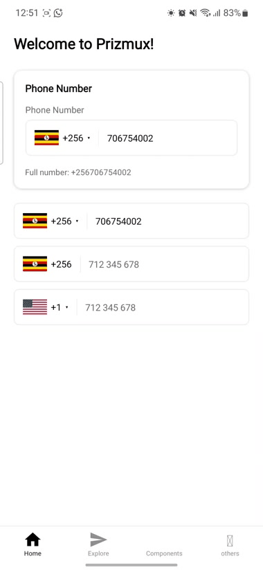
### 📱 Phone Input
International phone input with searchable country picker, dial-code auto-detection, and premium translucent selection styling.
---
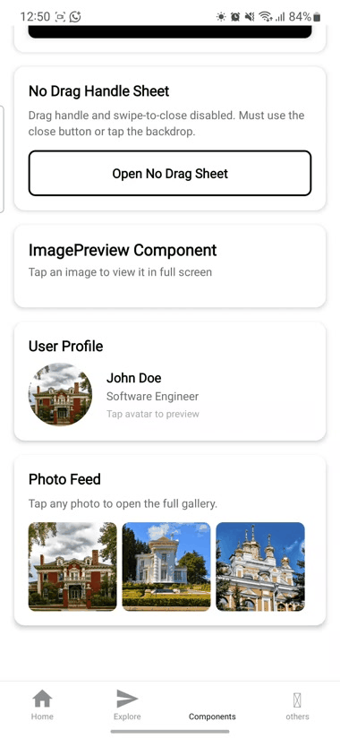
### 🖼️ Image Preview
High-performance gallery viewer with smooth pinch-to-zoom, swipe gestures, and pagination.
---
## Design Decisions
- **No icon library required** — every component that needs an icon accepts `ReactNode`.
- **No navigation dependency** — `HeaderWithBack` requires you to pass `onBackPress`.
- **No image library required** — image slots accept `ReactNode`.
- **No flag library required** — `PhoneInput` accepts a `renderFlag` prop with a built-in ISO code fallback.
- **Fully typed** — every component ships with a `.types.ts` file.
---
## Contact
Have questions, suggestions, or just want to say hi? Reach out via email:
📧 contecfy@gmail.com
## License
MIT