# postcss-bud
 一款 PostCSS 插件,用于保持视图横竖居中于屏幕。您可以[查看在线范例](https://wswmsword.github.io/examples/bud/react)以了解使用效果。
## 安装
npm 安装:
```bash
npm install --save-dev postcss postcss-bud
```
yarn 安装:
```bash
yarn add -D postcss postcss-bud
```
一款 PostCSS 插件,用于保持视图横竖居中于屏幕。您可以[查看在线范例](https://wswmsword.github.io/examples/bud/react)以了解使用效果。
## 安装
npm 安装:
```bash
npm install --save-dev postcss postcss-bud
```
yarn 安装:
```bash
yarn add -D postcss postcss-bud
```
安装之后在 postcss.config.js 配置文件中引入,或者其它框架配置文件中引入。
```javascript
import dataScreen from 'postcss-bud' // <---- 这里
import autoprefixer from 'autoprefixer'
// 省略……
{
postcss: {
plugins: [
autoprefixer(),
dataScreen({ // <---- 这里
rootSelector: '#app',
viewport: {
width: 1920,
height: 1080,
},
}),
],
},
}
// 省略……
```
## 演示效果
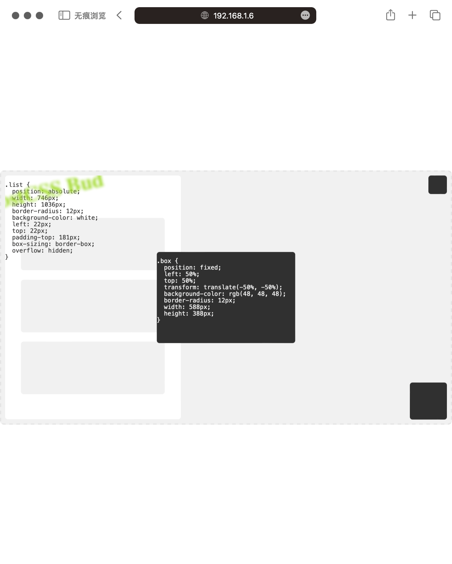
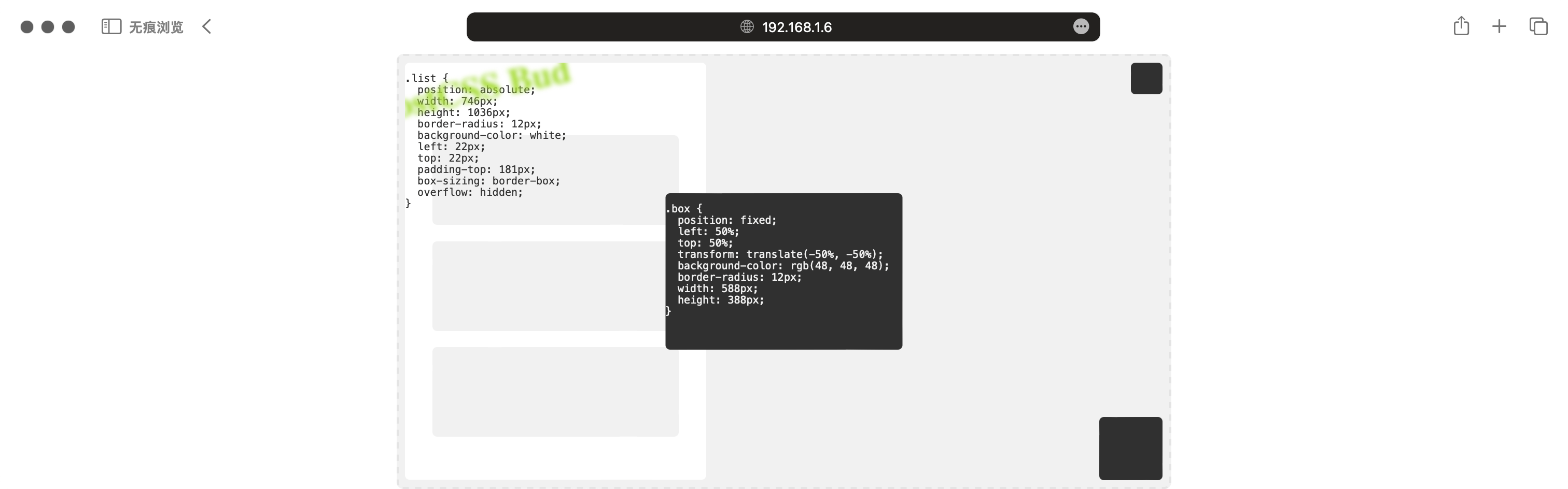
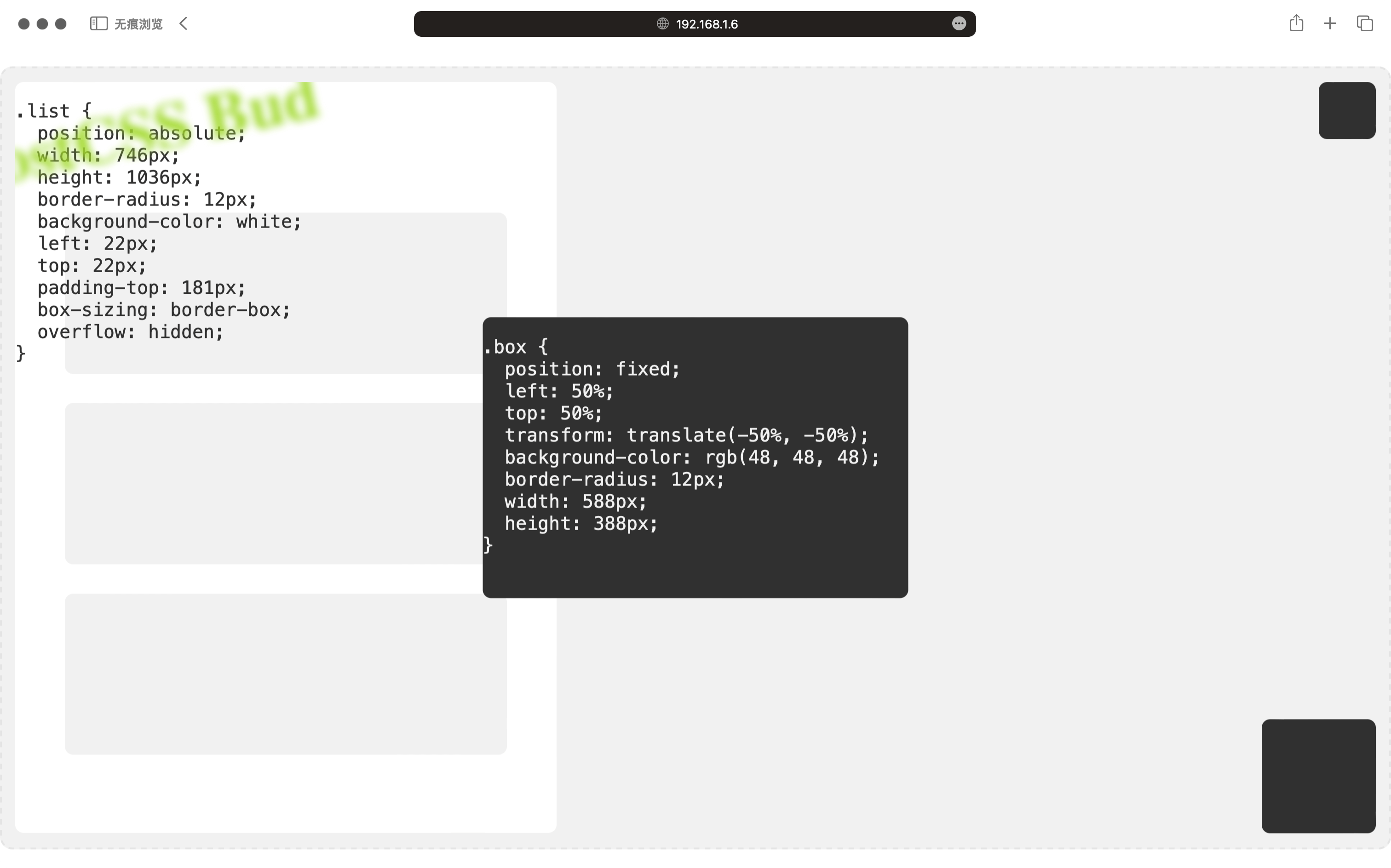
下面的图片展示了使用本插件后,左右半屏,上下半屏,以及全屏下,视图始终居中的效果:
查看动图,动图展示了拖拽窗口,视图始终居中的效果。
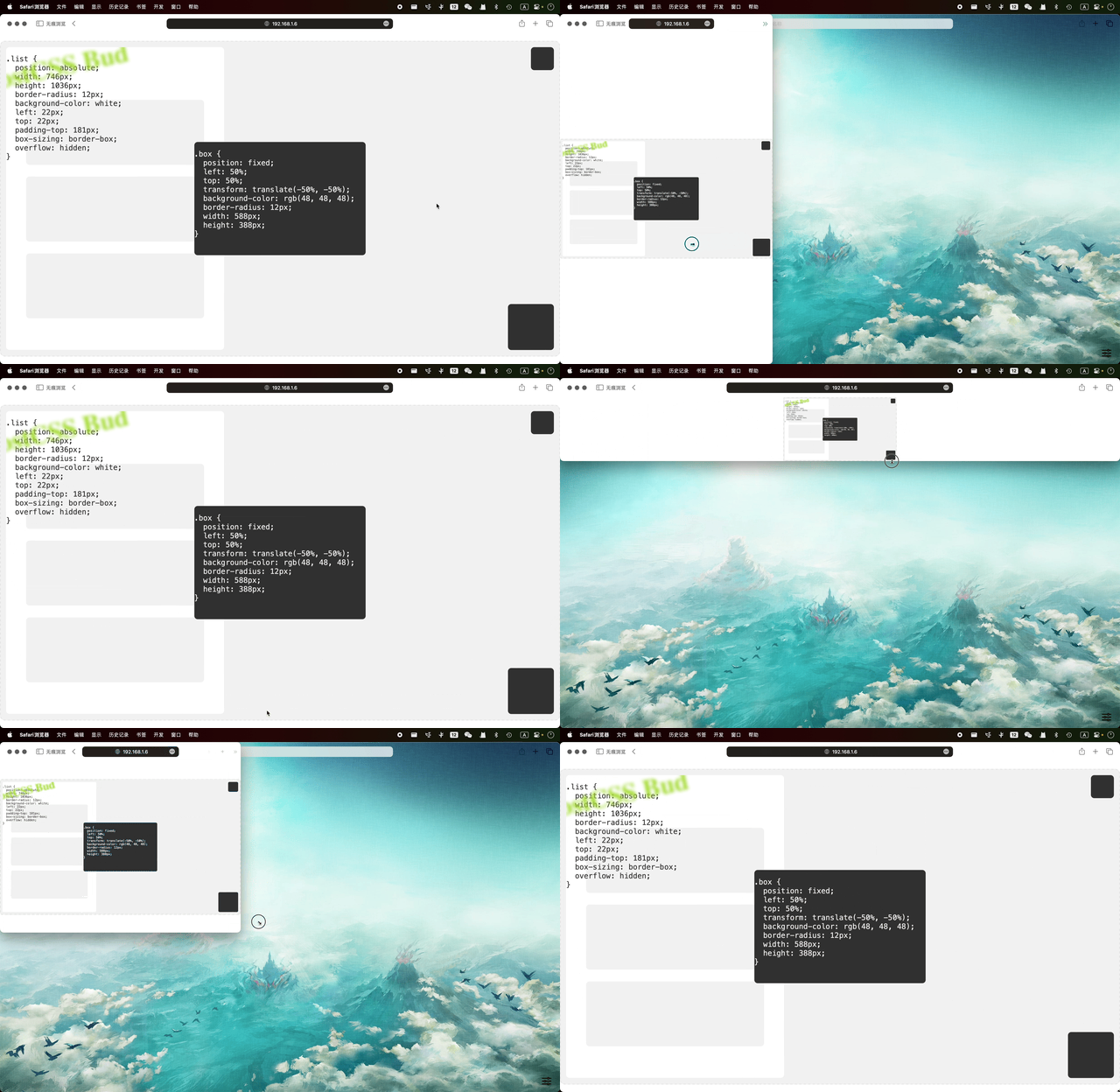
在“范例”一节查看,源码中提供了范例,用于在本地运行后验证演示效果,或者您也可以查看文档开头的在线范例。
## 配置参数
| Name | Type | isRequired | Default | Desc |
|:--|:--|:--|:--|:--|
| viewport | number\|(file: string, selector: string) => { width: number; height: number; } | N | 750 | 设计图宽度,可以传递函数动态生成设计图宽度,例如 `file => file.includes("vant") ? { width: 777, height: 888, } : { width: 1920, height: 1080, }` 表示在名称包含“vant”的文件内使用 777*888 的设计图尺寸 |
| viewport.width | number | N | 1920 | 设计图宽度 |
| viewport.height | number | N | 1920 | 设计图宽度 |
| rootSelector | string | N | null | 根元素选择器,如果指定,则将制定选择器居中 |
| unitPrecision | number | N | 3 | 精确到小数点后几位? |
| comment.vars | string | N | null | 自定义注释,定义全局变量的注释名称,如果未指定,将判断是否设置根元素选择器,如果设置,全局变量定义在根选择器处,如果未设置,将定义在每个 css 文件开头|
| comment.ignorePrev | string | N | null | 自定义注释,标记则不对当前行进行转换 |
| exclude | RegExp\|RegExp[] | N | null | 排除文件或文件夹,哪些文件不需要转换? |
| include | RegExp\|RegExp[] | N | null | 包括文件或文件夹,哪些文件需要转换? |
下面是默认的配置参数:
```json
{
"viewport": {
"width": 1920,
"height": 1080,
},
"rootSelector": null,
"unitPrecision": 3,
"comment": {
"vars": null,
"ignorePrev": null,
},
"include": null,
"exclude": null
}
```
## 单元测试
```bash
npm install
npm run test
```
## 范例
文件夹 `example` 内提供了分别在 [React](https://reactjs.org/) 中使用 `postcss-bud` 的范例,通过命令行进入对应的范例文件夹中,即可运行:
```bash
cd example/react/
npm install
npm run start
```
在“演示效果”一节中查看成功运行之后,不同屏幕尺寸的图片。
## 原理和输入输出
视图宽度:`min(calc(100vh * viewportWidth / viewportHeight), 100vw)`
视图高度:`min(calc(100vw * viewportHeight / viewportWidth), 100vh)`
输入:
```css
.petal {
width: 1920px;
height: 540px;
}
.bud {
width: 36px;
height: 36px;
position: fixed;
bottom: 0;
right: 0;
}
```
输出:
```css
:root {
--vW: min(calc(100vh * 1.778), 100vw); /* viewport width,min(calc(100vh * 1920 / 1080), 100vw) */
--vH: min(calc(100vw * 0.563), 100vh); /* viewport height,min(calc(100vw * 1080 / 1920), 100vh) */
--yE: calc(50% - var(--vH) / 2); /* column edge space */
--xE: calc(50% - var(--vW) / 2); /* row edge space */
}
.petal {
width : calc(var(--vW) * 1);
height: calc(var(--vH) * 0.5);
}
.bud {
width : calc(var(--vW) * 0.019);
height : calc(var(--vH) * 0.033);
position: fixed;
bottom : var(--yE);
right : var(--xE);
}
```
## CHANGELOG
查看[更新日志](./CHANGELOG.md)。
## 版本规则
查看[语义化版本 2.0.0](https://semver.org/lang/zh-CN/)。
## 协议
查看 [MIT License](./LICENSE)。
## 其它
相关链接:
- [postcss-mobile-forever](https://github.com/wswmsword/postcss-mobile-forever),一款 PostCSS 插件,用于转换视口单位,限制视图最大宽度,生成屏幕媒体查询,让移动端视图处处可访问。