# PIXI TextInput - Plugin for pixi.js
# About
This plugin for pixi.js provides a convenient way of adding text inputs to the pixijs-stage.
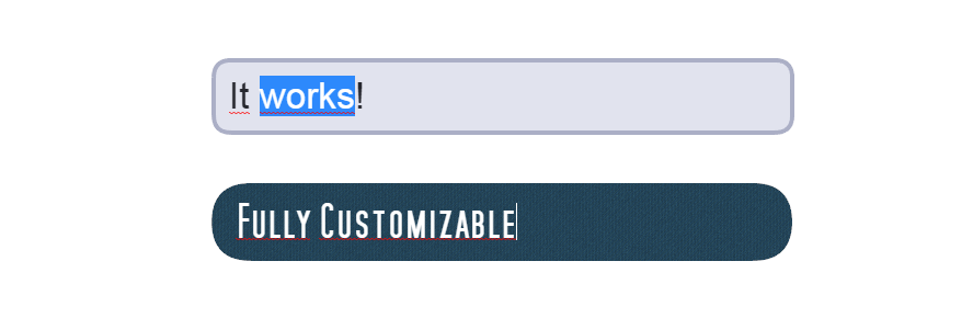
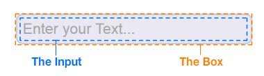
The input itself is a HTML `` element, which is positioned above the stage according to the transformation given by the PIXI-DisplayObject. The box is drawn on the PIXI-stage. Additionally, you can choose whether the plugin should substitute the `` with a native pixi-Text when the textfield has no focus.
# Demos
[Demo with default box generator](https://mwni.io/pixi-text-input/demos/default.html)
[Demo with custom box generator](https://mwni.io/pixi-text-input/demos/custom.html)
# Installing
```sh
npm install pixi-text-input
```
# Documentation
The TextInput behaves just like any other PIXI-DisplayObject. It inherits from `PIXI.Container` and has all the associated properties like `width`, `height`, `rotation`, `scale` ,`alpha`, [etc.](http://pixijs.download/dev/docs/PIXI.Container.html)
## Creating an instance
```js
import TextInput from 'pixi-text-input'
let input = new TextInput( { input: {...}, box: {...} } )
```
**input** : object
>The css style attributes for the HTML input tag.
**box** : object | function
>Either an object describing the style of the box using the default box generator, or a function which returns your own custom generated box.
## Styling the input
You can apply any CSS styles. You have to use the camcelCase property names, though.
```
new TextInput({
input: {
fontSize: '25pt',
padding: '14px',
width: '500px',
color: '#26272E'
},
box: {...}
})
```
If you plan to use more advanced properties like `text-shadow`, you will have to disable `substituteText`, as their translation to the pixi-Text style is not supported, yet.
## Box styling using the default box generator
The input can have 3 different states: `DEFAULT`, `FOCUSED` and `DISABLED`.
For each state you can apply a different style to the input-box.
When passing the following object to the second parameter of the constructor...
```
new TextInput({
input: {...},
box: {
default: {fill: 0xE8E9F3, rounded: 16, stroke: {color: 0xCBCEE0, width: 4}},
focused: {fill: 0xE1E3EE, rounded: 16, stroke: {color: 0xABAFC6, width: 4}},
disabled: {fill: 0xDBDBDB, rounded: 16}
}
})
```
...you will get a box-style as shown in [this demo.](https://mwni.io/pixi-text-input/demos/default.html)
If you don't want a different style for each state, you can just pass:
```
new TextInput({
input: {...},
box: {fill: 0xE8E9F3, rounded: 16, stroke: {color: 0xCBCEE0, width: 4}}
})
```
and have the same style for all 3 states.
| Possible attributes | |
|--|--|
| `fill` | The fill color of the box |
| `rounded` | The border-radius |
| `stroke.color` | the color of the stroke |
| `stroke.width` | the width of the stroke |
| `stroke.alpha` | the alpha of the stroke |
## Box styling using a custom generator
Write your own function to generate the box.
function generateCustomBox(width, height, state){
var box = new PIXI.Graphics()
// draw the box based on width, height and the state (DEFAULT, FOCUSED or DISABLED)
return box
}
then use it as follows
new TextInput({ input: {...}, box: generateCustomBox })
See [this demo](https://mwni.io/pixi-text-input/demos/custom.html).
# Reference
All described members & methods are accessible through an instance of the TextInput.
```
var input = new TextInput({
input: {fontSize: '25px'},
box: {fill: 0xEEEEEE}
})
input.x = 100
input.y = 100
input.placeholder = 'Enter your Text...'
stage.addChild(input)
input.focus()
```
## Members
**substituteText** : boolean
>Whether the plugin should substitute the html input tag with a pixi-Text DisplayObject when there's no focus.
>
>The plugin tries its best to mimic the exact look of the html input element, however with certain fonts/styles there might be some discrepancies.
>
>Set this to false in order to have the html input element visible at all times.
>Drawback: You cannot have overlays over the input field.
**placeholder** : string
>The placeholder text applied to the html input element or the substituted pixi-Text.
**placeholderColor** : int
>The color of the placeholder (has no effect when `substituteText` is set to false; Use CSS to set the placeholder color).
**text** : string
>The text (value) of the html input element.
**maxLength** : int
>The maximum length of the text.
**restrict** : RegExp \| string
>Restricts the text input to a specified character set. Either pass a string containing all possible characters or a regular expression, which will be matched against the whole input string.
**htmlInput** : HTMLInputElement
>Direct access to the native HTML input. Who knows what you're planning to do.
**disabled** : boolean
>Set to true to disable the input.
## Methods
**focus()** : void
>Focus the input.
**select()** : void
>Focus the input and have the text in selection.
**blur()** : void
>Remove the focus of the input.
**setInputStyle( key** : string, **value** : string **)** : void
>Change a css style attribute of the input element.
>For example, to change the font size,
use:
>`input.setInputStyle('fontSize', '21px')`
## Events
All events are dispatched via the default pixi EventEmitter.
```
input.on('keydown', keycode => {
console.log('key pressed:', keycode)
})
```
**keydown** -> keycode : int
>Dispatched when a key is pressed along with its [keycode](http://keycode.info/).
**keyup** -> keycode : int
>Dispatched when a key is released along with its [keycode](http://keycode.info/).
**input** -> text : string
>Dispatched when the input's text has been changed along with the current text of the input.
**focus**
>Dispatched when the input has been focused.
**blur**
>Dispatched when the focus to the input has been lost.
# Contribute
Feel free to add features or suggest improvements.