# React-Toastify
[](https://opencollective.com/react-toastify) 





🎉 React-Toastify allow you to add notification to your app with ease. No more nonsense!
- [Demo](#demo)
- [Installation](#installation)
- [Features](#features)
- [Usage](#usage)
- [One component to rule them all](#one-component-to-rule-them-all)
- [One ToastContainer to render them](#one-toastcontainer-to-render-them)
- [What if I told you that the ToastContainer is optional](#what-if-i-told-you-that-the-toastcontainer-is-optional)
- [Multi container support](#multi-container-support)
- [Positioning toast](#positioning-toast)
- [Set autoclose delay or disable it](#set-autoclose-delay-or-disable-it)
- [Render a component](#render-a-component)
- [Remove a toast programmatically](#remove-a-toast-programmatically)
- [Usage with redux](#usage-with-redux)
- [Pause toast timer when the window loses focus](#pause-toast-timer-when-the-window-loses-focus)
- [Use a custom id](#use-a-custom-id)
- [Prevent duplicate](#prevent-duplicate)
- [Delay notification appearance](#delay-notification-appearance)
- [Use a controlled progress bar](#use-a-controlled-progress-bar)
- [Update a toast](#update-a-toast)
- [Basic example](#basic-example)
- [Update the content](#update-the-content)
- [Update the toast id](#update-the-toast-id)
- [Apply a transition](#apply-a-transition)
- [Reset option or inherit from ToastContainer](#reset-option-or-inherit-from-toastcontainer)
- [Define callback](#define-callback)
- [Listen for change](#listen-for-change)
- [Set a custom close button or simply remove it](#set-a-custom-close-button-or-simply-remove-it)
- [Override the default one](#override-the-default-one)
- [Define it per toast](#define-it-per-toast)
- [Remove it](#remove-it)
- [Add an undo option to a toast like google drive](#add-an-undo-option-to-a-toast-like-google-drive)
- [Replace the default transition](#replace-the-default-transition)
- [Define a custom enter and exit transition](#define-a-custom-enter-and-exit-transition)
- [Ease your life with the cssTransition helper](#ease-your-life-with-the-csstransition-helper)
- [Different duration for enter and exit](#different-duration-for-enter-and-exit)
- [Handle transition based on the toast position](#handle-transition-based-on-the-toast-position)
- [Create a transition from scratch](#create-a-transition-from-scratch)
- [Swipe to remove](#swipe-to-remove)
- [Define the width percentage to remove the toast](#define-the-width-percentage-to-remove-the-toast)
- [Disable it](#disable-it)
- [Le style](#le-style)
- [style with css classes](#style-with-css-classes)
- [style with glamor](#style-with-glamor)
- [Define style globally](#define-style-globally)
- [Right to left support](#right-to-left-support)
- [Mobile](#mobile)
- [Api](#api)
- [ToastContainer](#toastcontainer)
- [toast](#toast)
- [cssTransition](#csstransition)
- [Browser Support](#browser-support)
- [Release Notes](#release-notes)
- [Contribute](#contribute)
- [License](#license)
## Demo
[A demo is worth a thousand words](https://fkhadra.github.io/react-toastify/)
## Installation
```
$ npm install --save react-toastify
$ yarn add react-toastify
```
> RC.5 `useLazyContainer has been removed. The lazy container is opt-in`
## Features
- Easy to setup for real, you can make it work in less than 10sec!
- Super easy to customize
- RTL support
- Swipe to close 👌
- Can display a react component inside the toast!
- Has ```onOpen``` and ```onClose``` hooks. Both can access the props passed to the react component rendered inside the toast
- Can remove a toast programmatically
- Define behavior per toast
- Pause toast when window loses focus 👁
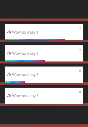
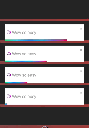
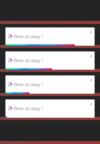
- Fancy progress bar to display the remaining time
- Possibility to update a toast
- You can control the progress bar a la nprogress 😲
- Starting v5 the `ToastContainer` is optional if you want to 😎
## Usage
### One component to rule them all
#### One ToastContainer to render them
The toasts inherit ToastContainer's props. **Props defined on toast supersede ToastContainer's props.**
```javascript
import React, { Component } from 'react';
import { ToastContainer, toast } from 'react-toastify';
import 'react-toastify/dist/ReactToastify.css';
// minified version is also included
// import 'react-toastify/dist/ReactToastify.min.css';
class App extends Component {
notify = () => toast("Wow so easy !");
render(){
return (
);
}
}
```
Remember to render the `ToastContainer` *once* in your application tree.
If you can't figure out where to put it, rendering it in the application root would be the best bet.
#### What if I told you that the ToastContainer is optional
```javascript
import React, { Component } from 'react';
import { toast } from 'react-toastify';
import 'react-toastify/dist/ReactToastify.css';
// Call it once in your app. At the root of your app is the best place
toast.configure()
const App = () => {
const notify = () => toast("Wow so easy !");
return ;
}
```
The library will mount a `ToastContainer` for you if none is mounted.
#### Configure the ToastContainer when it is mounted on demand
The configure function accept the same props as the ToastContainer. As soon as the container is
rendered call to configure will have no effect.
```js
toast.configure({
autoClose: 8000,
draggable: false,
//etc you get the idea
});
```
#### Multi container support
To enable multiple container support, you have to pass `enableMultiContainer` and specify a `containerId` and use it in
each toast, to do so add `containerId` to the toast's options object.
Note: adding `enableMultiContainer` prop to the `` will:
- Check each toast to verify if its `containerId` match the container `containerId` so it can be rendered.
- Ensure not to render any `toast` that has `containerId`.
- Render any toast if both the `toast` and `` does not include `containerId` and `containerId` respectively.
A simple example to demonstrate multi toast container capability.
- Notify A button will show a toast on the bottom left.
- Notify B button will show a toast on the top right.
```javascript
import React, { Component } from 'react';
import { ToastContainer, toast } from 'react-toastify';
import 'react-toastify/dist/ReactToastify.css';
class App extends Component {
notifyA = () => toast('Wow so easy !', {containerId: 'A'});
notifyB = () => toast('Wow so easy !', {containerId: 'B'});
render(){
return (
);
}
}
```
### Positioning toast
By default, all the toasts will be positioned on the top right of your browser. If a position is set on a `toast`, the one defined on ToastContainer will be replaced.
The following values are allowed: **top-right, top-center, top-left, bottom-right, bottom-center, bottom-left**
For convenience, `toast` expose a POSITION property to avoid any typo.
```javascript
// toast.POSITION.TOP_LEFT, toast.POSITION.TOP_RIGHT, toast.POSITION.TOP_CENTER
// toast.POSITION.BOTTOM_LEFT,toast.POSITION.BOTTOM_RIGHT, toast.POSITION.BOTTOM_CENTER
import React, { Component } from 'react';
import { toast } from 'react-toastify';
class Position extends Component {
notify = () => {
toast("Default Notification !");
toast.success("Success Notification !", {
position: toast.POSITION.TOP_CENTER
});
toast.error("Error Notification !", {
position: toast.POSITION.TOP_LEFT
});
toast.warn("Warning Notification !", {
position: toast.POSITION.BOTTOM_LEFT
});
toast.info("Info Notification !", {
position: toast.POSITION.BOTTOM_CENTER
});
toast("Custom Style Notification with css class!", {
position: toast.POSITION.BOTTOM_RIGHT,
className: 'foo-bar'
});
};
render(){
return ;
}
}
```
### Set autoclose delay or disable it
- Set the default delay
```js
import React from 'react';
import { ToastContainer } from 'react-toastify';
// close toast after 8 seconds
const App = () => (
);
```
- Set the delay per toast for more control
```js
import React from 'react';
import { ToastContainer, toast } from 'react-toastify';
class App extends Component {
closeAfter15 = () => toast("YOLO", { autoClose: 15000 });
closeAfter7 = () => toast("7 Kingdoms", { autoClose: 7000 });
render(){
return (
);
}
}
```
- Disable it by default
```js
```
- Disable it per toast
```js
toast("hello", {
autoClose: false
})
```
### Render a component
When you render a component, a `closeToast` function is passed as a props. That way you can close the toast on user interaction for example.
```js
import React from 'react';
import { ToastContainer, toast } from "react-toastify";
const Msg = ({ closeToast }) => (
Lorem ipsum dolor
)
const App = () => (
);
```
You can also render a component using a function. More or less like a "render props":
```js
toast(({ closeToast }) =>
Functional swag 😎
);
```
### Remove a toast programmatically
An id is returned each time you display a toast, use it to remove a given toast programmatically by calling ```toast.dismiss(id)```
Without args, all the displayed toasts will be removed.
```javascript
import React, { Component } from 'react';
import { toast } from 'react-toastify';
class Example extends Component {
toastId = null;
notify = () => this.toastId = toast("Lorem ipsum dolor");
dismiss = () => toast.dismiss(this.toastId);
dismissAll = () => toast.dismiss();
render(){
return (
);
}
}
```
### Usage with redux
"Talk is cheap. Show me the code"
[](https://codesandbox.io/s/2485wxy78j)
### Pause toast timer when the window loses focus
The default behavior is to pause the toast timer whenever the window loses focus. You can opt-out by setting the `pauseOnFocusLoss` props to false:
```js
// Opt-out for all toast
// Opt-out per toast
toast('Hello', {
pauseOnFocusLoss: false
})
```
### Use a custom id
A custom `toastId` can be used to replace the one generated. You can use a `number` or a `string`.
```javascript
import React, { Component } from 'react';
import { toast } from 'react-toastify';
class Example extends Component {
notify = () => {
toast("I cannot be duplicated !", {
toastId: 13
});
}
render(){
return (
);
}
}
```
### Prevent duplicate
To prevent duplicates, you can check if a given toast is active by calling `toast.isActive(id)` like the snippet below. Or, you can use a custom `toastId`:
```javascript
import React, { Component } from 'react';
import { toast } from 'react-toastify';
class Example extends Component {
toastId = null;
customToastId = 'xxx-yyy';
notify = () => {
if (! toast.isActive(this.toastId)) {
this.toastId = toast("I cannot be duplicated !");
}
toast("xxx-yyy cannot be duplicated", {
toastId: customToastId
});
}
render(){
return (
);
}
}
```
### Delay notification appearance
You can delay the notification appearance as shown below. Under the hood the lib simply use `setTimeout`.
```js
toast('Show now');
toast('Show after 1sec', { delay: 1000 })
```
_Note: [toast.dismiss()](#remove-a-toast-programmatically) has no effect if called during the delay before a given toast appears._
### Use a controlled progress bar
Imagine you want to see the progress of a file upload. The example below feature axios, but it works with anything!
```javascript
import React, { Component } from 'react';
import { toast } from 'react-toastify';
import axios from 'axios';
class Example extends Component {
upload = () => {
// we need to keep a reference of the toastId to be able to update it
let toastId = null;
axios.request({
method: "post",
url: "/foobar",
data: myData,
onUploadProgress: p => {
const progress = p.loaded / p.total;
// check if we already displayed a toast
if(toastId === null){
toastId = toast('Upload in Progress', {
progress: progress
});
} else {
toast.update(toastId, {
progress: progress
})
}
}
}).then (data => {
// Upload is done!
// The remaining progress bar will be filled up
// The toast will be closed when the transition end
toast.done(toast.id)
})
}
render(){
return (
);
}
}
```
### Update a toast
When you update a toast, the toast options and the content are inherited but don't worry you can update them.

#### Basic example
```js
import React, { Component } from 'react';
import { toast } from 'react-toastify';
class Update extends Component {
toastId = null;
notify = () => this.toastId = toast("Hello", { autoClose: false });
update = () => toast.update(this.toastId, { type: toast.TYPE.INFO, autoClose: 5000 });
render(){
return (
)
}
}
```
#### Update the content
If you want to change the content it's straightforward as well. You can render any valid element including a react component. Pass your value to a `render` option as follow:
```js
// With a string
toast.update(this.toastId, {
render: "New content",
type: toast.TYPE.INFO,
autoClose: 5000
});
// Or with a component
toast.update(this.toastId, {
render:
type: toast.TYPE.INFO,
autoClose: 5000
});
```
#### Update the toast id
If you want to update the `toastId` it can be done. But don't forget to use the new id!
```js
const myNewToastId = 'loremIpsum';
toast.update(this.toastId, {
render: "New content",
type: toast.TYPE.INFO,
autoClose: 5000,
toastId: myNewToastId
});
toast.update(myNewToastId, {
render:
autoClose: 6000
});
```
#### Apply a transition
By default, when you update a toast, there is no transition applied. If you want to apply a transition, it can be done via the `className` or the `transition` option:

```js
// with css
toast.update(this.toastId, {
render: "New Content",
type: toast.TYPE.INFO,
//Here the magic
className: 'rotateY animated'
})
// with glamor
toast.update(this.toastId, {
render: "New Content",
type: toast.TYPE.INFO,
//Here the magic
className: css({
transform: "rotateY(360deg)",
transition: "transform 0.6s"
})
})
// with transition
toast.update(this.toastId, {
render: "New Content",
type: toast.TYPE.INFO,
//Here the magic
transition: Rotate
})
```
#### Reset option or inherit from ToastContainer
If you want to inherit props from the `ToastContainer`, you can reset an option by passing null.
It's particulary useful when you remove the `closeButton` from a toast and you want it back during the update:
```js
class Update extends Component {
toastId = null;
notify = () => this.toastId = toast("Hello", {
autoClose: false,
closeButton: false // Remove the closeButton
});
update = () => toast.update(this.toastId, {
type: toast.TYPE.INFO,
autoClose: 5000,
closeButton: null // The closeButton defined on ToastContainer will be used
});
render(){
return (
)
}
}
```
### Define callback
You can define two callbacks on `toast`. They are really useful when the toast are not used only to display messages.
- onOpen is called inside componentDidMount
- onClose is called inside componentWillUnmount
```javascript
import React, { Component } from 'react';
import { toast } from 'react-toastify';
class Hook extends Component {
notify = () => toast(, {
onOpen: ({ foo }) => window.alert('I counted to infinity once then..'),
onClose: ({ foo }) => window.alert('I counted to infinity twice')
});
render(){
return ;
}
}
```
### Listen for change
If you want to know when a toast is displayed or removed, `toast` expose a `onChange` method:
```js
toast.onChange( (numberOfToastDisplayed, containerId) => {
// Do whatever you want
// The containerId is usefull when working with multiple containers
});
```
### Set a custom close button or simply remove it
#### Override the default one
You can pass a custom close button to the `ToastContainer` to replace the default one.
⚠️ **When you use a custom close button, your button will receive a ```closeToast``` function.
You need to call it in order to close the toast.** ⚠️
```javascript
import React, { Component } from 'react';
import { toast, ToastContainer } from 'react-toastify';
const CloseButton = ({ YouCanPassAnyProps, closeToast }) => (
delete
);
class CustomClose extends Component {
notify = () => {
toast("The close button change when Chuck Norris display a toast");
};
render(){
return (
;
} />
);
}
}
```
#### Define it per toast
```javascript
import React, { Component } from 'react';
import { toast } from 'react-toastify';
// Let's use the closeButton we defined on the previous example
class CustomClose extends Component {
notify = () => {
toast("The close button change when Chuck Norris display a toast",{
closeButton:
});
};
render(){
return ;
}
}
```
#### Remove it
Sometimes you don't want to display a close button. It can be removed globally or per toast. Pass
`false` to `closeButton` props:
- remove it by default
```js
```
- remove it per toast
```js
toast("hello", {
closeButton: false
})
```
-- if you removed it globally, you can display the default Button per toast (or you can set your custom button)
```js
toast("hello", {
closeButton: true // or
})
```
### Add an undo option to a toast like google drive
See it in action:
[](https://codesandbox.io/s/l2qkywz7xl)
```javascript
const ToastUndo = ({ id, undo, closeToast }) => {
function handleClick(){
undo(id);
closeToast();
}
return (
Row Deleted
);
}
class App extends Component {
state = {
collection: data,
// Buffer
toRemove: []
};
// Remove the row id from the buffer
undo = id => {
this.setState({
toRemove: this.state.toRemove.filter(v => v !== id)
});
}
// Remove definetly
cleanCollection = () => this.setState({
// Return element which are not included in toRemove
collection: this.state.collection.filter(v => !this.state.toRemove.includes(v.id)),
//Cleanup the buffer
toRemove: []
});
// Remove row from render process
// then display the toast with undo action available
removeRow = e => {
const id = e.target.dataset.rowId;
this.setState({
toRemove: [...this.state.toRemove, id]
});
toast(, {
// hook will be called whent the component unmount
onClose: this.cleanCollection
});
};
renderRows() {
const { collection, toRemove } = this.state;
// Render all the element wich are not present in toRemove
// Im using data-attribute to grab the row id
return collection.filter(v => !toRemove.includes(v.id)).map(v => (
{v.firstName}
{v.lastName}
{v.email}
));
}
render() {
// Dont close the toast on click
return (
name
firstname
gender
{this.renderRows()}
);
}
}
```
### Replace the default transition
There is 4 built-in transitions provided:
BounceSlideZoomFlip
Bounce is used by default but you can replace it by your own transition or by one of the list above:
```js
import { Slide, Zoom, Flip, Bounce } from 'react-toastify';
//...
```
You get the idea...
### Define a custom enter and exit transition
The toast relies on `react-transition-group` for the enter and exit transition. Any transition built with react-transition-group should work !
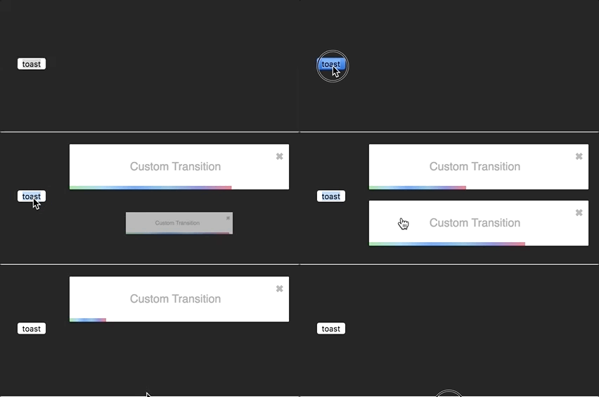
I'll use the zoom animation from animate.css. Of course, you could create your own animation.
```css
/* style.css*/
@keyframes zoomIn {
from {
opacity: 0;
transform: scale3d(.3, .3, .3);
}
50% {
opacity: 1;
}
}
.zoomIn {
animation-name: zoomIn;
}
@keyframes zoomOut {
from {
opacity: 1;
}
50% {
opacity: 0;
transform: scale3d(.3, .3, .3);
}
to {
opacity: 0;
}
}
.zoomOut {
animation-name: zoomOut;
}
/* Not needed with the cssTransition helper */
.animate {
animation-duration: 800ms;
}
```
#### Ease your life with the cssTransition helper
The easiest way to roll your own transition is by using the `cssTransition` helper. Doing so you don't need to deal with `react-transition-group`. You only need to provide the `enter` and the `exit` class name, the transition `duration` is set
to `750ms` by default but it can be overridden:
```js
import React, { Component } from 'react';
import { toast, cssTransition } from 'react-toastify';
import './style.css';
const Zoom = cssTransition({
enter: 'zoomIn',
exit: 'zoomOut',
// default to 750ms, can be omitted
duration: 750,
});
class App extends Component {
notify = () => {
toast("ZoomIn and ZoomOut", {
transition: Zoom,
autoClose: 5000
});
};
render(){
return ;
}
}
```
##### Different duration for enter and exit
If you want the transition duration to be different between the enter and exit transition pass an array:
```js
import React, { Component } from 'react';
import { toast, cssTransition } from 'react-toastify';
import './style.css';
const Zoom = cssTransition({
enter: 'zoomIn',
exit: 'zoomOut',
duration: [500, 800]
});
class App extends Component {
notify = () => {
toast("ZoomIn and ZoomOut", {
transition: Zoom,
autoClose: 5000
});
};
render(){
return ;
}
}
```
##### Handle transition based on the toast position
Some transitions are based on the toast position. This is the case for the default one. If you pass `appendPosition` to the `cssTransition` helper as shown below, the current position will be appended to the `enter` and `exit` class name:
```js
import React, { Component } from 'react';
import { toast, cssTransition } from 'react-toastify';
import './style.css';
const Zoom = cssTransition({
// zoomIn will become zoomIn--top-right or zoomIn--top-left and so on
enter: 'zoomIn',
// zoomIn will become zoomOut--top-right or zoomOut--top-left and so on
exit: 'zoomOut',
// default to false
appendPosition: true
});
class App extends Component {
notify = () => {
toast("ZoomIn and ZoomOut", {
transition: Zoom,
autoClose: 5000
});
};
render(){
return ;
}
}
```
#### Create a transition from scratch
```js
import React, { Component } from 'react';
import { toast } from 'react-toastify';
import Transition from 'react-transition-group/Transition';
import './style.css';
const ZoomInAndOut = ({ children, position, ...props }) => (
node.classList.add('zoomIn', 'animate')}
onExit={node => {
node.classList.remove('zoomIn', 'animate');
node.classList.add('zoomOut', 'animate');
}}
>
{children}
);
class App extends Component {
notify = () => {
toast("ZoomIn and ZoomOut", {
transition: ZoomInAndOut,
autoClose: 5000
});
};
render(){
return ;
}
}
```
### Swipe to remove
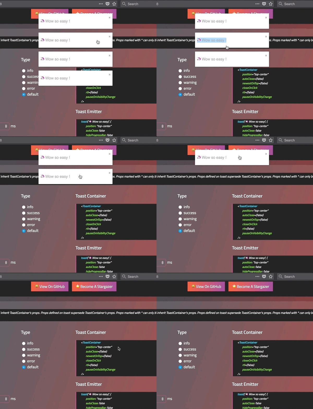
You can swipe the toast to remove it:
#### Define the width percentage to remove the toast
You need to drag 80% of the toast width to remove it. This can be changed to fit your need:
- Replace the default one:
```js
```
- Replace per toast:
```js
toast('Hello', {
draggablePercent: 60
});
```
#### Disable it
- Disable by default for all toast:
```js
```
- Disable per toast:
```js
toast('Hello', {
draggable: false
});
```
### Le style
#### style with css classes
```javascript
toast("Custom style",{
className: 'black-background',
bodyClassName: "grow-font-size",
progressClassName: 'fancy-progress-bar'
});
```
#### style with glamor
```javascript
import { css } from 'glamor';
toast("Custom style",{
className: css({
background: 'black'
}),
bodyClassName: css({
fontSize: '60px'
}),
progressClassName: css({
background: "repeating-radial-gradient(circle at center, red 0, blue, green 30px)"
})
});
```
#### Define style globally
```js
```
#### Right to left support
Your app need to support rtl content? Set the rtl props to `true`:
```javascript
render(){
return(
{/*Component*/}
{/*Component*/}
);
}
```
#### Include the bare minimum style
To include the bare minimum required style you can do as follow:
```js
import 'react-toastify/dist/ReactToastify.minimal.css';
```
### Mobile
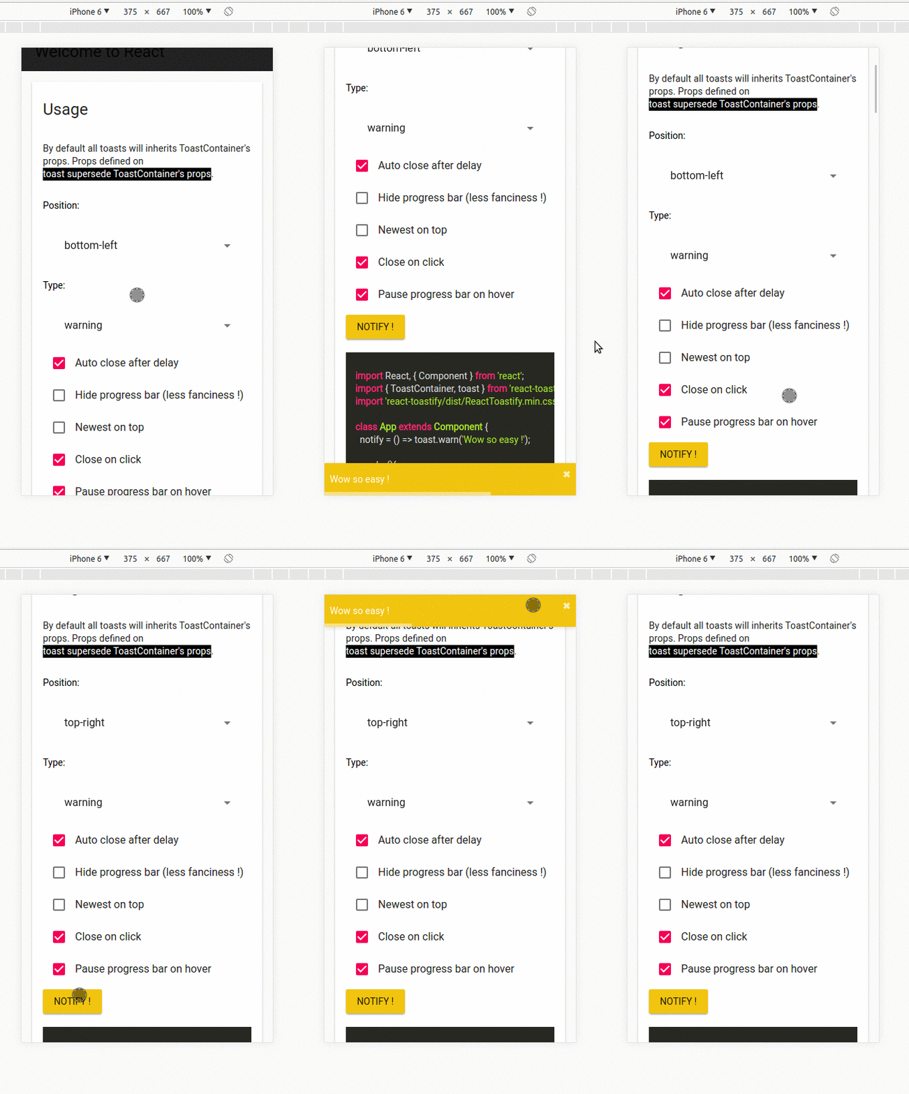
On mobile the toast will take all the available width.
## Api
### ToastContainer
| Props | Type | Default | Description |
|----------------------|------------------------|-----------|-----------------------------------------------------------------------------------------------------|
| position | string | top-right | One of top-right, top-center, top-left, bottom-right, bottom-center, bottom-left |
| autoClose | false or number | 5000 | Delay in ms to close the toast. If set to false, the notification need to be closed manualy |
| closeButton | React Element or false | - | A React Component to replace the default close button or `false` to hide the button |
| transition | function | - | A reference to a valid react-transition-group/Transition component |
| hideProgressBar | bool | false | Display or not the progress bar below the toast(remaining time) |
| pauseOnHover | bool | true | Keep the timer running or not on hover |
| pauseOnFocusLoss | bool | true | Pause the timer when the window loses focus |
| rtl | bool | false | Support right to left content |
| closeOnClick | bool | true | Dismiss toast on click |
| newestOnTop | bool | false | Display newest toast on top |
| className | string\|object | - | Add optional classes to the container |
| style | object | - | Add optional inline style to the container |
| toastClassName | string\|object | - | Add optional classes to the toast |
| bodyClassName | string\|object | - | Add optional classes to the toast body |
| progressClassName | string\|object | - | Add optional classes to the progress bar |
| progressStyle | object | - | Add optional inline style to the progress bar |
| draggable | bool | true | Allow toast to be draggable |
| draggablePercent | number | 80 | The percentage of the toast's width it takes for a drag to dismiss a toast(value between 0 and 100) |
| enableMultiContainer | bool | - | Enable multi toast container support |
| containerId | string\number | - | Container id used to match toast with the same containerId |
| role | string | alert | Define the ARIA role for the toasts |
### toast
All the method of toast return a **toastId** except `dismiss` and `isActive`.
The **toastId** can be used to remove a toast programmatically or to check if the toast is displayed.
| Parameter | Type | Required | Description |
| --------- | ------- | ------------- | ------------------------------------------------------------- |
| content | string or React Element | ✓ | Element that will be displayed |
| options | object | ✘ | Options listed below | |
- Available options :
- `type`: Kind of notification. One of "default", "success", "info", "warning", "error". You can use `toast.TYPE.SUCCESS` and so on to avoid any typo.
- `onOpen`: Called inside componentDidMount
- `onClose`: Called inside componentWillUnmount
- `autoClose`: same as ToastContainer.
- `closeButton`: `false` to disable, a `React Component` to replace or `true` to display the default button.
- `transition`: same as ToastContainer.
- `closeOnClick`: same as ToastContainer.
- `hideProgressBar`: same as ToastContainer.
- `position`: same as ToastContainer
- `pauseOnHover`: same as ToastContainer
- `pauseOnFocusLoss`: same as ToastContainer
- `className`: same as ToastContainer toastClassName
- `bodyClassName`: same as ToastContainer
- `progressClassName`: same as ToastContainer
- `draggable`: same as ToastContainer
- `draggablePercent`: same as ToastContainer
- `role`: same as ToastContainer
- `toastId`: optional integer or string to manually set a toastId. If an invalid type is provided a generated toastId will be used
- `progress`: a value between 0..1 to control the progress bar
- `render`: string or React Element, only available when calling update
- `delay`: a number to let you delay the toast appearance
- `containerId`: string or number to match a specific Toast container
- `onClick`: Called when click inside Toast notification
:warning:️ *Toast options supersede ToastContainer props* :warning:
:warning:️ *Manually setting a toastId overwrite automatically generated toastIds* :warning:
```js
const Img = ({ src }) =>
, options);
toast.success("Hello", options) // add type: 'success' to options
toast.info("World", options) // add type: 'info' to options
toast.warn(, options) // add type: 'warning' to options
toast.error(, options) // add type: 'error' to options
toast.dismiss() // Remove all toasts !
toast.dismiss(toastId) // Remove given toast
toast.isActive(toastId) //Check if a toast is displayed or not
toast.update(toastId, {
type: toast.TYPE.INFO,
render:
});
toast.done(toastId) // completes the controlled progress bar
toast.configure({
autoClose: 8000,
draggable: false,
//same as ToastContainer props
})
toast.useLazyContainer(false) // disable lazy container
```
### cssTransition
| Parameter | Type | Required | Default | Description |
|----------------|--------|----------|---------|------------------------------------------------------------------------------------------------------------|
| enter | string | ✓ | - | The class name that will be used when the toast enter |
| exit | string | ✓ | - | The class name that will be used when the toast exit |
| duration | number\| Array | ✘ | 750 | The transition duration in ms. |
| appendPosition | bool | ✘ | false | Append or not the position to the class name: `yourClassName--top-right`, `yourClassName--bottom-left`... |
```js
import { cssTransition } from 'react-toastify';
const Zoom = cssTransition({
enter: 'zoomIn',
exit: 'zoomOut',
duration: 750,
appendPosition: false
});
const Zoom = cssTransition({
enter: 'zoomIn',
exit: 'zoomOut',
duration: [500, 600],
appendPosition: false
});
```
## Browser Support
 |  |  |  |  | 
--- | --- | --- | --- | --- | --- |
IE 11+ ✔ | Latest ✔ | Latest ✔ | Latest ✔ | Latest ✔ | Latest ✔ |
## Release Notes
You can find the release note for the latest release [here](https://github.com/fkhadra/react-toastify/releases/latest)
You can browse them all [here](https://github.com/fkhadra/react-toastify/releases)
## Contribute
Show your ❤️ and support by giving a ⭐. Any suggestions are welcome ! Take a look at the contributing guide.
You can also find me on [reactiflux](https://www.reactiflux.com/). My pseudo is Fadi.
## Contributors
### Code Contributors
This project exists thanks to all the people who contribute. [[Contribute](CONTRIBUTING.md)].
### Financial Contributors
Become a financial contributor and help us sustain our community. [[Contribute](https://opencollective.com/react-toastify/contribute)]
#### Individuals
#### Organizations
Support this project with your organization. Your logo will show up here with a link to your website. [[Contribute](https://opencollective.com/react-toastify/contribute)]
## License
Licensed under MIT
 ### Financial Contributors
Become a financial contributor and help us sustain our community. [[Contribute](https://opencollective.com/react-toastify/contribute)]
#### Individuals
### Financial Contributors
Become a financial contributor and help us sustain our community. [[Contribute](https://opencollective.com/react-toastify/contribute)]
#### Individuals
 #### Organizations
Support this project with your organization. Your logo will show up here with a link to your website. [[Contribute](https://opencollective.com/react-toastify/contribute)]
#### Organizations
Support this project with your organization. Your logo will show up here with a link to your website. [[Contribute](https://opencollective.com/react-toastify/contribute)]






 ## License
Licensed under MIT
## License
Licensed under MIT