<div align="center">

# pi-sysmon

**bottom-style braille line charts inside [pi](https://github.com/earendil-works/pi)**

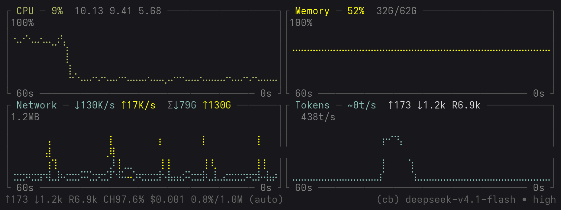
CPU · Memory · Network · Tokens — real-time history curves drawn with braille dot-matrix characters

[![test](https://img.shields.io/badge/tests-167%2F167-brightgreen)](#testing)
[![license](https://img.shields.io/badge/license-MIT-blue)](LICENSE)

<img src="docs/images/overview.png" alt="Four charts side by side: CPU / Memory / Network / Tokens" width="100%">

<sub>The default four charts at 150 columns wide. Curves are drawn with braille characters,
y-axis tick marks are overlaid inside the plot area, and time labels are embedded in the bottom border.</sub>

</div>

[English](README.md) | [简体中文](README.zh-CN.md) | [X @zzjcoo](https://x.com/zzjcoo)

## Features

- **Real line charts**, not progress bars or sparklines — each character encodes 2×4 braille dot sub-pixels, effectively multiplying terminal resolution by 8
- **Zero dependencies** — only Node built-ins plus pi's public extension API
- **Reads `/proc` directly** — no need for packages like `systeminformation` / `pidusage`
- **Four charts by default** — CPU / Memory / Network / **Tokens (LLM throughput rate)**;
  the Tokens chart shows, in real time, the output-token rate between this pi process and the model API,
  and cross-checks against the `⚡ 23.0 t/s (avg)` that pi itself shows in the status bar
- **Proper axes** — y-axis tick marks, an x-axis line, and time-window labels, replicating bottom's layout
- **Top of y-axis = true window maximum** — the height at any point in the 60s window can be read
  directly off the top tick; the scale never lies (set `PI_SYSMON_SCALE_WINDOW=<1` to also enable
  automatic falloff after a spike)
- **Automatically excludes loopback/container traffic** — `lo` / `veth*` / `docker*` / `br-*` don't
  count toward network speed (measured: while pushing 30 MB/s of loopback traffic locally, the network
  chart reports only the physical NIC's 178 KB/s)
- **Responsive side-by-side layout** — four charts in a row on wide terminals, automatically degrading
  to 2×2 / 1-column stacking as it narrows, so curves never get crushed into noise
- **Tokens chart shows both directions** — the readings use the same convention as pi's own status bar
  (`↑` upstream input / `↓` downstream output / `R` cache reads), so the numbers can be compared
  directly; the upstream figure is an **exact value**, while the rate is an estimate (marked with `~`)
- **High plot-area efficiency** — tick marks overlay the plot area and time labels sit inside the border.
  At the **same block height**, the plot area is **~71%** larger than the old layout where ticks owned
  a column and the axis owned a row (50 columns wide, 8 rows tall: 168 cells → 288 cells)
- **Readings live in the border title bar** (default) — reusing the `─` fill that line already has:
  zero cost, no curve occlusion; or set `PI_SYSMON_LABEL=box` to bring back bottom's top-right floating box
- **Persistent state** — display preferences (mode / placement) and the global on/off default are remembered in a config file across restarts; the per-session on/off lives in the session itself
- **Multiple display modes** — chart (default) / single text line / full footer; in fullscreen TUI mode a
  clickable chip switches chart ⇄ line with one click
- **Linux-friendly, doesn't crash elsewhere** — collection degrades to zero values on non-Linux platforms

## Screenshots

Each chart's readings are written into the **border title bar** (reusing the `─` fill that line
already has, so no curve is covered). Y-axis tick marks are **overlaid inside the plot area**, and
time labels are **embedded in the bottom border**.

The space these two choices save is quantifiable. **Comparing at the same block height (8 rows) and block width (50 columns)**:

| Layout | Chrome per block | Plot area |
| --- | --- | --- |
| Old (ticks own 5 columns + axis owns 1 row) | 4 rows | 42 × 4 = 168 |
| Now (overlay + border doubles as axis) | 2 rows | 48 × 6 = 288 |

The gain factors into two multipliers: width 42 → 48 (**+14%**, ticks no longer own a column) ×
rows 4 → 6 (**+50%**, the two saved rows go back to data) ≈ **+71%**.

### Automatic degradation on narrow terminals (95 columns)

<img src="docs/images/narrow.png" alt="2×2 degraded layout" width="100%">

When the terminal narrows, the charts go 2×2, and narrower still, 1 column stacked. The breakpoint
is 96 columns: ≥ 96 gives four charts in a row (the screenshot above), < 96 drops to 2×2 (this one
is 95 columns). At the same width, bottom would crush all four charts into one row (about 16 columns
each), making the curves unreadable.

### The two directions of the Tokens chart

```
┌ Tokens ─ ~58t/s ·92% ⌀87%  ↑5.9k ↓60 R2.7k ─┐
```

The readings use the same convention as pi's own status bar (`↑` upstream input / `↓` downstream
output / `R` cache reads), so the two can be compared directly. A few details:

- **The main curve only plots the downstream rate.** The two directions have completely different shapes
  over time (upstream is one bulk upload; downstream streams token by token — a measured ratio of
  about 516:1), so plotting them on the same axis would flatten downstream to 0.2% of the height.
- **`~` only appears on the rate** — it's estimated from streaming deltas; the cumulative figures
  come from the provider's exact `usage`, so they carry no `~`. Which number to trust is obvious at a glance.
- As the block narrows, segments are dropped by importance: rate → instantaneous hit → cumulative
  hit → upstream → downstream → cache reads.

### Cache hit rate: the second curve

Cached prompt tokens are billed far cheaper than fresh input, so the hit rate is the one number
that says whether the cache is actually working. The Tokens block shows it two ways:

- **`⌀N%` — session-cumulative hit rate** (the yellow curve). `⌀` reads as "average"; the value is
  recomputed from the session's running totals every time a message lands, so the curve is a
  staircase — honest, since the underlying numbers are exact provider-reported totals with no
  sub-frame information to draw.
- **`·N%` — instantaneous hit rate** (title bar only). The last turn's own
  `cacheRead / (cacheRead + input)` ratio; this is the actionable one; the cumulative average
  would hide a cache-missing turn for a long time.

The yellow curve has its **own fixed 0–100% scale**, pre-mapped onto the TPS axis and excluded
from the y-scale: a 90% hit rate always renders as 90% of the plot height, even while a
3000 t/s streaming spike pushes the TPS axis top higher. The gutter still shows TPS only — the
color binding (yellow curve ⇄ the `⌀` readout) is what tells the two apart.

Both readouts appear only once the provider has reported a cache read (`R`); sessions that never
touch the cache degrade to the previous single-curve block unchanged. In `line` mode the same
`·N%`/`⌀N%` readouts appear (gated identically), and the token group now sits before NET in the
importance order — when the line runs out of room, whole groups are dropped from the tail, and
the token readout is far less recoverable from elsewhere on screen.

## Installation

### Install with pi (recommended)

```bash
# latest release from npm
pi install npm:pi-sysmon

# or pin an exact version
pi install npm:pi-sysmon@0.4.0

# or straight from git
pi install git:github.com/zzjcool/pi-sysmon
```

Restart pi and the curves appear — **enabled by default**. Update later with
`pi update npm:pi-sysmon`, remove with `pi remove npm:pi-sysmon`.

### From a git clone: single file (simplest manual install)

```bash
git clone https://github.com/zzjcool/pi-sysmon && cd pi-sysmon && npm install
npm run build:single    # produces dist/pi-sysmon.ts
cp dist/pi-sysmon.ts ~/.pi/agent/extensions/pi-sysmon.ts
```

### From a git clone: directory form (multiple files)

```bash
git clone https://github.com/zzjcool/pi-sysmon
cp -r pi-sysmon ~/.pi/agent/extensions/pi-sysmon
```

> ⚠️ The directory form **must live in a subdirectory**. pi's auto-discovery treats every `.ts`
> directly under `extensions/` as an extension; laying out multiple files flat would make
> `braille.ts` get loaded as an extension and break the whole load.

### Try it without installing

```bash
pi -e npm:pi-sysmon
```

## Usage

```text
/sysmon                     toggle on / off (**this session only**)
/sysmon on | off            explicit on / off (this session only)
/sysmon global on | off     default on/off for **future** sessions (also applies to this one)
/sysmon chart               chart mode (default)
/sysmon below|above         place the charts / line below (default) / above the editor (persisted)
/sysmon line                single-line text mode (the `CPU … TOK …` line; alias: `status`)
/sysmon footer              replace the entire footer with the charts (can be taller than widget mode)
```

`chart` / `line` are **mutually exclusive display modes** (naming a mode switches to it and turns the monitor on — it never turns the monitor off); `on` / `off` / `above` / `below` are orthogonal to the mode.

### Click to switch modes (fullscreen TUI only)

In pi's **fullscreen** TUI mode (`--tui-mode fullscreen`, or **TUI mode** in `/settings`),
the panel shows a small clickable `[line]` / `[chart]` chip at its bottom-right —
one click switches between chart and line mode, no command needed:

```text
┌ CPU ─ 12% ───────────────────────┐
│ ⡿⢸⣿⡇ ...                       │
└ 60s ──────────────────────── 0s ┘
                              [line]
```

- The click runs the **same path** as `/sysmon chart` / `/sysmon line` — the
  mode switch is persisted as a global display preference, and the session's
  on/off state is never touched.
- In `line` mode the chip shares the text row (the row stays exactly 1 line
  tall — the chip borrows its columns from the metrics, which drop whole
  groups from the tail as usual).
- In fullscreen the chart pays for the chip row **out of its row budget**, so
  the panel never grows past `WIDGET_MAX_ROWS`.
- Clicks outside the chip are not consumed: drag-to-select text over the panel
  keeps working exactly as before.
- `regular` TUI mode (the default) never captures mouse input — the terminal
  owns the scrollback there — so no chip is rendered and the panel behaves
  exactly as before. Use `/sysmon chart | line` instead.

Why no hover highlight on the chip: under tmux/zellij/screen pi only enables
button-motion mouse reporting (no `move` events), so the chip must read as
clickable without any hover feedback.

### Session scope vs global scope

`/sysmon on|off` is **session-scoped**: it is stored in that session's own entry list, so
`/resume` brings the switch back exactly as you left it, while **other sessions and future
runs are unaffected**. Off in one project stays off in that session only.

`/sysmon global on|off` writes the **default for every new session** to
`<configDir>/pi-sysmon.json`, and applies it to the current session immediately (an "off by
default from now on" that left the charts running would read as a broken command).

Precedence on startup: **session choice → `--sysmon` → global default → built-in default (on)**.
Mode (`chart`/`line`/`footer`) and placement (`above`/`below`) are **global display
preferences** — they keep persisting in the config file, so you don't re-select your charts
every session.

### What line mode shows

One line, in descending order of importance; when it doesn't fit, whole segments are dropped **from the tail** (never cutting a number in half, e.g. no `↑1.0` stubs):

```text
CPU 12%  MEM 60% 37G  NET ↑592K/s ↓34K/s  TOK ~0t/s ↑5.7k ↓89 R2.7k
└─ system metrics ──────────────────────┘ └─ LLM tokens ────────────────┘
```

- **CPU / MEM / NET** come from the same sources and use the same colors as the corresponding chart-mode blocks;
- **TOK** is LLM token throughput: `~<rate>` (estimated from streaming deltas, hence the `~`)
  plus the session-cumulative `↑input ↓output RcacheRead` (from the **exact** `usage` of
  `message_end`, byte-aligned with pi footer's `↑↓R` convention, so it can be checked directly
  against the bottom line);
- Without a snapshot (non-Linux / `/proc` unreadable) the TOK segment is still emitted — it's
  the only metric that doesn't depend on `/proc`.

`line` is implemented as a **widget** rather than `setStatus`, so it follows `above`/`below`
just like the charts: after `/sysmon below`, the charts and the line appear at **the same
position**.
(`setStatus` content is always rendered by pi's built-in footer, pinned at the bottom — that
can't be changed.)

The charts lay out **responsively** by terminal width (using the default four charts as an example):

| Terminal width | Layout |
| --- | --- |
| ≥ 96 columns | 4 charts side by side in one row (8 rows total) |
| 48 – 95 columns | 2 columns × 2 rows |
| < 48 columns | 1 column stacked |

> Row counts assume the default widget-mode budget (`PI_SYSMON_CHART_HEIGHT=6`, `WIDGET_MAX_ROWS=18`);
> footer mode has a larger budget (40 rows), so it gets more rows.

Each chart needs at least 24 columns (2 for the border + 22 for the plot). Tick marks are
**overlaid** on the plot area rather than owning a column, so this floor is much lower than the
old layout (where ticks owned 5 columns). Below that, bottom would crush N charts together (at 50
columns, 16 columns each — the curves are already unreadable), while this project degrades the
arrangement instead.

The column count also adapts to the **number of blocks** (controlled by `PI_SYSMON_TOKENS` /
`PI_SYSMON_DISKS`): with three charts, ≥ 72 columns already goes side by side (unchanged old
behavior); with ≥ 4 blocks, the **3-column tier is skipped**, avoiding a "3+1" shape where the
second group has a single block plus a full row of blanks.

### Configuration

| Environment variable | Default | Description |
| --- | --- | --- |
| `PI_SYSMON_INTERVAL` | `1000` | Sampling interval (milliseconds, floor 500) |
| `PI_SYSMON_POINTS` | `60` | History point count (overrides the count derived from `PI_SYSMON_WINDOW`) |
| `PI_SYSMON_CHART_HEIGHT` | `6` | Plot rows per chart (excluding the 2 border rows) |
| `PI_SYSMON_LABEL` | `title` | Reading placement: `title` (border title bar) / `box` (top-right floating box) / `both` / `none` |
| `PI_SYSMON_WINDOW` | `60` | Horizontal time-window length (seconds) |
| `PI_SYSMON_SCALE_WINDOW` | `1` (= scale window == display window) | **Scale sampling ratio** for rate charts: `1` = top of y-axis is the true window maximum; set `<1` (e.g. `1/6`) to enable "auto-falloff about 10s after a spike passes" (spikes beyond the scale then show as `+` markers) |
| `PI_SYSMON_MODE` | `chart` | Initial mode (`chart` / `line` / `footer`) |
| `PI_SYSMON_PLACEMENT` | `belowEditor` | Whether `chart` / `line` hang **below** (default) or **above** the editor: `belowEditor` / `aboveEditor` (also switchable anytime via `/sysmon below` / `/sysmon above`, persisted; `footer` mode is unaffected) |
| `PI_SYSMON_TOKENS` | on | LLM token throughput chart. Set `0` to return to the old three-chart form |
| `PI_SYSMON_DISKS` | — | Set `1` to add a disk I/O chart (the 5th block) |

On/off has **two scopes**, so it is stored twice:

- `<configDir>/pi-sysmon.json` (`configDir` defaults to `~/.pi/agent`) holds `mode`,
  `placement` and the **global default** `enabled` — written by `/sysmon global on|off`;
- the **current session's** on/off choice is a session entry, written by `/sysmon on|off`,
  so it survives `/resume` of that session without touching any other session.

The `--sysmon` CLI flag forces the monitor **on for that run only** — it overrides the global
default but not an in-session `/sysmon off`, since an explicit "off" typed inside the session is
the more specific statement.

> **Config compatibility:** an older `pi-sysmon.json` that only carries `enabled: false` (the
> pre-session-scope form) is read as "the global default is off", so sessions that never touched
> the switch start off — the behavior the old flag expressed. `/sysmon global on` restores the
> on-by-default feel.

### What gets published

`pi-sysmon` is a **pi package**: it declares its extension in `package.json` under the `pi` key,
needs nothing but the pi runtime at run time, and has no third-party `dependencies` (the pi
packages are optional `peerDependencies` that pi itself provides). The npm tarball ships `src/`,
`docs/`, both READMEs, the changelog and the license — it is what `pi install npm:pi-sysmon`
fetches.

## Implementation Notes

The charts use no TUI drawing library; the characters are composed by hand. The core is the
**braille dot matrix**:

Each braille character (U+2800–U+28FF) maps to 8 independently lit dots, arranged in 2 columns × 4 rows:

```
(0,0) (1,0)      bit0  bit3
(0,1) (1,1)  →   bit1  bit4
(0,2) (1,2)      bit2  bit5
(0,3) (1,3)      bit6  bit7
```

So a character region of `width × height` actually resolves to `2*width × 4*height`.
Linearly mapping data points into sub-pixel coordinates and connecting them with **Bresenham**
yields smooth polylines.

This matches what [bottom](https://github.com/ClementTsang/bottom) does (ratatui's
`Marker::Braille`). We align with bottom on these parameters:

| Item | bottom | This project |
| --- | --- | --- |
| Drawing characters | `Marker::Braille` (2×4 sub-pixels) | Same |
| Line algorithm | Bresenham | Same |
| Percentage-chart y-axis | Fixed `0 .. 100.5` | Same |
| Dynamic-chart y-axis | Window maximum × 1.5 (headroom) | Same |
| Grid lines | None; only axis line + y ticks + time labels at both ends | Same |
| Default sampling interval | 1000 ms | Same |
| Per chart | `Block` border, title embedded in the top border | Same |
| Y-tick position | Own column (5 columns wide) | **Overlaid inside the plot area** (no column) |
| Y-tick count | 2 for percentages, 4 for rates | **Only the top 1** (with units) |
| X time labels | Own a row | **Embedded in the bottom border** (saves 1 row) |
| X axis line | Owns a row | Doubled by the 0 baseline (saves 1 row) |
| Top-right reading box | Painted over the plot's top-right; disappears entirely if space is short | Same (different threshold algorithm, see below) |
| When width runs out | Crushes N charts into one row (16 columns each at 50 columns) | **Degrades to 2 / 1 columns** |
| Default horizontal window | 60 s | Same |
| Auto-scale falloff | Drops a tier after a lag counter (`net_auto`) | **No falloff by default** (top = window maximum); optionally enable with `PI_SYSMON_SCALE_WINDOW=1/6` |

### Architecture

```
src/
├── metrics.ts      # collection layer: reads /proc/{stat,meminfo,net/dev,diskstats} + os.loadavg
├── state.ts        # decision layer: session-vs-global on/off precedence + `/sysmon` argument parsing (pure functions)
├── braille.ts      # rendering layer: data → braille dot matrix → character rows (pure functions, no side effects)
├── tokens.ts       # estimation layer: LLM streaming deltas → token counts (pure functions + closure meter)
├── blocks.ts       # assembly layer: history + snapshot → MetricBlock[] (pure data → pure data)
├── chart-panel.ts  # layout layer: responsive columns, borders, ticks, floating reading box, side-by-side joining
└── index.ts        # extension layer: pi lifecycle, commands, config persistence, timed refresh
```

Dependencies flow one way: `index → {chart-panel, blocks, metrics}`, `blocks → chart-panel`,
`chart-panel → braille`, `blocks → tokens`. `braille.ts` and `tokens.ts`
**depend on no other module in this project**.

Layering principles: `braille.ts` is **pure functions** (numeric arrays in, string arrays out), so
it can be tested and reused without pi; `metrics.ts` only reads numbers and doesn't care how they're displayed.

### How the layout was aligned with bottom

Not by eyeballing parameters, but by reading bottom/ratatui source to copy the algorithm exactly,
then verifying character by character against frames captured from a real `btm` at controlled
widths (the `┌ CPU ─ 1.91 1.80 2.17 ───┐` kind). For example:

- **The x-axis line does not extend into the y-axis column** — ratatui's `Chart::layout` does
  `x += 1` after placing the y-axis;
- **The last digit of the bottom-left time label lands on the y-axis column** — with
  `labels_alignment = Left`, the first x-label's region is `[chart_left, graph_left)`
  (left-inclusive, right-exclusive), right-aligned;
- **Y-tick positions** use `dy = i * (plotH - 1) / (n - 1)` (index 0 at the **bottom**).

**Three intentional deviations**:

1. **Readings default to the border title bar** (`PI_SYSMON_LABEL=title`) instead of bottom's
   top-right floating box. The title-bar line already has to carry the block name, and the
   remaining `─` fill is **pure decoration** — putting readings there costs nothing and covers no
   curve. bottom's floating box is painted over the plot's top-right and genuinely eats plot area.
   Set `PI_SYSMON_LABEL=box` to bring back bottom-style floating boxes.

2. **Floating-box show/hide thresholds** (only effective in `box`/`both` mode). bottom uses the
   `hidden_legend_constraints` set of **proportional** thresholds (Network is 9/10 × 3/4), but
   those were calibrated for charts 40+ columns wide; applied to this project's 20~30-column
   blocks, the reading box would never show. This project instead requires "it fits
   (`legendW <= plotW`) and at least one curve row remains below the box (`legendH < rows`)" —
   the latter avoids the box's bottom border fusing with the plot's 0% baseline into a double line.

3. **Readings are tiered segments**, dropped from the tail as the block narrows. For example,
   Network's order is `instantaneous rate → cumulative traffic`; on narrow blocks the cumulative
   figure is dropped first, preserving the more important instantaneous rate.

## Testing

```bash
npm test          # 167 unit tests (braille 13 + layout 74 + tokens 31 + state 26 + extension 23)
```

```bash
npm run typecheck # tsc strict
npm run check     # runs both
```

`test/braille.test.ts` covers the braille bit mapping (verified dot by dot against the Unicode
standard), coordinate mapping, output dimensions, and boundary inputs (empty data / all zeros /
single point / `NaN` / `Infinity` / extremely small widths).

`test/layout.test.ts` covers the responsive layout (column breakpoints, column widths always
summing exactly to the total, constant row count) plus **two hard constraints that would crash
or misalign pi**: across the full width range 8..220 columns × multiple heights and block counts,
it asserts no row's visible width overflows and the row count matches the layout's claim — these
sweep the whole width range rather than spot-checking a few widths.

`line` mode is swept across the full width range here too: `plainLineSegs` +
`renderStyledLine` must render at **exactly** the declared width across 8..220 columns (one
column over and pi exits), must not throw even when squeezed to 1 column, and the CPU segment
is always kept.

`test/tokens.test.ts` covers token estimation (English `chars/4`, per-character CJK, emoji count
as one, non-string defenses), the drain semantics of per-second buckets (backlog during an off
period must not turn into a fake spike), and the **width upper bounds** of `fmtTps` / `tokenAxis`
(title-bar readings that overflow would make pi exit).

`test/state.test.ts` covers the on/off precedence chain (session choice → `--sysmon` → global
default → built-in on), the backwards session-entry scan, and `/sysmon` argument parsing
(`globally` must not be read as the `global` subcommand; unknown input must be rejected rather
than silently toggling).

`test/extension.test.ts` drives the real `index.ts` against a stubbed pi API and a throwaway
config dir. It locks down the scope rules that motivated this design: `/sysmon off` must **not**
touch the config file, `/sysmon global off` must write the default *and* apply it to the current
session, a new session must inherit the default while `/resume` restores the session's own
choice, and headless `/sysmon global off` must still persist both.

### Verification method: real-machine frame capture is the only truth

Unit tests catch geometry and bad values, but not **packaging/loading** problems — e.g. the
extension never actually loading in a real pi, or a bundle with leftover relative imports. This
project launches a real pi under `pty` and replays the screen with `pyte` to verify; this step has
caught multiple "all unit tests green but nothing shows on a real machine" incidents.

## Pitfalls Hit During Development

These were actually hit and fixed; recorded here to avoid repeats:

1. **A width miscalculation crashes pi outright.** pi's renderer throws `uncaughtException` and
   exits when a row exceeds the terminal width. Custom components must truncate with
   `truncateToWidth()` and must not use `String.slice()` (it counts bytes, including ANSI escapes).
2. **Panel height changes shift the editor and break mouse selections.** If a component returns
   different row counts with vs. without data, the editor jumps up and down, causing "selected
   text can't be copied". So height must be constant — occupy the same number of rows even with no data.
3. **Flat multi-file installation makes pi fail to start.** See the installation notes above.
4. **`yMax <= 0` or data containing `NaN` produces `NaN` coordinates**; a non-null assertion `!`
   masks the problem and crashes at runtime. All coordinates need finiteness checks.
5. **`setStatus` from different extensions shares the same line**, and they squeeze/truncate each
   other on narrow terminals.

## Contributing

Issues and PRs are welcome. Run `npm run check` to make sure tests and type checking pass.

You can also reach me on X: [**@zzjcoo**](https://x.com/zzjcoo)

## Acknowledgements

**This project is inspired by [bottom](https://github.com/ClementTsang/bottom) (`btm`).**

The original idea of pi-sysmon was simply "bring btm's in-terminal braille line charts into pi".
More than a visual homage — this project treats bottom as a **behavioral baseline**: reading its
source, capturing its frames at controlled widths, and verifying the layout character by character:

- Braille dot matrix (`Marker::Braille`, 2×4 sub-pixels) and Bresenham line drawing
- Percentage charts fixed at `0 .. 100.5`; dynamic charts take the window maximum × 1.5 headroom
- Y-tick positions `dy = i * (plotH - 1) / (n - 1)` (index 0 at the bottom)
- The x-axis line not extending into the y-axis column (ratatui `Chart::layout`'s `x += 1`)
- The last digit of the bottom-left time label landing on the y-axis column
  (`labels_alignment = Left`'s half-open interval, right-aligned)

And precisely because it's a mature tool, we could see **where not to copy it** — e.g. this project
puts readings in the border title bar (bottom paints a top-right floating box that eats plot area),
and degrades the arrangement when width runs out instead of crushing N charts into 16 columns.
The reasons for each deviation are recorded above in "How the layout was aligned with bottom".

Thanks to [Clement Tsang](https://github.com/ClementTsang) and bottom's contributors.

Another prerequisite of this project is the extension API provided by
[pi](https://github.com/earendil-works/pi) — `setWidget`'s `placement`, `message_update`'s
streaming events, `Theme` colors; without these there would be no extension.

## License

[MIT](LICENSE) — use it however you like.

This project borrows **inspiration and layout algorithms** from bottom (MIT licensed) but
**copies none of its code**: everything was reimplemented from its observable behavior.