# ng-circle-progress
## Demo
[Try out the demo!](https://bootsoon.github.io/ng-circle-progress/)
[](https://bootsoon.github.io/ng-circle-progress/)
## About
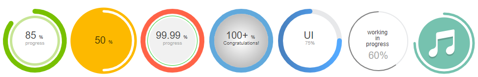
It is a simple circle progress component created for Angular 4 based only on SVG graphics and has various of options to customize it.
## Installation
To install this library, run:
```bash
$ npm install ng-circle-progress --save
```
Once you have installed it, you can import it in any Angular application,
then from your Angular `AppModule`:
```typescript
import { BrowserModule } from '@angular/platform-browser';
import { NgModule } from '@angular/core';
import { AppComponent } from './app.component';
// Import ng-circle-progress
import { NgCircleProgressModule } from 'ng-circle-progress';
@NgModule({
declarations: [
AppComponent
],
imports: [
BrowserModule,
// Specify ng-circle-progress as an import
NgCircleProgressModule.forRoot({
// set defaults here
radius: 100,
outerStrokeWidth: 16,
innerStrokeWidth: 8,
outerStrokeColor: "#78C000",
innerStrokeColor: "#C7E596",
animationDuration: 300,
...
})
],
providers: [],
bootstrap: [AppComponent]
})
export class AppModule { }
```
Once NgCircleProgressModule is imported, you can use CircleProgressComponent in your Angular application:
```xml
```
## Options
Option | Type | Default | Description
--- | --- | --- | ---
percent | `number` | `0` | Number of percent you want to show
maxPercent | `number` | `1000` | Max number of percent you want to show
radius | `number` | `90` | Radius of circle
clockwise | `boolean` | `true` | Whether to rotate clockwise or counter-clockwise
responsive | `boolean` | `false` | Whether to make the circle responsive
showTitle | `boolean` | `true` | Whether to display title
showSubtitle | `boolean` | `true` | Whether to display subtitle
showUnits | `boolean` | `true` | Whether to display units
showBackground | `boolean` | `true` | Whether to display background circle
showInnerStroke | `boolean` | `true` | Whether to display inner stroke
backgroundStroke | `string` | `'transparent'` | Background stroke color
backgroundStrokeWidth | `number` | `0` | Stroke width of background circle
backgroundPadding | `number` | `5` | Padding of background circle
backgroundColor | `string` | `'transparent'` | Background color
backgroundOpacity | `number` | `1` | Opacity of background color
space | `number` | `4` | Space between outer circle and inner circle
toFixed | `number` | `0` | Using fixed digital notation in Title
renderOnClick | `boolean` | `true` | Render when component is clicked
units | `string` | `'%'` | Units showed aside the title
unitsFontSize | `string` | `'10'` | Font size of units
unitsColor | `string` | `'#444444'` | Font color of units
outerStrokeWidth | `number` | `8` | Stroke width of outer circle (progress circle)
outerStrokeColor | `sting` | `'#78C000'` | Stroke color of outer circle
outerStrokeLinecap | `sting` | `'round'` | Stroke linecap of outer circle. Possible values(butt, round, square, inherit)
innerStrokeWidth | `number` | `4` | Stroke width of inner circle
innerStrokeColor | `sting` | `'#C7E596'` | Stroke color of inner circle
title | `string\|Array` | `'auto'` | text showed as title. Percentage is displayed when title equals 'auto'.
titleFormat | `Function` | `undefined` | A callback function to format title. It returns a string or an array of string.
titleColor | `string` | `'#444444'` | Font color of title
titleFontSize | `string` | `'20'` | Font size of title
subtitle | `string\|Array` | `'Percent'` | text showed as subtitle
subtitleFormat | `Function` | `undefined` | A callback function to format subtitle. It returns a string or an array of string.
subtitleColor | `string` | `'#A9A9A9'` | Font color of subtitle
subtitleFontSize | `string` | `'10'` | Font size of subtitle
animation | `boolean` | `true` | Whether to animate the outer circle when rendering
animateTitle | `boolean` | `true` | Whether to animate the title when rendering
animateSubtitle | `boolean` | `false` | Whether to animate the subtitle when rendering
animationDuration | `number` | `500` | Duration of animation in microseconds
class | `string` | `''` | CSS class name for SVG element
```typescript
// subtitleFormat callback example
formatSubtitle = (percent: number) : string => {
if(percent >= 100){
return "Congratulations!"
}else if(percent >= 50){
return "Half"
}else if(percent > 0){
return "Just began"
}else {
return "Not started"
}
}
```
## Development
To generate all `*.js`, `*.d.ts` and `*.metadata.json` files:
```bash
$ npm run build
```
To lint all `*.ts` files:
```bash
$ npm run lint
```
## License
MIT © [bootsoon](mailto:bootsoon@aliyun.com)
This project was generated by [Yeoman generator angular2-library](https://github.com/jvandemo/generator-angular2-library)