ng2-daterangepicker
-------------------
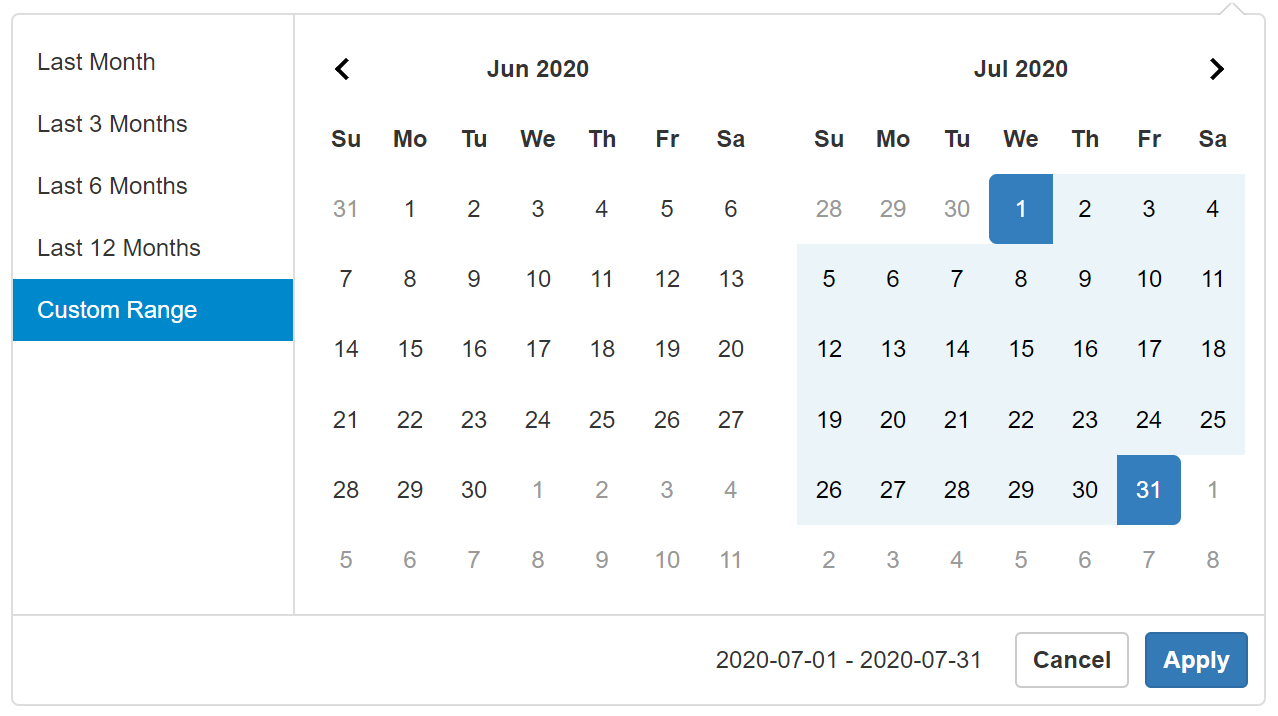
This library was generated with [Angular CLI](https://github.com/angular/angular-cli) version 9.0.1.
## Version 3.0.0 adds support for Angular 9.0 Ivy compiler
I have not made efforts to test earlier versions of angular with version 3.x of this package but it should still work.
### Installation
Use your preferred package manager
```
npm install ng2-daterangepicker
yarn add ng2-daterangepicker
ng add ng2-daterangepicker
```
#### peerDependencies
Please note and install the following peerDependencies if necessary for your setup
```json
"peerDependencies": {
"@types/jquery": "^3.2.12",
"jquery": "^3.2.1",
}
```
### Update tsconfig.json
Update tsconfig.json file in your project root to allow syntectic default imports
```javascript
"allowSyntheticDefaultImports": true
```
### Usage
Add JQuery and the custom css stylesheet to `angular.json`. You can customize the stylesheet as you want.
Latest version does not require Bootstrap. You can also skip this and copy the contents of the css file to your stylesheets for customizations.
```json
{
"styles": [
"node_modules/ng2-daterangepicker/assets/daterangepicker.css"
],
"scripts": [
"node_modules/jquery/dist/jquery.min.js"
]
}
```
### Import Daterangepicker Module
Import the `Daterangepicker` module in your application module
``` javascript
import { Daterangepicker } from 'ng2-daterangepicker';
@NgModule({
imports: [Daterangepicker]
})
```
Use the `daterangepicker` directive in your component by passing in options `{}` and consuming the `selected` event. Directive can be added to inputs, buttons or any other html element.
### Component Template
``` html
```
### Component
```javascript
export class AppComponent {
public daterange: any = {};
// see original project for full list of options
// can also be setup using the config service to apply to multiple pickers
public options: any = {
locale: { format: 'YYYY-MM-DD' },
alwaysShowCalendars: false,
};
public selectedDate(value: any, datepicker?: any) {
// this is the date selected
console.log(value);
// any object can be passed to the selected event and it will be passed back here
datepicker.start = value.start;
datepicker.end = value.end;
// use passed valuable to update state
this.daterange.start = value.start;
this.daterange.end = value.end;
this.daterange.label = value.label;
}
}
```
### Using Multiple Instances
You can pass global settings that can be overloaded by the `options` object in the daterangepicker instances. Use the `DaterangepickerConfig` service to do so. The service provider is set in the daterangepicker module.
``` javascript
import { DaterangepickerConfig } from 'ng2-daterangepicker';
@Component({
selector:'my-app',
template:'
Component Template
'
})
export class AppComponent {
constructor(private daterangepickerOptions: DaterangepickerConfig) {
this.daterangepickerOptions.settings = {
locale: { format: 'YYYY-MM-DD' },
alwaysShowCalendars: false
};
}
}
```
## Daterangepicker methods
You can programmatically update the `startDate` and `endDate` in the picker using the `setStartDate` and `setEndDate` methods. You can access the Date Range Picker object and its functions and properties through the `datePicker` property of the directive using `@ViewChild`.
``` javascript
import { Component, AfterViewInit, ViewChild } from '@angular/core';
import { DaterangePickerComponent } from 'ng2-daterangepicker';
@Component({
selector:'my-app',
template:'
Component Template
'
})
export class AppComponent {
@ViewChild(DaterangePickerComponent)
private picker: DaterangePickerComponent;
public updateDateRange() {
this.picker.datePicker.setStartDate('2017-03-27');
this.picker.datePicker.setEndDate('2017-04-08');
}
}
```
## Using Daterangepicker Events
You can bind to the events fired by the daterangepicker. All events will emit an object containing the event fired and the datepicker object.
```
{
event: {},
picker: {}
}
```
#### Available events
Below is the list of events that you can bind into.
Visit the original site for detailed options and documentation http://www.daterangepicker.com/#options
```
cancelDaterangepicker
applyDaterangepicker
hideCalendarDaterangepicker
showCalendarDaterangepicker
hideDaterangepicker
showDaterangepicker
```
Below is a sample usage. You can have multiple methods and implement only the events you want.
Create methods that will be called by the events in your component and bind to fired events in the component's template.
``` javascript
@Component({
selector: 'my-app',
template: ``,
})
export class AppComponent {
public daterange: any = {};
private selectedDate(value: any) {
daterange.start = value.start;
daterange.end = value.end;
}
// expected output is an object containing the event and the picker.
// your method can be named whaterver you want.
// you can add multiple params to the method and pass them in the template
public calendarCanceled(e:any) {
console.log(e);
// e.event
// e.picker
}
public calendarApplied(e:any) {
console.log(e);
// e.event
// e.picker
}
}
```
Notes
-----
* This component was made in the early days of transitioning from JQuery to Angular 2.0 You might want to consider using more modern alternatives
* Though this package still uses JQuery and Bootstrap it has been updated to support Angular 9 in 2020 (I have not made efforts to test earlier versions of Angular with version 3.0)
* If your project is not using JQuery for other features this date picker might not be the best option for your project
* This package ports the original [Daterangepicker](http://www.daterangepicker.com) by [Dan Grossman](https://github.com/dangrossman) for use in Angular. Angular 9 support starts with `Version 3.x` of this package
Contributing
------------
## Development server
Run `ng serve` for a dev server. Navigate to `http://localhost:4200/`. The app will automatically reload if you change any of the source files.
## Code scaffolding
Run `ng generate component component-name` to generate a new component. You can also use `ng generate directive|pipe|service|class|guard|interface|enum|module`.
## Build Development
Run `ng build` to build the project. The build artifacts will be stored in the `dist/` directory. Use the `--prod` flag for a production build.
## Build Package
Run `ng build ng2-daterangepicker` to build the project. The build artifacts will be stored in the `dist/` directory.
## Publishing
After building your library with `ng build ng2-daterangepicker`, go to the dist folder `cd dist/ng2-daterangepicker` and run `npm publish`.
## Running unit tests
Run `ng test ng2-daterangepicker` to execute the unit tests via [Karma](https://karma-runner.github.io).
## Further help
To get more help on the Angular CLI use `ng help` or go check out the [Angular CLI README](https://github.com/angular/angular-cli/blob/master/README.md).