# Info Drawer component(s)
- [InfoDrawerLayoutComponent](#infodrawerlayoutcomponent)
* [Example](#example)
- [InfoDrawerComponent](#infodrawercomponent)
* [Properties](#properties)
* [Example](#example-1)
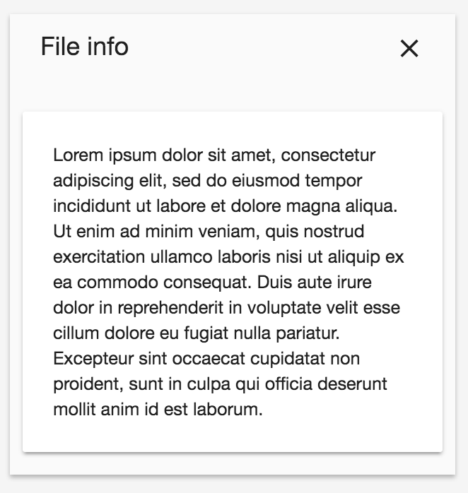
The **Info Drawer components** helps you manage your layout when you want a *(tabbable)* sidebar-like design, what you can see below.

There are 2 different kind of components what you can choose from:
- InfoDrawerLayoutComponent
- InfoDrawerComponent
## InfoDrawerLayoutComponent
The InfoDrawerLayoutComponent (as the name says) is basically just a layout with css applied on it. In this layout you have 3 regions you can transclude content into:
- info-drawer-title
- info-drawer-buttons
- info-drawer-content
### Example
```html
File info
clear
Lorem ipsum dolor sit amet...
```
## InfoDrawerComponent
The InfoDrawerComponent is on top of the InfoDrawerLayoutComponent. This version of the info drawer is supposed to be used if you need tabbing behaviour. You can set a title (if it only contains a string) with the **title** input property. Additionally, It also provides a **currentTab** output property. This component has the same 3 regions as described above, but if you want to leverage the tabbing functionality, you have to use the **adf-info-drawer-tab** component to organize your content. The only input paramter of the adf-info-drawer-tab component is the **"label"**, with you can specify the tab label with.
### Properties
| Name | Type | Default | Description |
| --- | --- | --- | --- |
| title | string | null | The title of the info drawer component|
| currentTab | any | null | The current active tab |
### Example
```html
clear
```