# multi-range-slider-react

a react component that can easy to use and interact with parent component with props and events.


------------

## Click on image to view demo-code.

[<img src="./simple-range-slider.png">](https://codesandbox.io/s/range-slider-with-default-values-jjr9nt)
[<img src="./range-slider-with-custom-css.png">
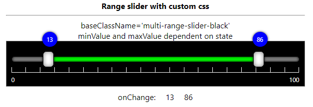
](https://codesandbox.io/s/range-slider-with-custom-css-bunj91)
[<img src="./range-slider-week-days.png">
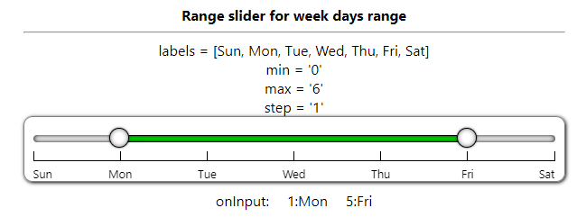
](https://codesandbox.io/s/range-slider-week-days-slider-24xqki)
[<img src="./range-slider-date-range.png">
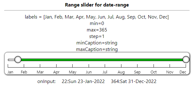
](https://codesandbox.io/s/range-slider-date-range-ndngb6)
[<img src="./range-slider-time-range.png">
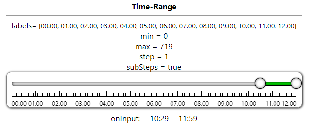
](https://codesandbox.io/s/range-slider-time-range-f47oy7)
[<img src="./range-slider-negative-positive-range.png">
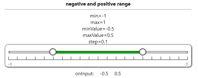
](https://codesandbox.io/s/range-slider-negative-positive-range-o9i02h)
[<img src="./range-slider-step-only-round.png">
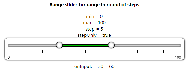
](https://codesandbox.io/s/range-slider-round-step-only-qf339k)
[<img src="./range-slider-custom-style-props.png">
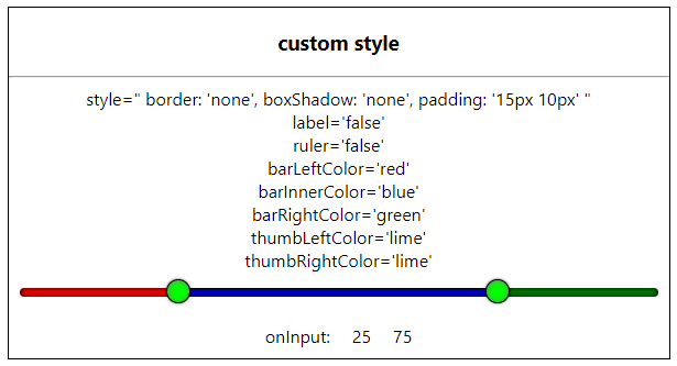
](https://codesandbox.io/s/range-slider-custom-style-props-dcvshf)

------------


# No Dependency only single component file and css file 

## MultiRangeSlider.jsx , MultiRangeSlider.css

### You can customize css to change UI/UX.

Download CSS file and modify it and reference it with baseClassName attribute

[multirangeslider.css](https://raw.githubusercontent.com/developergovindgupta/multi-range-slider-react-ts/master/src/components/multirangeslider.css)

[multirangesliderblack.css](https://raw.githubusercontent.com/developergovindgupta/multi-range-slider-react-ts/master/src/components/multirangesliderblack.css)


<hr/>

# view Demo 
## [GitHub-page](https://developergovindgupta.github.io/multi-range-slider-react-ts/)

<hr/>

Following is the list of props that control the component 

|props   | type | default | description | 
| ------------ | ------------ | ------------ | ------------ |
| id  | String  | '' | Set id to multi-range-slider control root div |
| min  | Number  | 0 | Slider Minimum Value that user can set |
| max  | Number  | 100 | Slider Maximum Value that user can Set |
| minValue  | Number  | 25 | Slider range selected minimum value that will show default selected |
| maxValue  | Number  | 75 | Slider range selected maximum value that will show default selected |
| step  | Number  | 5 | Slider change value that will change when bar clicked or keyboard arrow key pressed |
| stepOnly  | Boolean  | false | specify user to select only values in round of step only |
| canMinMaxValueSame | Boolean | false | If true then user can select both min and max same value otherwise have difference of step value |
| preventWheel  | Boolean  | false | true then it not accept mouse wheel to change its value. false then (shift + wheel) change minValue (ctrl+wheel) change maxValue, (ctrl+shift+wheel) change both values |
| disabled  | Boolean  | false | true then user can not change its value by mouse/keyboard. Only can change by update props/state value |
|ruler|Boolean|true|is ruler visible or not|
|label|Boolean|true|is label visible or not|
|labels|String Array||specify steps label string value|
|minCaption|String||caption on min thumb when sliding - can set on onChange/onInput event|
|maxCaption|String||caption on max thumb when sliding - can set on onChange/onInput event|
|subSteps|Boolean|false|is small steps line visible or not|
|baseClassName|String|multi-range-slider|Change CSS style of your own|
|className|String|''|Add additional class with baseClassName to div.multi-range-slider|
|style|React.CSSProperties||specify/override additional style on div.multi-range-slider|
|barLeftColor|String-Color||specify slider left part background color|
|barRightColor|String-Color||specify slider right part background color|
|barInnerColor|String-Color||specify slider inner part background color|
|thumbLeftColor|String-Color||specify slider left thumb background color|
|thumbRightColor|String-Color||specify slider right thumb background color|
|ref|React.useRef||reference to div.multi-range-slider|

### Event List

|Event|Description|
|-|-|
|onChange|trigger when thumb mouse up OR slider value change done|
|onInput|trigger on thumb mouse move OR slider value changing|


### typescript props definition 

	Props = {
		min?: number | string;
		max?: number | string;
		step?: number | string;
		minValue?: number | string;
		maxValue?: number | string;
		baseClassName?: string;
		className?: string;
		style?: React.CSSProperties;
		ruler?: boolean | string;
		label?: boolean | string;
		subSteps?: boolean | string;
		stepOnly?: boolean | string;
		preventWheel?: boolean | string;
		labels?: string[];
		minCaption?: string;
		maxCaption?: string;
		barLeftColor?: string;
		barRightColor?: string;
		barInnerColor?: string;
		thumbLeftColor?: string;
		thumbRightColor?: string;
		onInput?: (e: ChangeResult) => void;
		onChange?: (e: ChangeResult) => void;
	};


### onInput/onChange event parameter type - typescript
	type ChangeResult = {
		min: number;
		max: number;
		minValue: number;
		maxValue: number;
	};

<hr/>

## How to Install
copy following code and run on CLI

`npm install multi-range-slider-react`

<hr/>

## How to use 
Example Code 

[download from gitHub](https://github.com/developergovindgupta/multi-range-slider-react-ts "download from gitHub")


#### App.jsx

	import React, { useState } from "react";
	import MultiRangeSlider from "multi-range-slider-react";
	function App() {
	const [minValue, set_minValue] = useState(25);
	const [maxValue, set_maxValue] = useState(75);
	const handleInput = (e) => {
		set_minValue(e.minValue);
		set_maxValue(e.maxValue);
	};

	return (
		<div className="App">
			<MultiRangeSlider
				min={0}
				max={100}
				step={5}
				minValue={minValue}
				maxValue={maxValue}
				onInput={(e) => {
					handleInput(e);
				}}
			/>
		</div>
		);
	}

	export default App;


<br/><br/>

#### App.tsx

	import React, { useState } from "react";
	import MultiRangeSlider, { ChangeResult } from "multi-range-slider-react";

	const App = () => {
		const [minValue, setMinValue] = useState(25);
		const [maxValue, setMaxValue] = useState(75);

		return (
			<div className='App'>
				<div className='multi-range-slider-container'>
					<b>Simple range slider with default values</b>
					<hr />
					<MultiRangeSlider
						min={0}
						max={100}
						step={5}
						minValue={minValue}
						maxValue={maxValue}
						onInput={(e: ChangeResult) => {
							setMinValue(e.minValue);
							setMaxValue(e.maxValue);
						}}
					></MultiRangeSlider>
					<div style={{ display: 'flex', justifyContent: 'center' }}>
						<div style={{ margin: '10px' }}>onInput:</div>
						<div style={{ margin: '10px' }}>{minValue}</div>
						<div style={{ margin: '10px' }}>{maxValue}</div>
					</div>
				</div>
			</div>
		)
	
	}
	export default App;


<br/><br/><br/><br/><br/>
# View Demo

## [GitHub-page](https://developergovindgupta.github.io/multi-range-slider-react-ts/)

## [Click here to view DEMO](https://tsi0x.csb.app/)
## [Click here to view DEMO + Example Code](https://codesandbox.io/dashboard/all/multi-range-slider-react)

<br/><br/><br/><br/><br/>


# License 
## (Free to use)

<br/><br/><br/><br/><br/>


# Author
## Govind Prasad Gupta
### developergovindgupta
### email : developergovindgupta@gmail.com
