# MonthYearPicker
Allow to select month and year.
* Install by executing `npm install month-year-picker`.
* Import by adding `import MonthPicker from 'month-year-picker'`.
* Use by adding ``.
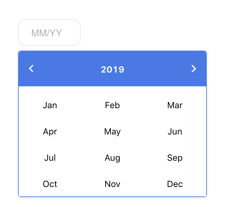 ## Demo
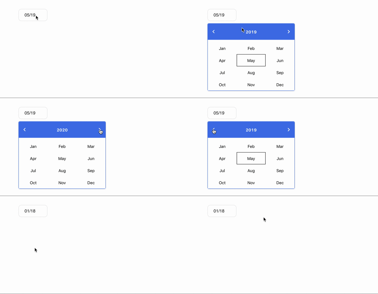 ### Usage
Here's an example of basic usage:
```js
import React, { Component } from 'react';
import MonthPicker from 'month-year-picker';
class MyApp extends Component {
render() {
return (
### Usage
Here's an example of basic usage:
```js
import React, { Component } from 'react';
import MonthPicker from 'month-year-picker';
class MyApp extends Component {
render() {
return (
);
}
}
```
## User guide
#### Props
|Prop name|Description|Default value|Example values|
|----|----|----|----|
|className|Class name that will be added to rendered element along with the default.|n/a|- String:
`"custom-class-name-1"`
|
|Id|Id for Month Picker.|n/a||
|allowedYears|allowedYears for Month Picker.|n/a|- object:
`{ "after": new Date().getFullYear() - 2,"before": new Date().getFullYear() + 4}`
|
|ChangeYearFormat|Change year format to YYYY.|false||
|hintText|hint text shown in picker.|"MM/YY"||
|primaryColor|Background Color of Month Picker.|"#27718c"||
|secondaryColor|Text Color of Month Picker.|"#898989"||
|textFieldStyle|Text field Style for Month Picker.|n/a||
|disabled|For disabling Month Picker.|false||