# Angular Jalali Date Picker
This is a configurable jalali (persian, khorshidi, shamsi) date-picker build for Angular 2 - 5 applications and uses [jalali-moment](https://github.com/fingerpich/moment-jalaali) as its dependency. it's only Angular! No jQuery.
[DEMO](https://fingerpich.github.io/jalali-angular-datepicker/)
Read this in other languages: [فارسی](./README.fa.md)
[](https://travis-ci.org/fingerpich/jalali-angular-datepicker)
[](https://badge.fury.io/js/ng2-jalali-date-picker)
[](http://packagequality.com/#?package=ng2-jalali-date-picker)
[](https://david-dm.org/fingerpich/jalali-angular-datepicker)
[](https://david-dm.org/fingerpich/jalali-angular-datepicker?type=dev)
[](https://www.codacy.com/app/zarei-bs/jalali-angular-datepicker?utm_source=github.com&utm_medium=referral&utm_content=fingerpich/jalali-angular-datepicker&utm_campaign=Badge_Grade)
[](https://www.codacy.com/app/zarei-bs/jalali-angular-datepicker?utm_source=github.com&utm_medium=referral&utm_content=fingerpich/jalali-angular-datepicker&utm_campaign=Badge_Coverage)
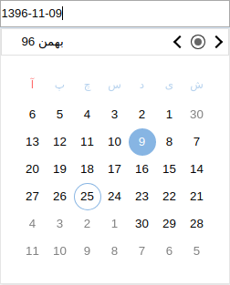
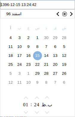
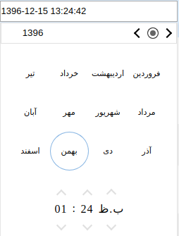
## Screenshots
## Installation:
1. Download from npm:
`npm install ng2-jalali-date-picker --save`
2. import the `DpDatePickerModule` module in typescript (.ts) or es6 files like below:
`import {DpDatePickerModule} from 'ng2-jalali-date-picker';`
3. Add `DpDatePickerModule` to your module imports:
```ts
@NgModule({
...
imports: [
...
DpDatePickerModule
]
})
```
## How to use
```html
```
```ts
dateObject = "";
//OR if you have initial value you could use following code
import * as moment from 'jalali-moment';
dateObject = moment('1395-11-22','jYYYY,jMM,jDD');
```
[Demo](https://plnkr.co/XJSWtt)
#### How to use the output as a jalali (shamsi) date
```ts
import * as moment from 'jalali-moment';
dateObject.format('jYYYY/jMM/jD)'
```
read [jalali-moment](https://github.com/fingerpich/jalali-moment)
#### How to use it with system.js
[this Demo](https://plnkr.co/XJSWtt) is using system.js.
### Attributes (Input):
all attributes in the following table could be used as
```html
// a future selector
```
| Name | Type | Default | Applies To | Description |
|----------------------|:-----------------------------------:|:------------------:|:-------------------------:|----------------------------------------------------------------------------------------------------------------------------------------------------------------------------------------------------------------------------------------------------|
| dir | `rtl`|`ltr` | `ltr` | the type of the calender which will be displayed in the picker |
| mode | `"day"\|"month"\|"time"\|"daytime"` | `"day"` | All | The mode of the calender which will be displayed in the picker |
| displayDate | `Moment\|String` | current date | `day\|month\|daytime` | Indicates on what date to open the calendar on |
| disabled | `Boolean` | `false` | All | If set to true the input would be disabled |
| placeholder | `String` | `""` | All | The date-picker input placeholder |
| required | `Boolean` | `undefined` | All | This is a validation rule, if there won't be any selected date then the containing form will be invalid. |
| minDate | `Moment\|String` | `undefined` | `day\|month\|daytime` | This is a validation rule, if the selected date will be before `minDate` the containing form will be invalid. Note: if provided as string format configuration should be provided in the config object. |
| maxDate | `Moment\|String` | `undefined` | `day\|month\|daytime` | This is a validation rule, if the selected date will be after `maxDate` the containing form will be invalid. Note: if provided as string format configuration should be provided in the config object. |
| minTime | `Moment\|String` | `undefined` | `time` | This is a validation rule, if the selected date will be before `minTime` the containing form will be invalid. Note: if provided as string format configuration should be provided in the config object. |
| maxTime | `Moment\|String` | `undefined` | `time` | This is a validation rule, if the selected date will be after `maxTime` the containing form will be invalid. Note: if provided as string format configuration should be provided in the config object. |
| theme | `String` | `""` | All | Theme is a class added to the popup container (and inner components) - this will allow styling of the calendar when it's appended to outer element (for example - body). There is a built in theme named dp-material, you can find it in the demo. |
| config | `IDatePickerConfig` | See Below | All | Configuration object - see description below. |
### Attributes (Output):
| Name | Event Arguments | Applies To | Description |
|----------------------|:-----------------------------------:|:-------------------------:|------------------------------------------------------------------------------------------------------------------------------------------------------------------|
| onChange | `CalendarValue` | All Pickers | This event will be emitted on every valid value change, if you want to receive every value (valid and invalid) please use the native `ngModelChange` output. |
| open | `undefined` | All Pickers | This event will be emitted when picker is opened. |
| close | `CalendarValue` | All Pickers | This event will be emitted when picker is closed. |
| onGoToCurrent | void | All Pickers | This event will be emitted when click was made on go to current button. |
| onLeftNav | void | All Pickers | This event will be emitted when click was made on left navigation button. |
| onRightNav | void | All Pickers | This event will be emitted when click was made on right navigation button. |
### Configuration:
In order to provide configurations to the date-picker you need to pass it to the `dp-date-picker` component:
```html
```
```ts
datePickerConfig = {
drops: 'up',
format: 'YY/M/D'
}
```
Here are the available configurations:
| Name | Type | Default | Applies To | Description |
|-----------------------------|:---------------------:|:-------------------------------------------------------------------------:|:-------------------------:|-------------------------------------------------------------------------------------------------------------------------------------------------------------------------------------------------------------------------------------------------------------------------------|
| appendTo | `String\|HTMLElement` | `undefined` | All | The selector/element to which the calendar popup will append to (this is useful for `overflow: hidden` container issues). Please note that the `appendTo` element will be set with position `absolute` if it has position `static` (the default position). |
| locale | `String` | [`moment.locale()`](https://momentjs.com/docs/#/i18n/getting-locale/) | All | Localisation of language (see in the demo all supported locales) |
| disableKeypress | `Boolean` | `false` | All | Disables the possibility to change the date value by typing it - changing the date would be possible only from the picker |
| format | `String` | `"DD-MM-YYYY"` | All | If ngModel provided as `String` the format is required, this format also will be used as the input format style. |
| onOpenDelay | `Number` | `0` | All | The delay (in ms) between the date picker focusing and the date-picker popup apparel |
| drops | `'up'\|'down'` | `undefined` down if possible | All | Whether the picker appears below or above the input element. |
| opens | `'right'\|'left'` | `undefined` right if possible | All | Whether the picker appears aligned to the left or to the right the input element. |
| closeOnSelect | `Boolean` | `true` | `day\|month` | If set to `true` will close the date-picker after choosing a date from the calender, otherwise, won't. |
| openOnClick | `Boolean` | `true` | `day\|month\|daytime` | If set to `false` will not open the date-picker when input gets clicked, otherwise, will. |
| openOnFocus | `Boolean` | `true` | `day\|month\|daytime` | If set to `false` will not open the date-picker when input gets focused, otherwise, will. |
| closeOnSelectDelay | `Number` | `100` | `day\|month` | The delay (in ms) between the date selection and the date-picker collapse |
| allowMultiSelect | `Boolean` | `undefined` | `day\|month` | If set to `true` will allow for choosing multiple dates. `false` will force a single selection. If `undefined`, the picker will attempt to guess based on the type of the input value. |
| dayBtnFormat | `String` | `DD` | `day\|daytime` | The day format of the day button in the calendar. |
| dayBtnFormatter | `(Moment) => String` | `undefined` | `day\|daytime` | The formatter (callback function) of the day button in the calendar. |
| dayBtnCssClassCallback | `(Moment) => String` | `undefined` | `day\|daytime` | Callback for adding custom CSS classes to the day button in the calendar. Can contain multiple classes, just seperate with a space. |
| enableMonthSelector | `Boolean` | `true` | `day\|daytime` | Whether to enable/disable the selection of a moth granularity picker. |
| firstDayOfWeek | `String` | `"su"` | `day\|daytime` | The first day of the calendar's week. Should be one of: `"su", "mo", "tu", "we", "th", "fr", "sa"` |
| isDayDisabledCallback | `(Moment) => boolean` | `undefined` | `day\|daytime` | Callback which should indicate if specific day is disabled. |
| monthFormat | `String` | `"MMM-YYYY"` | `day\|daytime` | The date format of the day calendar, the one that seen above the calendar days. Will be overwritten if `monthFormatter` provided. |
| monthFormatter | `(Moment) => String` | `undefined` | `day\|daytime` | The date formatter (callback function) of the day calendar, the one that seen above the calendar days. |
| showNearMonthDays | `Boolean` | `true` | `day\|daytime` | Whether to show/hide next and previous month days. |
| showWeekNumbers | `Boolean` | `false` | `day\|daytime` | Whether to show/hide the week number of each week (iso week number). |
| isMonthDisabledCallback | `(Moment) => boolean` | `undefined` | `day\|month\|daytime` | Callback which should indicate if specific month is disabled (month selector). |
| max | `Moment\|String` | `undefined` | `day\|month\|daytime` | Disables all dates (on the date-picker) that are set to after the `max`, note that if invalid date would be set by the input then the date picker value would be the max date but the input will show the user typed date. |
| min | `Moment\|String` | `undefined` | `day\|month\|daytime` | Disables all dates (on the date-picker) that are set to before the `min`, note that if invalid date would be set by the input then the date picker value would be the min date but the input will show the user typed date. |
| monthBtnFormat | `String` | `DD` | `day\|month\|daytime` | The month format of the month button in the calendar. |
| monthBtnFormatter | `(Moment) => String` | `undefined` | `day\|month\|daytime` | The formatter (callback function) of the month button in the calendar. |
| monthBtnCssClassCallback | `(Moment) => String` | `undefined` | `day\|month\|daytime` | Callback for adding custom CSS classes to the month button in the calendar. Can contain multiple classes, just seperate with a space. |
| yearFormat | `String` | `"YYYY"` | `day\|month\|daytime` | The date format of the month calendar, the one that seen above the calendar months. Will be overwritten if `yearFormatter` provided. (available when `enableMonthSelector` is set to `true`). |
| yearFormatter | `(Moment) => String` | `undefined` | `day\|month\|daytime` | The date formatter (callback function) of the month calendar, the one that seen above the calendar months. (available when `enableMonthSelector` is set to `true`). |
| hours12Format | `String` | `"hh"` | `daytime\|time` | The hours format of the time select when `showTwentyFourHours` is `false`. |
| hours24Format | `String` | `"HH"` | `daytime\|time` | The hours format of the time select when `showTwentyFourHours` is `true`. |
| maxTime | `Moment\|String` | `undefined` | `daytime\|time` | Disables arrow buttons on the time select that would make the time after the `maxTime`. |
| meridiemFormat | `String` | `"A"` | `daytime\|time` | The AM/PM format of the time select when `showTwentyFourHours` is `false`. |
| minTime | `Moment\|String` | `undefined` | `daytime\|time` | Disables arrow buttons on the time select that would make the time before the `minTime`. |
| minutesFormat | `String` | `"mm"` | `daytime\|time` | The minutes format of the time select. |
| minutesInterval | `number` | `1` | `daytime\|time` | The number of minutes that will be added/subtracted when clicking up/down arrows on the time select. |
| secondsFormat | `String` | `"ss"` | `daytime\|time` | The seconds format of the time select. |
| secondsInterval | `number` | `1` | `daytime\|time` | The number of seconds that will be added/subtracted when clicking up/down arrows on the time select. |
| showSeconds | `boolean` | `false` | `daytime\|time` | If set to `true` will show seconds in the time select, otherwise, won't. |
| showTwentyFourHours | `boolean` | `false` | `daytime\|time` | If set to `true` will show hours in 24 hour format. `false` will show hours in 12 hours format and append AM/PM to the end of the time select. |
| timeSeparator | `String` | `":"` | `daytime\|time` | The separator that will be placed between hours and minutes and between minutes and seconds on the time select. |
| showMultipleYearsNavigation | `boolean` | `false` | `day\|month\|daytime` | If set to `true` will show buttons to navigate by multiple years (10 by default) |
| multipleYearsNavigateBy | `number` | `10` | `day\|month\|daytime` | Number of years to navigate when showMultipleYearsNavigation is `true` |
| returnedValueType | `ECalendarValue` | `Moment` | All | The returned value type (`Moment`, `Moment[]`, `string`, `string[]` |
| unSelectOnClick | `boolean` | `true` | `day\|month` | Will allow disallow/unselect to selected date by clicking on the selected date |
| inputElementContainer | `string\|HTMLElement` | `undefined` | All | Will place picker popup relative to the provided elemenr (if string provided will used as a selector) |
| showGoToCurrent | `boolean` | `true` | All | Show/Hides the go to current button on the calendars navigation |
| hideOnOutsideClick | `boolean` | `true` | All | Show/Hides the picker popup after click outside of the component |
### API:
In order to use the date-picker api user the `@ViewChild` annotation in the date-picker containing component class, take at the example below:
Container component:
```ts
import {Component, ViewChild} from '@angular/core';
import {DatePickerComponent} from 'ng2-jalali-date-picker';
@Component({
selector: 'my-container',
template: `
Container
`
});
class MyContainer {
@ViewChild('dayPicker') datePicker: DatePickerComponent;
open() {
this.datePicker.api.open();
}
close() {
this.datePicker.api.close();
}
}
```
If you want to use API with [`Directive`](#directive) - you can do it by using `#dateDirectivePicker`, like below:
```ts
import {Component, ViewChild} from '@angular/core';
import {DatePickerDirective} from 'ng2-date-picker';
@Component({
selector: 'my-container',
template: `
`
});
class MyContainer {
@ViewChild('dateDirectivePicker') datePickerDirective: DatePickerDirective;
close() {
this.datePickerDirective.api.close();
}
}
```
Here is the list of APIs:
| Name | Signature | Description |
|----------------------|:----------------------------------:|----------------------------------|
| open | `() => void` | Opens the date picker |
| close | `() => void` | Closes the date picker |
| moveCalendarTo | `(to: Moment \| String) => void` | Moves calendar to specific date |
## Inline - Day Calendar
You can use the `` component to display the calendar widget without an associated input box.
i.e.
```html
```
### Attributes:
| Name | Type | Default | Description |
|----------------------|:-------------------:|:------------------------------------------------------------------------:|----------------------------------------------------------------------------------------------------------------------------------------------------------------------------------------------------------------------------------------------------|
| required | `Boolean` | `undefined` | This is a validation rule, if there won't be any selected date then the containing form will be invalid. |
| minDate | `Moment\|String` | `undefined` | This is a validation rule, if the selected date will be before `minDate` the containing form will be invalid. Note: if provided as string format configuration should be provided in the config object. |
| maxDate | `Moment\|String` | `undefined` | This is a validation rule, if the selected date will be after `maxDate` the containing form will be invalid. Note: if provided as string format configuration should be provided in the config object. |
| theme | `String` | `''` | Theme is a class added to the popup container (and inner components) - this will allow styling of the calendar when it's appended to outer element (for example - body). There is a built in theme named dp-material, you can find it in the demo. |
| config | `IDayPickerConfig` | See Below | Configuration object - see description below. |
### Attributes (Output):
| Name | Event Arguments | Description |
|----------------------|:-----------------------------------:|:------------------------------------------------------------------------------------------------------------------------------------------------------------------|
| onSelect | `IDay` | This event will be emitted when a day is selected. |
| onMonthSelect | `IMonth` | This event will be emitted when a month is selected. |
| onNavHeaderBtnClick | `ECalendarMode` | This event will be emitted when the mode of the calendar switches form day to month and vise versa. |
| onGoToCurrent | void | This event will be emitted when click was made on go to current button. |
| onLeftNav | void | This event will be emitted when click was made on left navigation button. |
| onRightNav | void | This event will be emitted when click was made on right navigation button. |
### Configuration:
In order to provide configurations to the day-calendar you need to pass it to the `dp-day-calendar` component:
```html
```
Here are the available configurations:
| Name | Type | Default | Description |
|-----------------------------|:--------------------:|:-------------------------------------------------------------------------:|-------------------------------------------------------------------------------------------------------------------------------------------------------------------------------------------------------------------------------------------------------------------------------|
| format | `String` | `"DD-MM-YYYY"` | If ngModel provided as `String` the format is required, this format also will be used as the input format style. |
| firstDayOfWeek | `String` | `"su"` | The first day of the calendar's week. Should be one of: `"su", "mo", "tu", "we", "th", "fr", "sa"` |
| monthFormat | `String` | `"MMM-YYYY"` | The date format of the day calendar, the one that seen above the calendar days. Will be overwritten if `monthFormatter` provided. |
| monthFormatter | `(Moment) => String` | `undefined` | The date formatter (callback function) of the day calendar, the one that seen above the calendar days. |
| yearFormat | `String` | `"YYYY"` | The date format of the month calendar, the one that seen above the calendar months. Will be overwritten if `yearFormatter` provided. (available when `enableMonthSelector` is set to `true`). |
| yearFormatter | `(Moment) => String` | `undefined` | The date formatter (callback function) of the month calendar, the one that seen above the calendar months. (available when `enableMonthSelector` is set to `true`). |
| allowMultiSelect | `Boolean` | `undefined` | If set to `true` will allow for choosing multiple dates. `false` will force a single selection. If `undefined`, the picker will attempt to guess based on the type of the input value. |
| min | `Moment\|String` | `undefined` | Disables all dates (on the date-picker) that are set to before the `min`, note that if invalid date would be set by the input then the date picker value would be the min date but the input will show the user typed date. |
| max | `Moment\|String` | `undefined` | Disables all dates (on the date-picker) that are set to after the `max`, note that if invalid date would be set by the input then the date picker value would be the max date but the input will show the user typed date. |
| showNearMonthDays | `Boolean` | `true` | Whether to show/hide next and previous month days. |
| showWeekNumbers | `Boolean` | `false` | Whether to show/hide the week number of each week (iso week number). |
| enableMonthSelector | `Boolean` | `true` | Whether to enable/disable the selection of a moth granularity picker. |
| isDayDisabledCallback | `(Moment) => boolean`| `undefined` | Callback which should indicate if specific day is disabled. |
| isMonthDisabledCallback | `(Moment) => boolean`| `undefined` | Callback which should indicate if specific month is disabled (month selector). |
| dayBtnFormat | `String` | `DD` | The day format of the day button in the calendar. |
| dayBtnFormatter | `(Moment) => String` | `undefined` | The formatter (callback function) of the day button in the calendar. |
| dayBtnCssClassCallback | `(Moment) => String` | `undefined` | Callback which can add custom CSS classes to the day button in the calendar. Multiple classes can be returned with a space between them. |
| monthBtnFormat | `String` | `DD` | The month format of the month button in the calendar. |
| monthBtnFormatter | `(Moment) => String` | `undefined` | The formatter (callback function) of the month button in the calendar. |
| monthBtnCssClassCallback | `(Moment) => String` | `undefined` | Callback which can add custom CSS classes to the month button in the calendar. Multiple classes can be returned with a space between them. |
| showMultipleYearsNavigation | `boolean` | `false` | If set to `true` will show buttons to navigate by multiple years (10 by default) |
| multipleYearsNavigateBy | `number` | `10` | Number of years to navigate when showMultipleYearsNavigation is `true` |
## Inline - Month Calendar
You can use the `` component to display the calendar widget without an associated input box.
i.e.
```html
```
### Attributes:
| Name | Type | Default | Description |
|----------------------|:--------------------:|:--------------------:|----------------------------------------------------------------------------------------------------------------------------------------------------------------------------------------------------------------------------------------------------|
| required | `Boolean` | `undefined` | This is a validation rule, if there won't be any selected date then the containing form will be invalid. |
| minDate | `Moment\|String` | `undefined` | This is a validation rule, if the selected date will be before `minDate` the containing form will be invalid. Note: if provided as string format configuration should be provided in the config object. |
| maxDate | `Moment\|String` | `undefined` | This is a validation rule, if the selected date will be after `maxDate` the containing form will be invalid. Note: if provided as string format configuration should be provided in the config object. |
| theme | `String` | `''` | Theme is a class added to the popup container (and inner components) - this will allow styling of the calendar when it's appended to outer element (for example - body). There is a built in theme named dp-material, you can find it in the demo. |
| config | `IMonthPickerConfig` | See Below | Configuration object - see description below. |
### Attributes (Output):
| Name | Event Arguments | Description |
|----------------------|:-----------------------------------:|:------------------------------------------------------------------------------------------------------------------------------------------------------------------|
| onSelect | `IMonth` | This event will be emitted when a month is selected. |
| onNavHeaderBtnClick | `null` | This event will be emitted when the mode button, in the navigation section, was clicked. |
| onGoToCurrent | void | This event will be emitted when click was made on go to current button. |
| onLeftNav | void | This event will be emitted when click was made on left navigation button. |
| onRightNav | void | This event will be emitted when click was made on right navigation button. |
### Configuration:
In order to provide configurations to the month-calendar you need to pass it to the `dp-month-calendar` component:
```html
```
Here are the available configurations:
| Name | Type | Default | Description |
|-----------------------------|:--------------------:|:-------------------------------------------------------------------------:|-------------------------------------------------------------------------------------------------------------------------------------------------------------------------------------------------------------------------------------------------------------------------------|
| format | `String` | `"DD-MM-YYYY"` | If ngModel provided as `String` the format is required, this format also will be used as the input format style. |
| yearFormat | `String` | `"YYYY"` | The date format of the month calendar, the one that seen above the calendar months. Will be overwritten if `yearFormatter` provided. (available when `enableMonthSelector` is set to `true`). |
| yearFormatter | `(Moment) => String` | `undefined` | The date formatter (callback function) of the month calendar, the one that seen above the calendar months. (available when `enableMonthSelector` is set to `true`). |
| allowMultiSelect | `Boolean` | `undefined` | If set to `true` will allow for choosing multiple dates. `false` will force a single selection. If `undefined`, the picker will attempt to guess based on the type of the input value. |
| min | `Moment\|String` | `undefined` | Disables all dates (on the date-picker) that are set to before the `min`, note that if invalid date would be set by the input then the date picker value would be the min date but the input will show the user typed date. |
| max | `Moment\|String` | `undefined` | Disables all dates (on the date-picker) that are set to after the `max`, note that if invalid date would be set by the input then the date picker value would be the max date but the input will show the user typed date. |
| isMonthDisabledCallback | `(Moment) => boolean`| `undefined` | Callback which should indicate if specific month is disabled (month selector). |
| monthBtnFormat | `String` | `DD` | The month format of the month button in the calendar. |
| monthBtnFormatter | `(Moment) => String` | `undefined` | The formatter (callback function) of the month button in the calendar. |
| monthBtnCssClassCallback | `(Moment) => String` | `undefined` | Callback which can add custom CSS classes to the month button in the calendar. Multiple classes can be returned with a space between them. |
| showMultipleYearsNavigation | `boolean` | `false` | If set to `true` will show buttons to navigate by multiple years (10 by default) |
| multipleYearsNavigateBy | `number` | `10` | Number of years to navigate when showMultipleYearsNavigation is `true` |
Here is the list of APIs:
| Name | Signature | Description |
|----------------------|:-----------------------------------------------------------------------------------:|----------------------------------|
| moveCalendarsBy | `(current: Moment, amount: number, granularity: moment.unitOfTime.Base) => void` | Moves calendar by given amount |
| moveCalendarTo | `(to: Moment \| String) => void` | Moves calendar to specific date |
| toggleCalendarMode | `(mode: day \| month) => void` | Changes clander mode day/month |
## Inline - Time Select
You can use the `` component to display the time select widget without an associated input box.
i.e.
```html
```
### Attributes:
| Name | Type | Default | Description |
|----------------------|:--------------------:|:--------------------:|----------------------------------------------------------------------------------------------------------------------------------------------------------------------------------------------------------------------------------------------------|
| required | `Boolean` | `undefined` | This is a validation rule, if there won't be any selected date then the containing form will be invalid. |
| minTime | `Moment\|String` | `undefined` | This is a validation rule, if the selected date will be before `minTime` the containing form will be invalid. Note: if provided as string format configuration should be provided in the config object. |
| maxTime | `Moment\|String` | `undefined` | This is a validation rule, if the selected date will be after `maxTime` the containing form will be invalid. Note: if provided as string format configuration should be provided in the config object. |
| theme | `String` | `''` | Theme is a class added to the popup container (and inner components) - this will allow styling of the calendar when it's appended to outer element (for example - body). There is a built in theme named dp-material, you can find it in the demo. |
| config | `ITimeSelectConfig` | See Below | Configuration object - see description below. |
### Attributes (Output):
| Name | Event Arguments | Description |
|----------------------|:-----------------------------------:|:------------------------------------------------------------------------------------------------------------------------------------------------------------------|
| onChange | `IDate` | This event will be emitted when time is selected. |
### Configuration:
In order to provide configurations to the time-select you need to pass it to the `dp-time-select` component:
```html
```
Here are the available configurations:
| Name | Type | Default | Description |
|---------------------------|:--------------------:|:-------------------------------------------------------------------------:|-------------------------------------------------------------------------------------------------------------------------------------------------------------------------------------------------------------------------------------------------------------------------------|
| hours12Format | `String` | `"hh"` | The hours format of the time select when `showTwentyFourHours` is `false`. |
| hours24Format | `String` | `"HH"` | The hours format of the time select when `showTwentyFourHours` is `true`. |
| maxTime | `Moment\|String` | `undefined` | Disables arrow buttons on the time select that would make the time after the `maxTime`. |
| meridiemFormat | `String` | `"A"` | The AM/PM format of the time select when `showTwentyFourHours` is `false`. |
| minTime | `Moment\|String` | `undefined` | Disables arrow buttons on the time select that would make the time before the `minTime`. |
| minutesFormat | `String` | `"mm"` | The minutes format of the time select. |
| minutesInterval | `number` | `1` | The number of minutes that will be added/subtracted when clicking up/down arrows on the time select. |
| secondsFormat | `String` | `"ss"` | The seconds format of the time select. |
| secondsInterval | `number` | `1` | The number of seconds that will be added/subtracted when clicking up/down arrows on the time select. |
| showSeconds | `boolean` | `false` | If set to `true` will show seconds in the time select, otherwise, won't. |
| showTwentyFourHours | `boolean` | `false` | If set to `true` will show hours in 24 hour format. `false` will show hours in 12 hours format and append AM/PM to the end of the time select. |
| timeSeparator | `String` | `":"` | The separator that will be placed between hours and minutes and between minutes and seconds on the time select. |
## Inline - DayTime Calendar
You can use the `` component to display the calendar widget and time select widget without an associated input box.
i.e.
```html
```
### Attributes:
| Name | Type | Default | Description |
|----------------------|:-------------------:|:------------------------------------------------------------------------:|----------------------------------------------------------------------------------------------------------------------------------------------------------------------------------------------------------------------------------------------------|
| required | `Boolean` | `undefined` | This is a validation rule, if there won't be any selected date then the containing form will be invalid. |
| minDate | `Moment\|String` | `undefined` | This is a validation rule, if the selected date will be before `minDate` the containing form will be invalid. Note: if provided as string format configuration should be provided in the config object. |
| maxDate | `Moment\|String` | `undefined` | This is a validation rule, if the selected date will be after `maxDate` the containing form will be invalid. Note: if provided as string format configuration should be provided in the config object. |
| theme | `String` | `''` | Theme is a class added to the popup container (and inner components) - this will allow styling of the calendar when it's appended to outer element (for example - body). There is a built in theme named dp-material, you can find it in the demo. |
| config | `IDatePickerConfig` | See Below | Configuration object - see description below. |
### Attributes (Output):
| Name | Event Arguments | Description |
|----------------------|:-----------------------------------:|:------------------------------------------------------------------------------------------------------------------------------------------------------------------|
| onChange | `IDate` | This event will be emitted when time is selected. |
| onGoToCurrent | void | This event will be emitted when click was made on go to current button. |
| onLeftNav | void | This event will be emitted when click was made on left navigation button. |
| onRightNav | void | This event will be emitted when click was made on right navigation button. |
### Configuration:
In order to provide configurations to the day-time-calendar you need to pass it to the `dp-day-time-calendar` component:
```html
```
Here are the available configurations:
| Name | Type | Default | Description |
|-----------------------------|:--------------------:|:-------------------------------------------------------------------------:|-------------------------------------------------------------------------------------------------------------------------------------------------------------------------------------------------------------------------------------------------------------------------------|
| format | `String` | `"DD-MM-YYYY"` | If ngModel provided as `String` the format is required, this format also will be used as the input format style. |
| firstDayOfWeek | `String` | `"su"` | The first day of the calendar's week. Should be one of: `"su", "mo", "tu", "we", "th", "fr", "sa"` |
| monthFormat | `String` | `"MMM-YYYY"` | The date format of the day calendar, the one that seen above the calendar days. Will be overwritten if `monthFormatter` provided. |
| monthFormatter | `(Moment) => String` | `undefined` | The date formatter (callback function) of the day calendar, the one that seen above the calendar days. |
| yearFormat | `String` | `"YYYY"` | The date format of the month calendar, the one that seen above the calendar months. Will be overwritten if `yearFormatter` provided. (available when `enableMonthSelector` is set to `true`). |
| yearFormatter | `(Moment) => String` | `undefined` | The date formatter (callback function) of the month calendar, the one that seen above the calendar months. (available when `enableMonthSelector` is set to `true`). |
| allowMultiSelect | `Boolean` | `undefined` | If set to `true` will allow for choosing multiple dates. `false` will force a single selection. If `undefined`, the picker will attempt to guess based on the type of the input value. |
| min | `Moment\|String` | `undefined` | Disables all dates (on the date-picker) that are set to before the `min`, note that if invalid date would be set by the input then the date picker value would be the min date but the input will show the user typed date. |
| max | `Moment\|String` | `undefined` | Disables all dates (on the date-picker) that are set to after the `max`, note that if invalid date would be set by the input then the date picker value would be the max date but the input will show the user typed date. |
| showNearMonthDays | `Boolean` | `true` | Whether to show/hide next and previous month days. |
| showWeekNumbers | `Boolean` | `false` | Whether to show/hide the week number of each week (iso week number). |
| enableMonthSelector | `Boolean` | `true` | Whether to enable/disable the selection of a moth granularity picker. |
| isDayDisabledCallback | `(Moment) => boolean`| `undefined` | Callback which should indicate if specific day is disabled. |
| isMonthDisabledCallback | `(Moment) => boolean`| `undefined` | Callback which should indicate if specific month is disabled (month selector). |
| dayBtnFormat | `String` | `DD` | The day format of the day button in the calendar. |
| dayBtnFormatter | `(Moment) => String` | `undefined` | The formatter (callback function) of the day button in the calendar. |
| dayBtnCssClassCallback | `(Moment) => String` | `undefined` | Callback which can add custom CSS classes to the day button in the calendar. Multiple classes can be returned with a space between them. |
| monthBtnFormat | `String` | `DD` | The month format of the month button in the calendar. |
| monthBtnFormatter | `(Moment) => String` | `undefined` | The formatter (callback function) of the month button in the calendar. |
| monthBtnCssClassCallback | `(Moment) => String` | `undefined` | Callback which can add custom CSS classes to the month button in the calendar. Multiple classes can be returned with a space between them. |
| hours12Format | `String` | `"hh"` | The hours format of the time select when `showTwentyFourHours` is `false`. |
| hours24Format | `String` | `"HH"` | The hours format of the time select when `showTwentyFourHours` is `true`. |
| meridiemFormat | `String` | `"A"` | The AM/PM format of the time select when `showTwentyFourHours` is `false`. |
| minutesFormat | `String` | `"mm"` | The minutes format of the time select. |
| minutesInterval | `Number` | `1` | The number of minutes that will be added/subtracted when clicking up/down arrows on the time select. |
| secondsFormat | `String` | `"ss"` | The seconds format of the time select. |
| secondsInterval | `Number` | `1` | The number of seconds that will be added/subtracted when clicking up/down arrows on the time select. |
| showSeconds | `boolean` | `false` | If set to `true` will show seconds in the time select, otherwise, won't. |
| showTwentyFourHours | `boolean` | `false` | If set to `true` will show hours in 24 hour format. `false` will show hours in 12 hours format and append AM/PM to the end of the time select. |
| timeSeparator | `String` | `":"` | The separator that will be placed between hours and minutes and between minutes and seconds on the time select. |
| showMultipleYearsNavigation | `boolean` | `false` | If set to `true` will show buttons to navigate by multiple years (10 by default). |
| multipleYearsNavigateBy | `Number` | `10` | Number of years to navigate when showMultipleYearsNavigation is `true`. |
| hideInputContainer | `Boolean` | `false` | Will hide the input element of any picker if set to `true`. |
| weekDayFormat | `String` | `ddd` | The format of the weekday name. |
| weekDayFormatter | `(Number) => String` | `undefined` | You can customize the value of any weekday with this configuration. The parameter of the callback will start with 0 as Sunday and so on. |
## Directive
You can use the `[dpDayPicker]` directive to attach the picker to any component with an `ngModel` or a `FormControl` (using reactive forms).
i.e.
```html
```
or using reactive forms:
```html
```
or with `@angular/material`:
```html
```
### Attributes:
| Name | Type | Default | Description |
|----------------------|:-----------------------------------------:|:-------------:|----------------------------------------------------------------------------------------------------------------------------------------------------------------------------------------------------------------------------------------------------|
| mode | `'day'\|'month'\|'time'\|'daytime'` | `'day'` | the type of the calender which will be displayed in the picker |
| attachTo | `ElementRef\|String` | `undefined` | the element used to position the picker. If `attachTo` is a `String`, it is used as a css selector to match any parent of the directive's host component. If `attachTo` is `undefined`, the host component itself is used. |
| theme | `String` | `''` | Theme is a class added to the popup container (and inner components) - this will allow styling of the calendar when it's appended to outer element (for example - body). There is a built in theme named dp-material, you can find it in the demo. |
| config | `IDatePickerDirectiveConfig` | See Below | Configuration object - see description below. |
### Configuration:
In order to provide configurations to the date-picker you need to pass it to the `[dpDayPicker]` directive:
```html
```
The `IDatePickerDirectiveConfig` is identical to [`IDatePickerConfig`](#configuration) above except that it lacks the `showGoToCurrent` property.
Here is the list of APIs:
| Name | Signature | Description |
|----------------------|:----------------------------------:|----------------------------------|
| moveCalendarTo | `(to: Moment \| String) => void` | Moves calendar to specific date |
## Compatibility
### Internet Explorer 10:
Internet explorer 10 doesn't support hidden attribut, but you can use a css rule on `data-hidden` to hide date picker components:
```css
[data-hidden="true"] {
display: none !important;
}
```
 ## Installation:
1. Download from npm:
`npm install ng2-jalali-date-picker --save`
2. import the `DpDatePickerModule` module in typescript (.ts) or es6 files like below:
`import {DpDatePickerModule} from 'ng2-jalali-date-picker';`
3. Add `DpDatePickerModule` to your module imports:
```ts
@NgModule({
...
imports: [
...
DpDatePickerModule
]
})
```
## How to use
```html
## Installation:
1. Download from npm:
`npm install ng2-jalali-date-picker --save`
2. import the `DpDatePickerModule` module in typescript (.ts) or es6 files like below:
`import {DpDatePickerModule} from 'ng2-jalali-date-picker';`
3. Add `DpDatePickerModule` to your module imports:
```ts
@NgModule({
...
imports: [
...
DpDatePickerModule
]
})
```
## How to use
```html