Button
按钮
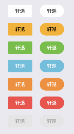
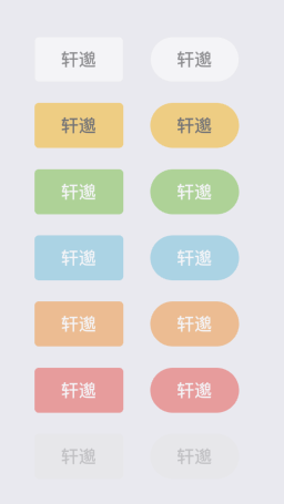
### type默认default,round默认为true
```js
```
### disabled 默认false
```js
```
### icon 和iconPosition 默认left (left、right)

```js
```
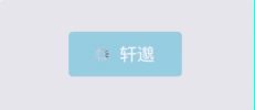
### loading 默认为true 可指定loading颜色和图标
loadingColor loadingIcon
```js
```
默认图标loading图标

### 自定义样式
```js
```
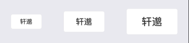
### size 默认值为 md (sm 、md、lg)
```js
```