material-design-inspired-color-picker
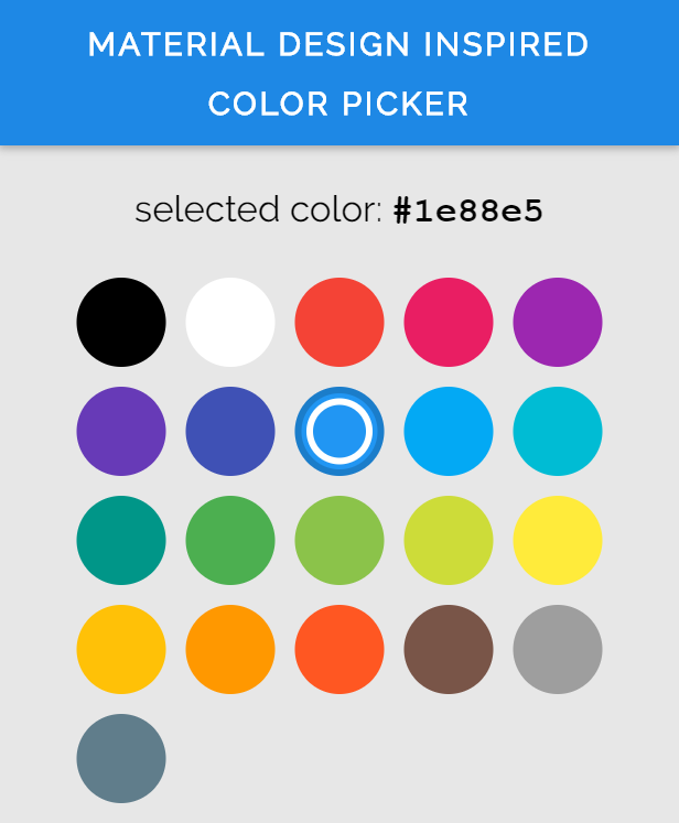
A customizable javascript color picker inspired by material design
[](http://forthebadge.com)
[](http://forthebadge.com)
## [DEMO](https://bennyalex.github.io/material-design-inspired-color-picker/ "DEMO")
## Features
* built-in material color palette with shades and accent colors
* highly customizable
* support for custom color palettes
* display main color first and by clicking on it show its shades or accent colors
* easy to use
* lightweight
* can be used in plain javascript projects or with other js frameworks
## Installation
With **npm**:
> npm install material-design-inspired-color-picker --save
As **script**:
> Download the md-color-picker.js file from [here](https://raw.githubusercontent.com/BennyAlex/material-design-inspired-color-picker/master/dist/md-color-picker.js "md-color-picker.js")
## Usage
Include the script in your app.
If you installed the color picker with npm:
````javascript
import 'material-design-inspired-color-picker'
````
If you just downloaded the md-color-picker.js file:
````html
````
Then, you can use it like a html tag:
````html
````
A custom elements polyfill is included, so it will work in even in browsers wich do not support the custom-elements specification.
## Api
The picker let you pass in some options and attributes so you can customize it.
**Note:** In html the attributes are seperated by a hyphen instead of using camelCase in JavaScript.
Following properties can be parsed into the picker:
|propertyname (JS / HTML)|type|default| example|
| :---: | :---:| :---:| :---: |
| colorMargin / color-margin (in px) | number | 6 | 12 |
| colorsPerRow / colors-per-row | number | 5 | 4 |
| colorSize / color-size (in px) | number | 54 | 42 |
| defaultTint / default-tint | number or string | 500 | '200' |
| fixedMinHeight / fixed-min-height | bool | true | false |
| palette | string or object | 'material' | 'material-full' |
| useSpectrumPicker / use-spectrum-picker | bool | true | false |
| value | string | none | #f1c5a9 |
**Description:**
* colorMargin : The distance between the colors
* colorsPerRow : The number of colors per row
* colorSize : The size of each color circle
* defaultTint : this is the tint for each color wich will be shown at the beginning. Material colors default tint is 500. For custom palettes you can also use strings.
*fixedMinHeight : If disabled, the picker will become less high, when the current subpalette has less colors than the mainpalette
* palette : the palette with all colors. If it is a string, the picker will use a built in palette. Currently the following palettes are available:
````
material : standard material colors
material-full : the material colors including the accent colors
material-accent : only the accent material colors
````
* useSpectrumPicker : if false, the other color tints can not be selected, so only the color wich matches default tint is selectable.
* value : the color which is selected. Must be a hex number with 6 digits and a hashtag.
**Full example:**
````html
````
For a more detailed example, see the demo page under docs folder or live: https://bennyalex.github.io/material-design-inspired-color-picker/