# markdown-wysiwyg-editor
[](https://badge.fury.io/js/markdown-wysiwyg-editor)
[](https://opensource.org/licenses/MIT)
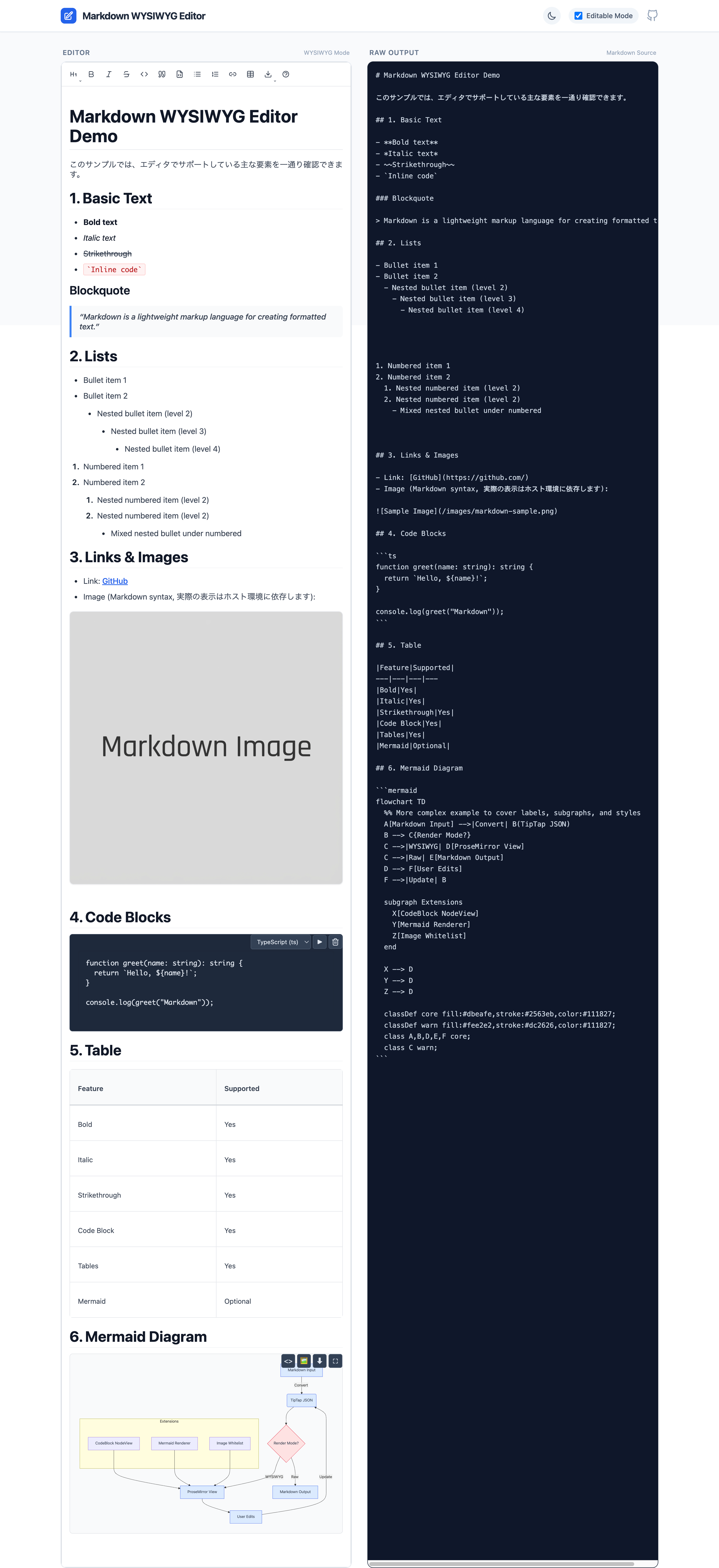
Lightweight Markdown WYSIWYG editor for React, powered by TipTap.
[Live Demo](https://wysiwyg-doc.com/markdown-wysiwyg/index.html)
---
## Features
- Rich text editing with Markdown syntax
- Code blocks with syntax highlighting (19 languages)
- Table editing with context menu and resize controls
- Optional Mermaid diagram support
- Optional image insertion
- Emoji picker for inserting emojis
- Bidirectional Markdown conversion
- Link context menu
- TypeScript support
## Installation
> [!WARNING]
> This package requires **Tailwind CSS v4** or later.
> It uses v4's CSS-first configuration. If you are using Tailwind v3, you must upgrade.
This editor is a React component targeting **React 19+ / ReactDOM 19+**.
This package is **Tailwind CSS v4 + shadcn/ui token compatible**. It uses Tailwind utility classes (e.g. `bg-background`, `text-foreground`, `bg-popover`) that are compiled by your host app's Tailwind.
```bash
pnpm add markdown-wysiwyg-editor tailwindcss@^4.0.0
# or
npm install markdown-wysiwyg-editor tailwindcss@^4.0.0
# or
yarn add markdown-wysiwyg-editor tailwindcss@^4.0.0
```
## Quick Start
**⚠️ IMPORTANT**
- **Tailwind CSS v4** is required.
- **React 19** or later is required.
1. **Import the CSS bundle** in your app's entry point (e.g., `main.tsx`, `App.tsx`, or `index.css`):
```css
@import "markdown-wysiwyg-editor/dist/bundle.css";
```
2. **Use the component**:
```tsx
import { useState } from 'react';
import { MarkdownEditor } from 'markdown-wysiwyg-editor';
function App() {
const [content, setContent] = useState('');
return ;
}
```
## CSS Integration Guide
Since version 0.3.0, the CSS integration strategy has changed to support Tailwind CSS v4.
### ✅ Recommended: Zero-Config (Pre-built Bundle)
Builds are simplified by using the pre-compiled bundle. This file includes:
- All required Tailwind utilities
- The default shadcn/ui-compatible theme
- Core editor styles
- Dark mode support
Just import it once:
```css
@import "markdown-wysiwyg-editor/dist/bundle.css";
```
### 🛠️ Advanced: Custom Tailwind Integration
Only use this method if you want to:
- Share your application's `theme` configuration with the editor.
- Minimize bundle size by compiling only utilized classes (though the bundle is already optimized).
**Requirements:**
- Tailwind CSS v4 installed in your project.
- `@tailwindcss/vite` or `@tailwindcss/postcss` configured.
In your CSS entry point:
```css
@import "tailwindcss";
/* 1. Scan package source for Tailwind classes */
@source "./node_modules/markdown-wysiwyg-editor/dist/*.js";
/* 2. Import package theme (Optional: If you have your own theme, skip this) */
@import "markdown-wysiwyg-editor/theme.css";
/* 3. Import core editor styles */
@import "markdown-wysiwyg-editor/style.css";
/* 4. Ensure your theme defines the required shadcn variables (see below) */
@theme {
--color-background: hsl(var(--background));
--color-foreground: hsl(var(--foreground));
/* ... map other variables as needed ... */
--variant-dark: .dark &;
}
```
### Theming Options
#### Option A: Use Package Default Theme
Import `theme.css` to get shadcn-compatible light/dark mode defaults:
```css
@import "markdown-wysiwyg-editor/theme.css";
```
#### Option B: Use Your Own Theme
If you already use shadcn/ui or have your own CSS variables defined, skip importing `theme.css`:
```css
@import "tailwindcss";
@source "./node_modules/markdown-wysiwyg-editor/dist/*.js";
@import "markdown-wysiwyg-editor/style.css";
/* Your own theme variables */
@layer base {
:root {
--background: 0 0% 100%;
--foreground: 222.2 84% 4.9%;
--popover: 0 0% 100%;
--popover-foreground: 222.2 84% 4.9%;
/* ... other variables */
}
.dark {
--background: 222.2 84% 4.9%;
--foreground: 210 40% 98%;
--popover: 222.2 84% 4.9%;
--popover-foreground: 210 40% 98%;
/* ... other variables */
}
}
```
#### Required CSS Variables
The editor expects these shadcn-style CSS variables (HSL triplets without `hsl()`):
| Variable | Light Mode Example | Description |
|----------|-------------------|-------------|
| `--background` | `0 0% 100%` | Page background |
| `--foreground` | `222.2 84% 4.9%` | Primary text color |
| `--popover` | `0 0% 100%` | Dropdown/menu background |
| `--popover-foreground` | `222.2 84% 4.9%` | Dropdown/menu text |
| `--primary` | `222.2 47.4% 11.2%` | Primary action color |
| `--primary-foreground` | `210 40% 98%` | Primary action text |
| `--secondary` | `210 40% 96.1%` | Secondary elements |
| `--secondary-foreground` | `222.2 47.4% 11.2%` | Secondary text |
| `--muted` | `210 40% 96.1%` | Muted backgrounds |
| `--muted-foreground` | `215.4 16.3% 46.9%` | Muted text |
| `--accent` | `210 40% 96.1%` | Hover states |
| `--accent-foreground` | `222.2 47.4% 11.2%` | Hover text |
| `--border` | `214.3 31.8% 91.4%` | Border color |
| `--input` | `214.3 31.8% 91.4%` | Input border |
| `--ring` | `222.2 84% 4.9%` | Focus ring |
| `--radius` | `0.5rem` | Border radius |
### Dark Mode
Dark mode works automatically when you add the `.dark` class to `` or ``:
```tsx
// Toggle dark mode
document.documentElement.classList.toggle('dark');
```
If you imported `theme.css`, dark mode colors are already defined. Otherwise, define them under `.dark` selector in your CSS.
### Height and Scroll Configuration
The editor needs proper height configuration to enable scrolling. Choose one approach:
#### Option A: Fixed Height (Recommended)
```tsx
```
#### Option B: Flex Layout (For Full-Height Containers)
```tsx
// Parent container must have defined height
```
#### Option C: Auto-Height (No Scroll)
```tsx
```
### Common Issues and Solutions
#### Issue: Lists not displaying correctly
- Make sure the CSS is imported properly
- The CSS file contains all necessary styles for headings, lists, tables, etc.
#### Issue: No scrollbar appears
- Set a fixed height using `className="h-96"` or similar
- Enable scroll with `enableVerticalScroll={true}`
#### Issue: Styles not applying
- Check that you've added `@source` directive pointing to this package
- Verify the `@theme` block maps CSS variables correctly
- Check browser console for CSS loading errors
#### Issue: Toolbar / menus look unstyled or transparent
- Ensure Tailwind CSS v4 is installed and configured
- Verify `@source "./node_modules/markdown-wysiwyg-editor/dist/*.js"` is in your CSS
- Check that CSS variables (`--popover`, `--background`, etc.) are defined
- Make sure `.dark` class toggle updates the CSS variables correctly
#### Issue: Dark mode not working
- Ensure `.dark` class is applied to `` or ``
- Import `theme.css` or define dark mode variables under `.dark` selector
- Check that `--variant-dark: .dark &;` is in your `@theme` block
### With Mermaid
`mermaid` is an optional peer dependency. Install it only if you enable Mermaid:
```bash
pnpm add mermaid
# or
npm install mermaid
```
```tsx
import { useState } from 'react';
import mermaid from 'mermaid';
import { MarkdownEditor } from 'markdown-wysiwyg-editor';
mermaid.initialize({ startOnLoad: false });
function App() {
const [content, setContent] = useState('');
return (
);
}
```
### Disable Features
```tsx
```
Emoji insertion is available via the built-in toolbar. To hide it, hide the toolbar:
```tsx
```
### Image whitelist (local images)
For security reasons, **local image paths are not rendered by default**.
- Remote images are allowed only with `http` / `https`.
- For local paths (e.g. `/images/foo.png`), set `publicImagePathPrefix` and the `src` must start with that prefix.
- The following are rejected: `javascript:` / `data:` / `file:` / protocol-relative (`//...`) / path traversal (`../`).
Example:
```tsx
```
## API (Props)
| Prop | Type | Default | Description |
| ----------------- | ------------------------- | ------------------- | --------------------------------------------------- |
| `value` | `string` | - | Markdown content (required) |
| `onChange` | `(value: string) => void` | - | Change handler (required) |
| `editable` | `boolean` | `true` | Enable editing |
| `enableMermaid` | `boolean` | `false` | Enable Mermaid diagrams |
| `enableImage` | `boolean` | `true` | Enable image insertion |
| `enableTable` | `boolean` | `true` | Enable table editing |
| `enableCodeBlock` | `boolean` | `true` | Enable code blocks |
| `enableLink` | `boolean` | `true` | Enable links |
| `publicImagePathPrefix` | `string` | - | Allow local image `src` only when it starts with this prefix (e.g. `/images`) |
| `mermaidLib` | `typeof mermaid` | - | Mermaid instance (required if `enableMermaid=true`) |
| `debug` | `boolean` | `false` | Show debug info (syntax status, paste debug) |
| `className` | `string` | - | Additional CSS class |
| `style` | `React.CSSProperties` | - | Inline styles |
| `onBlur` | `() => void` | - | Blur event handler |
| `onFocus` | `() => void` | - | Focus event handler |
| `extensions` | `Extension[]` | - | Custom TipTap extensions |
## Supported Languages (Code Blocks)
- JavaScript / TypeScript
- Python
- Java
- Go
- Rust
- PHP
- HTML / CSS
- SQL
- Bash / Shell (sh, zsh, tcsh)
- JSON / YAML / XML
- Mermaid (if enabled)
## Bundle Size (rough guideline)
- Without Mermaid: ~150KB (gzipped)
- With Mermaid: +2.5MB
Consider your app's performance and whether you really need Mermaid.
## Limitations / Notes
- Focused on **Markdown-based WYSIWYG**. It is not a full block editor like Notion.
- Styling assumes a relatively neutral, Tailwind-friendly base; you are expected to adapt it to your design system.
- TipTap / Mermaid and other internals may receive major updates; this library will follow with its own major bumps.
## Browser Support
- Chrome / Edge: latest 2 versions
- Firefox: latest 2 versions
- Safari: latest 2 versions
- Mobile: iOS Safari 15+, Chrome Android
## Advanced Usage
### Internationalization (i18n)
This editor uses a host-driven i18n strategy.
- Your app provides a translator function `t(key)` via `I18nProvider`.
- All UI labels are defined by `I18N_KEYS` (translation keys).
- If you don't provide a translator, the default behavior is to render the key itself.
#### With react-i18next
```tsx
import { I18nProvider, MarkdownEditor, type Translator } from 'markdown-wysiwyg-editor';
import { useTranslation } from 'react-i18next';
function App() {
const { t: t18n } = useTranslation();
const [content, setContent] = useState('');
const t: Translator = (key, fallback) => t18n(key, { defaultValue: fallback ?? key });
return (
);
}
```
#### Add to your i18n JSON files
**en.json:**
```json
{
"markdown_editor": {
"table": {
"row_operations": "Row Operations",
"add_row_above": "Add Row Above",
"add_row_below": "Add Row Below",
"delete_row": "Delete Row",
"column_operations": "Column Operations",
"add_column_left": "Add Column Left",
"add_column_right": "Add Column Right",
"delete_column": "Delete Column",
"delete_table": "Delete Entire Table",
"cancel": "Cancel"
}
}
}
```
**ja.json:**
```json
{
"markdown_editor": {
"table": {
"row_operations": "行の操作",
"add_row_above": "上に行を追加",
"add_row_below": "下に行を追加",
"delete_row": "行を削除",
"column_operations": "列の操作",
"add_column_left": "左に列を追加",
"add_column_right": "右に列を追加",
"delete_column": "列を削除",
"delete_table": "テーブル全体を削除",
"cancel": "キャンセル"
}
}
}
```
See [docs/i18n.md](./docs/i18n.md) for more details.
### Custom Toolbar
You can hide the built-in toolbar and provide your own UI:
```tsx
```
### Custom Extensions
You can inject TipTap extensions directly:
```tsx
import TextAlign from '@tiptap/extension-text-align';
;
```
## Troubleshooting
### Styles not loading
```css
/* Recommended */
@import "markdown-wysiwyg-editor/dist/bundle.css";
```
Ensure the CSS is imported in your app entry.
If using Custom Integration (Advanced) and the toolbar is unstyled:
- Verify `@source` is pointing correctly to `node_modules/markdown-wysiwyg-editor/dist/*.js`.
- Check that your `theme.css` imports or `@theme` configuration are correct.
### "ReferenceError: global is not defined"
With some Vite setups you may need:
```ts
define: {
global: 'window',
},
```
## Development
```bash
pnpm install
pnpm dev
pnpm build
pnpm test
pnpm lint
```
## License
MIT
## Credits
Built with:
- [TipTap](https://tiptap.dev/)
- [Lowlight](https://github.com/wooorm/lowlight)
- [Lucide](https://lucide.dev/) for icons
- [Mermaid](https://mermaid.js.org/)