<div align="center">

# Loopem

**A picker in any shape you want.**

[![npm](https://img.shields.io/npm/v/loopem?style=flat&color=0fa98f&label=npm)](https://www.npmjs.com/package/loopem)
[![license](https://img.shields.io/npm/l/loopem?style=flat&color=0fa98f&label=license)](https://github.com/TahaSh/loopem/blob/main/LICENSE)
[![types](https://img.shields.io/npm/types/loopem?style=flat&color=0fa98f&label=types)](https://www.npmjs.com/package/loopem)
[![size](https://img.shields.io/bundlejs/size/loopem?style=flat&color=0fa98f&label=gzipped)](https://bundlejs.com/?q=loopem)

[Documentation](https://loopem.tahazsh.com) ·
[Get started](https://loopem.tahazsh.com/docs/get-started) ·
[Options](https://loopem.tahazsh.com/docs/options)
<br />

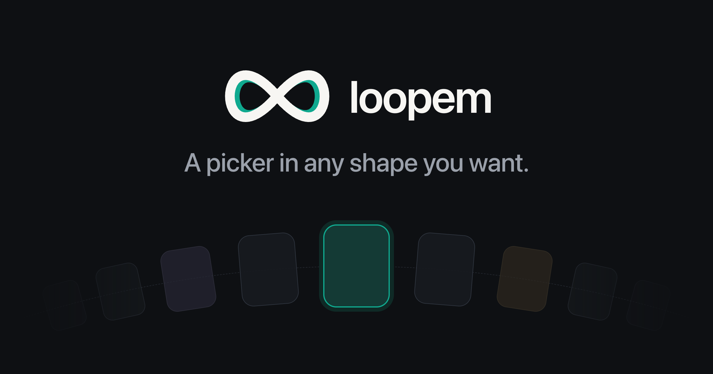
<img src="https://raw.githubusercontent.com/TahaSh/loopem/main/.github/assets/hero.png" alt="A row of color swatches curving into an arc, the centered one ringed" width="820">

</div>

<br />

A framework-agnostic library for building pickers: date wheels, color swatches,
photo carousels, anything where someone drags through options and lands on one.
You pick the shape, from a straight line to an arc, a wheel, or a layout you
write yourself.

Drag it, flick it, or use the arrow keys, and it always lands on an item instead
of resting between two. Only the items on screen are in the DOM, so the length
of your list stops mattering.

No dependencies.

## Install

```sh
npm install loopem
```

## Use

The container is one empty element. Loopem creates the items inside it, and
keeps only the ones on screen.

```html
<div id="colors"></div>
```

```js
import { createPicker } from 'loopem'

const picker = createPicker(document.getElementById('colors'), {
  items: colors,
  renderItem: (color) => {
    const button = document.createElement('button')
    button.style.background = color.hex
    button.setAttribute('aria-label', color.name)
    return button
  },
})

picker.on('select', ({ item }) => {
  console.log('Picked', item)
})
```

Loopem positions items but never sizes them. Give the container a height and
each item a size, in ordinary CSS.

## Shapes

`line` and `arc` are built in. Four more ship as presets in `loopem/layouts`,
each one line:

```js
import { coverflow } from 'loopem/layouts'

createPicker(el, { items, renderItem, ...coverflow() })
```

| Preset | Shape |
| --- | --- |
| [`wheel`](https://loopem.tahazsh.com/docs/layouts/wheel) | A vertical drum, like an iOS date picker. |
| [`coverflow`](https://loopem.tahazsh.com/docs/layouts/coverflow) | Cards turning away into real perspective. |
| [`fan`](https://loopem.tahazsh.com/docs/layouts/fan) | A hand of cards, or a paint deck. |
| [`stack`](https://loopem.tahazsh.com/docs/layouts/stack) | A wallet you flick through. |

A layout is just a function from distance-to-center to a position, so
[writing your own](https://loopem.tahazsh.com/docs/layouts/custom) is a few
lines of arithmetic.

## Frameworks

Works with any framework. React, Vue and Svelte also get an adapter, so it feels
native there.

```jsx
import { usePicker } from 'loopem/react'

const { containerRef, selectedItem, renderSlots } = usePicker({ items, layout: 'arc' })
```

- [React](https://loopem.tahazsh.com/docs/frameworks/react)
- [Vue](https://loopem.tahazsh.com/docs/frameworks/vue)
- [Svelte](https://loopem.tahazsh.com/docs/frameworks/svelte)
- [Everything else](https://loopem.tahazsh.com/docs/frameworks/other), including
  Solid, Lit and Angular

## Accessibility

The container is a `listbox` and each item an `option`. Arrow keys step, Page
Up and Page Down jump five, Home and End reach the ends, Enter and Space choose.
A horizontal track claims one gesture axis only, so a thumb dragged up the page
over it still scrolls the page. Autoplay never starts under
`prefers-reduced-motion`.

## License

MIT © [Taha Shashtari](https://tahazsh.com)
