# lc-cell
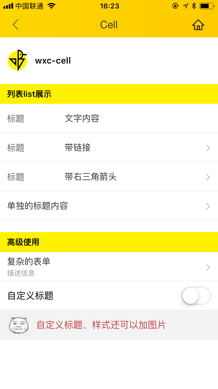
> Weex 单元格组件,可用作展示列表信息、链接或者表单等
### 规则
- 一般由主要信息、操作动作组成,信息在左、操作在右
- 可以对 `label, title, value` 进行 `slot` 覆盖
## [Demo](https://h5.m.taobao.com/trip/lc-cell/index.html?_wx_tpl=https%3A%2F%2Fh5.m.taobao.com%2Ftrip%2Flc-cell%2Fdemo%2Findex.native-min.js)
 ## 使用方法
```vue
```
更详细代码可以参考 [demo](https://github.com/alibaba/weex-ui/blob/master/example/cell/index.vue)
### 可配置参数
| Prop | Type |Required | Default | Description |
|-------------|------------|--------|--------|-----|
| label | `String` | `N`| `-` |标签 |
| title | `String` | `N`| `-` |右侧标题 |
| desc | `String` | `N`| `-` | 展示说明信息 |
| link | `String` | `N`| `-`| 跳转链接,无链接不跳转 |
| arrow-icon | `String` | `N`|`箭头` | 覆盖右向箭头 |
| has-arrow | `Bool` |`N`| `false` | 是否显示箭头 |
| has-top-border | `Bool` | `N`| `false` | 是否有上边框 |
| has-bottom-border | `Bool` | `N`| `true` | 是否有下边框 |
| cell-style | `Object` | `N`| `-` | 单元格样式 |
| label-style | `Object` | `N`| `-` | 标签样式 |
| desc-style | `Object` | `N`| `-` | 说明信息样式 |
| icon-style | `Object` | `N`| `-` | 标签图片样式 |
| title-style | `Object` | `N`| `-` | 右侧标题样式 |
| cell-index | `String` |`N`| `false` | 单元格在表格中的序号 `first` / `last` |
| icon | `String` | `N`| `-` | 标签图片 |
### Slot
1. ``:label卡槽,替换默认 label 占位
2. ``:title卡槽,替换默认 title 占位
3. ``:右边卡槽,有需要传入switch等场景
### 事件回调
```
//点击事件回调 `@LcCellClicked="LcCellClicked"`
```
## 使用方法
```vue
```
更详细代码可以参考 [demo](https://github.com/alibaba/weex-ui/blob/master/example/cell/index.vue)
### 可配置参数
| Prop | Type |Required | Default | Description |
|-------------|------------|--------|--------|-----|
| label | `String` | `N`| `-` |标签 |
| title | `String` | `N`| `-` |右侧标题 |
| desc | `String` | `N`| `-` | 展示说明信息 |
| link | `String` | `N`| `-`| 跳转链接,无链接不跳转 |
| arrow-icon | `String` | `N`|`箭头` | 覆盖右向箭头 |
| has-arrow | `Bool` |`N`| `false` | 是否显示箭头 |
| has-top-border | `Bool` | `N`| `false` | 是否有上边框 |
| has-bottom-border | `Bool` | `N`| `true` | 是否有下边框 |
| cell-style | `Object` | `N`| `-` | 单元格样式 |
| label-style | `Object` | `N`| `-` | 标签样式 |
| desc-style | `Object` | `N`| `-` | 说明信息样式 |
| icon-style | `Object` | `N`| `-` | 标签图片样式 |
| title-style | `Object` | `N`| `-` | 右侧标题样式 |
| cell-index | `String` |`N`| `false` | 单元格在表格中的序号 `first` / `last` |
| icon | `String` | `N`| `-` | 标签图片 |
### Slot
1. ``:label卡槽,替换默认 label 占位
2. ``:title卡槽,替换默认 title 占位
3. ``:右边卡槽,有需要传入switch等场景
### 事件回调
```
//点击事件回调 `@LcCellClicked="LcCellClicked"`
```