# lc-cell 

> A cell to display list, link or form
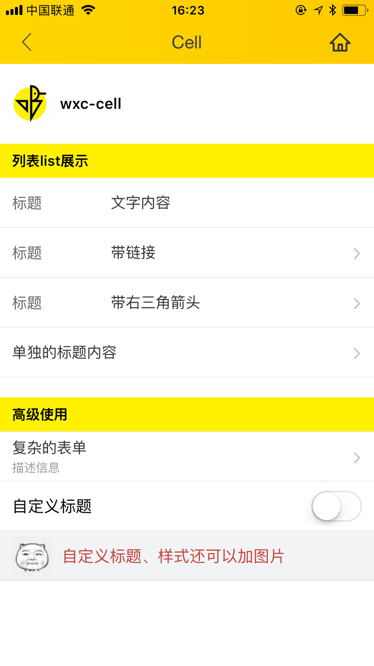
### Rule
  - Generally cell consists of main information、operations.
  - The main information are placed on the left side of cell, While the operations are placed on the right side.
  - You can override the `label`、`title`、`value` by `slot`. 
  

## [Demo](https://h5.m.taobao.com/trip/lc-cell/index.html?_wx_tpl=https%3A%2F%2Fh5.m.taobao.com%2Ftrip%2Flc-cell%2Fdemo%2Findex.native-min.js)
<img src="https://img.alicdn.com/tfs/TB1mIA5c5qAXuNjy1XdXXaYcVXa-750-1334.jpg" width="240"/>&nbsp;&nbsp;&nbsp;&nbsp;<img src="https://img.alicdn.com/tfs/TB15ta_SpXXXXcFaVXXXXXXXXXX-191-197.png" width="160"/>

## Code Example

```vue
<template>
  <div class="container">
    <div class="demo">
      <text class="demo-title">List demo</text>

      <lc-cell label="Label demo text"
                title="Title demo text"
                :has-arrow="true"
                @LcCellClicked="LcCellClicked"
                :has-margin="true"></lc-cell>

      <lc-cell label="Label demo text"
                title="Title demo text"
                :has-arrow="true"
                link="https://h5.m.taobao.com/trip/home/index.html"
                @LcCellClicked="LcCellClicked"
                spm="181.12312312.12312.d01"
                :has-top-border="false"></lc-cell>

      <lc-cell label="Label demo text"
                title="Title demo text"
                :has-arrow="true"
                @LcCellClicked="LcCellClicked"
                :has-top-border="false"></lc-cell>

    </div>
    <div class="demo">
      <text class="demo-title">No label</text>
      <lc-cell title="Title demo text"
                :has-arrow="true"
                @LcCellClicked="LcCellClicked"
                :has-top-border="true"></lc-cell>
    </div>

    <div class="demo">
      <text class="demo-title">Add desc</text>
      <lc-cell title="Title text"
                desc="Desc text"
                :has-arrow="true"
                @LcCellClicked="LcCellClicked"
                :has-top-border="true"></lc-cell>
    </div>

    <div class="demo">
      <text class="demo-title">No arrow</text>
      <lc-cell title="Title text"
                :has-arrow="false"
                @LcCellClicked="LcCellClicked"
                :has-top-border="true"></lc-cell>
    </div>
    <div class="demo">
      <text class="demo-title">Custom slot</text>
      <lc-cell title="Title text"
                :has-arrow="false"
                :has-top-border="true">
        <switch slot="value"></switch>
      </lc-cell>
    </div>
  </div>
</template>

<script>
  import { LcCell } from 'weex-ui';
  export default {
    components: { LcCell },
    methods: {
      LcCellClicked (e) {
        console.log(e)
      }
    }
  };
</script>
```
More details can be found in [here](https://github.com/alibaba/weex-ui/blob/master/example/cell/index.vue)


### API

| Prop      | Type   |Required  | Default   | Description  |
|-------------|------------|--------|--------|-----|
| label | `String` | `N`|  `-` |describing the title|
| title | `String` | `N`|  `-` | main information |
| desc  | `String` | `N`| `-` | description information |
| link  | `String` | `N`| `-`| jump link |
| arrow-icon | `String` | `N`|`arrow` |  override right arrow |
| has-arrow | `Bool` |`N`| `false` |  whether to show arrow |
| has-top-border | `Bool` | `N`| `false` |  whether to show top border |
| has-bottom-border | `Bool` | `N`| `true` | whether to show bottom border |
| has-vertical-indent | `Bool` | `N`| `true` |  whether has vertical indent|
| has-margin | `Bool` |`N`| `false` | whether has vertical margin |


### Slot
1. `<slot name="label"></slot>`：label slot
2. `<slot name="title"></slot>`：title slot
3. `<slot name="value"></slot>`：right slot


### Event

```
//`@LcCellClicked="LcCellClicked"`
```
