# lc-button
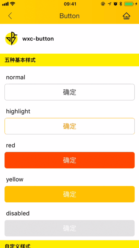
> Weex 按钮组件,支持 5 种基本类型 button,可自定义样式
## [Demo](https://h5.m.taobao.com/trip/wx-detection-demo/button/index.html?_wx_tpl=https%3A%2F%2Fh5.m.taobao.com%2Ftrip%2Fwx-detection-demo%2Fbutton%2Findex.weex.js)
 ## 使用方法
```vue
```
更详细代码可以参考 [这里](https://github.com/HS-Light/weex-ui/blob/light-ui/example/button/index.vue)
### 可配置参数
| Prop | Type | Required | Default | Description |
| ---- |:----:|:---:|:-------:| :----------:|
| **`text`** | `string` | `Y` | `-` | 展现的文字 |
| **`type`** | `enum` | `N` | `red` | 类型:`normal`/ `highlight`/`red`/`yellow` |
| **`disabled`** | `bool` | `N` | `false` | 是否 disabled(注1) |
| **`btnStyle`** | `object` | `N` | `{}` | 按钮的样式对象(注2) |
| **`textStyle`** | `object` | `N` | `{}` | 文字的样式对象(注3) |
- 注1:disabled 样式会覆盖掉默认样式
- 注2:对默认按钮样式的覆盖全部依赖btnStyle进行,详细样式可以参考 [type.js](https://github.com/alibaba/weex-ui/blob/master/packages/lc-button/type.js)
- 注2:对默认字体样式的覆盖全部依赖textStyle进行,详细样式可以参考 [type.js](https://github.com/alibaba/weex-ui/blob/master/packages/lc-button/type.js)
### 事件回调
```
// `@LcButtonClicked="LcButtonClicked"`
将会返回 e, type, disabled
```
## 使用方法
```vue
```
更详细代码可以参考 [这里](https://github.com/HS-Light/weex-ui/blob/light-ui/example/button/index.vue)
### 可配置参数
| Prop | Type | Required | Default | Description |
| ---- |:----:|:---:|:-------:| :----------:|
| **`text`** | `string` | `Y` | `-` | 展现的文字 |
| **`type`** | `enum` | `N` | `red` | 类型:`normal`/ `highlight`/`red`/`yellow` |
| **`disabled`** | `bool` | `N` | `false` | 是否 disabled(注1) |
| **`btnStyle`** | `object` | `N` | `{}` | 按钮的样式对象(注2) |
| **`textStyle`** | `object` | `N` | `{}` | 文字的样式对象(注3) |
- 注1:disabled 样式会覆盖掉默认样式
- 注2:对默认按钮样式的覆盖全部依赖btnStyle进行,详细样式可以参考 [type.js](https://github.com/alibaba/weex-ui/blob/master/packages/lc-button/type.js)
- 注2:对默认字体样式的覆盖全部依赖textStyle进行,详细样式可以参考 [type.js](https://github.com/alibaba/weex-ui/blob/master/packages/lc-button/type.js)
### 事件回调
```
// `@LcButtonClicked="LcButtonClicked"`
将会返回 e, type, disabled
```