# lc-button
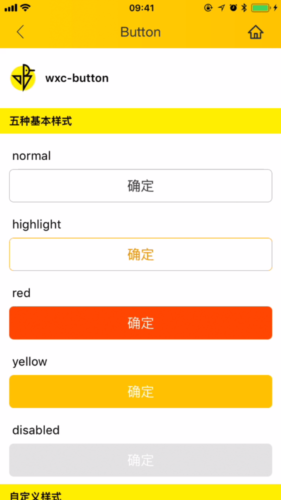
> Basic button with 5 built-in types, supports custom style
## [Demo](https://h5.m.taobao.com/trip/wx-detection-demo/button/index.html?_wx_tpl=https%3A%2F%2Fh5.m.taobao.com%2Ftrip%2Fwx-detection-demo%2Fbutton%2Findex.weex.js)
 ## Code Example
```vue
```
More details can be found in [here](https://github.com/alibaba/weex-ui/blob/master/button/loading/index.vue)
### API
| Prop | Type | Required | Default | Description |
| ---- |:----:|:---:|:-------:| :----------:|
| **`text`** | `string` | `Y` | `-` | the text of button |
| **`type`** | `enum` | `N` | `red` | can be set to `normal`/ `highlight`/`red`/`yellow` |
| **`disabled`** | `bool` | `N` | `false` | set disabled(*1) |
| **`btnStyle`** | `object` | `N` | `{}` | custom style about button(*2) |
| **`textStyle`** | `object` | `N` | `{}` | custom style about text (*3) |
- *1:`disabled` will override the default style.
- *2:Detailed style can be referenced [here](https://github.com/alibaba/weex-ui/blob/master/packages/lc-button/type.js)
- *3:Detailed style can be referenced [here](https://github.com/alibaba/weex-ui/blob/master/packages/lc-button/type.js)
### Event
```
// `@LcButtonClicked="LcButtonClicked"`
will return e, type, disabled
```
## Code Example
```vue
```
More details can be found in [here](https://github.com/alibaba/weex-ui/blob/master/button/loading/index.vue)
### API
| Prop | Type | Required | Default | Description |
| ---- |:----:|:---:|:-------:| :----------:|
| **`text`** | `string` | `Y` | `-` | the text of button |
| **`type`** | `enum` | `N` | `red` | can be set to `normal`/ `highlight`/`red`/`yellow` |
| **`disabled`** | `bool` | `N` | `false` | set disabled(*1) |
| **`btnStyle`** | `object` | `N` | `{}` | custom style about button(*2) |
| **`textStyle`** | `object` | `N` | `{}` | custom style about text (*3) |
- *1:`disabled` will override the default style.
- *2:Detailed style can be referenced [here](https://github.com/alibaba/weex-ui/blob/master/packages/lc-button/type.js)
- *3:Detailed style can be referenced [here](https://github.com/alibaba/weex-ui/blob/master/packages/lc-button/type.js)
### Event
```
// `@LcButtonClicked="LcButtonClicked"`
will return e, type, disabled
```