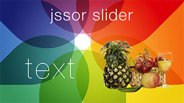
<!DOCTYPE html>
<html>
<head>
    <meta charset="utf-8">
    <meta name="viewport" content="width=device-width, initial-scale=1.0">
    <title>Full Width Slider - Jssor Slider, Carousel, Slideshow</title>
</head>
<body style="padding:0px; margin:0px; font-family:Arial, Verdana;background-color:#fff;">

    <!-- use jssor.slider.min.js for release -->
    <!-- jssor.slider.min.js = (jssor.js + jssor.slider.js) -->
    <script type="text/javascript" src="../js/jssor.js"></script>
    <script type="text/javascript" src="../js/jssor.slider.js"></script>
    <script>
        jssor_slider1_starter = function (containerId) {
            var _CaptionTransitions = [];
            _CaptionTransitions["L"] = { $Duration: 900, x: 0.6, $Easing: { $Left: $JssorEasing$.$EaseInOutSine }, $Opacity: 2 };
            _CaptionTransitions["R"] = { $Duration: 900, x: -0.6, $Easing: { $Left: $JssorEasing$.$EaseInOutSine }, $Opacity: 2 };
            _CaptionTransitions["T"] = { $Duration: 900, y: 0.6, $Easing: { $Top: $JssorEasing$.$EaseInOutSine }, $Opacity: 2 };
            _CaptionTransitions["B"] = { $Duration: 900, y: -0.6, $Easing: { $Top: $JssorEasing$.$EaseInOutSine }, $Opacity: 2 };
            _CaptionTransitions["ZMF|10"] = { $Duration: 900, $Zoom: 11, $Easing: { $Zoom: $JssorEasing$.$EaseOutQuad, $Opacity: $JssorEasing$.$EaseLinear }, $Opacity: 2 };
            _CaptionTransitions["RTT|10"] = { $Duration: 900, $Zoom: 11, $Rotate: 1, $Easing: { $Zoom: $JssorEasing$.$EaseOutQuad, $Opacity: $JssorEasing$.$EaseLinear, $Rotate: $JssorEasing$.$EaseInExpo }, $Opacity: 2, $Round: { $Rotate: 0.8} };
            _CaptionTransitions["RTT|2"] = { $Duration: 900, $Zoom: 3, $Rotate: 1, $Easing: { $Zoom: $JssorEasing$.$EaseInQuad, $Opacity: $JssorEasing$.$EaseLinear, $Rotate: $JssorEasing$.$EaseInQuad }, $Opacity: 2, $Round: { $Rotate: 0.5} };
            _CaptionTransitions["RTTL|BR"] = { $Duration: 900, x: -0.6, y: -0.6, $Zoom: 11, $Rotate: 1, $Easing: { $Left: $JssorEasing$.$EaseInCubic, $Top: $JssorEasing$.$EaseInCubic, $Zoom: $JssorEasing$.$EaseInCubic, $Opacity: $JssorEasing$.$EaseLinear, $Rotate: $JssorEasing$.$EaseInCubic }, $Opacity: 2, $Round: { $Rotate: 0.8} };
            _CaptionTransitions["CLIP|LR"] = { $Duration: 900, $Clip: 15, $Easing: { $Clip: $JssorEasing$.$EaseInOutCubic }, $Opacity: 2 };
            _CaptionTransitions["MCLIP|L"] = { $Duration: 900, $Clip: 1, $Move: true, $Easing: { $Clip: $JssorEasing$.$EaseInOutCubic} };
            _CaptionTransitions["MCLIP|R"] = { $Duration: 900, $Clip: 2, $Move: true, $Easing: { $Clip: $JssorEasing$.$EaseInOutCubic} };

            var options = {
                $FillMode: 2,                                       //[Optional] The way to fill image in slide, 0 stretch, 1 contain (keep aspect ratio and put all inside slide), 2 cover (keep aspect ratio and cover whole slide), 4 actual size, 5 contain for large image, actual size for small image, default value is 0
                $AutoPlay: true,                                    //[Optional] Whether to auto play, to enable slideshow, this option must be set to true, default value is false
                $AutoPlayInterval: 4000,                            //[Optional] Interval (in milliseconds) to go for next slide since the previous stopped if the slider is auto playing, default value is 3000
                $PauseOnHover: 1,                                   //[Optional] Whether to pause when mouse over if a slider is auto playing, 0 no pause, 1 pause for desktop, 2 pause for touch device, 3 pause for desktop and touch device, 4 freeze for desktop, 8 freeze for touch device, 12 freeze for desktop and touch device, default value is 1

                $ArrowKeyNavigation: true,   			            //[Optional] Allows keyboard (arrow key) navigation or not, default value is false
                $SlideEasing: $JssorEasing$.$EaseOutQuint,          //[Optional] Specifies easing for right to left animation, default value is $JssorEasing$.$EaseOutQuad
                $SlideDuration: 800,                                //[Optional] Specifies default duration (swipe) for slide in milliseconds, default value is 500
                $MinDragOffsetToSlide: 20,                          //[Optional] Minimum drag offset to trigger slide , default value is 20
                //$SlideWidth: 600,                                 //[Optional] Width of every slide in pixels, default value is width of 'slides' container
                //$SlideHeight: 300,                                //[Optional] Height of every slide in pixels, default value is height of 'slides' container
                $SlideSpacing: 0, 					                //[Optional] Space between each slide in pixels, default value is 0
                $DisplayPieces: 1,                                  //[Optional] Number of pieces to display (the slideshow would be disabled if the value is set to greater than 1), the default value is 1
                $ParkingPosition: 0,                                //[Optional] The offset position to park slide (this options applys only when slideshow disabled), default value is 0.
                $UISearchMode: 1,                                   //[Optional] The way (0 parellel, 1 recursive, default value is 1) to search UI components (slides container, loading screen, navigator container, arrow navigator container, thumbnail navigator container etc).
                $PlayOrientation: 1,                                //[Optional] Orientation to play slide (for auto play, navigation), 1 horizental, 2 vertical, 5 horizental reverse, 6 vertical reverse, default value is 1
                $DragOrientation: 1,                                //[Optional] Orientation to drag slide, 0 no drag, 1 horizental, 2 vertical, 3 either, default value is 1 (Note that the $DragOrientation should be the same as $PlayOrientation when $DisplayPieces is greater than 1, or parking position is not 0)

                $CaptionSliderOptions: {                            //[Optional] Options which specifies how to animate caption
                    $Class: $JssorCaptionSlider$,                   //[Required] Class to create instance to animate caption
                    $CaptionTransitions: _CaptionTransitions,       //[Required] An array of caption transitions to play caption, see caption transition section at jssor slideshow transition builder
                    $PlayInMode: 1,                                 //[Optional] 0 None (no play), 1 Chain (goes after main slide), 3 Chain Flatten (goes after main slide and flatten all caption animations), default value is 1
                    $PlayOutMode: 3                                 //[Optional] 0 None (no play), 1 Chain (goes before main slide), 3 Chain Flatten (goes before main slide and flatten all caption animations), default value is 1
                },

                $BulletNavigatorOptions: {                          //[Optional] Options to specify and enable navigator or not
                    $Class: $JssorBulletNavigator$,                 //[Required] Class to create navigator instance
                    $ChanceToShow: 2,                               //[Required] 0 Never, 1 Mouse Over, 2 Always
                    $AutoCenter: 1,                                 //[Optional] Auto center navigator in parent container, 0 None, 1 Horizontal, 2 Vertical, 3 Both, default value is 0
                    $Steps: 1,                                      //[Optional] Steps to go for each navigation request, default value is 1
                    $Lanes: 1,                                      //[Optional] Specify lanes to arrange items, default value is 1
                    $SpacingX: 8,                                   //[Optional] Horizontal space between each item in pixel, default value is 0
                    $SpacingY: 8,                                   //[Optional] Vertical space between each item in pixel, default value is 0
                    $Orientation: 1                                 //[Optional] The orientation of the navigator, 1 horizontal, 2 vertical, default value is 1
                },

                $ArrowNavigatorOptions: {                       //[Optional] Options to specify and enable arrow navigator or not
                    $Class: $JssorArrowNavigator$,              //[Requried] Class to create arrow navigator instance
                    $ChanceToShow: 1,                               //[Required] 0 Never, 1 Mouse Over, 2 Always
                    $AutoCenter: 2,                                 //[Optional] Auto center arrows in parent container, 0 No, 1 Horizontal, 2 Vertical, 3 Both, default value is 0
                    $Steps: 1                                       //[Optional] Steps to go for each navigation request, default value is 1
                }
            };

            var jssor_slider1 = new $JssorSlider$(containerId, options);

            //responsive code begin
            //you can remove responsive code if you don't want the slider scales while window resizes
            function ScaleSlider() {
                var bodyWidth = document.body.clientWidth;
                if (bodyWidth)
                    jssor_slider1.$ScaleWidth(Math.min(bodyWidth, 1920));
                else
                    $Jssor$.$Delay(ScaleSlider, 30);
            }

            ScaleSlider();
            $Jssor$.$AddEvent(window, "load", ScaleSlider);

            $Jssor$.$AddEvent(window, "resize", $Jssor$.$WindowResizeFilter(window, ScaleSlider));
            $Jssor$.$AddEvent(window, "orientationchange", ScaleSlider);
            //responsive code end
        };
    </script>
    <!-- Jssor Slider Begin -->
    <!-- To move inline styles to css file/block, please specify a class name for each element. --> 
    <div id="slider1_container" style="position: relative; margin: 0 auto;
        top: 0px; left: 0px; width: 1300px; height: 500px; overflow: hidden;">
        <!-- Loading Screen -->
        <div u="loading" style="position: absolute; top: 0px; left: 0px;">
            <div style="filter: alpha(opacity=70); opacity: 0.7; position: absolute; display: block;
                top: 0px; left: 0px; width: 100%; height: 100%;">
            </div>
            <div style="position: absolute; display: block; background: url(../img/loading.gif) no-repeat center center;
                top: 0px; left: 0px; width: 100%; height: 100%;">
            </div>
        </div>
        <!-- Slides Container -->
        <div u="slides" style="cursor: move; position: absolute; left: 0px; top: 0px; width: 1300px;
            height: 500px; overflow: hidden;">
            <div>
                <img u="image" src="../img/1920/red.jpg" />
                <div u="caption" t="NO" t3="RTT|2" r3="137.5%" du3="3000" d3="500" style="position: absolute; width: 445px; height: 300px; top: 100px; left: 600px;">
                    <img src="../img/new-site/c-phone.png" style="position: absolute; width: 445px; height: 300px; top: 0px; left: 0px;" />
                    <img u="caption" t="CLIP|LR" du="4000" t2="NO" src="../img/new-site/c-jssor-slider.png" style="position: absolute; width: 102px; height: 78px; top: 70px; left: 130px;" />
                    <img u="caption" t="ZMF|10" t2="NO" src="../img/new-site/c-text.png" style="position: absolute; width: 80px; height: 53px; top: 153px; left: 163px;" />
                    <img u="caption" t="RTT|10" t2="NO" src="../img/new-site/c-fruit.png" style="position: absolute; width: 140px; height: 90px; top: 60px; left: 220px;" />
                    <img u="caption" t="T" du="4000" t2="NO" src="../img/new-site/c-navigator.png" style="position: absolute; width: 200px; height: 155px; top: 57px; left: 121px;" />
                </div>
                <div u="caption" t="RTT|2" r="-75%" du="1600" d="2500" t2="NO" style="position: absolute; width: 470px; height: 220px; top: 120px; left: 650px;">
                    <img src="../img/new-site/c-phone-horizontal.png" style="position: absolute; width: 470px; height: 220px; top: 0px; left: 0px;" />
                    <img u="caption" t3="MCLIP|L" du3="2000" src="../img/new-site/c-slide-1.jpg" style="position: absolute; width: 379px; height: 213px; top: 4px; left: 45px;" />
                    <img u="caption" t="MCLIP|R" du="2000" t2="NO" src="../img/new-site/c-slide-3.jpg" style="position: absolute; width: 379px; height: 213px; top: 4px; left: 45px;" />
                    <img u="caption" t="RTTL|BR" x="500%" y="500%" du="1000" d="-3000" r="-30%" t3="L" x3="70%" du3="1600" src="../img/new-site/c-finger-pointing.png" style="position: absolute; width: 257px; height: 300px; top: 80px; left: 200px;" />
                    <img src="../img/new-site/c-navigator-horizontal.png" style="position: absolute; width: 379px; height: 213px; top: 4px; left: 45px;" />
                </div>
                <div style="position: absolute; width: 480px; height: 120px; top: 30px; left: 30px; padding: 5px;
                    text-align: left; line-height: 60px; text-transform: uppercase; font-size: 50px;
                        color: #FFFFFF;">Touch Swipe Slider
                </div>
                <div style="position: absolute; width: 480px; height: 120px; top: 300px; left: 30px; padding: 5px;
                    text-align: left; line-height: 36px; font-size: 30px;
                        color: #FFFFFF;">
                        Build your slider with anything, includes image, content, text, html, photo, picture
                </div>
            </div>
            <div>
                <img u="image" src="../img/1920/purple.jpg" />
                <img src="../img/new-site/c-phone.png" style="position: absolute; width: 445px; height: 300px; top: 100px; left: 600px; background-color: transparent;" />
                <div style="position: absolute; width: 480px; height: 120px; top: 30px; left: 30px; padding: 5px;
                    text-align: left; line-height: 60px; text-transform: uppercase; font-size: 50px;
                        color: #FFFFFF;">Touch Swipe Slider
                </div>
                <div style="position: absolute; width: 480px; height: 120px; top: 300px; left: 30px; padding: 5px;
                    text-align: left; line-height: 36px; font-size: 30px;
                        color: #FFFFFF;">
                        Build your slider with anything, includes image, content, text, html, photo, picture
                </div>
            </div>
            <div>
                <img u="image" src="../img/1920/blue.jpg" />
                <img src="../img/new-site/c-phone.png" style="position: absolute; width: 445px; height: 300px; top: 100px; left: 600px; background-color: transparent;" />
                <div style="position: absolute; width: 480px; height: 120px; top: 30px; left: 30px; padding: 5px;
                    text-align: left; line-height: 60px; text-transform: uppercase; font-size: 50px;
                        color: #FFFFFF;">Touch Swipe Slider
                </div>
                <div style="position: absolute; width: 480px; height: 120px; top: 300px; left: 30px; padding: 5px;
                    text-align: left; line-height: 36px; font-size: 30px;
                        color: #FFFFFF;">
                        Build your slider with anything, includes image, content, text, html, photo, picture
                </div>
            </div>
        </div>
                
        <!--#region Bullet Navigator Skin Begin -->
        <!-- Help: http://www.jssor.com/development/slider-with-bullet-navigator-jquery.html -->
        <style>
            /* jssor slider bullet navigator skin 21 css */
            /*
            .jssorb21 div           (normal)
            .jssorb21 div:hover     (normal mouseover)
            .jssorb21 .av           (active)
            .jssorb21 .av:hover     (active mouseover)
            .jssorb21 .dn           (mousedown)
            */
            .jssorb21 {
                position: absolute;
            }
            .jssorb21 div, .jssorb21 div:hover, .jssorb21 .av {
                position: absolute;
                /* size of bullet elment */
                width: 19px;
                height: 19px;
                text-align: center;
                line-height: 19px;
                color: white;
                font-size: 12px;
                background: url(../img/b21.png) no-repeat;
                overflow: hidden;
                cursor: pointer;
            }
            .jssorb21 div { background-position: -5px -5px; }
            .jssorb21 div:hover, .jssorb21 .av:hover { background-position: -35px -5px; }
            .jssorb21 .av { background-position: -65px -5px; }
            .jssorb21 .dn, .jssorb21 .dn:hover { background-position: -95px -5px; }
        </style>
        <!-- bullet navigator container -->
        <div u="navigator" class="jssorb21" style="bottom: 26px; right: 6px;">
            <!-- bullet navigator item prototype -->
            <div u="prototype"></div>
        </div>
        <!--#endregion Bullet Navigator Skin End -->
        
        <!--#region Arrow Navigator Skin Begin -->
        <!-- Help: http://www.jssor.com/development/slider-with-arrow-navigator-jquery.html -->
        <style>
            /* jssor slider arrow navigator skin 21 css */
            /*
            .jssora21l                  (normal)
            .jssora21r                  (normal)
            .jssora21l:hover            (normal mouseover)
            .jssora21r:hover            (normal mouseover)
            .jssora21l.jssora21ldn      (mousedown)
            .jssora21r.jssora21rdn      (mousedown)
            */
            .jssora21l, .jssora21r {
                display: block;
                position: absolute;
                /* size of arrow element */
                width: 55px;
                height: 55px;
                cursor: pointer;
                background: url(../img/a21.png) center center no-repeat;
                overflow: hidden;
            }
            .jssora21l { background-position: -3px -33px; }
            .jssora21r { background-position: -63px -33px; }
            .jssora21l:hover { background-position: -123px -33px; }
            .jssora21r:hover { background-position: -183px -33px; }
            .jssora21l.jssora21ldn { background-position: -243px -33px; }
            .jssora21r.jssora21rdn { background-position: -303px -33px; }
        </style>
        <!-- Arrow Left -->
        <span u="arrowleft" class="jssora21l" style="top: 123px; left: 8px;">
        </span>
        <!-- Arrow Right -->
        <span u="arrowright" class="jssora21r" style="top: 123px; right: 8px;">
        </span>
        <!--#endregion Arrow Navigator Skin End -->
        <a style="display: none" href="http://www.jssor.com">Image Slider</a>
    </div>
    <!-- Trigger -->
    <script>
        jssor_slider1_starter('slider1_container');
    </script>
    <!-- Jssor Slider End -->
</body>
</html>