The BEST jQuery Modal, Alert, Popup, Lightbox Plugin
jAlert is really easy, and really powerful! See why below:
Plenty-o Sizes
Completely responsive (just under full width on small screens), but for tablets and desktops, you have a lot of control over how large the alert is. Enhanced tablet support with optimized button sizing for better touch interaction.
xsm sm md lg xlg full auto 20% 600px {'height':'100px', 'width':'300px'} {'height':'400px', 'width':'300px'}Sweet Themes
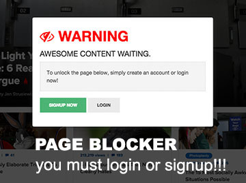
When used correctly, a user may not even need to read your message to know what it pertains to. Red alert = error. Green = success. You can use the default black background, or optional white one.
default red dark_red green dark_green blue dark_blue yellow brown gray dark_gray blackdefault red dark_red green dark_green blue dark_blue yellow brown gray dark_gray black
Responsive Lightbox(es)
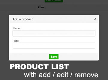
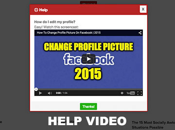
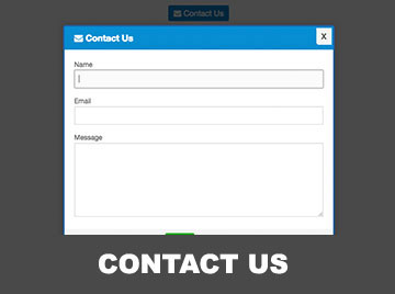
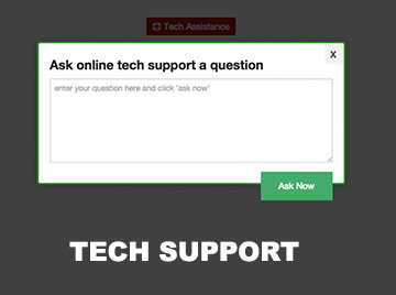
Need to show a video, image, iframe, or something fetched via AJAX? It's dead-simple and beautiful using jAlert:Image Image no Pad Video Video no Pad iFrame iFrame no Pad iFrame fullscreen, no Pad AJAX
Slideshow
Basic Slideshow Auto-Advance Fit Largest DOM Slideshow Looping Slideshow Dots Navigation No Controls Keyboard Only Dots + ArrowsDynamic Resize
Manual Resize Auto-Resize on ChangeBlurred Background
Popup an alert and blur all the background elements:Image
CSS Animations
In version 3, Animate.css was integrated.
default fade bounce flip x flip y zoomThese are just a few. Checkout Animate.css for the full list (must choose ones that hide/show the element).
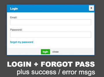
Confirmation
In version 3, a confirmation was added with callbacks for onConfirm and onDeny.
confirmEasy Callbacks
There are callbacks for: alert "onOpen", alert "onClose", alert "onAjaxFail", and btn "onClick".
onOpen onClose onAjaxFail onClickMIT Licensed
Go ahead and use jAlert in any commercial project you'd like. Just leave the MIT license intact to give credit where credit's due. If you really like jAlert, consider buying me a new car! (or like...a beer or something..) Thank you in advance!
Examples & Use-Cases
Instead of just giving you more of what's on the homepage, here are some advanced examples and use-cases that show how you can take full advantage of jAlert's functionality to build awesome apps.
Shortcut Functions (requires jAlert-functions.js)
alert('For your info...', '...you rock!');
alert('...you rock!'); //default is to not display a title
Need to show a success message?
successAlert('Success!', 'Saved your profile.');
successAlert('Saved your profile.'); //default title is Success
How about an error?
errorAlert('Error!', 'Could not save your profile.');
errorAlert('Could not save your profile.'); //default title is Error
Info anyone?
infoAlert('Info', 'I like your shirt.');
infoAlert('I like your shirt.'); //default title is Info
Warning?
warningAlert('Warning', 'Your shirt is not yellow!');
warningAlert('Your shirt is not yellow!'); //default title is Warning
Black (like your ex wife's heart)
blackAlert('Warning', 'It\'s still got that new car smell.');
blackAlert('It\'s still got that new car smell.'); //default title is Warning
Confirmation anyone?
confirm(function(e,btn){ //event + button clicked
    e.preventDefault();
    successAlert('Confirmed!');
}, function(e,btn){
    e.preventDefault();
    errorAlert('Denied!');
});
errorAlert('Could not save your profile.'); //default title is Error!
Getting Started
1. Install
Via npm:
npm install jalert
Or download from GitHub and include manually.
2. Include Files
<link rel="stylesheet" href="dist/jAlert.min.css">
<script src="https://code.jquery.com/jquery-3.7.0.min.js"></script>
<script src="dist/jAlert.min.js"></script>
3. Basic Usage
$.jAlert({
  title: 'Hello!',
  content: 'Welcome to jAlert!',
  theme: 'green'
});
4. Data Attributes (Optional)
You can use data-jAlert attributes for simple triggers:
<a href="#" data-jAlert data-title="Hi" data-content="I opened!">Click me</a>
$(function() {
  $.jAlert('attach');
});
jAlert Settings
How to set options when calling jAlert:
$.jAlert({
  'title': 'Set It',
  'content': 'Set',
  'theme': 'green',
  'size': 'md',
  'showAnimation': 'fadeInUp',
  'hideAnimation': 'fadeOutDown'
});
If you're using the data-jAlert attributes (every options can be set this way, however, some (like callbacks) may not work):
<a href='#' data-jAlert data-title="Set It" data-content="Set" data-theme="green" data-size="md" data-showAnimation="fadeInUp" data-hideAnimation="fadeOutDown">
   Click Me
</a>
How to get the current top-most visible jAlert:
var currentAlert = $.jAlert('current');
//now that you've got it, you can get it's properties, or close it.
console.log(currentAlert);
currentAlert.closeAlert();
How to override defaults:
$.fn.jAlert.defaults.size = 'lg';
$.fn.jAlert.defaults.theme = 'blue';
$.fn.jAlert.defaults.showAnimation = 'fadeInUp';
$.fn.jAlert.defaults.hideAnimation = 'fadeOutDown';
Full list of available options
| Property | Default | Options | Description | ||||||||||||||||||||||||||||||||
|---|---|---|---|---|---|---|---|---|---|---|---|---|---|---|---|---|---|---|---|---|---|---|---|---|---|---|---|---|---|---|---|---|---|---|---|
| title | false | string, false | This is the title of the modal. If false, a title bar isn't shown. | ||||||||||||||||||||||||||||||||
| content | false | string, false | Content is ignored if you're using image, iframe, ajax, or video. If content is false and you don't provide one of those, an error will be console logged. | ||||||||||||||||||||||||||||||||
| noPadContent | false | boolean | By default, the content of an alert has padding. You may choose to remove this by setting this param to true. This is useful in situations where you want something like an Iframe to be the full size without padding. | ||||||||||||||||||||||||||||||||
| fullscreen | false | boolean | This option makes jAlert stretch to the full height and width of the current window. Useful for fullscreen iframes, images, or other content. | ||||||||||||||||||||||||||||||||
| image | false | string (url), false | Displays an image centered with a max-width: 100% (of the alert's width). Shows a loader until the image has loaded. | ||||||||||||||||||||||||||||||||
| imageWidth | 'auto' | string (include % or px) | Defines the width of the image. max-width is always 100%. | ||||||||||||||||||||||||||||||||
| ajax | false | string (url), false | Does a $.get request and puts the content in the alert. Shows a loader until the content has been put in the DOM. onOpen is called AFTER the content is retrieved. | ||||||||||||||||||||||||||||||||
| onAjaxFail | function(alert, errorThrown){ alert.closeAlert(); errorAlert(errorThrown); }; | function | What to do if the $.get request fails for ajax. Default closes the alert and displays the ajax error. | ||||||||||||||||||||||||||||||||
| iframe | false | string (url), false | Displays a full width iframe with no border. Show a loader until the iframe has loaded. | ||||||||||||||||||||||||||||||||
| iframeHeight | false | string (px, %), false | Controls the height of the iframe. False will calculate 90% of the viewport height. | ||||||||||||||||||||||||||||||||
| class | false | string, false | Comma delimited string of classes (or just one class). Will be added to div.jAlert | ||||||||||||||||||||||||||||||||
| id | false | string, false | Sets an ID for div.jAlert | ||||||||||||||||||||||||||||||||
| showAnimation | 'fadeInUp' | string, false | Controls how to animate the entrance of the alert. Uses Animate.css (included in the CSS file). | ||||||||||||||||||||||||||||||||
| hideAnimation | 'fadeOutDown' | string, false | Controls how to animate the closing of the alert. Uses Animate.css (included in the CSS file). | ||||||||||||||||||||||||||||||||
| animationTimeout | 500 | int | Approx. how long the hide/show animation takes so that the background can wait and then hide. Since the animation is in CSS, there is no callback to rely on. If you change the animation speed in the CSS, you should change this to match. | ||||||||||||||||||||||||||||||||
| theme | 'default' | string ('default', 'red', 'dark_red', 'green',' dark_green', 'blue', 'dark_blue', 'brown', 'gray', 'dark_gray', 'black') | Controls the color of the title background, the border of the entire alert, and the font color of the title. | ||||||||||||||||||||||||||||||||
| backgroundColor | 'black' | string ('black', 'white') | Controls the color of the background behind the alert (the color that covers up the rest of the page). | ||||||||||||||||||||||||||||||||
| blurBackground | false | boolean | Blurs all elements behind the alert. | ||||||||||||||||||||||||||||||||
| size (width is an alias) | 'sm' | string ('xsm', 'xsmall', 'sm', 'small', 'md', 'medium', 'lg', 'large', 'xlg', 'xlarge', 'full', 'auto', {'height': '300px', 'width': '300px'}, 'npx', 'n%') | If you need to know exact pixel sizes of each, they're in the CSS file. All sizes are max-width of just smaller than the viewport (aka..responsive). Auto adjusts to the size of the content. You can also pass an object with height and width OR just a width (px or %) | ||||||||||||||||||||||||||||||||
| replaceOtherAlerts | false | boolean | When opening an alert/this alert, should other alerts be removed first? (true = yes) | ||||||||||||||||||||||||||||||||
| closeOnClick | false | boolean | Whether or not to hide the alert when you click anywhere on the page (true = yes). This is disabled if you include buttons in your alert. | ||||||||||||||||||||||||||||||||
| closeOnEsc | true | boolean | Whether or not to hide the alert when you click the "esc" key (true = yes). | ||||||||||||||||||||||||||||||||
| closeBtn | true | boolean | Whether or not to show the close button in the top-right side of the alert (true = yes). | ||||||||||||||||||||||||||||||||
| closeBtnRound | true | boolean | Default. Makes the button round. Set to false for the old style. | ||||||||||||||||||||||||||||||||
| closeBtnAlt | false | boolean | Enables an alternative version of the top-right close button | ||||||||||||||||||||||||||||||||
| btns | false | object, false | You can include just one button object, or multiple by wrapping them in brackets. Example: [ {'text': 'close'}, {'text': 'close'} ] | ||||||||||||||||||||||||||||||||
| A btn object can contain the following properties: |
|
||||||||||||||||||||||||||||||||||
| btnBackground | true | boolean | Whether or not to show the gray background behind the button(s). | ||||||||||||||||||||||||||||||||
| autofocus | false | string (dom selector), false | String should be an element within the alert that you would like autofocused onOpen (good for inputs and buttons). | ||||||||||||||||||||||||||||||||
| onOpen | function(alert){ return false; } | function | Function is called after the alert has finished opening. In the case of Ajax content, it's called after the content is loaded. The only parameter passed is a reference to the alert. | ||||||||||||||||||||||||||||||||
| onClose | function(alert){ return false; } | function | Function is called after the alert has closed. The only parameter passed is a reference to the alert. | ||||||||||||||||||||||||||||||||
| type | 'modal' | string ('modal', 'confirm') | A type: 'confirm' has magic that creates a standard confirmation popup. | ||||||||||||||||||||||||||||||||
| confirmQuestion | 'Are you sure?' | string | The question to ask when type: 'confirm'. | ||||||||||||||||||||||||||||||||
| confirmBtnText | 'Yes' | string | The confirmation button's text for type: 'confirm'. | ||||||||||||||||||||||||||||||||
| denyBtnText | 'No' | string | The deny button's text for type: 'confirm'. | ||||||||||||||||||||||||||||||||
| confirmAutofocus | '.confirmBtn' | string ('.confirmBtn', '.denyBtn', dom selector) | Autofocuses on the confirm button by default. You may pass any selector for a DOM element in the alert, or one of the two classes shown here. For type: 'confirm'. | ||||||||||||||||||||||||||||||||
| onConfirm | function(e, btn){ e.preventDefault(); console.log('confirmed'); return false; } | function | This callback is triggered when you click the confirmBtn. It's passed two parameters, the first is the event and the second is the button clicked. For type: 'confirm'. | ||||||||||||||||||||||||||||||||
| onDeny | function(alert){ return false; } | function | This callback is triggered when you click the denyBtn. It's passed two parameters, the first is the event and the second is the button clicked. For type: 'confirm'. | ||||||||||||||||||||||||||||||||
Public methods
| Function | Sample | Params | Description |
|---|---|---|---|
| closeAlert | $('.jAlert').closeAlert(true, function(){ console.log('the alert is now closed'); }); OR $('.jAlert').jAlert().closeAlert(true, function(){ console.log('the alert is now closed'); }); | destroyOrJustHide, onClose | The first parameter determines whether or not to hide or remove from the DOM (boolean), and the second is a callback for when it's done closing. |
| showAlert | $('.jAlert').jAlert().showAlert(); | replaceOthers, removeOthers, onOpen, onClose | Shows a hidden alert that was previously opened. replaceOthers will close all other alerts to show this one. removeOthers will remove the closed alerts before opening this one. onOpen and onClose are the same callbacks you can apply when instantiating a jAlert. |
Slideshow Options
jAlert now supports lightbox slideshows with navigation controls, auto-advance, and keyboard navigation.
Basic Usage
// Array of image URLs
$.jAlert({
    'slideshow': [
        'image1.jpg',
        'image2.jpg',
        'image3.jpg'
    ]
});

// DOM-based slideshow
$.jAlert({
    'slideshow': '#my-slideshow-container'
});

// Slideshow with dots navigation
$.jAlert({
    'slideshow': ['image1.jpg', 'image2.jpg', 'image3.jpg'],
    'slideshowOptions': {
        'showCounter': 'dots'
    }
});

// Slideshow without controls
$.jAlert({
    'slideshow': ['image1.jpg', 'image2.jpg', 'image3.jpg'],
    'slideshowOptions': {
        'showArrows': false,
        'showCounter': false
    }
});
Slideshow Options
| Option | Type | Default | Description |
|---|---|---|---|
| autoAdvance | boolean | false | Whether to automatically advance to the next slide |
| autoAdvanceInterval | number | 3000 | Time in milliseconds between auto-advances |
| keyboardNav | boolean | true | Enable keyboard navigation (left/right arrow keys) |
| pauseOnHover | boolean | false | Pause auto-advance when hovering over slideshow |
| resizeMode | string | 'fitCurrent' | 'fitCurrent' (resize modal to fit current image) or 'fitLargest' (resize to fit largest image) |
| loop | boolean | true | Whether to loop back to the first slide when reaching the end (or last slide when going backwards) |
| showArrows | boolean | true | Whether to show navigation arrows on the sides |
| showCounter | string | 'numbers' | 'numbers' (1/3 format), 'dots' (clickable dots), or false (no counter) |
| arrowButtons | DOM elements | null | Custom DOM elements to use as arrow buttons instead of defaults |
DOM Structure for Slideshows
When using DOM-based slideshows, use this structure:
<div id="my-slideshow">
    <div class="ja_slide">
        <img src="image1.jpg" alt="Description">
        <div class="caption">Image Caption</div>
    </div>
    <div class="ja_slide">
        <img src="image2.jpg" alt="Description">
        <div class="caption">Another Caption</div>
    </div>
</div>
Utility Function
// Quick slideshow creation
slideshowAlert([
    'image1.jpg',
    'image2.jpg',
    'image3.jpg'
], {
    autoAdvance: true,
    autoAdvanceInterval: 2000
});

// Looping slideshow
slideshowAlert([
    'image1.jpg',
    'image2.jpg',
    'image3.jpg'
], {
    autoAdvance: true,
    autoAdvanceInterval: 2000,
    loop: true
});
Dynamic Resize Functionality
jAlert now supports dynamic resizing of modals to fit content changes. This is particularly useful for modals with dynamic content that changes after the modal is opened.
Basic Usage
// Manual resize to fit content
$.jAlert({
    title: 'Dynamic Content',
    content: '<div id="dynamic-content">Short content</div>'
});

// Later, after content changes
$('#dynamic-content').text('Much longer content that needs more space');
$('.jAlert').autoResize();

// Or use the global function
$.autoResize();
Auto-Resize on Content Changes
// Enable automatic resizing when content changes
$.jAlert({
    title: 'Auto-Resize Demo',
    content: '<div id="auto-content">Initial content</div>',
    autoResizeOnContentChange: true
});

// Content changes will automatically trigger resize
$('#auto-content').html('<h3>New Content</h3><p>This will automatically resize the modal</p>');
Resize Options
| Option | Type | Default | Description |
|---|---|---|---|
| autoResizeOnContentChange | boolean | false | Automatically resize the modal when content changes (uses MutationObserver) |
Resize Methods
| Method | Sample | Params | Description |
|---|---|---|---|
| autoResize | $('.jAlert').autoResize(); OR $.autoResize(); |
none | Automatically resize the modal to fit its current content (height only) |
| resizeToFit | $('.jAlert').resizeToFit(); OR $.resizeToFit(); |
none | Alias for autoResize() - resize modal to fit content |
| resizeModal | $('.jAlert').resizeModal(null, 300); OR $.resizeModal(300); |
height (optional) | Resize modal to specific height (in pixels) or auto-fit if no height provided |
Advanced Usage
// Get the alert instance and call methods
const alert = $.jAlert('current');
if (alert) {
    alert.autoResize();
    alert.resizeModal(null, 400); // Set specific height
}

// Resize after AJAX content loads
$.jAlert({
    ajax: 'dynamic-content.html',
    onOpen: function(alert) {
        // Content is loaded, now resize to fit
        alert.autoResize();
    }
});

// Resize after dynamic content changes
$('#dynamic-content').load('new-content.html', function() {
    $('.jAlert').autoResize();
});
Notes
- Resize functionality only adjusts height - width is controlled by the size option (sm, md, lg, etc.)
- Auto-resize uses MutationObserver to detect content changes
- Manual resize methods should be called after content changes are complete
- Resize works with all content types: text, HTML, AJAX-loaded content, etc.
Enhanced Reliability & Performance
jAlert v5.0.4 includes significant improvements to error handling and API consistency for better reliability in production environments.
Enhanced Error Handling
- Defensive Programming: Added robust guards to prevent undefined access errors in async scenarios
- AJAX Error Handling: Improved error handling for AJAX content loading with proper type checking
- Async Safety: Better handling of race conditions and DOM removal timing
- Memory Management: Proper cleanup of MutationObserver instances and event handlers
API Consistency
- Standardized Access: Consistent use of
.jAlert()method for API access - Method Chaining: All methods return
thisfor better chaining support - Better Encapsulation: Improved error prevention through proper method access patterns
- Backward Compatibility: All changes maintain 100% compatibility with existing code
Mobile & Tablet Enhancements
- Optimized Button Sizing: Better touch-friendly button dimensions for tablet devices (451px - 1024px)
- Improved Layout: Enhanced responsive design for button containers and spacing
- Touch Interaction: Better padding and font sizes for improved user experience on touch devices